Hi there 👋
I'm Charlie, a Product Manager in B2B SaaS and today I'll share with you everything I know about how to build a top-converting landing page for a SaaS product.
The average conversion rate (CVR) for SaaS is ~10%, but most are 3-4%. At this level, just a 1% increase boosts MRR by 25-35%!
So it really matters!
Let's jump in 👇
🧠 The Newsletter For SaaS Founders
Every week discover the best growth, marketing, tech and product development strategies for your SaaS!
Join 1,100+ SaaS founders, indie hackers and tech entrepreneurs already reading!
1. How to build a top landing page
For most new SaaS products, the landing page is just the website's home page. But 90% of the time, a dedicated landing page will convert better.
Here are the must-have sections for almost all SaaS products:
Hero
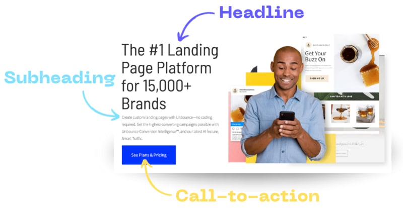
(See Unbounce’s full landing page
A hero has 3 things:
A clear headline
A justifiable sub-heading
A simple call-to-action (CTA)
Your headline is the first thing a customer reads. Its job is to get across the why of your product. If customers don’t feel it resonates with them, they will bounce (leave without interaction) immediately.
Your sub-heading should expand on the headline, adding more detail on how the customer can achieve their goal.
An image is optional, but they have been shown to increase CVR by supporting the statement in your headline.
Your CTA should be singular and tell your customers exactly what you want them to do. It depends on your specific SaaS model, but here are the most common ones:
“Start a free trial”
“See pricing”
“Book a demo”
“Get started”
Read this guide on CTA’s to figure out what’s best for your business.
Feature Spotlights
The next section of your landing page should tell your customers about your product’s key features.
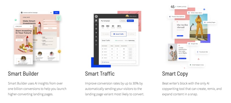
For each, include a screenshot of the product and some short copy focused on how the feature helps solve the customer’s problem.
Here’s how Unbounce does it:
Testimonials/Social Proof
Landing page visitors don’t know or trust you. They need to know others have already achieved success. Include reviews, ratings, awards and customer logos.
Plus, tools like Famewall make it super easy to collect and display this on your landing page.
2. Boost CVR in < 1 hour
These tactics can easily boost CVR by 1%+:
Minimise links
Every link on your landing page is an opportunity for a visitor to leave without converting. So minimising the number of links will naturally increase CVR.
Remove all menus, chat widgets, newsletter sign-ups and footers. The only links you truly need are a privacy policy and terms of service. Everything else is take it or leave it.
Repeat the CTA
Research shows that repeating your CTA multiple times increases conversions. And near the end of the page is one of the best places to do it.
Why? Because those who make it to the end of the page are more engaged and likely to convert.
Track behaviour
Keeping customers around for longer increases their chances of converting.
Install tools like Hotjar for heatmaps and Simple Analytics as a Google Analytics alternative to spy on your customers.
Identify the biggest areas where customers are leaving your page and adjust them to fix the leak.
3. Awesome landing pages
How can we know landing pages even work?
A lot of the links below are from search ads. The big guys are putting money behind landing pages, so you should use them too.
That's all!
I hope this helps you convert more website visitors into customers!
🧠 The Newsletter For SaaS Founders
Every week discover the best growth, marketing, tech and product development strategies for your SaaS!
Join 1,100+ SaaS founders, indie hackers and tech entrepreneurs already reading!


Top comments (2)
Hi! #discuss posts should be questions designed to elicit community responses. Since this is more of a blog post than a question, please consider removing the #discuss tag. Thanks!
No problem, I've removed it and will consider it more carefully in future posts.