Originally posted on my blog
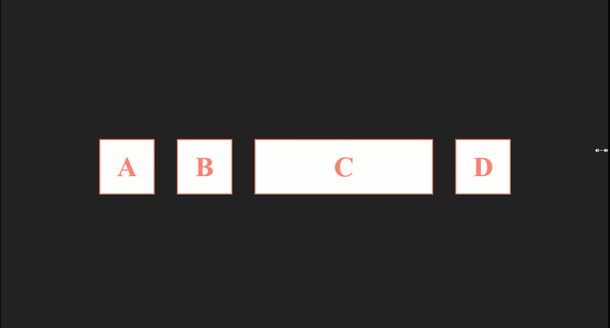
CSS flexbox makes it easier to design a flexible and responsive layout structure without using float or positioning.
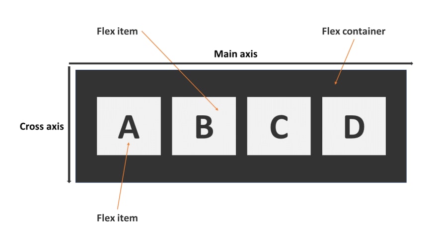
Flex container
These following properties are applied to the flex container.
display
It transforms the container to a flexible one (flexbox) or inline flex container.
- flex: This value will transform the elements of the container to flex items.
flex-direction
It specifies in which direction the main axis go.
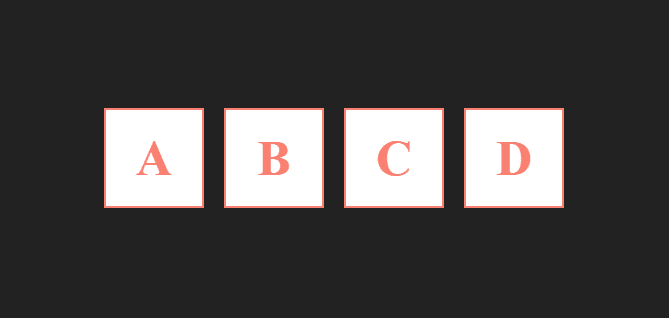
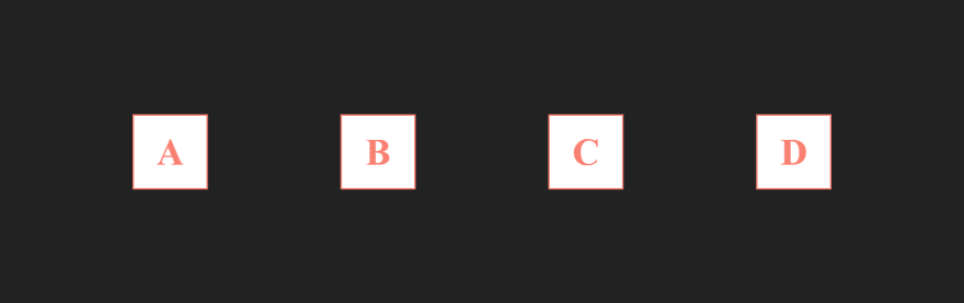
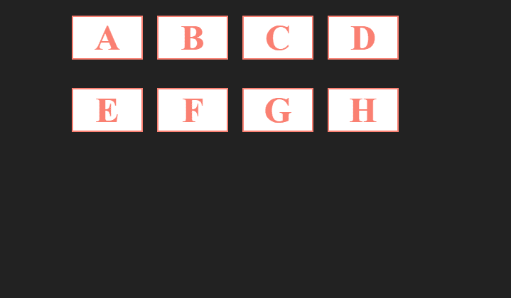
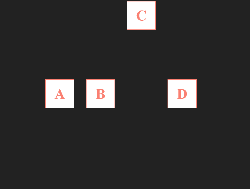
- row: it's the default, flex items will be displayed horizontally and the main axis will go from the left to the right side.
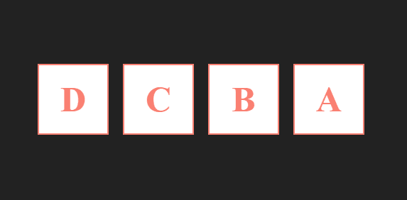
- row-reverse: it's the same as
row, except the order will be inverted and the main axis will go from the right to the left.
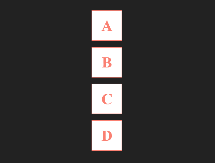
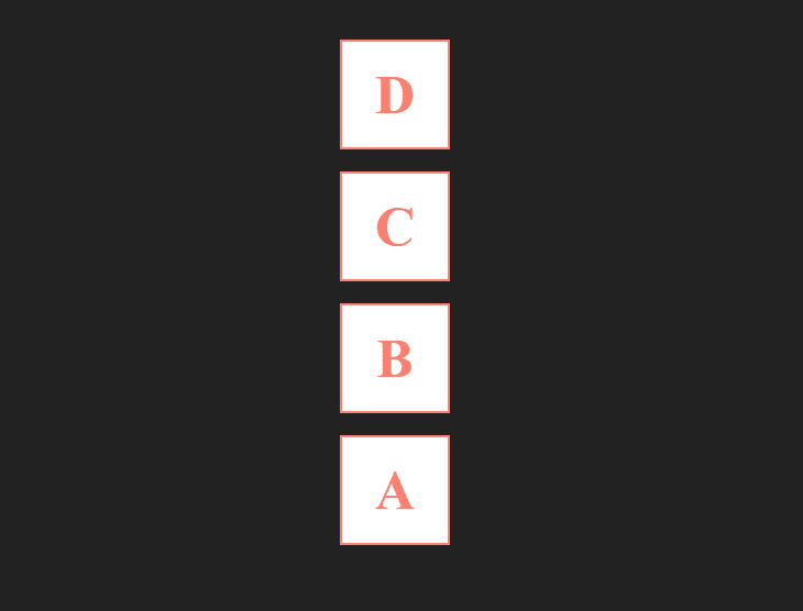
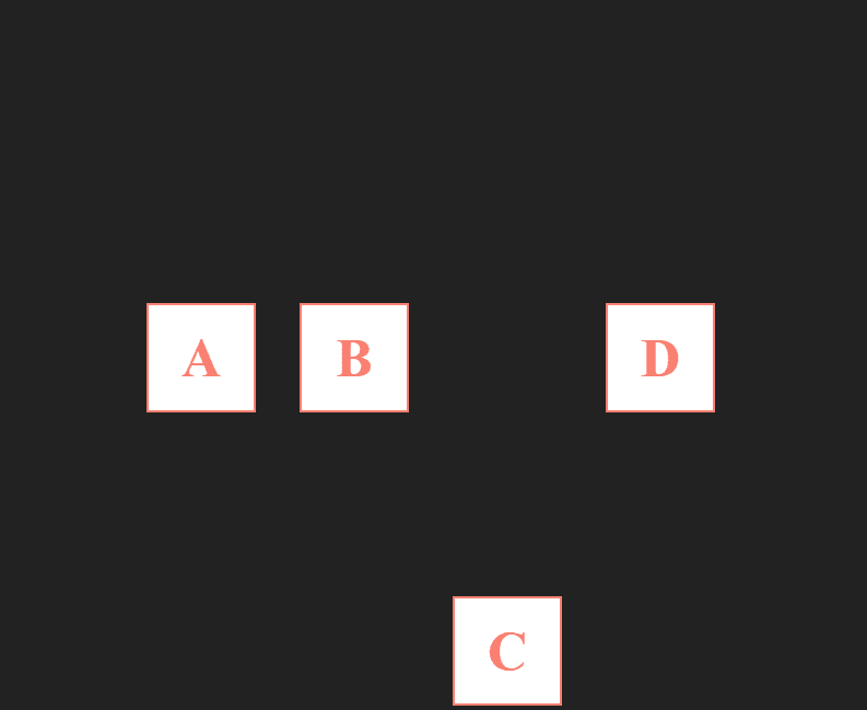
- column: flex items will be displayed as a column (vertically) and the main direction will go from top to bottom.
- column-reverse: it's the same as a
column, except the order will be inverted and the main axis will go from bottom to top.
justify-content
It's used to control how the items should be positioned following the main axis.
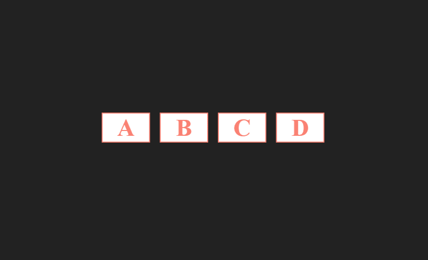
- center: This value will center all the items.

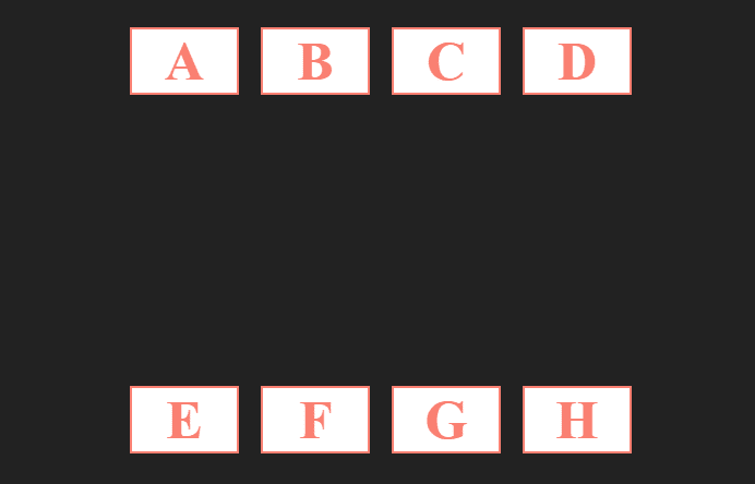
- space-between: It will distribute the available space evenly between the items.

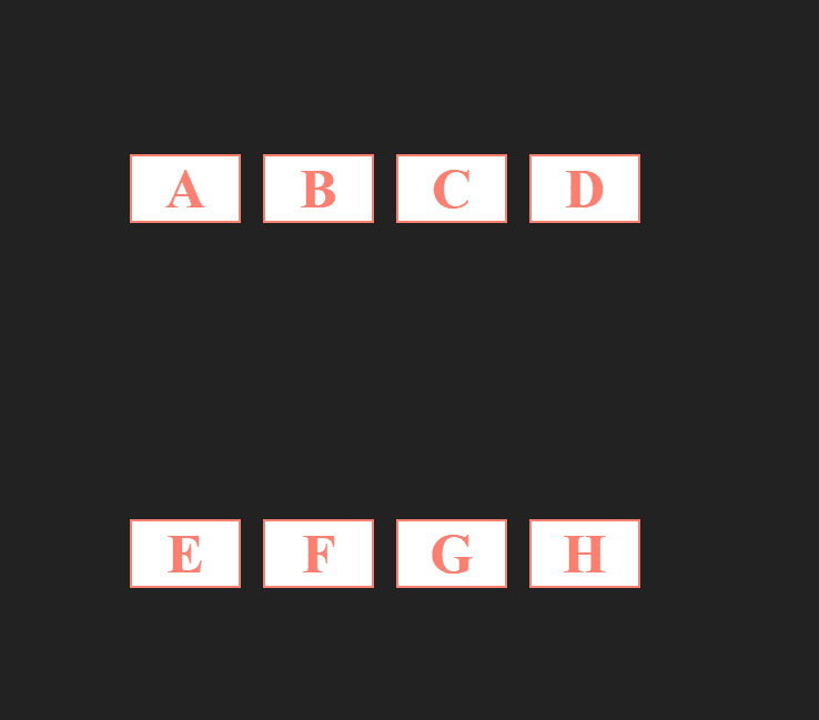
- space-around: It will give each flex item the same amount of space on both left and right.

- space-evenly: This value ensures that the space between flex items will be the same.
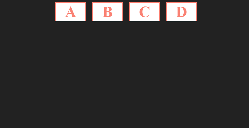
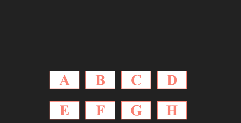
- flex-start: it's the default, the items will be positioned at the start of the flex container.
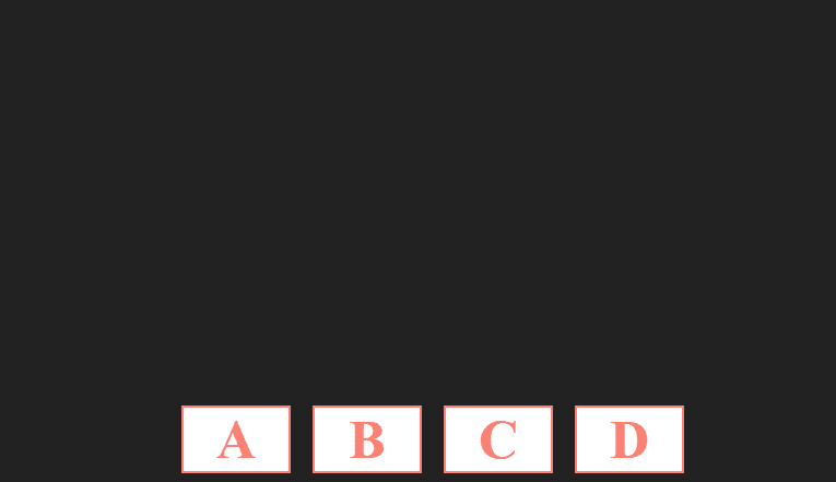
- flex-end: the items will be positioned at the end of the flex container.

align-items
It's used to control how the items should be positioned along the cross-axis.
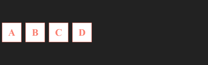
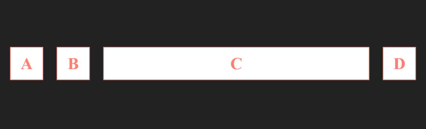
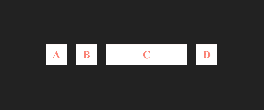
- stretch: it's the default, the flex items will be stretched along the cross axis.
- center: This value will center the items along the cross axis.
- flex-start: the items will be positioned at the start of the cross axis.
- flex-end: the items will be positioned at the end of the cross axis.
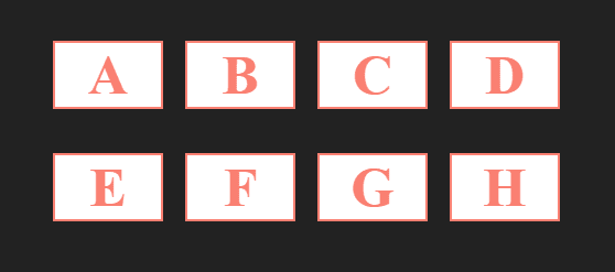
flex-wrap
- wrap: This value will put the overflowing items into a new line.

flex-flow
The flex-flow property is a shorthand property for setting both the flex-direction and flex-wrap properties.
e.g: flex-flow: column wrap;
align-content
It does the same job as align-items, except this property aligns the flex container along the cross-axis if extra space is available.
Notice that the property will be applied only if the number of flex containers is more than one.
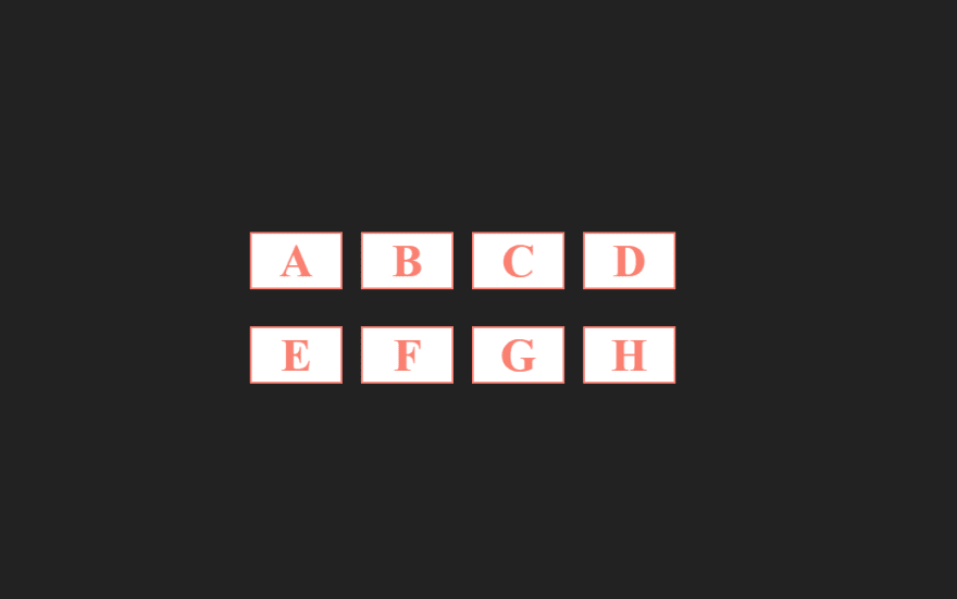
- stretch: it's the default, flex containers stretch to take up the remaining space.
- center: This value will center the flex container along the cross axis.
- flex-start: the flex container will be positioned at the start of the cross axis.
- flex-end: the flex container will be positioned at the end of the cross axis.
- space-between: It will distribute the available space evenly between flex containers.
- space-around: It will give each flex container the same amount of space on both left and right.
Flex Item
These following properties are applied to the flex item.
align-self
The property align-items sets the default alignment for all the flex items, align-self enables us to override this default alignment for an individual item.
auto: it's the default.
center: This value will center the flex item towards its container.

- flex-start: the flex item will be positioned at the start of the cross axis.
- flex-end: the flex item will be positioned at the end of the cross axis.
- stretch: the flex item will be stretched along the cross axis.
order
The order property controls the order in which children of a flex container appear within the flex container. The value must be an integer.
e.g: order: -1;

flex-grow
It gives the flex item the ability to grow. The value must be positive.
e.g: flex-grow: 1;
flex-basis
It sets the flex basis, in other words the width.
e.g: flex-basis: 30%;
flex-shrink
It controls how a flex item can shrink.
flex-shrink:0 it will not shrink
flex-shrink:1 it will shrink.
e.g: flex-shrink:0
flex
We can simplify flex-grow, flex-basis flex-shrink with flex followed by them values.
e.g: flex: 0 30% auto


Top comments (7)
Nice, when i started learning about flexbox i played this game to learn;
flexboxfroggy.com/
Ditto
Great resource and thanks for sharing
Thanks, it is very helpful short guide
Personally I'm terrible at css, but just skimming through this gave me confidence to the point where I'm scared of myself. :)
Thank you dearly for the post. I'll be using this extensively.
Great write-up! Very helpful. :)
thanks man for info.