
(Originally posted on my blog: https://iamschulz.com/a-deep-dive-into-webfonts/)
Inspired by Ben Halperns discussion about webfonts, I decided to take a deep dive into the subject. What are Webfonts, where did they come from and how do we load them as fast as possible?
TL;DR
- convert your font to woff/woff2
- split font files into character sets and load them with
unicode-range - preload your font or use HTTP2 server pushes
- use
font-display: fallback;oroptional; - Cache your fonts efficiently
What's a font?
Let's start at the beginning: What are fonts?
A font file is a collection of vector-based graphics. That means they're scalable, so you don't need a different set of graphics for different sizes. Those graphics get assigned to addresses, which represent specific glyphs. A glyph can be
- a letter (
A) - a number (
3) - a mathematical operator (
÷) - weird dingbats (
♆) - or whatever else you can find in the Unicode table.
Partly because font files would become bloated, partly because it's a huge amount of work, next to no font supports the full Unicode set. We mostly work with subsets and accept the constraints that come with that. If you're a non-English speaker and your language uses its own letters, you'll most certainly have been in the situation of having found a nice font, but unable to use it, because there's no ß inside. I'll cover later on how the browser handles those cases.
Fonts can also transform their characters on a contextual basis with ligatures. A common example would be fi, with the arch of the f merging with the i's dot and the x-line serifs becoming one.

The font recognizes defined character strings and replaces them with a special graphic. That mechanism can be taken to an extreme for creative effects.
A font file typically includes only one style (as in bold, italic, etc). A font family that covers all styles of a font consists of multiple font files. This becomes very important when bringing fonts into the web because each style means another request.
Formats
Back in the days of the Browser Wars, you had to have a plethora of file formats to get your webfont running consistently. There was EOT for Internet Explorers, SVG for older iOS devices, and TTF and OTF for more modern browsers like Chrome and Firefox.
Things have become clearer since then. TTF and OTF were pioneered by Microsoft, who also introduced the @font-face rules to begin with. Both are flavors of OpenType, with TTF being focused on TrueType and OTF being focused on PostScript. There's a comprehensive history in the Wikipedia article. OpenType eventually got a nice, browser-supported compression and evolved into woff (which became woff2 with an even better compression).
Browser support for woff and woff2 is very good. You can pretty much just stick to them and forget about the others unless you have to support some niche devices. Fonts that are only available as TTF/OTF can easily be converted to woff2.
Still, what's even better than loading a super optimized font over the network is checking if the user already has it on their system. When using very popular fonts like Open Sans, Roboto or Fira Code the chance of that is quite high. Let's put the local() option at the top of the list.
Loading a webfont
A naïve implementation of a webfont would look like this:
<!-- index.html -->
<!DOCTYPE html>
<html>
    <head>
        <link rel="stylesheet" type="text/css" href="./styles.css">
    </head>
    <body>Trololo</body>
</html>
/* ./styles.css */
@font-face {
    font-family: "MyAwesomeFont";
    src: local("MyAwesomeFont"),
         url(./MyAwesomeFont.woff2) format("woff2"),
         url(./MyAwesomeFont.woff) format("woff");
}

body {
    font-family: "MyAwesomeFont";
}
That works. The body text is shown in the specified font. Mission accomplished, good job everyone. Hold up! There's still a lot of potential here. Here's what that would look like as a simplified waterfall diagram with totally made up numbers.
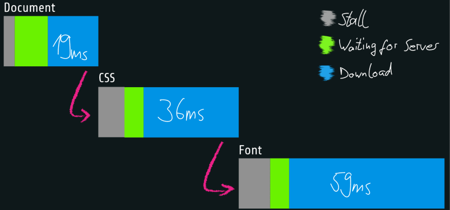
You might notice a "flash" or layout change when loading the site. There's also some heavy data usage or a bit of delay until the page has finished rendering. You can speed things up. You can cut down on both the download's size and efficiency. Let's look into that!
Load only what you need
Before I talk about cutting down on file sizes, I'll talk about what you don't want to throw overboard.
Font Stacks
Webfonts are progressive enhancements. A browser will always display text, whether you specified a valid font or not. It will just fall back to the system font if all else fails. The font-family property gives us the option to specify more than one font: That's called a font stack and it's read from left to right.
.sans {
    font-family: "Roboto", "Arial", "Helvetica Neue", "Helvetica", sans-serif;
}
If the webfont Roboto fails to load or parse for some reason, the browser falls back to Arial. If that's not found locally, it tries Helvetica Neue, then Helvetica, and finally uses whatever sans-serif font is specified in the browsers settings.
Here are some more stacks for serif, monospace and fabulous fonts:
.serif {
    font-family: "Roboto Slab", "Georgia", "Times", "Times New Roman", serif;
}

.mono {
    font-family: "Fira Code", "Consolas", "monaco", monospace;
}

.script {
    font-family: "Lobster", "Brush Script MT", cursive;
}
Synthetic fonts
If you use bold and italic styles of your font, make sure to load the corresponding files. If you use exotic characters, make sure those are included in your font.
You can have the browser synthesizing missing styles, but doing that is a great way to make designers cry. A faux-bold font is simply the base font with thicker lines. Most of the time, your text will be prettier in a designed font, since not all lines should scale equally with boldness and not all lines slant equally for italic fonts. This example uses Raleway in Regular, Black and Italic:

Missing characters are even more noticeable. They'll simply fall back according to the font stack and stick out like a sore thumb. This example uses the following font stack:
font-family: "Bentham", "Comic Sans MS", sans-serif;

Umlauts can easily be synthesized by simply adding some graphics to a base character. Ligatures are harder, as they're completely new characters. The browser can't know how they're supposed to look like, so it falls back down the font stack. In this case, the next viable option is Comic Sans. The same goes for an entire character set that the font doesn't include. (Yes, I specifically looked for a font without Cyrillic and ß.)
In the end, synthetic fonts should only be used as a fallback option, in case your font file fails to load properly, and for the time between loading the document and rendering the font.
Throw away what you don't need
Trimming file sizes
Using webfonts comes at a cost: they're huge. Vector-based graphics become larger the more details they have and fonts are no exception. This is what Roboto's lowercase a looks like with all its anchor points:
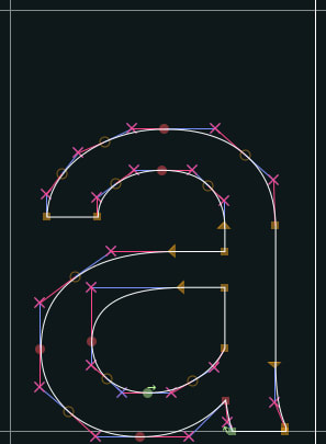
Doesn't seem so bad on its own, but there are 1109 glyphs inside the font. In the end that stacks up to 168kB - and that's for the regular style only!
Removing characters from the file
In most cases, you don't want to simplify the glyph's paths to save space. That would come at the expense of the readability of the font - which is likely why you want to use a webfont in the first place. But you can cut down on the number of glyphs inside the font file. If you don't write exclusively in English, you can safely remove any umlauts Ä, Ø, non-decorative ligatures ß, Æ and even whole character sets like Cyrillic. FontForge is a simple and capable tool for that that also brings a CLI and scripts, so you can automate your character stripping.
Unicode ranges
Let's take this a step further: You've got a multi-language site. English speakers should get a font with Latin characters, Russian speakers one with Cyrillic characters and Japanese speakers one Japanese characters. It's overkill to have every user load ever character set. Enter unicode-range. This is a CSS property that defines what font file will be used based on your content.
/* ./styles.css */
@font-face {
    font-family: "MyAwesomeFont-latin";
    src: url(./MyAwesomeFont-latin.woff2) format("woff2"),
        url(./MyAwesomeFont-latin.woff) format("woff");
    unicode-range: U+0020—007F;
}

@font-face {
    font-family: "MyAwesomeFont-cyril";
    src: url(./MyAwesomeFont-cyril.woff2) format("woff2"),
        url(./MyAwesomeFont-cyril.woff) format("woff");
    unicode-range: U+0400–04FF;
}

@font-face {
    font-family: "MyAwesomeFont-jp";
    src: url(./MyAwesomeFont-jp.woff2) format("woff2"),
        url(./MyAwesomeFont-jp.woff) format("woff");
    unicode-range: U+3000-9FFF, U+ff??;
}
If the browser sees some Japanese characters on the page, it will now download the pre-split Japanese part of your font.
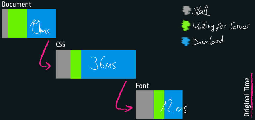
Using a modern file format and stripping out unneeded stuff leaves us with something like the following waterfall:
Loading strategies
Preloading
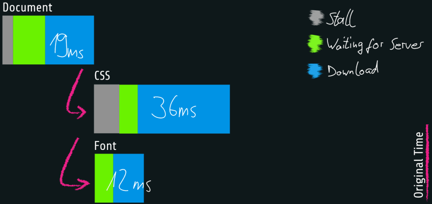
Now that you've slimmed down the transfer size of our font files, it's time to polish the loading order. Let's take a look at our naïve implementation from above: The first thing the browser sees is the document. The document links to the stylesheet, so that gets loaded next. The stylesheet finally links to the font files. You can skip one step by telling the browser directly in the document, which font files it's gonna need.
<!-- index.html -->
<link rel="preload" href="./MyAwesomeFont.woff2" as="font" crossorigin>
<link rel="stylesheet" type="text/css" href="./styles.css">
/* ./styles.css */
@font-face {
    font-family: "MyAwesomeFont";
    src: url(./MyAwesomeFont.woff2) format("woff2"),
         url(./MyAwesomeFont.woff) format("woff");
}

body {
    font-family: 'MyAwesomeFont';
}
Note that Preload can't know if your browser needs a woff or woff2-file, so it would just download both. All browsers that support preloading also support woff2, so we'll preload only that. The woff file stays as a fallback in CSS.
That keeps the CSS together in its own file, isn't render-blocking in any way, and cleans up the waterfall diagram just the same.
Great Success? Well, Firefox doesn't like it. This feature is behind a flag right now, and it seems like they're shipping it later this year. Until then, browser coverage is at around 80%.
HTTP/2 Push
But there's a similar solution that works on Firefox: Pushing resources by HTTP/2. The idea is similar to HTTP preload (you push any needed assets as early as possible), but a bit more extreme. The browser doesn't have to wait for the document to read the preload meta but gets the assets with the first answer from the server.

Implementation is a bit trickier. Instead of just inserting a meta tag, you need to edit your server or CDN configuration. Also, you'll lose access to unicode-range, so you'll need to workaround that server-side. Still, HTTP/2 push goes as my recommendation in terms of optimizing the request chain.
Content Flashes
You now have shortened the loading time, but font rendering still relies on a second request, which can take a long time on slow connections or fail. What happens in the meantime between the First Paint and font rendering is either of
a Flash of Unstyled Content (FOUT)

or a Flash of Invisible Content (FOIT)

Luckily, you can step in here and tell the browser what to do with the CSS property font-display. It takes one of five values:
-
auto: That's the browsers default behavior. Chrome usesswaphere, Firefox and Safari useblock. -
block: The browser blocks some space for the text, but doesn't render it for a long time (3s for Chrome) unless the webfont loads. If the font didn't load in that time, the browser uses the fallback font, but will still use the webfont as soon as it loads. A long FOIT occurs with the possibility of a FOUT further down the line. -
swap: The browser renders the text immediately with the fallback font. As soon as the webfont loads, the text is re-rendered with that. A short FOUT occurs at that point. -
fallback: The browser blocks the font rendering for a short time (100ms for Chrome) while waiting for the webfont. If it doesn't load in time, the text will render in the fallback font. The browser will now wait for a long time (3s for Chrome) for the webfont. A short FOIT occurs with the possibility of a FOUT within the next 3 seconds. -
optional: This is the most performance-driven option. Like before, the browser blocks the font rendering for a short time (100ms for Chrome), while waiting for the webfont, then switch to the fallback font and terminate the webfonts request. A short FOIT occurs.
A short FOIT is most likely the preferable option. A long one (like when using block) prevents the user from reading your text at all. A FOUT should be prevented, or at least contained to a short time frame after the document renders, because it can disrupt the user when they're already reading the text. Also, keep in mind that each re-render of a webfont is a costly layout operation.
Caching
Phew. Now you've gone through so much trouble to make sure your fonts load as fast as possible, let's make sure your users wont have to load them again next time they visit your page. As fonts are pretty much static in nature, we can be sure of them being still the same file at that point. Give them a long cache halftime by setting its Cache Headers to Cache-Control: public, max-age=31536000 and giving it an ETag. Also, make sure you don't apply any cachebreakers to your fonts in your budler or html.
And that's your webfont strategy done! Congratulations for making it this far and enjoy your blazing fast™ fonts! If you want do dive even deeper, here are some more hints on where to go:
Variable fonts
Despite being in the spec since TTF, those are a quite recent addition to webfonts, becoming supported widely in 2018. Right now, browser support is decent and safe for modern clients.
Variable fonts have custom properties. Those can be font's weight, slant, width or ascender height, or completely wild and creative properties. The value of those properties is set in a range. Unlike font-weight (set in increments of 100) or slant (set as true or false), you can set them freely between a minimum and maximum value. The font reacts by morphing its vectors along pre-defined paths, manipulating the glyphs in the process. (Bonus points: they're animatable!)
That's exciting because it allows you to just load one font file and get all the weights and styles you want from that, instead of loading multiple files for a whole font family. However, variable font files are larger than their traditional counterparts. If you only use one or two font files to begin with, switching to a variable font probably isn't worth it.
Google fonts
An honorary mention goes to Google. Their fonts collection is very extensive and actually quite fast. Harry Roberts wrote an awesome article on how to speed them up even more.
Google Fonts still raises some privacy concerns and gets blocked way faster by adblockers than self-hosted solutions.
Further reads
- Almanac entry for fonts: https://css-tricks.com/almanac/properties/f/font/
- More font stacks: https://css-tricks.com/snippets/css/system-font-stack/
- A Smashing article on HTTP/2 pushes: https://www.smashingmagazine.com/2017/04/guide-http2-server-push/
- Variable fonts playgrounds:


Top comments (0)