Designing a new identity from scratch is fun. It's a lot of work, but it’s fun. It’s like getting to know someone new when you start dating but better, because in the end you get to choose which quirky features to keep and which ones need to sashay away.
Designing identities is also a lot of work. But redesigning them is even worse. Because you have to take something that already exists and represents an idea or concept and turn in into something new while still keeping that essence alive. You need to do it in a way that’s delicate enough not to confuse your audience, while being bold enough for the change to make sense.
Redesigning identities is HARD work.
A while ago I had the opportunity to redesign the brand I’m currently working with. The company, CourseIt, offers several coding bootcamps in Spanish for aspirant (or seasoned) web developers. Classes can be taken on-site or 100% online. Right now the whole offer is online (thanks, COVID-19)
I’ve been working with this brand for over a year, and the first week I got the following instructions: ‘We don’t want a designer that plans to take over, we want someone that can take what we have and work with it’.
Maybe it feels a bit aggressive, but I get it. Designers, we love to mark our territory. And we have opinions, oh yes we do. So even if I wanted to tear my eyes from my face each time I had to use their logo, I humored this request because in the end it made sense. You can’t go around destroying all previous work just because you don’t like it on a personal level. Also I was sure that if I stood around sooner or later a redesign was coming our way. I just needed to assess which parts of the identity were not working as intended in order to propose a better solution.
I started off by changing the parts that didn’t work and were low priority — my first victim were the brands Instagram and Twitter accounts. Because social media posts are usually short lived they provide a perfect place to try and mix it up, specially if you are a smaller brand who doesn’t have a big design department.
Eventually we got to a point of brand maturity where I was asked for a redesign. I believe this was a really important step. Brands are not inert objects, they live, breathe, grow and change. And sometimes they need to shed their old skin before growing even further.
Because the previous design felt heavily influenced by local competitors we felt the need to get away from that and create something from scratch (as ‘from scratch as possible, I know everything is a remix)’.
We also wanted to stray away from some concepts that are very common like ‘rockstar developers’, ‘ninjas’ and the whole ‘developer astronaut thing’.
(I mean, I’m all about powering spaceships with javascript if that’s your thing, but as a frontend developer I’m not planning to visit space any time soon.)
As a smaller company we usually work closely to the public we cater and they are amazing people trying to live their best life, make the most of their careers and trying to have fun in the process. So for my concept I wanted something relatable and down to earth, something that represents people doing their best.
The concept we ended up with was ‘Road’ as in career -> path -> road. Thinking about career milestones as stops in a road that keeps going. Switching careers as finding a crossroad sign in the forest, and in every step there we are, as a brand, guiding you. You don’t have to walk that path on your own. We can be the gas in your car, your trekking shoes. You don’t have to worry about anything, only about moving.
Concepts are a very powerful thing because they may not be obvious, but if you let them permeate every inch of your identity, from visuals to the way you communicate, you end up with a product that feels solid and consistent. And in the land of brand identities consistency is DA QUEEN.
I was asked to keep some elements from the previous branding like the color palette. This was easy since their main color was a beautiful shade of bluish-violet that conveys a lot of emotion related to academic endeavors. It also made keeping the connection to the previous identity easier. I was able to transition social media posts in a way that didn’t feel disconnected or aggressive.
We also changed up the typography — the previous version was using Rubik for everything, which made some sections of the site, like the class chatroom, a bit uncomfortable to use. We decided to go with a pairing, 'Exo2' for titles and accents and good old 'Open Sans' for every bit of the site that has chunks of text.
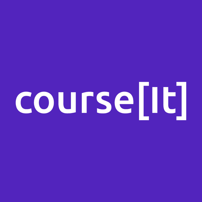
The logo was probably the hardest change. I was asked to keep some sort of code related characters on it. We ended up enclosing the It bit of the name between brackets, which is common notation for arrays. This was kind of perfect since arrays are by definition ‘an ordered series or arrangement.’ Just like a road! I know, right? Concepts are just amazing.
We ended up with a logo that is simple enough and works in a variety of contrasts and colors which is always desirable.
Old logo:

New logo:
There’s probably still a lot to adjust, but overall we feel very represented by the result, which means that we, as a brand, are comfortable in our own skin. It still feels down-to-earth without being boring and hopefully will accompany our own path for a long time.
If you wish to see the final product feel free to visit courseit.com.ar (remember, it’s in spanish).
I'd love to hear some stories about brand redesign for startups, do you have one? Hit me up!

Top comments (0)