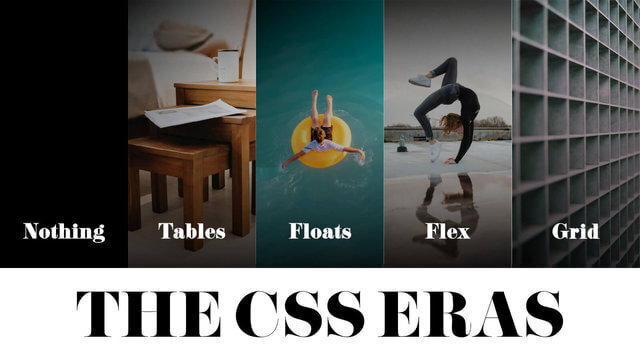
Do people still write CSS in CSS files any more? I honestly don’t keep up with the trends as much as I did back when I started by career. Partly because I’ve started to feel that the web development community online has become a lot more “this(my) way is the best way” than when I started out at the tail-end of the HTML tables era and the start of the floats era.
Love this slide from my The State of CSS talk at Web Directions Code back in 2024
Regardless, personal opinions aside, I do have projects that involve CSS in CSS files. It’s a Drupal 10 site, so the custom theme uses CSS. Who still uses Drupal in 2025, you might ask? Apparently, Drupal is used by 1.2% of all the websites whose content management system we know. This is 0.9% of all websites.. As of time of writing, there are estimated to be 192 million actively maintained websites, so it’s still a good number.
So what’s the use case?
The use case is i18n. If you’re new to Drupal, or someone like me who returned from a long hiatus since Drupal 7, the Drupal documentation SEO is a little messed up if you just Google directly. Largely because Drupal 7 had such a long, long shelf life.
Anyway, the up-to-date Drupal i18n documentation is at Chapter 10. Making Your Site Multilingual and Multilingual guide. Go there if you’re trying implement i18n on your own Drupal 10 site.
The specific problem I was trying to solve was related to the language switcher. Once you turn on multilingual capabilities on your Drupal site, there is a language switcher block that you can place where you deem fit.
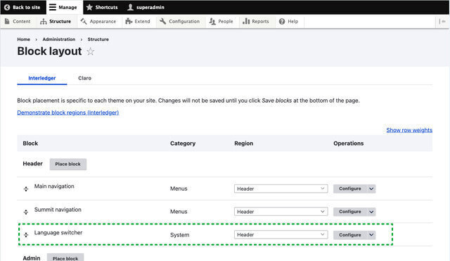
I suppose, depending on the Drupal theme you are using, there may or may not be some styling associated with the block. But as my site was a fully custom implementation, my theme was built off Starterkit theme.
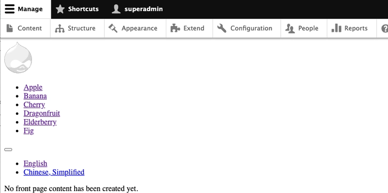
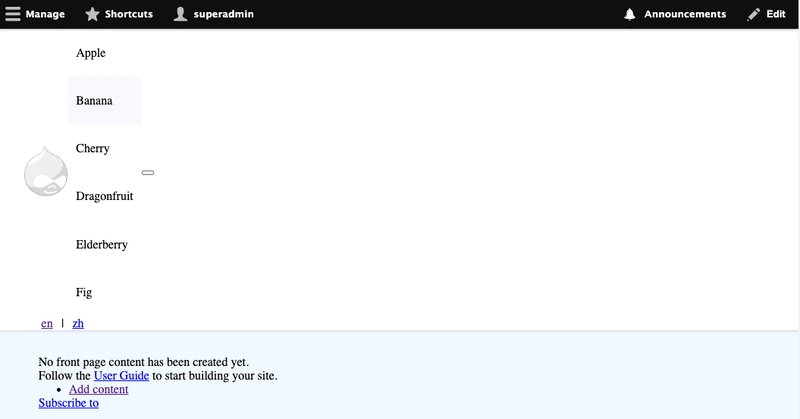
Without doing anything to the default implementation, once you turn on the Language Switcher block in your Header region on a vanilla theme, you will get an unordered list of all the languages supported by your site.
Those language labels can be edited via the admin interface. You have to go to admin/config/regional/language and edit each of the languages listed there. My use case only involved 2 languages, so I decided to design the language switcher to appear like additional link options on the header, with the labels being the 2-letter language code.
Templating with Twig
You can’t old-school CSS without CSS classes. And in the land of Drupal theming, that menas it’s Twig templating time. Templates in Drupal make use of naming conventions to let you override them.
So if you are starting from scratch with a starterkit base theme, your out-of-the-box markup is going to be wrapped in layers of <div>s, which I personally do not like. My first thing is to override the page.html.twig and region.html.twig templates with ones that provide some useful CSS class names.
# page.html.twig
{% if logged_in %}
  {{ page.admin }}
  {% endif %}

<header class="site-header" role="banner">
  {{ page.header }}
</header>

<main role="main">
  <a id="main-content" tabindex="-1"></a>
  <h1 class="visually-hidden">{{ current_page_title }}</h1>
  {{ page.content }}
</main>
# region.html.twig
{%
  set classes = [
    'region',
    'region-' ~ region|clean_class,
  ]
%}
{% if content %}
  <div{{ attributes.addClass(classes) }}>
    {{ content }}
  </div>
{% endif %}
The out-of-the-box menu list also has zero CSS classes. Nah, gotta add some in there for the menu as well.
# menu--main.html.twig
{% import _self as menus %}

{{ menus.menu_links(items, attributes, 0) }}

{% macro menu_links(items, attributes, menu_level) %}
  {% import _self as menus %}
  {% if items %}
    {% if menu_level == 0 %}
      <ul{{ attributes}} class="site-nav__links menu--level-{{ menu_level + 1 }}" id="siteNavMenu">
    {% else %}
      <ul class="menu--level-{{ menu_level + 1 }}">
    {% endif %}
    {% for item in items %}
      {%
        set classes = [
          'menu-item',
          item.is_expanded ? 'has-submenu',
          'menu-item--level-' ~ (menu_level + 1)
        ]
      %}
      <li{{ item.attributes.addClass(classes) }}>
        {{ link(item.title, item.url) }}
        {% if item.below %}
          {{ menus.menu_links(item.below, attributes, menu_level + 1) }}
        {% endif %}
      </li>
    {% endfor %}
    </ul>
  {% endif %}
{% endmacro %}
And finally, I wanted to sprinkle on some extra stuff onto the navigation block, like a site logo and mobile menu icon so that meant overriding the main menu block.
# block--blank-main-menu.html.twig
{% set heading_id = attributes.id ~ '-menu'|clean_id %}

<nav class="site-nav" role="navigation" aria-labelledby="{{ heading_id }}"{{ attributes|without('role', 'aria-labelledby') }}>
  {% if not configuration.label_display %}
    {% set title_attributes = title_attributes.addClass('visually-hidden') %}
  {% endif %}
  {{ title_prefix }}
  <h2{{ title_attributes.setAttribute('id', heading_id) }}>{{ configuration.label }}</h2>
  {{ title_suffix }}

  <a href="{{ path('<front>') }}" rel="home" class="site-logo">
    <img src="{{ site_logo }}" alt="{{ 'Home'|t }}" fetchpriority="high" />
  </a>

  <div class="site-links-wrapper" data-nav-wrapper id="siteNavLinks">
    {{ content }}
  </div>

  <button
    type="button"
    class="site-nav__toggle"
    aria-controls="siteNavMenu"
    aria-label="Toggle Menu"
    title="Toggle Menu"
    id="siteNavToggle"
  >
    <div id="menuIcon" class="menu-icon">
      <span></span>
      <span></span>
      <span></span>
      <span></span>
    </div>
  </button>
</nav>
Always remember to drush cr after messing around with templates.
CSS time
After that it’s really all CSS. Mostly around using flexbox. But let’s see if going through it (almost) line by line makes sense to people who no longer write “traditional” CSS, whatever that means.
I’d like my header to remain sticky at the top of the page even as people scroll down. The trick here is to remember to set the top value, otherwise it’s not going to stick.
.site-header {
  padding: 0 var(--space-m);
  position: sticky;
  top: 0;
  z-index: 2;
  box-shadow: var(--box-shadow);
  background-color: white;
}
I have a <nav> element with the CSS class .site-nav which wraps around the site logo, list of navigation links and mobile menu toggle button. Let’s make it a flexbox and make everything inside align center, plus some basic hover styles.
.site-nav {
  display: flex;
  align-items: center;
}

.site-logo {
  flex: none;
}

.site-nav__links {
  list-style: none;
  padding-inline-start: 0;
}

.site-nav__links a {
  display: block;
  color: currentColor;
  transition: text-decoration 200ms ease-in-out;
  white-space: nowrap;
  text-underline-offset: 8px;
  text-decoration: underline 1.5px transparent;
  padding: var(--space-s) var(--space-2xs);
}

.site-nav__links a:hover {
  background-color: ghostwhite;
}

.site-nav__links .is-active {
  text-decoration-color: currentColor;
}
As for the language switcher, it’s an unordered list by default, but we can and should spruce it up a little bit.
.language-switcher-language-url {
  flex: none;
}

.language-switcher-language-url .links {
  display: flex;
  list-style: none;
  padding: 0;
  margin-inline-start: var(--space-2xs);
}

.language-switcher-language-url .links li:first-child::after {
  display: inline-flex;
  content: "|";
}

.language-switcher-language-url .links a {
  padding: var(--space-s) var(--space-2xs);
}
At this point, your header still looks very wonky. Don’t worry, it’s all part of the process.
When there is enough space in the viewport, for this example, when there’s at least 700px worth of space, everyone can all hang out on the same line.
@media screen and (min-width: 700px) {
  .region-header {
    display: flex;
    align-items: center;
  }

  .site-links-wrapper {
    flex: 1;
  }

  .site-nav {
    flex: 1;
  }

  .site-nav__links {
    display: flex;
    justify-content: center;
  }

  .site-nav__toggle {
    display: none;
  }
}
These layout styles essentially make sure the list of links take up the all the space left over after the site logo and the language switcher are accounted
Without modifying the markup further, we can sprinkle on some JavaScript to help create a mobile menu. But first, the styling.
@media screen and (max-width: 699px) {
  .site-links-wrapper {
    position: absolute;
    background-color: white;
    top: var(--site-header-height);
    right: 0;
    transition: transform 300ms ease-in-out;
    border-block-start: 1px solid lightgrey;
  }

  .site-links-wrapper.offscreen {
    transform: translateX(100%);
  }

  .site-links-wrapper a {
    padding-inline: var(--space-s);
  }

  .language-switcher-language-url {
    position: absolute;
    top: 25px;
    right: calc(var(--space-m) + var(--space-xs) + 24px);
  }
}
This absolutely positions the list of links to just under the site header and stuck to the right of the viewport. And if you are wondering why the language switcher is also absolutely positioned, this is because of the way the markup is structured.
The language switcher, as explained above, is a Drupal system block. Could we rewrite the main menu template to incorporate the language switcher? Probably, but between doing that and using CSS, I chose the CSS route.
So the approach was to position the language switcher next to the mobile menu toggle. A lesser of two evils approach methinks.
The styling for the mobile menu toggle goes something like this, which is essentially just 3 black lines, which are supposed to transform into a cross when the open class is added to the icon.
.site-nav__toggle {
  border: 0;
  background: initial;
  padding: var(--space-xs) 0;
  color: currentColor;
  margin-inline-start: auto;
}

.menu-icon {
  position: relative;
  transform: rotate(0deg);
  transition: 0.5s ease-in-out;
  cursor: pointer;
  height: 1em;
  width: 1.5em;
}

.menu-icon span {
  display: block;
  position: absolute;
  height: 4px;
  width: 100%;
  background: currentColor;
  border-radius: 4px;
  opacity: 1;
  left: 0;
  transform: rotate(0deg);
  transition: 0.25s ease-in-out;
}

.menu-icon span:nth-child(1) {
  top: 0;
}

.menu-icon span:nth-child(2),
.menu-icon span:nth-child(3) {
  top: 50%;
}

.menu-icon span:nth-child(4) {
  top: 100%;
}

.menu-icon.open span:nth-child(1),
.menu-icon.open span:nth-child(4) {
  top: 50%;
  width: 0%;
  left: 50%;
}

.menu-icon.open span:nth-child(2) {
  transform: rotate(45deg);
}

.menu-icon.open span:nth-child(3) {
  transform: rotate(-45deg);
}
A sprinkling of JavaScript
The actual opening and closing of the mobile menu needs the help of some JavaScript.
// Site navigation CSS classes
const siteLinksWrapper = document.querySelector("[data-nav-wrapper]");
const wideNavMinWidth = window.matchMedia("(min-width: 700px)");
handleNavDisplayStyles(wideNavMinWidth);
wideNavMinWidth.addEventListener("change", handleNavDisplayStyles);

const siteNavToggle = document.getElementById("siteNavToggle");
const siteNavLinks = document.getElementById("siteNavLinks");
const menuIcon = document.getElementById("menuIcon");

if (document.contains(siteNavToggle)) {
  siteNavToggle.addEventListener("click", handleMobileNavToggle, false);
}

function handleMobileNavToggle(event) {
  siteLinksWrapper.classList.toggle("offscreen");
  if (siteLinksWrapper.getAttribute("class").includes("offscreen")) {
    menuIcon.classList.remove("open");
  } else {
    menuIcon.classList.add("open");
  }
}

function handleNavDisplayStyles(event) {
  if (event.matches) {
    siteLinksWrapper.classList.remove("offscreen");
  } else {
    if (siteLinksWrapper) {
      flashPrevention(siteLinksWrapper);
    }
    siteLinksWrapper.classList.add("offscreen");
  }
}

function flashPrevention(element) {
  element.setAttribute("style", "display:none");
  setTimeout(() => {
    element.removeAttribute("style");
  }, 10);
}
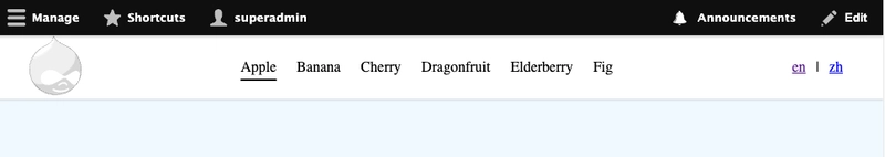
After all that, you end up with something like this:
Wrapping up
This was honestly really fun to write up, especially the part where I built out a fresh Drupal install to make sure all the theming code is not polluted with other components on my production website. If anyone still does Drupal, or still writes “old-school” CSS, let me know. I feel a sense of remote kinship with all of you. 😬
Credits: OG:image from CraftPix.net 2D Game Assets

Top comments (17)
I've been developing with Drupal, exclusively, since about 2017. I never jumped on the Bootstrap, [insert framework] hype -wagon(s), and still entirely write plain, old, CSS. I would have it no other way.
PS. This, Coaching Association of Canada, site is built with plain CSS
Me too. I've been on Drupal 7 and 8-11, and avoided doing any of the bolt-ons. You don't need anything "more" than regular CSS in 2025. If anything, as the years have gone on, the use-case for frameworks and utility-class stuff has decreased.
I use css in a new vue3 project im working on. the markup just got way to messy using tailwind and also, wrangling tailwind to be more dynamic is hard. + i like oldschool css
I wanted to read an article about "the case for old school CSS"
I gave up trying to read this because it's clearly an article about CSS in Drupal
if you have a case to make for "old school CSS" in general, I'd love to read an article that isn't about Drupal
either way, I'd suggest a more precise title ending with "in Drupal" 😌
You're right, it is VERY drupal heavy. but you also gave me a good suggestion for the next potential blog post, so thank you for that :)
I dont use Drupal, but I do use .css files all the time. I have used so many css-in-js frameworks and things like Tailwind, all of which introduce their own ideals, issues etc and then are eventually abandoned as the FE web world moves on. CSS will always be supported (in the foreseeable future). I believe having a solid understanding of it is invaluable for the work we do, whether we use it in our day-to-day or not.
Your Drupal 10 use case is spot-on—nearly a million sites still rocking it in 2025 shows it’s far from dead. The flexbox approach and mobile toggle animation are slick yet simple. I still write CSS in .css files too—there’s a charm to it. Did you ever think about templating the language switcher into the menu instead? Either way, great stuff!
I did think about that! But my rudimentary research all pointed toward having to write my own custom module for it, so I chose to go the CSS route instead.
Thank you for posting!
A bonus in Drupal is that you don't need to have a a bundler because it has assets management build in.
Great article using drupal and old-school CSS. I was thinking these days about a course or something to make me updated with all the new stuff in the frontend world, do you have any suggestions? Btw, I've been working with Drupal for 15 years.
personally, a lot of my awareness of the new stuff comes from newsletters like frontendfoc.us/ and bytes.dev/
i haven't actually taken any courses lately so i don't feel qualified to recommend specific ones, but i think folks like Adam Argyle (nerdy.dev/), Una Kravets (una.im/), Ahmad Shadeed (ishadeed.com/articles/) and Stephanie Eckles (moderncss.dev/) among many others write a lot about modern CSS techniques in the real world. i find their blog posts very useful.
... isn't that what the cascade is for?
SCSS for the win.
can't say i disagree. but once nesting started being supported in native CSS, that was a bulk of what i used SCSS for. mixins and being able to loop is still great in SCSS though.
Can’t say I disagree 🤝