
Recently, I came across an animation prototype on a button hover state and wanted to see if I could build it with just CSS. To explain in words, when you hovered over the pill-shaped button, the background changed from a plain white background to a nice coloured gradient, and there was a light sweep effect across the button.
I have a standard approach to building any design with CSS, and that is to break things down into smaller bits. First, there’s the button itself when nobody is interacting with it. Then, there’s that gradient transition, and the final flourish is the light sweep effect.
The pill-shape
For the pill-shape, we call upon the trusty border-radius property. The value itself represents the radius of the circle at the corner of the box which affects how large the round corner is going to be. This is why when we set a border-radius value of 50% on a square box, we can get a perfect circle.
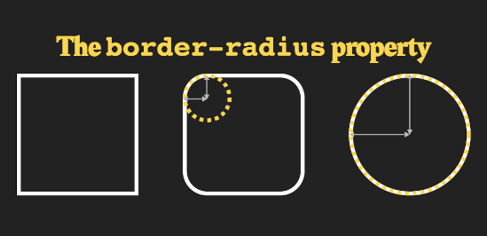
Anyway, for the pill-shape, setting the border-radius to half of the height of the element should do the trick.
My CSS looks like this for now:
button {
  padding: 0.75em 1.5em;
  background-color: white;
  border: 2px solid;
  font-size: larger;
  border-radius: 1.65em;
  cursor: pointer;
}
The background gradient transition
Unfortunately, the background-image property is not animatable. If you check the section about background-image in CSS Backgrounds and Borders Module Level 3, you’ll see that the animation type is discrete.
This means that the animation will proceed from one keyframe to the next one without any interpolation, which is required for a smooth transition between states.
There is a workaround for this problem though, which makes use of pseudo-elements. Set the gradient on a pseudo-element of the button, then animate the opacity of that pseudo-element to make the background transition into a gradient background.
button {
  padding: 0.75em 1.5em;
  background-color: white;
  border: 2px solid;
  font-size: larger;
  border-radius: 1.65em;
  cursor: pointer;
  position: relative;
  overflow: hidden;
  z-index: 1;
}
I added a position: relative to the button to ensure that my pseudo-element is positioned inside the button. The overflow: hidden is to make sure the corners of the pseudo-element don’t peek out of the rounded corners, and the z-index ensures that the pseudo-element is below the content of the button.
For the pseudo-element itself, my CSS looks like this:
button::before {
  position: absolute;
  content: "";
  top: 0;
  right: 0;
  bottom: 0;
  left: 0;
  background-image: linear-gradient(to left, tomato 0%, salmon 25%, peachpuff 100%);
  z-index: -1;
  transition: opacity 240ms linear;
  opacity: 0;
}

button:hover::before {
  opacity: 1;
}
The light sweep effect
For the light sweep effect, I need the other pseudo-element as well. Depending on how the light sweep is designed, the CSS for this can be vastly different. I’m not a very creative person, so I’ll just go with a thin vertical white line with blurry edges to look like light.
button::after {
  content: '';
  height: 150%;
  width: 0.25em;
  background-color: #fff;
  box-shadow: 0px 0px 8px 4px #fff;
  transform: translateX(-1em);
}
And for the animation, I just want my light line to sweep across horizontally from left to right when someone hovers over the button.
button:hover::after {
  animation-duration: 300ms;
  animation-name: sweep;
}

@keyframes sweep {
  from {
    transform: translateX(-1em)
  }
  to {
    transform: translateX(12.5em);
    animation-timing-function: ease-out;
  }
}
This is why it would be good to work with a motion designer, or someone who’s familiar with animation timings to tweak the things until it looks good. Depending on the design, you could even use an SVG as a background image for the sweep shape instead of a vertical line. Lots of options available.
If you’re interested to see the full code in action, here’s the Codepen:
See the Pen Bling button ✨ by Chen Hui Jing (@huijing) on CodePen.
Wrapping up
Personally, building out animations with CSS is really fun. And even though you might not be able to do really complex line animations with only CSS alone, I find that there a number of animation properties that most people hardly ever use.
I myself only discovered them in depth a couple years ago when I tried to animate the unofficial Talk.CSS mascot, Kittencorn. I wrote that one up in Figuring out CSS animation properties with a magic kittencorn.
But there’s really quite a lot that can be done. I highly encourage everyone to play around with CSS animation properties more. If there’s something you want to do which can’t be done, you can also join in the discussion in the CSSWG Github repository. There are plenty of issues tagged with web-animations-1 and web-animations-2.
Remember, properties do come true when we ask for them nicely, but if we don’t use them and talk about them, how will the browser vendors know we want them? Have fun exploring! ヾ(^ᴗ^)ノ

Top comments (1)
Great guide.