
We tend to think of accessibility as being something we add to websites to help the disabled. This is a mindset we need to get out of. The principles of accessibility help everyone and, as such, should be a foundation we build our applications on - not something added as an afterthought.
“Accessibility is not hard, it’s only a pain-in-the-neck if you wait til the very end to do it.”
Door handles vs Door knobs
Imagine our users could be in one of four states: permanently disabled, temporarily disabled, contextually disabled, or abled.
For example,
- I have arthritis (Permanently disabled)
- I have a broken wrist and am wearing a cast (Temporarily disabled)
- I am carrying several heavy shopping bags (Contextually disabled)
- None of the above

I arrive home and this is my front door.
In the first two cases, this door knob is largely impossible to use. Even for a contextually disabled person, it is harder to use - they may have to put their bags down to operate the knob for example.

Alternatively, a door handle can be operated with an elbow or a hand or a foot or a cat. It requires less motor control and directly benefits the people in the first three scenarios and, importantly, does not inconvenience anyone in the fourth category.
With all other things being equal, why would you not opt for a handle?
How does this apply to websites?
Digressing briefly, Presbyopia is a natural ageing of the eyes caused by the hardening of the lens of the eye resulting in a “progressively worsening ability to focus clearly on close objects”. It affects things like being able to read small print, headaches and eyestrain when reading for long periods, and blurred vision. It will happen to us all eventually.
In addition to this, the muscles we use to control our pupil size will weaken as we age which results in becoming less responsive to changes in ambient lighting. The average 60 year old needs three times more ambient lighting for comfortable reading than a 20 year old.
Also as we age, the cells in our retinas responsible for normal colour vision decline in sensitivity causing colours to become less bright and the contrast between different colours to be less noticeable.
We are used to thinking that ensuring sufficient contrast of our website’s text and using icons as well as colour for error states is for the 4.5% of the UK population that are colour-blind, but it really isn’t. It’s for the 18% of the UK population that are over 65 and the ever-changing percentage of people in the UK trying to access our content on a fingerprint-y laptop in bright sunshine.

It’s not even a touchscreen!
So, using our criteria from before along with this information as an example, we could have;
- I have been blind since birth (Permanently disabled)
- I have recently had cataract surgery and my vision is diminished (Temporarily disabled)
- I am in a park on a sunny summer’s day (Contextually disabled)
- None of the above

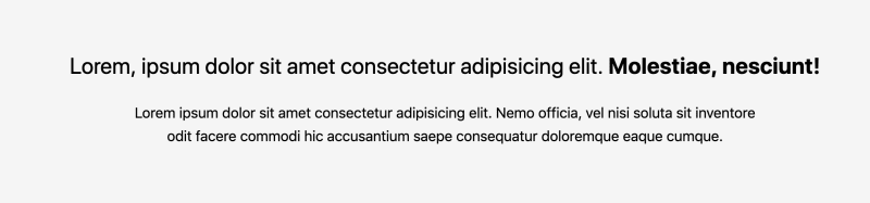
An example of poor web design
In this example, we see a few red flags.
Though it may be perfectly readable for some, the pale light-weight font on a white background renders it unreadable for others.
The size of the smaller text beneath the title is also likely to cause issues - don’t forget that we’re also talking about decreasing degrees of visual acuity from age 20 and up in people with no other visual disabilities.
Even on the assumption that this has been built using semantic HTML and has all of the requisite code to make it accessible to screen-readers, we’re still only helping those people actually using screen-readers. Someone who, for example, has been blind from birth may well be using a screen-reader but it is highly unlikely our person recovering from cataract surgery or our able-bodied person in a park will be.
Increasing the font size of the body copy and using a darker shade of grey that adheres to the WCAG Guidelines for contrast helps everyone and hinders no-one.
To take this further;
- I have Parkinson’s Disease (Permanently disabled)
- I have a migraine (Temporarily disabled)
- I am on a busy tram (Contextually disabled)
- None of the above

Here is another example of something we could see on a typical website. For anyone in our three “disabled” groups, the small hit areas in these buttons could result in disaster!

By making the buttons larger and further apart, we are helping people with motor-control issues, people operating the site through teary eyes while sneezing, people being elbowed mercilessly by fellow commuters, and our able-bodied user. In this regard, at least, size is everything! 😏
If you are looking for numbers, the Massachusetts Institute of Technology (MIT) conducted a study into the Mechanics of Tactile Sense concluding the average human thumb is the equivalent of 45px to 78px. So make your hit areas at least that big! 😄
By not considering external factors, such as situational usage of our website, we can inadvertently create a terrible experience for everyone.
Other kinds of contextual disability
As Chris LaCroix explains in Panic Room!, the real world is vastly different to a sterile testing environment - full of noises and distractions that can make using a poorly designed application impossible for anyone.
Imagine you are at the train station and your train has been cancelled (thanks, Northern Rail!). You have to find the next train to your destination on the app as quickly as possible.
Are you happy about the loading spinner? Are you squinting to read the small text? Is even the large text hard to read in the sunshine? Are you constantly distracted by Tannoy announcements or other passengers jostling on the platform? Are those delightful animated page transitions helping you find the next train?
CNN have a “lite version” of their main website. It was released to help people with crappy internet connections get access to breaking news - such as the people who, at the time, were about to be hit by Hurricane Irma.
Now, I’m not saying we need to implement a “text-only” version of every website we make but we can learn from it.
Why should we bother with any of this?
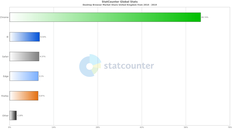
A part of our development process includes “cross-browser testing” to ensure there is a working experience for users on Chrome, Firefox, Edge, etc. Earlier I mentioned that 4.5% of the UK’s population is colour-blind. According to StatCounter, that is half as many people as use either Microsoft Edge or Safari. At 18%, over 65s in the United Kingdom count for more people than any browser users other than Google Chrome.
The conclusion seems simple; if you’re going to ensure the experience is suitable for Safari users, why are you not ensuring the experience is suitable for people with diminished vision?
Eyes and ears and mouth and nose: It’s not just visual design
I’ve spent a bit of time talking about visual impairment in this article, but the same principles hold true for impairments to the other senses.
For example, thinking of hearing impairment, similar situations arise. There are various reasons for watching video content with the volume down;
- deaf from birth (Permanently disabled)
- a bout of tinnitus (Temporarily disabled)
- a sleeping baby in a nearby room, partner asleep in the same bed, on a train with no headphones (Contextually disabled).
Irrespective of “demographic data” or the “prevalence of deafness in the target market”, doesn’t it make sense to provide quality subtitles with every piece of video content?
It’s not all sunshine and rainbows
Inclusive design and making a website accessible to anyone is a difficult thing to do. There are certainly situations where using a pattern to assist a specific group could negatively impact a different group and it may take time and a trial-and-error approach to find a half-way-house solution that caters for as many people as possible.
Similarly, given deadlines and budgets, taking the time to solve all of these problems adequately may be out of the question.
However, starting with some solid principles as a base, and validating any deviations with actual users, can get us closer to Accessibility Nirvana™️ quickly and cost-effectively.
Conclusion
Not to be too down on designers but no-one goes to a website to marvel at the design - they come to absorb the content. That content needs to be accessible.
If we are saying “this website can be used by anyone” then we need to determine if there are any barriers to the content.
-
Can I find the content?
- Search engine optimisation
- Information hierarchy
- Categorisation of content leading to clear and intuitive navigation
- Clear structure of page/post copy
- Semantic markup
- Schema data
- Human-readable filenames can also help with SEO
-
Can I use the website?
- Performance
- Alt text on images
- Videos have subtitles and/or transcripts
- Videos can be played/paused/muted/volume-controlled/full-screen
- Audio tracks have subtitles and/or transcripts
- Reduced cognitive load
- The option of customising the colour scheme (Light/Dark mode) to make the site easier to use. The Manchester City Council accessibility settings are probably a little too extreme for the average website but well worth a look.
- Affordance of interaction - do buttons do what I expect them to do?
-
Is the content readable?
- Comfortable font size
- Comfortable line length
- Adequate reading level
- Comfortable contrast
- Comfortable negative space
There is no magic bullet or “one size fits all” solution to the problem of allowing your website to be accessible to anyone - this whole area is hard and riddled with contradictions but if we consider these points for all of our websites, we will build better websites that people can find and use and benefit from.
“Accessibility”, as we are used to thinking about it - making sure we have alt text on images for users of screen-readers, is only a part of the solution. The rest is not the job of A11y but the job of Inclusive Design.
Further reading
There’s a lot of stuff on the internet and a lot of stuff about “A11y Best Practice” (~40 million results). I have cut through the noise for you and curated a few articles for further reading.
- Marvel: Your Body Text Is Too Small
- Envoy Design: How to design an accessible color scheme
- WebAIM: Web Accessibility for Designers
- The A11y Project: Basically anything on the site…
- Chris Ashton: I Used The Web For A Day Using A Screen Reader
- UK Government: Accessibility blog
- UK Government: Design system
- BBC: BBC Accessibility Standards Checker
- WikiHow: How to Write Successfully for the Web
- Lifewire: Why Use Semantic HTML?
- Heydon Pickering: Anything by Heydon Pickering
- Laura Franz: Size Matters: Balancing Line Length And Font Size In Responsive Web Design


Top comments (0)