
The ability to label the lines in a CSS Grid is an underused superpower, as far as I can tell. I've used it on several responsive layouts to easily move elements around a page as screen sizes vary.
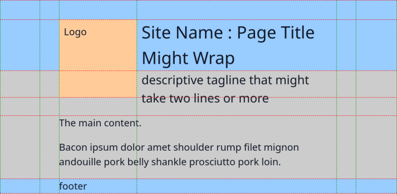
For example, I was throwing a layout together last week and wanted it to look like this (padding and margins excluded):

There's a few ways to achieve this, but I also had to keep in mind how this would need to adapt to narrower/smaller screens. Particularly, the logo should shrink and some of the header area needed to move a little.
This is what I wanted the narrower design to look like:

Would you believe that there's only two lines of CSS that are different for these two layouts?
.container {
  display: grid;
  grid-template-columns: [left] auto 2rem [gutter-left logo-left] 6rem [logo-right title-left tagline-left] minmax(0, min-content) [gutter-right tagline-right title-right] 2rem auto [right];
  grid-template-rows: [top] 2rem [logo-top title-top] minmax(0, min-content) [header-bottom title-bottom tagline-top] minmax(0, min-content) [logo-bottom] minmax(0, min-content) [tagline-bottom main-top] 1fr [main-bottom footer-top] minmax(3rem, min-content) [bottom];
}

@media (max-width: 768px) {
  .container {
    grid-template-columns: [left gutter-left tagline-left] 1rem [logo-left] 2rem [logo-right title-left] 1fr [gutter-right tagline-right title-right right];
    grid-template-rows: [top title-top] 1rem [logo-top ] minmax(0, max-content) [header-bottom title-bottom tagline-top] minmax(0, max-content) [logo-bottom] minmax(0, max-content) [tagline-bottom main-top] 1fr [main-bottom footer-top] minmax(0, max-content) [bottom];
  }
}
How does it work?
When we define a grid, it may look like we're defining the widths and heights of the columns and rows:
.container {
  display: grid;
  grid-template-columns: minmax(0, max-content) 10rem 10rem auto;
  grid-template-rows: max-content 1fr max-content;
  min-height: 100%;
}
But what we're really doing is specifying the spacing between some grid lines. These lines are simply numbered, with the first line starting at 1.
We can refer to these line numbers when positioning elements inside our container:
header {
  grid-column: 1 / 5; /* take up the full width of the container */
}

main {
  grid-column: 2 / 4; /* occupy the centre */
}

footer {
  grid-column: 3 / 5; /* only take up the right half of the container */
}

Using numbered lines brings some extra maintenance - if we add or remove a column or row, we would have to change the relevant properties for child elements in the grid.
Instead, we could use names:
.container {
  display: grid;
  grid-template-columns: [left] 5rem [content-left] 1fr [center] 1fr [content-right] 5rem [right];
  grid-template-rows: max-content 1fr max-content;
  min-height: 100%;
}

header {
  grid-column: left / right; /* take up the full width of the container */
}

main {
  grid-column: content-left / content-right; /* occupy the centre */
}

footer {
  grid-column: center / right; /* only take up the right half of the container */
}
Now can easily rearrange things if we want to:
@media (max-width: 768px) {
  .container {
    grid-template-columns: [left content-left center] 100% [content-right right];
  }
}
This is a very simple example, which might be better solved by changing the containers display property to block - all children will then just be displayed as blocks in normal flow.
On the other hand, keeping it as a grid lets you use properties like gap to space child elements, and other grid related design.
However, I advise using clearer descriptive labels such as footer-left rather than center - especially as lines may move.
Overlapping elements
Ordinarily, I use grid-template-areas and grid-area to place elements in a layout, but there is one advantage that using grid start/end and lines have: you can easily overlap elements.

<style>
.container {
    display: grid;
    grid-template-columns: repeat(7, 1fr);
    grid-template-rows: repeat(7, 1em);
}
</style>

<div class="container">
    <div style="background-color: #000000; grid-column: 1 / 3; grid-row: 1 / 3;"></div>
    <div style="background-color: #003300; grid-column: 2 / 4; grid-row: 2 / 4;"></div>
    <div style="background-color: #006600; grid-column: 3 / 5; grid-row: 3 / 5;"></div>
    <div style="background-color: #009900; grid-column: 4 / 6; grid-row: 4 / 6;"></div>
    <div style="background-color: #00cc00; grid-column: 5 / 7; grid-row: 5 / 7;"></div>
    <div style="background-color: #00ff00; grid-column: 6 / 8; grid-row: 6 / 8;"></div>
</div>

<style>
.container {
    display: grid;
    grid-template-columns: repeat(5, 1fr);
    grid-template-rows: repeat(7, 1em);
    margin: 1rem auto;
}
</style>

<div class="container">
    <div style="background-color: #000000; grid-column: 1 / 3; grid-row: 1 / 8;"></div>
    <div style="background-color: #003300; grid-column: 2 / 4; grid-row: 2 / 7;"></div>
    <div style="background-color: #006600; grid-column: 3 / 5; grid-row: 3 / 6;"></div>
    <div style="background-color: #009900; grid-column: 4 / 6; grid-row: 4 / 5;"></div>
</div>
Things can get a bit tricky when we're trying to overlap content that we want to be able to fit content, alongside fixed height and width elements.
.container {
    display: grid;
    grid-template-columns: repeat(3, 1fr);
    grid-template-rows: 2rem auto auto 2rem;
    margin: 1rem auto;
    color: white;
}
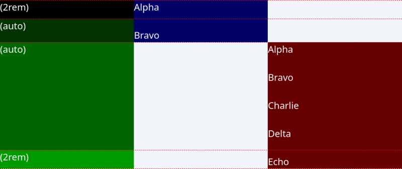
When we don't overlap the blue and red elements, the rows marked auto behave as expected by being just the right size to fit the content from the red and blue elements.
However, if we place the red element as below, the middle rows each become half the height of the red element, which means the blue element stretches downwards.

If we stretch the red element across the bottom three rows, the middle two rows become half the height of the red element minus the 2rems we specified for the bottom row.

We can overcome this using minmax on the middle rows:
.container {
    display: grid;
    grid-template-columns: repeat(5, 1fr);
    grid-template-rows: 2rem minmax(0, max-content) minmax(0, 1fr) 2rem;
    margin: 1rem auto;
    color: white;
}

Back to the original example
I'll format the CSS to try and help:
.container {
  display: grid;
  grid-template-columns: [left] auto
                         2rem
                         [gutter-left logo-left] 8rem
                         [logo-right title-left tagline-left] minmax(0, min-content)
                         [gutter-right tagline-right title-right] 2rem
                         auto
                         [right];
  grid-template-rows: [top] 2rem
                      [logo-top title-top] minmax(0, min-content)
                      [header-bottom title-bottom tagline-top] minmax(0, min-content)
                      [logo-bottom] minmax(0, min-content)
                      [tagline-bottom main-top] 1fr
                      [main-bottom footer-top] minmax(3rem, min-content)
                      [bottom];
}
The two outer columns are both set to auto - basically centring the rest of the grid. The next two columns in on the left and right are fixed width. This allows us to stretch the header and footer backgrounds all the way across the screen, and ensure a minimum margin around the logo, title and other content.
We then have a fixed-width column to hold the logo, and then one other column that adapts to the width of the content, which lets us easily place the site name and tagline.
We set the width of the main content to 50ch (normally, I'd go with 80ch for readability) - but the main content is stretched across the fixed and flexible column. This means the flexible column ends up being 50ch - 6rem - and the title and tagline elements are kept within that width.
Similarly, the top row is fixed to put some space above the logo and title. Then we have some flexible rows that fit the title, and then the logo and tagline before we fill the page with the content and then the fixed height footer.
By setting the height of the logo, we 'fix' the height of two rows it sits in, while the overlapping header background will move up/down to fit the title, and the overlapping tagline pushes the main content down to make room for itself.
And when the title and tagline are shortened, our content still starts comfortably below the logo:

Limits
This is pretty complicated, and there a probably other ways to do this. But I like the idea of simply rearranging my grid and have its contents move accordingly.
There's also one odd issue that I uncovered as I put this blog post together - I can't account for the vertical space between the logo and the main content. If I put a background color on the tagline, we can see that the tagline is stretching a bit.

The discrepancy starts at 10 pixel, but as more text is added to the tagline and it wraps, it eventually reaches a point where the grid line for the logo bottom begins to move. From this point, the logo bottom line is exactly halfway between the title bottom and the tagline bottom.
We also see that there's no vertical space between the tagline and the content, so I would need some padding at the top of the content to make sure.

I was able to deal with this in the simpler overlapping examples earlier, but I haven't been able to solve this for the more complex layout. On the other hand, perfection is the enemy of done, and I got my layout working and adapting to screen sizes.

Top comments (0)