
I've been playing with CSS Grid quite a bit - trying to see exactly what it can and can't do. One thing I decided to have a go at is what minimum amount of code is required to create a valid grid layout.
A simple two column layout
.container {
  display: grid;
  grid: '. .';
}
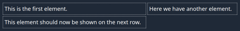
This CSS rule will create a grid containing two columns. If the container has more than two child elements, then it will automatically generate new rows as required:
<div class="container">
    <div>This is the first element.</div>

    <div>Here we have another element.</div>

    <div>This element should now be shown on the next row.</div>
</div>
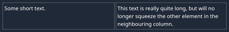
As you can see in the above example, the columns may adjust to fit the content as best they can. If you want more control of the column widths, you can define them in the same grid property. For example, if you want the two columns to always be equal, regardless of content, you can set the first column to be 50%. The second column will the fill the other 50% and no more:
.container {
  display: grid;
  grid: '. .' / 50%;
}
You can specify the width of the first column as a percentage or a fixed value, and the second column will automatically take up the extra space:
.container {
  display: grid;
  grid: '. .' / 200px;
}
Alternatively, you can specify both the column widths explicitly:
.container {
  display: grid;
  grid: '. .' / 200px 50%;
}
Three columns (or more)
You can define as many columns as you like. If you don't specify any column widths, then they will default to being equal, but with the ability to grow depending on content:
.container {
  display: grid;
  grid: '. . .';
}

If you set a width for the first column, then the remaining two columns will divide the remaining space between themselves:
.container {
  display: grid;
  grid: '. . .' / 50px;
}
You can set the column width for any number of columns from left to right, with the remaining columns sharing the remaining space:
.container {
  display: grid;
  grid: '. . . . .' / 25px 75px 25px;
}
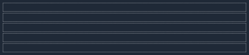
Controlling grid rows
This is where things start to get messy. The grid property is a shorthand for several other properties. So far we've used the property to specify grid-template-areas and grid-template-columns in the examples above.
Using the grid rule, we can also take control of the height of grid rows. Take this single column - the first row will
.container {
  display: grid;
  grid: '.' 10rem;
}
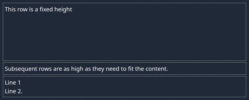
To control the heights of multiple rows:
.container {
  display: grid;
  grid: '.' 10rem
        '.' 5rem;
}
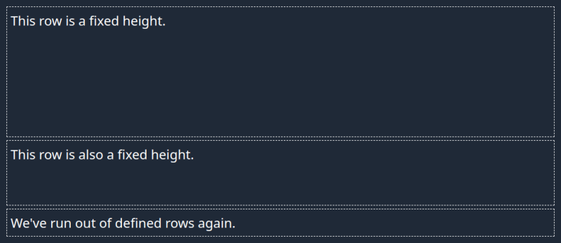
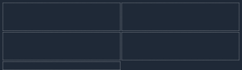
Rows and columns
.container {
  display: grid;
  grid: '. .' 5rem
        '. .' 5rem;
}
Every row must have the same number of columns:
.container {
  display: grid;
  grid: '. .' 5rem
        '. . .' 5rem;
}
If you want to control column widths:
.container {
  display: grid;
  grid: '. .' 5rem
        '. .'
        / 200px;
}
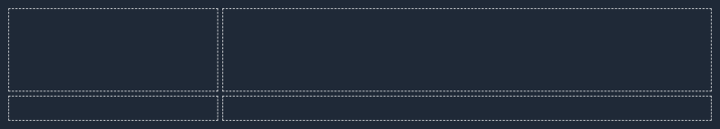
See what I mean about getting a bit messy - and we've only done about half the things that the grid property itself can use.
Be explicit
While the grid shorthand is nice for fairly trivial layouts, it is a fairly powerful shorthand, which means it can quickly get quite complex when trying to add in lots of rules. In fact, we've only covered about half of the properties that grid can handle.
While coding golf experiments can be fun and instructive, I prefer to be more explicit/expressive with actual code. Anything beyond the simple column definitions like above, and I would rather avoid using the shorthand property.
.container {
  display: grid;
  grid-template-areas: '. .'
                       '. .';
  grid-template-columns: 200px 1fr;
  grid-template-rows: 5rem
                      min-content;
}

Top comments (0)