
Today at Honeycomb we saw a huge drop in incoming data volume from several customers. It turned out to be a result of the Cloudflare outage.
 honeycomb@honeycombio
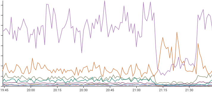
 Here's what the downstream effects of a @Cloudflare outage looked like to our customer success team: some of our customers processed less traffic (and thus sent us less telemetry), while one had a traffic surge!
Our measurements show the impact lasted 25 minutes and is now over.22:09 PM - 17 Jul 2020
15
39
I did this investigation as a live thread in the replies to the above Honeycomb tweet, but I'm copying it here as well. Follow along with us!

Do you notice that one spike that went upwards? Someone had increased traffic during the outage.
By astounding coincidence, it just happens to be RubyGems, which Honeycomb -- working with @rubytogether -- offers as a free public dataset for anyone to play with.
Which means that you can, without signing up, go explore live data from RubyGems! And since Honeycomb permalinks work forever, all the links here will open query results in the Honeycomb UI even after the original outage has aged out.
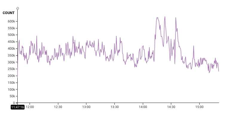
We're looking at the Fastly logs from the RubyGems site. Each of these represents a request of someone wanting to request something about a gem -- maybe get a list of them, or download one.
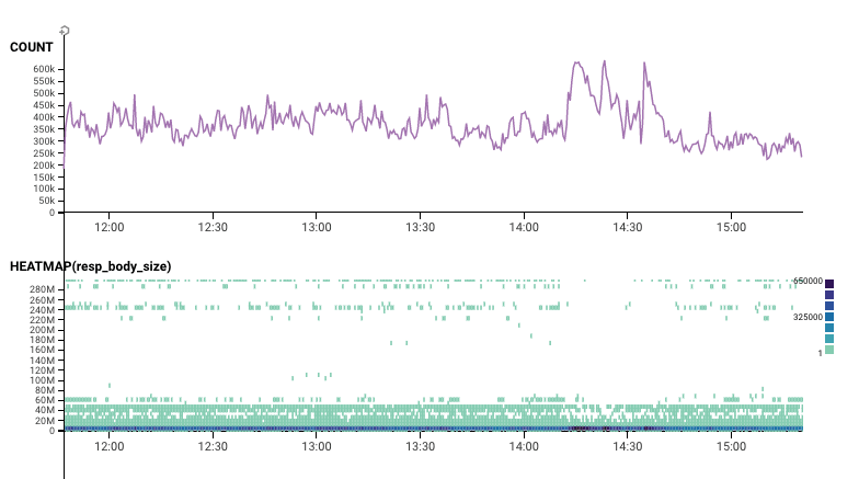
Exploring by Size
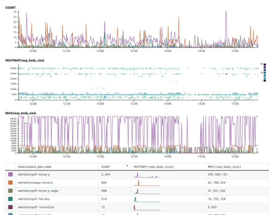
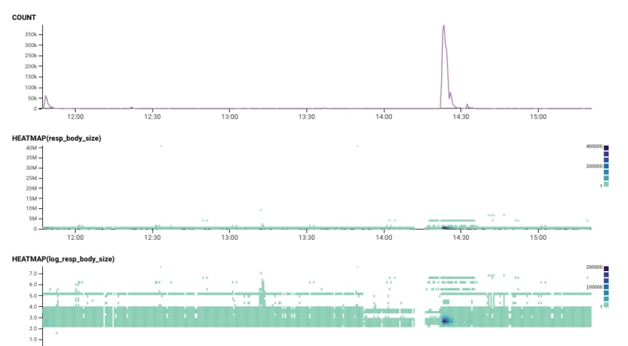
Let's add in a heatmap of the response_body_size -- in other words, how much were people downloading? Looks like during that time, we saw fewer requests for big downloads.
Let's grab a few samples of how the outage is different from before and after the outage. I click to "Bubbleup" -- again, you can do this too, with the same clicks I did! -- and grab that top area. This asks "how are the data points in the yellow area different than the green ones below?"
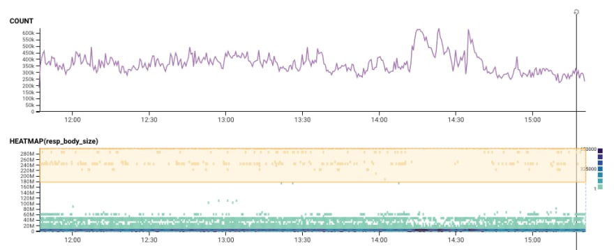
And we see the top few dimensions where the requests highlighted in yellow look different. That huge file was wkhtmltopdf. I'd love to know why it suddenly fell off the radar. Is there something about big packages that made them more likely to fail?
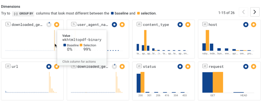
You know what? Let's check that hypothesis. Let's list all gems by their size (descending). Now we can scroll through some of the various gems and see if they also had interruptions.

I'll leave it to someone smarter than myself to explain why wkhtmltopdf-binary had a dropoff, but wkhtmltopdf-binary-edge saw consistent traffic.
Feel free to try this later!
As a side note: every one of these URLs will persist indefinitely. Honeycomb keeps all query results forever, so it's always easy to share URLs.
If you find something, it's definitely the best way to share it back! (On Slack, they even have pretty unfurls.)
Examining what went up
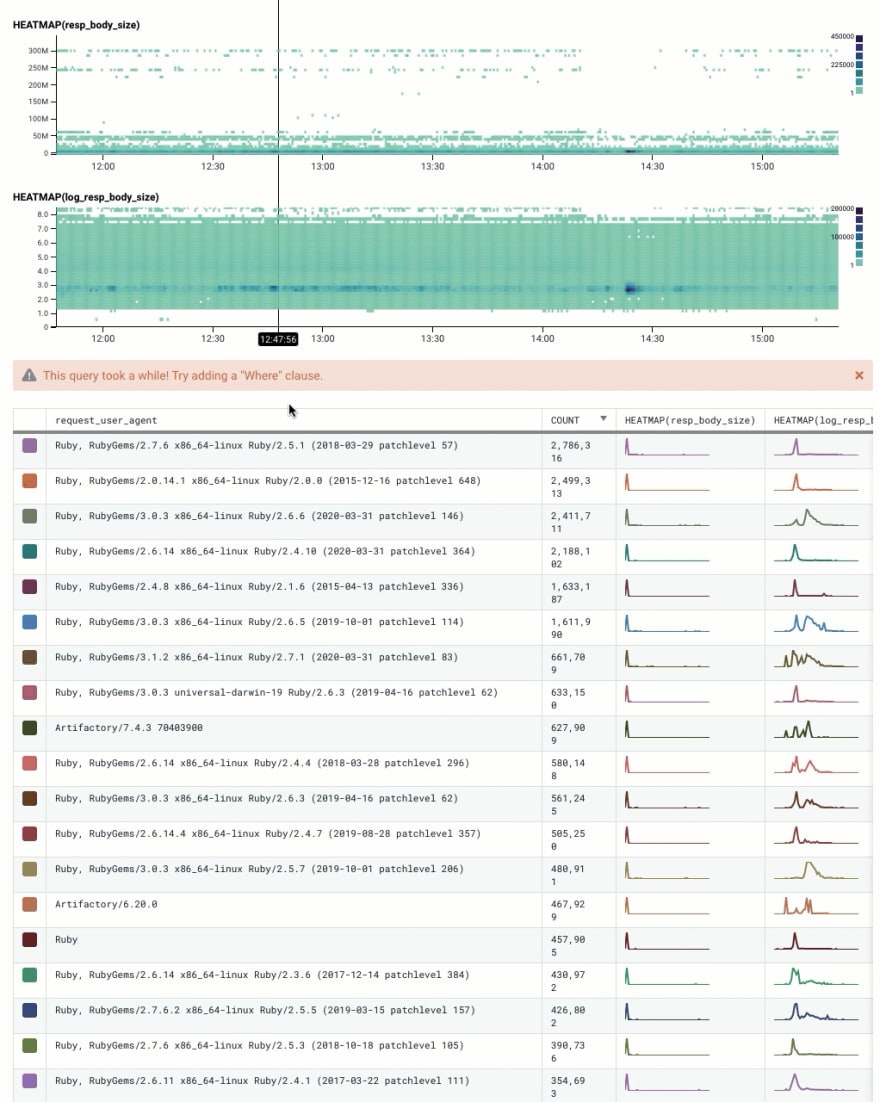
Back to the main heatmap. When I've got some outliers, a log transformation can help make the image much easier to read. So here we've got the response body size -- and the log scaled version.
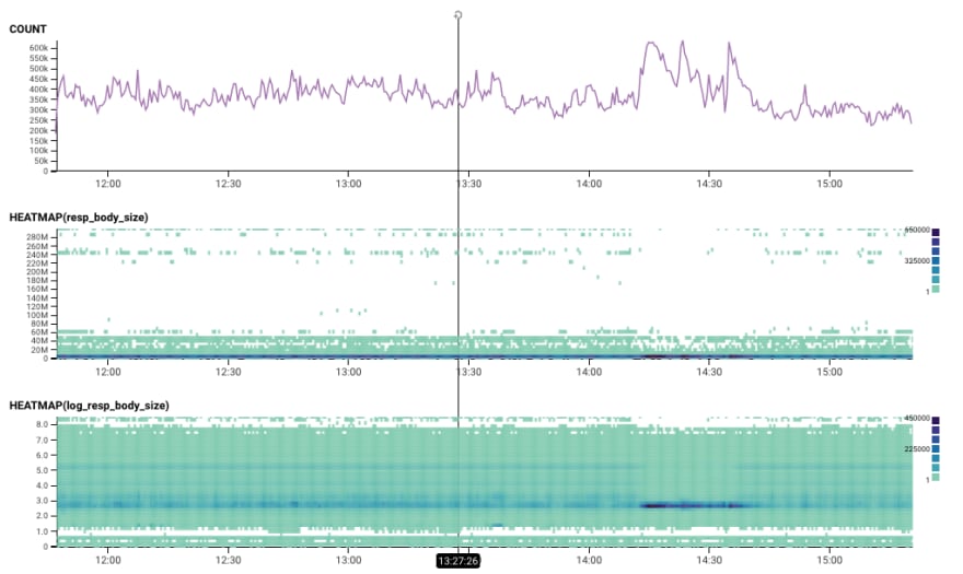
That dark blue spot really stands out to me. Why are the requests in that dense area so different from everything else?
Let's try another BubbleUp: we'll grab the interesting area, select it, and bubbleup shows how those fields are different.
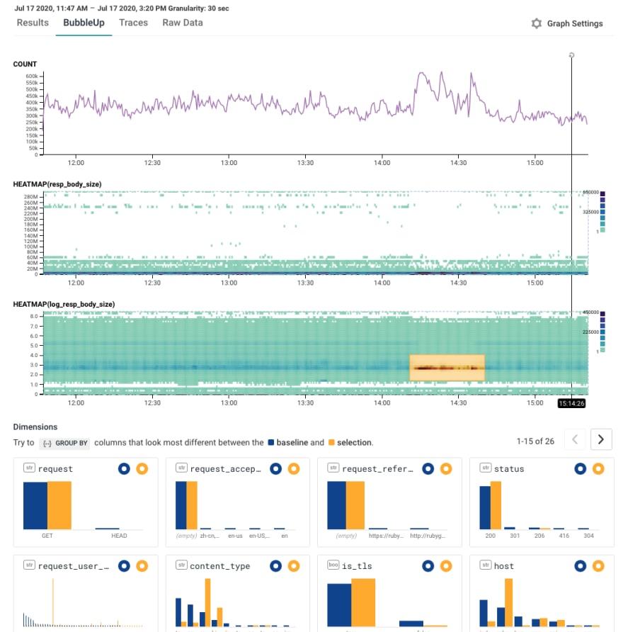
Most fields aren't very different. But then there's that one on the left: request_user_agent.
A quick hover tells us that's Ruby, RubyGems/2.6.14 x86_64-linux Ruby/2.4.10 (2020-03-31 patchlevel 364)

Um. WTF? My first hypothesis would be that it's a coincidence: maybe they just happened to release that new version, so these events are disproportionately of that release. (Correlation does not equal causation!)
So let's break down by user agent. There's a lot of them! They have different temporal patterns -- including a few others that may also have a similar pattern to the one we care about.
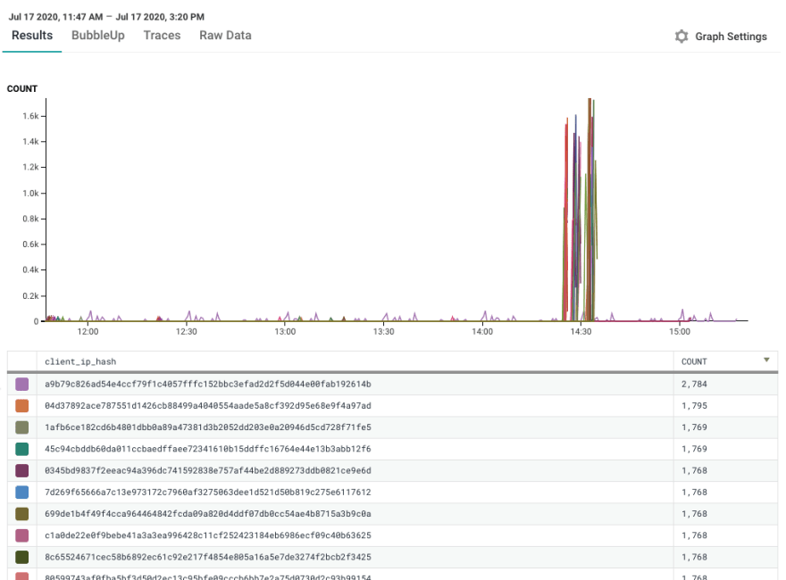
But still: this one seems special. When Cloudflare went down, it decided to spike like mad. Here it is in Honeycomb.
Was it just this one crazy user? Good thing we can break down by user IP address! (Hashed and sanitized for your protection). Nope.
What's next?
There are a lot of places we could go with this investigation. We could investigate what people downloaded, or what other user agents seem to have been affected, or whether caching policies made a difference.
We could look at the time it took to serve requests.
But what's more fun than me looking at this stuff? It's you.
Go click the links. Play with things a little bit. See if you can find something, and let me know what you found.
Let's learn, together, from the public RubyGems data!

Top comments (0)