This article was originally written by Julio Sampaio on the Honeybadger Developer Blog.
Companies that build the entire front-end side of their applications often choose the same framework, such as Rails, to build the back-end. For many years, this has been the best and most reliable option.
Today, tons of libraries and frameworks, in a constantly evolving front-end universe, allow developers to select different platforms for both the back and front-end and easily integrate them.
React has become the titan of the front-end Pangea. If you work with Ruby on Rails, chances are that you once needed to switch the default Rails pages to React code (or any other front framework). Perhaps, you simply love Rails + React features and would love to integrate the power of both techs into a single app.
And, that’s ok! This article aims to explore a real-world example: a CRUD application that manages an inventory of beer products. It will be initially created with Rails, and then a new front-end made with React with be further integrated.

Beer CRUD application.
In a few steps, you’ll understand the main pieces of React, how Rails embraces it, and how you can start integrating both Rails and React into your future projects.
Setup
As prerequisites, you need to have an environment set up with Ruby (and Rails), Node.js, and Yarn.
You can preferably choose npm to manage the front packages, but we’ll stick to Yarn for simplicity.
In a folder of your preference, run the following command:
rails new crud-rails-react
This will start our Rails project. Then, open the created project in your IDE and go directly to the Gemfile.
We need to fix a bug that this command generates for the SQLite gem. So, make sure to locate the sqlite3 gem and change it to the following:
gem 'sqlite3', '~> 1.3.10'
This will prevent some known errors related to database versioning since we’ll be using SQLite as the default database for the CRUD example.
Don’t worry, though; in other databases, this problem won’t happen.
Database Config
I usually prefer to build things from the base to the top layers, so let’s start creating the database models.
We’ll only need one, so there is no better command feature for the task than Rails scaffolding:
rails g scaffold Beer brand:string style:string country:string quantity:integer & rake db:migrate
This model is pretty basic, so feel free to add other attributes and types as you go.
Within the db/migrate folder, there’s a new file with a name ending in “_create_beers.rb”. This is the record that Rails created for us to represent a beer.
The model, in turn, will be generated under the app/models folder. Leave them as they are and add the following lines of code to the db/seeds.rb file:
Beer.create(brand: 'Double Stout', style: 'Stout', country: 'England', quantity: 54)
Beer.create(brand: 'Spaten', style: 'Helles', country: 'Germany', quantity: 3)
Beer.create(brand: 'Newcastle', style: 'Brown ale', country: 'UK', quantity: 12)
This file will store the initial data load for the database when the app starts up. To release them into the database, run the following command:
rake db:seed
That’s it! Now, you have some beers at your table.
Webpacker Setup
Webpacker is one of the most widely used static module bundlers for JavaScript applications. Because of that, it’s the perfect match to incorporate the React capabilities into an existing application.
Rails also provides us with a Webpacker bundler that’s fully adapted to manage JavaScript-like applications within Rails.
To install it, add a second line to your Gemfile, as follows:
gem 'webpacker', '~> 4.3.x'
Great! This is the only gem we’ll need to add for the entire app development. That’s only possible because we’re delegating the front responsibilities to Yarn, which will be set later on in this article.
Now, it’s time to install the updates by issuing the following commands:
bundle install
bundle exec rake webpacker:install
bundle exec rake webpacker:install:react
The first one is well known by most Rails developers. We’re simply installing all the dependencies, including the Webpacker itself.
Once Webpacker is installed, we can emulate its commands through Rake to install the Webpacker dependencies, as well as the React ones.
This is a very important step because this is where Webpacker will make sure all of your JavaScript dependencies are properly set to a Rails environment, so don’t skip it or try running them directly as you usually do with npm or Yarn, ok?
When the commands are complete, a couple of folders and files (like the node_modules and the package.json) will also be created.
Front-end Setup
All the settings we’ve made so far are enough to have the CRUD application working with Rails only. If you start the Rails server through the rails s command, this will be the result:

Rails auto-generated beer CRUD.
However, we want our own CRUD with React.
First, you need to make sure that all the required front-end dependencies are configured through Yarn:
- React
- React Router to deal with the navigation into the React app
- Ant Design for ready-to-use React components
Ant Design (known as antd) is a rich open-source library for enterprise-level applications. It provides a bunch of highly customizable React components that simplify a lot the development of web apps.
To get everything installed, run the following command:
yarn add antd react-router-dom
We don’t need to explicitly add the react library since react-router-dom will do it.
At this point, when you open the package.json file, this will be the auto-generated content:
{
  "dependencies": {
    "@babel/preset-react": "^7.12.1",
    "@rails/webpacker": "4.3.0",
    "antd": "^4.7.2",
    "babel-plugin-transform-react-remove-prop-types": "^0.4.24",
    "prop-types": "^15.7.2",
    "react": "^17.0.0",
    "react-dom": "^17.0.0",
    "react-router-dom": "^5.2.0"
  },
  "devDependencies": {
    "webpack-dev-server": "^3.11.0"
  }
}
That’s the most basic setup for a Rails-React combo. So, we’re good to move on to the code.
Adapting the Rails Side
Some important actions must be addressed on the Rails side before proceeding to the front.
First, we need to define the controller that’ll centralize page redirects. Since we’re creating a single-page application (SPA), only one controller is needed, which was already created: BeersController.
Open it under the app/controllers folder and change its content as follows:
class BeersController < ApplicationController
  def index
  end
end
Don’t worry; all the code we’ve removed will be placed in the next controller to be created.
This controller’s only function is to provide a direct route from Rails to React, which is why we’re only setting the index method.
To connect directly with it, let’s open the routes.rb file under the config folder and change its content to the following:
Rails.application.routes.draw do
  root 'beers#index'
  # For details on the DSL available within this file, see http://guides.rubyonrails.org/routing.html
end
Note the new root config. Yes, we’re mapping the root’s endpoint to the beers index method.
You’ll also need to empty the index.html.erb file within the app/views/beers folder since we don’t want any of the Rails web content to be rendered. It’s a trick we can use to force Rails to exhibit React code only.
Beer API
Now, let’s move on to Beer API creation. The API structure will be practically the same as the BeersController but with some slight changes. To create it, run the following command:
rails generate controller api/v1/Beers
Make sure to create it using a versioning system. This will allow you to evolve your API in the future and distinguish it from ordinary controllers.
Now, open the app/controllers/api/v1/beers_controller.rb file and replace the code with the following:
class Api::V1::BeersController < ApplicationController
  before_action :set_beer, only: [:show, :edit, :update, :destroy]

  # GET /beers
  # GET /beers.json
  def index
    @beers = Beer.all.order(brand: :asc)
    render json: @beers
  end

  # GET /beers/1
  # GET /beers/1.json
  def show
    if @beer
      render json: @beer
    else
      render json: @beer.errors
    end
  end

  # GET /beers/new
  def new
    @beer = Beer.new
  end

  # GET /beers/1/edit
  def edit
  end

  # POST /beers
  # POST /beers.json
  def create
    @beer = Beer.new(beer_params)


    if @beer.save
      render json: @beer
    else
      render json: @beer.errors
    end
  end

  # PATCH/PUT /beers/1
  # PATCH/PUT /beers/1.json
  def update
  end

  # DELETE /beers/1
  # DELETE /beers/1.json
  def destroy
    @beer.destroy

    render json: { notice: 'Beer was successfully removed.' }
  end

  private
    # Use callbacks to share common setup or constraints between actions.
    def set_beer
      @beer = Beer.find(params[:id])
    end

    # Only allow a list of trusted parameters through.
    def beer_params
      params.permit(:brand, :style, :country, :quantity)
    end
end
Most of the operations were recycled from the previous controller.
The before_action snippet will take care of recovering the proper beer object according to the id parameter within the requests. Only the operations placed into the array after the :only clause will need this auto-recover feature.
The rest of the methods are equivalent to each of the CRUD’s operations. Just remember to always return JSON as a response to your requests because that’s the format we’ll be using within our React components.
Finally, you’ll need to adapt config/routes.rb again to include the newly created routes. So, make sure to change the file contents to the following:
Rails.application.routes.draw do
  namespace :api do
    namespace :v1 do
      get 'beers/index'
      post 'beers/create'
      delete 'beers/:id', to: 'beers#destroy'
    end
  end

  root 'beers#index'
  # For details on the DSL available within this file, see http://guides.rubyonrails.org/routing.html
end
The destroy route demonstrates how to map to the destroy method if it’s not explicitly set in the path.
React Components
React works through components, which act like the building blocks of a web application. Each one does one or more tasks that make sense as a context.
In short, a component is made of a JavaScript class or function that can receive properties as parameters, process business logic within it, and, in the end, return a functional UI component representing a portion of the screen.
Take the following code snippet extracted from the next examples we’ll build:
<Layout>
  <Header />
  <Content>...</Content>
  <Footer>Honeybadger ©2020.</Footer>
</Layout>
Yes, React components use a custom markup language called JSX (JavaScript XML) that closely resembles HTML. All of the HTML tags are available within JSX files, too. You can read more on JSX here.
The example above illustrates how antd deals with a structural layout component. Components are made out of other components and stacked on top of each other, composing a whole. Some receive properties (optional or not), and some can have inner contents.
Components can be class- or function-based.
Class Components
Class-based components are created as usual JavaScript classes, like the one shown below:
class Beers extends React.Component {}
They inherit from the React.Component class, have a lifecycle, and provide utilization methods to execute code before initialization, rendering, and destroying phases.
However, the most important (and required) method is render(), which is called every time the component is updated.
Functional Components
Functional components make use of ES6’s arrow function and simplify React components in terms of syntax and complexity.
The same Beer component above would be represented in a function as follows:
const Beers = () => <div>My Beers</div>;
This is much simpler, isn’t it?
Setting Up React
We’ve already emptied the Rails index page. Now, we’ll let Rails know that it needs to make React its default front-end.
To achieve this, you need to add the following line of code to the <head> tag of your app/views/layouts/application.html.erb file:
<%= javascript_pack_tag 'index' %>
This will add the JavaScript pack to our application header, which will cause all the JavaScript files, including React ones, to be executed within the index page.
We need to make sure that the index.jsx file has the same name since it is pointed at the import pack.
For this purpose, let’s rename the autogenerated app/javascript/packs/hello_react.jsx file to index.jsx.
Then, replace the code with the following:
import React from "react";
import { render } from "react-dom";
import App from "../components/App";

document.addEventListener("DOMContentLoaded", () => {
  render(<App />, document.body.appendChild(document.createElement("div")));
});
Don’t mistake this file for the React application file, as it is just the file that will load the entire React app hierarchy into the DOM through ReactDOM's render function.
Usually, every React application starts from an index.js file that loads everything needed, including React itself.
The App tag maps the top component of our hierarchy. So, let’s create it as index.jsx under the javascript/components folder (create the folders manually in case they don’t exist yet) and place the following code into it:
import React from "react";
import Routes from "../routes/index";
import "antd/dist/antd.css";

export default () => <>{Routes}</>;
Alternatively, you can import the antd CSS file within the index.jsx. Either approach will work.
The list of routes is placed under the routes folder. They’re extracted from the React Router library, which does most of the hard work for us. This is its content:
import React from "react";
import { BrowserRouter as Router, Route, Switch } from "react-router-dom";
import Home from "../components/Home";

export default (
  <Router>
    <Switch>
      <Route path="/" exact component={Home} />
    </Switch>
  </Router>
);
Each of your routes must be mapped within a different Route tag. The path parameter must match the URI of each route endpoint, while the component param indicates the component to which the React Router should redirect the request.
Recall that we will have a single route for our SPA. You can also add other paths here in case you want to map a /beers for the listing of beers, for example, but we’ll keep it simple.
Also, note that we’re importing the Home component here, which doesn’t exist yet. So, let’s create it as Home.jsx under the components folder. Then, add the following code to it:
import { Layout } from "antd";
import React from "react";
import Beers from "./Beers";
import Header from "./Header";

const { Content, Footer } = Layout;

export default () => (
  <Layout className="layout">
    <Header />
    <Content style={{ padding: "0 50px" }}>
      <div className="site-layout-content" style={{ margin: "100px auto" }}>
        <h1>Beer Catalog</h1>
        <Beers />
      </div>
    </Content>
    <Footer style={{ textAlign: "center" }}>Honeybadger ©2020.</Footer>
  </Layout>
);
When it comes to React components, I prefer to build them from top to bottom. This way, you can have an overall look at all the needed components to make the app work as a whole.
The Home component behaves like an assembler; it accommodates all the other component pieces of the app, like Layout, Header, Content, and Footer.
It is important to properly distinguish from where each of these pieces is coming. Antd provides a bunch of ready components, such as Layout, Content, and Footer, to compose your screens.
They’re primarily focused on the structure of the page parts, but some also offer built-in CSS styles, which will benefit us with a better look.
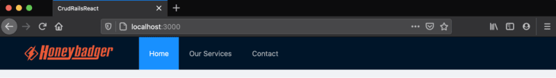
The Header Component
The Header.jsx component file, which should also be created within the javascript/components folder, will keep the header’s content. It includes a simple antd menu and a div with the Honeybadger logo, as shown below:
Antd menu items.
Below, you can find the code to place into the Header.jsx:
import React from "react";
import { Layout, Menu } from "antd";

const { Header } = Layout;

export default () => (
  <Header>
    <div className="logo" />
    <Menu theme="dark" mode="horizontal" defaultSelectedKeys={["1"]}>
      <Menu.Item key="1">Home</Menu.Item>
      <Menu.Item key="2">Our Services</Menu.Item>
      <Menu.Item key="3">Contact</Menu.Item>
    </Menu>
  </Header>
);
The Antd Menu component is quite simple to use but broad in terms of available customization options, allowing us to create, for example, navigation drawers, drop-downs, groups, and subgroups.
Note that we’re providing defaultSelectedKeys, an array that tells the menu which items are active.
Our menus won’t navigate to anywhere; they’ll occupy the screen to fulfill the look-and-feel only. So, let’s move on to the Beers component.
The Beers Component
This component is focused on the listing of beers, and the actions available within the table, such as deletion, data pagination, and table reloading.

Visual representation of React actions & components.
Take a look at the image above. We’ve broken down the components and actions to a lower level, so you can better understand what will be done here.
React State
React components are built with a state object. This object acts as a store directly attached to the given component. Each component has its own state object, and every time you change the state, the component gets re-rendered.
The first action of our Beers component is to display the listing on a table. For this purpose, we’ll need to hold this list in an array:
state = {
  beers: [],
};
The Beers Listing
To feed this array, we’ll need to retrieve the list from the API controller we created earlier. Review the function that’ll retrieve it:
loadBeers = () => {
  const url = "api/v1/beers/index";
  fetch(url)
    .then((data) => {
      if (data.ok) {
        return data.json();
      }
      throw new Error("Network error.");
    })
    .then((data) => {
      data.forEach((beer) => {
        const newEl = {
          key: beer.id,
          id: beer.id,
          brand: beer.brand,
          style: beer.style,
          country: beer.country,
          quantity: beer.quantity,
        };

        this.setState((prevState) => ({
          beers: [...prevState.beers, newEl],
        }));
      });
    })
    .catch((err) => message.error("Error: " + err));
};
For the sake of simplicity, we’ll be using the Fetch API available to all modern browsers every time we need to request data from the API.
The function above takes a few steps to retrieve the array of beers from the API:
- It first requests the /index endpoint asynchronously and
thenchecks if the response status equals OK. - If it does, we return the data as JSON; otherwise, let’s throw an
Error. -
Then, we iterate over the array of results to compose our own beer object and add to the state’sbeersarray. - If anything went wrong during the process, the
catchblock will capture the exception and exhibit it as a message alert.
Nice, isn’t it? This is pretty much the same steps we’ll take for all the other requests.
But, how does antd display the data in the table? Good question! Let’s take a look at the following code:
columns = [
  {
    title: "Brand",
    dataIndex: "brand",
    key: "brand",
  },
  ...{
    title: "",
    key: "action",
    render: (_text, record) => (
      <Popconfirm title="Are you sure to delete this beer?" onConfirm={() => this.deleteBeer(record.id)} okText="Yes" cancelText="No">
        <a href="#" type="danger">
          Delete{" "}
        </a>
      </Popconfirm>
    ),
  },
];
I’ve simplified it a bit for a better understanding. This is an array that represents the skeleton of our table. This is how antd tables work; they need to receive the metadata information about your table structure (rows and columns) as an array.
Each column is an object within the array, and the order is important here. The title attribute receives the name of the column, while the dataIndex name is how it’ll be known within React components, and the key is its unique identifier.
For most columns, the configuration is similar, except for the actions column. There, we need to specify the link of action to trigger when the user wants to delete an item. Note that we’re making use of the antd’s Popconfirm component.
It is a very nice component that facilitates the job of prompting users to confirm an action before it happens. The image below illustrates how it looks:

Prompting a confirm dialog before deletion.
Delete Action
To delete an item, we’ll need to perform two main operations: the deletion call on the API and table reloading.
The delete function is similar to the first fetch we’ve made:
deleteBeer = (id) => {
  const url = `api/v1/beers/${id}`;

  fetch(url, {
    method: "delete",
  })
    .then((data) => {
      if (data.ok) {
        this.reloadBeers();
        return data.json();
      }
      throw new Error("Network error.");
    })
    .catch((err) => message.error("Error: " + err));
};
See? the only thing new here is the HTTP method passed as the second parameter of the fetch method. Plus, within the then clause, we call the reloadBeers function, which will re-fetch all the beers from the back-end once again.
The contents of this function are pretty much the following:
reloadBeers = () => {
  this.setState({ beers: [] });
  this.loadBeers();
};
We’re resetting the state’s beers array and calling the load function again.
The Final Component
Finally, we need to compose the component by explicitly calling antd tags. Let’s see how it goes along with the final component code:
import { Table, message, Popconfirm } from "antd";
import React from "react";
import AddBeerModal from "./AddBeerModal";

class Beers extends React.Component {
  columns = [
    {
      title: "Brand",
      dataIndex: "brand",
      key: "brand",
    },
    {
      title: "Style",
      dataIndex: "style",
      key: "style",
    },
    {
      title: "Country",
      dataIndex: "country",
      key: "country",
    },
    {
      title: "Quantity",
      dataIndex: "quantity",
      key: "quantity",
    },
    {
      title: "",
      key: "action",
      render: (_text, record) => (
        <Popconfirm title="Are you sure to delete this beer?" onConfirm={() => this.deleteBeer(record.id)} okText="Yes" cancelText="No">
          <a href="#" type="danger">
            Delete{" "}
          </a>
        </Popconfirm>
      ),
    },
  ];

  state = {
    beers: [],
  };

  componentDidMount() {
    this.loadBeers();
  }

  loadBeers = () => {
    const url = "api/v1/beers/index";
    fetch(url)
      .then((data) => {
        if (data.ok) {
          return data.json();
        }
        throw new Error("Network error.");
      })
      .then((data) => {
        data.forEach((beer) => {
          const newEl = {
            key: beer.id,
            id: beer.id,
            brand: beer.brand,
            style: beer.style,
            country: beer.country,
            quantity: beer.quantity,
          };

          this.setState((prevState) => ({
            beers: [...prevState.beers, newEl],
          }));
        });
      })
      .catch((err) => message.error("Error: " + err));
  };

  reloadBeers = () => {
    this.setState({ beers: [] });
    this.loadBeers();
  };

  deleteBeer = (id) => {
    const url = `api/v1/beers/${id}`;

    fetch(url, {
      method: "delete",
    })
      .then((data) => {
        if (data.ok) {
          this.reloadBeers();
          return data.json();
        }
        throw new Error("Network error.");
      })
      .catch((err) => message.error("Error: " + err));
  };

  render() {
    return (
      <>
        <Table className="table-striped-rows" dataSource={this.state.beers} columns={this.columns} pagination={{ pageSize: 5 }} />

        <AddBeerModal reloadBeers={this.reloadBeers} />
      </>
    );
  }
}

export default Beers;
Now, you can see everything together. The render function will display the two tags we’re importing there: the antd’s Table component and AddBeerModal (the modal form we’ll create in a few minutes).
The table component is very rich in the way that it allows us to automatically paginate through the results by setting a pagination object. The only property we’re adding here is the size of each page (5 results per page).
The dataSource attribute receives the list of beers we’ve mounted from the back-end, and the columns attribute receives the metadata we’ve already built.
The AddBeerModal Component
Below the table, you can spot a button to add new beers. When we click on this button, it’ll open a modal with a form to register new beers to our catalog, as you may see below:

Adding new beers to the catalog.
This is a great way to explore how antd handles forms too.
First, let’s break down the actions we’ll have in this component. Note that the component itself is made out of two ones: a Button and a Modal.
This means that we’ll have to map the operations related to both of them:
-
showModalandhandleCanceldeal with the modal’s opening and closing. -
onFinishis triggered when we submit the form.
They’ll play with the component’s state, which will only store the modal toggle (i.e., whether it is visible):
state = {
  visible: false,
};
To show or hide the modal, we just need to toggle this Boolean:
this.setState({
  visible: true,
});
To call the Beer’s API and register a new beer, we’ll need to make use of the Fetch API again:
onFinish = (values) => {
  const url = "api/v1/beers/";
  fetch(url, {
    method: "post",
    headers: {
      "Content-Type": "application/json",
    },
    body: JSON.stringify(values),
  })
    .then((data) => {
      if (data.ok) {
        this.handleCancel();

        return data.json();
      }
      throw new Error("Network error.");
    })
    .then(() => {
      this.props.reloadBeers();
    })
    .catch((err) => console.error("Error: " + err));
};
This is the first time we’re calling a request in which we send data to the server. In this case, we’ll also need to explicitly say to the API which type of information is heading over. That’s why the headers attribute must be informed.
If everything goes well, we just close the modal and reload the table’s listing.
Now, let’s see everything together, along with the component render:
import { Button, Form, Input, Modal, Select } from "antd";
import React from "react";

const { Option } = Select;

class AddBeerModal extends React.Component {
  formRef = React.createRef();
  state = {
    visible: false,
  };

  onFinish = (values) => {
    const url = "api/v1/beers/";
    fetch(url, {
      method: "post",
      headers: {
        "Content-Type": "application/json",
      },
      body: JSON.stringify(values),
    })
      .then((data) => {
        if (data.ok) {
          this.handleCancel();

          return data.json();
        }
        throw new Error("Network error.");
      })
      .then(() => {
        this.props.reloadBeers();
      })
      .catch((err) => console.error("Error: " + err));
  };

  showModal = () => {
    this.setState({
      visible: true,
    });
  };

  handleCancel = () => {
    this.setState({
      visible: false,
    });
  };

  render() {
    return (
      <>
        <Button type="primary" onClick={this.showModal}>
          Create New +
        </Button>

        <Modal title="Add New Beer ..." visible={this.state.visible} onCancel={this.handleCancel} footer={null}>
          <Form ref={this.formRef} layout="vertical" onFinish={this.onFinish}>
            <Form.Item name="brand" label="Brand" rules={[{ required: true, message: "Please input your beer brand!" }]}>
              <Input placeholder="Input your beer brand" />
            </Form.Item>

            <Form.Item name="style" label="Style" rules={[{ required: true, message: "Please input your beer style!" }]}>
              <Input placeholder="Input your beer style" />
            </Form.Item>

            <Form.Item
              name="country"
              label="Country"
              rules={[
                {
                  required: true,
                  message: "Please input the country of the beer!",
                },
              ]}
            >
              <Select showSearch placeholder="Select your beer country" optionFilterProp="children" style={{ width: "100%" }}>
                <Option value="Finland">Finland</Option>
                <Option value="Germany">Germany</Option>
                <Option value="Netherlands">Netherlands</Option>
                <Option value="UK">UK</Option>
                <Option value="USA">USA</Option>
                <Option value="Other">Other</Option>
              </Select>
            </Form.Item>

            <Form.Item name="quantity" label="Quantity" rules={[{ required: true, message: "Please input the quantity!" }]}>
              <Input type="number" placeholder="How many beers you desire?" />
            </Form.Item>

            <Form.Item>
              <Button type="primary" htmlType="submit">
                Submit
              </Button>
            </Form.Item>
          </Form>
        </Modal>
      </>
    );
  }
}

export default AddBeerModal;
Antd allows us to specify each form’s item rules individually. If a field is required, just say so by providing a rules attribute. You can customize the message it’ll display in case the user submits the form without filling it properly:
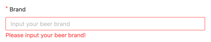
Validating form inputs.
Take a look at the Select component, which translates a combo box. See how easy it is to create complex components by just providing the right attributes. For example, if you want to make your select searchable, just put the showSearch property, there and it’s done:

Filtering results within a Select.
Antd will automatically filter the select options based on your input.
Styling
Sometimes, you’ll need to provide some CSS styling to components that do not provide a default (like antd’s table) or customize the ones that come built-in.
To do this, you can create as many CSS files as you want and organize them in a structure that pleases you. Rails already create an application.css file, under the app/assets/stylesheets folder. Open it and the following content:
.site-layout-content {
  background: #fff;
  padding: 24px;
  min-height: 380px;
}

.logo {
  width: 200px;
  min-height: 31px;
  margin: 16px 24px 16px 0;
  float: left;
  background-image: url(https://www.honeybadger.io/images/navbar_logo.svg?1602785015);
  background-repeat: no-repeat;
}

.table-striped-rows th,
.table-striped-rows td {
  border-bottom: 1px solid #dedddd !important;
}

.table-striped-rows tr:nth-child(2n) td {
  background-color: #fbfbfb;
}

.table-striped-rows thead {
  background-color: #f1f1f1;
}
Those are the CSS rules to make our table stripped, for example. Feel free to add as many extra styles here as you want.
Testing
Before heading to the tests, we need to disable the CSRF token checking that Rails automatically configures for our apps. To do so, go to the app/controllers/application_controller.rb file and change it to the following:
class ApplicationController < ActionController::Base
  protect_from_forgery with: :null_session
end
This way, we avoid having to validate the tokens each time we perform a request.
Great! Now, start your server via rails s command, access the http://localhost:3000/ address, and play around with the CRUD.
Conclusion
As a homework task, I’d recommend that you try implementing the update functionality of the CRUD. You can adapt the edit method at the API controller to receive the updated beer info and perform the update to the database. For the view, another modal would suit very well to accommodate the edit’s form.
You can also find the source code for this tutorial here. Good studies!
About Honeybadger
Honeybadger has your back when it counts. We're the only error tracker that combines exception monitoring, uptime monitoring, and cron monitoring into a single, simple to use platform.

Top comments (0)