Styling checkboxes and radio buttons without JavaScript
When it comes to web forms, checkboxes and radio buttons are elements that always appear. But in the environment when everything also needs to be beautiful, default ones aren't good enough. And it is a task with which many developers with less experience in CSS struggle. In this post, I am describing how to achieve it on the example of a radio button.
Default browser elements problems
Many problems can happen when using default HTML elements. The first one is different looks between different browsers. In general, you want to have the same design and behavior in all browsers. You want colors and sizes to match with the rest of your app. With default ones, that is not the case. In the images below, you can notice differences between radio buttons in Chrome and ones in Microsoft Edge. While the only difference is color, the difference is still apparent. And in other browsers could be something else.
The second big issue is that there are no CSS rules for them. That means that you can't style them directly. But there are different tricks for that, and that is the whole goal of this post.
Solution overview
First, let's cover a few things I am using to get this done before going into code.
Label
One thing that helps with this solution is the label tag, wrap your element into the label tab. When you do this, clicking anywhere on the label triggers click on the input element.
Input
I am still using proper input types, depending on what I want to get. The display of the input element is hidden, and that is why clicking on the label is so essential for this solution. What makes the selected indicator visible is using before and after pseudo-selectors. These use absolute position, and because of it, the label needs to have a position defined as relative.
Code
Step 1
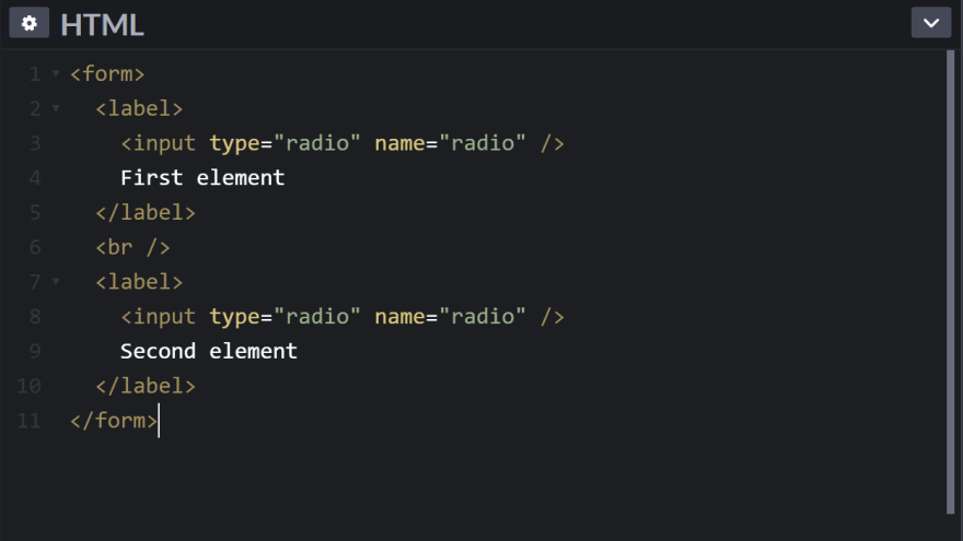
We need to set our basic structure. That is a form with two labels, each containing input radio.
Step 2
When we have our structure set, it is time for CSS—first, initial styling for the label. As said before, the label has to have a relative position. Because input elements are positioned absolute, there is left padding. Cursor styling and font size are just there for a bit better user experience, but that should be according to your needs.
Step 3
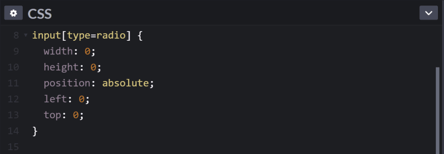
Now we need to hide the default input element. Using display none properly is a solution. But that would make after and before content also hidden. That is why I am setting width and height to 0. It is there, just not visible.
Step 4
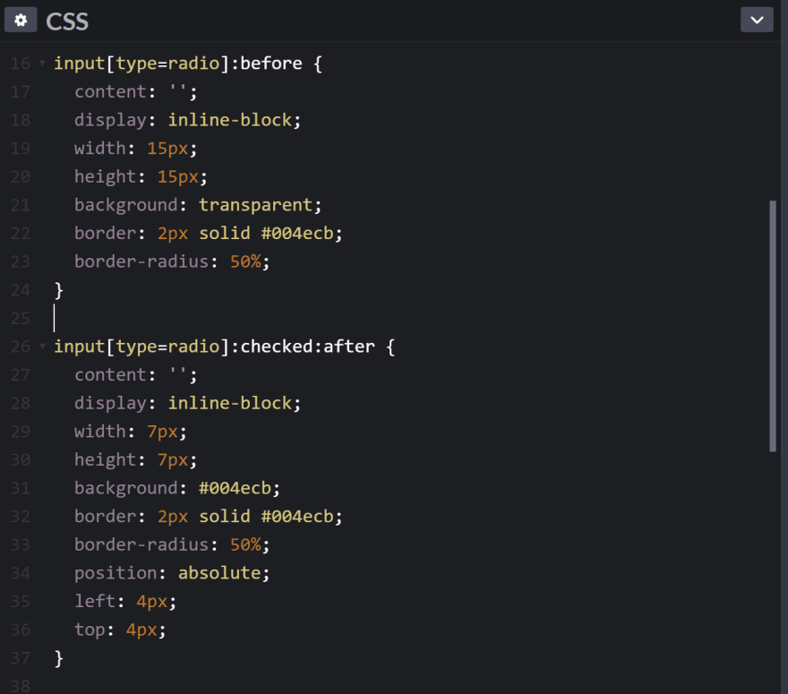
Now we are almost there. Both before and after styling is mostly the same. Content needs to be defined, but it is an empty string. It inherits position and left and top properties values from default radio button styling. Width and height can be any value you want, but it is essential to have a display defined as inline-block. Without it, it just wouldn't be displayed. The border-radius rule is there to make a circle.
After styling is almost the same as before. The main thing to notice is that it paired with checked pseudo-selector. The reason is that we only want to see this when the radio button is selected. Additional, and last difference is size and position. That is to have a smaller circle placed in the center of the larger one as an indicator of selected.
You can find a full and running example in following code pen:
Wrap up
There are many ways you can choose to do this. What this one gives you is that it is clean and only uses HTML and CSS and works in all browsers. No need for extra JavaScript logic. Here, I only showed it for making radio buttons simple circles, but by using the same approach, you can style checkboxes and make more complex ones. Maybe instead of using rounded borders, background images. All in an effortless way.
For more, you can follow me on Twitter, LinkedIn, GitHub and Instagram.


Top comments (2)
Nice one! ❤️
Tnx Niall 😃