Having a poorly designed landing page is like choosing between an ugly-looking cake and a beautiful-looking cake. Sure the "ugly" cake might taste nice, but you're less inclined to try it in case it tastes like it looks. Chances are you'll pick the pretty-looking cake with the sprinkles, piped-icing, and striking colors (note to self: order some cake for lunch).
A well-designed landing page is more likely to convert users into customers.
Your landing page doesn't have to be a visual masterpiece, but there are some simple steps you can follow to instantly improve its visual quality. To turn it from an "ugly cake" to a "beautiful cake".
The goal of this article is to give you a checklist of actionable steps to improve the design of your landing page.
#1 Use a simple color palette
Color, or lack of color, is the first thing a user notices when landing on a landing page. Because of this, how you use color is an easy way to improve the aesthetics of your landing page.
Color can be used to convey meaning, emotion, and (arguably most importantly) your brand. However, you don't need to be an expert in color theory to create a simple but effective color palette for your landing page.
Here's an easy rule-of-thumb for creating a color palette:
• Use black and white as your base colors (text + background)
• Pick one accent color (buttons, links, important text, headings)
• Use two or three tints (lighter versions) and shades (darker versions) of the accent color if needed.
Here’s what my website looks like (screenshot below). As you can see the only colors used are black, grey, white, pink:
If you're looking for color inspiration, I recommend checking out the Trending section of the Coolors website.
If you want to improve your knowledge of color theory or if you just need a refresher, I wrote a starter guide for color theory you should bookmark and read later.
#2 Design in black and white
While color is the most noticeable aspect of your landing page, you shouldn't use any color when designing the wireframes and initial mockups. Stick to black, white, and shades of grey where needed.
This is a little trick you can easily forget about because you're so enthusiastic about adding color to your landing page right away.
The downside of adding color too early is it will distract you from getting the layout and content right. You become more focused on making sure everything is the right color rather than where everything should go.
Only add color when you're happy with the layout and the content of your landing page.
#3 Use 1 (max 2) easy to read fonts
The font you choose for your landing page will determine how easy your copy is to read.
Most, if not all users today will scan a website instead of reading everything from top to bottom. An easy-to-read font, combined with an effective page layout, is easy to scan. This means the user can quickly find what they're looking for on the page. When a user can't easily scan, they can't quickly see if the page has what they're looking for so they leave.
Your choice of font can also convey your branding or how your landing page looks and feels. With that said, avoid the temptation to go overly decorative with your font choice as this will end up affecting readability.
My recommendation is to pick 1 easy to read font.
If you're feeling particularly creative you could use 2, one for headings and one for body copy, but there's often no need for the added complexity. You can use other things like font weight, size, and color to make headings stand out from body copy.
Stick to the most popular fonts on Google Fonts when you're looking for a font to use. They are popular for a reason.
A good example of font choice affecting readability:
https://twitter.com/MishaCreatrix/status/1403880306965237761
#4 Limit options to avoid information overload
An effective landing page should only have one call to action whether it's subscribe, buy now, or sign up here.
If a user has too many choices, they become paralyzed and don't know what choice to make. This is what's known as the paradox of choice, a term coined by Psychologist Barry Schwartz.
Think about the last time you sat down to watch Netflix.
If you're like me, you spent more time scrolling through the thousands of TV Shows and Movies available instead of picking one to watch. This is the paradox of choice in action and you're doing the same thing with your landing page when you have too many options.
Limit your call to action to 1 thing and consider how you can simplify things like pricing options.
#5 Have a clear and concise headline and sub-headline
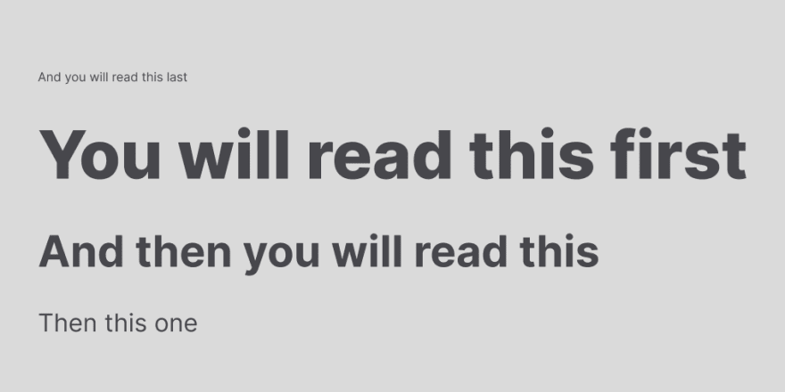
You may have seen this image or one like it floating around on Twitter or other design-related forums.
It shows the importance of your headline and sub-headline. These are the things your eye is immediately drawn to when looking at a web page.
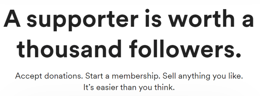
An effective headline showcases the value your audience is getting rather than just what the product or service does.
Here are some great examples of headlines and sub-headlines:
Grayscale font landing page from Charli Marie
Buy Me A Coffee's landing page
There is a whole lot more I could say about how to write the perfect headline and sub-headline but that would be an article in itself.
Instead, here are some excellent resources if you want to level up your copywriting game:
- 7 Formulas for Landing Page Headlines(With Examples)
- 20 Easy Ways to Practice Getting Better at Copywriting
#6 Use a better call to action than Sign Up
We already mentioned how the goal of your landing page is to convert your audience into customers. This means your landing page will have a call to action (CTA) to prompt people to take that step. This is yet another opportunity for you to design something inviting.
Avoid using a generic CTA like "Sign Up" or "Buy Now".
Instead, you want to help people understand the value they receive by signing up or buying. For instance, if your landing page is for a piece of software, a CTA like "Start Building" or "Start Creating" is much more fun and inviting.
There's a fine line here between fun and overcomplicated so be mindful of keeping things clear instead of clever.
#7 Use good-quality photos of real people for your testimonials
Testimonials build trust in your product or service. This is why any well-designed landing page features testimonials in some shape or form.
However, if you have fake or inauthentic testimonials you are doing more harm than good to your credibility.
An effective way to improve your testimonials is to include high-quality images of the people behind them. People respond more positively when they see actual people beside something. Use this to your advantage by including photos of those people rather than a stock avatar, a generic image, or worse, no image at all.
#8 Show your product in action
It should go without saying that a photo is worth a thousand words.. although I just said it so... 🤔
My point here is people want to see what they're getting before they commit to buying, signing up, or joining. Rather than writing a whole lot of copy about how amazing your product is, a better way is to show your product in action. When people can visualize your product, they are more likely to try it out.
There are 3 main ways you can show this: screenshots, gifs, or videos.
Screenshots
A staple of any landing page is screenshots of your product.
Done well, this can be really impactful, but overdo it or choose poor quality screenshots and you'll put people off.
Pick high-quality screenshots that effectively show particular features or selling points of your product.
Brandbird does this really well.
Gifs
Gifs are slightly more engaging than still screenshots because they show your product working and moving. This is really useful for people looking to visualize what your product can do to help them.
Each Gif should be focused on one interaction or task and it should only be a few seconds long.
Videos
The most immersive way to show your product in action is with video.
It gives you more space to showcase your product and show off what it can do. Plus most people will be inclined to watch a short video than to read a lot of text.
The Tweet100 landing page does this really well
#9 Highlight the recommended pricing plan
If your product or service is paid, you should include a pricing plan that's easy to access and understand. People want to know upfront how much something will cost them to determine if it's worth the time investigating the rest of your landing page.
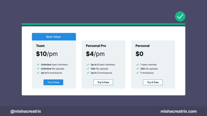
To make an easy-to-understand pricing plan, it's important to visually differentiate between each one. A helpful way to do this is to highlight the recommended option. This could be the best value option or the option most people choose.
To make the recommended option stand out, you could:
• Change the coloring relative to the other pricing options
• Make it taller than the others
• Make the CTA more noticeable by making it larger, or a different color
Also, if your product is free or offers a free trial be sure to say that so people know what to expect. Some people may want to try before they buy.
#10 Test your website on mobile, tablet, and desktop
More users are accessing the web on their phones than ever before and it's a trend that will only continue to increase.
This is why it's important to design your landing page for multiple screen sizes and test everything before you call your landing page finished.
If a landing page doesn't look well on a mobile device, it's so easy for someone to just press the back button and never return.
Most web browsers have a built in way to test the responsiveness of your website so if you don't have a variety of different devices to test on this works pretty well. At the very least you should test your landing page on your computer and your phone.
Landing Page Checklist Summary
- Use a simple color palette
- Design in black and white
- Use 1 (max 2) easy to read fonts
- Limit options to avoid information overload
- Have a clear and concise headline and sub-headline
- Use a better call to action than sign-up
- Use good-quality photos of real people for your testimonials
- Show your product in action
- Highlight the recommended pricing plan
- Test your website on mobile, tablet, and desktop
If you enjoyed this, please consider sharing it with someone else who might find it useful 🤗
This article was originally published over on my website: This 10 Step Checklist Will Instantly Improve Your Landing Page Design


Top comments (0)