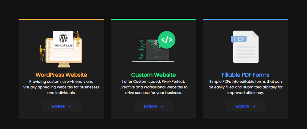
I designed this flexible three-card design with HTML CSS with great care and attention to detail. The bright border at the top of each card captures the eye and draws the viewer’s attention. The three cards are distinct hues – yellow, green, and blue – that express different emotions and create a visually pleasing contrast.
The border was constructed with CSS, and the bold colours/colors make it stick out. The overall design is contemporary, sleek, and professional, with a focus on minimalism and simplicity. The cards have been deliberately designed to be totally responsive, which means that they adapt their size to match any screen size, making them easy to see on any device.
Each card’s layout is basic but lovely. It comprises of a picture, a title, a text, and a button. All of these parts have been meticulously focused to achieve a well-balanced design. The photos used in the cards are of excellent quality and responsive. The title appears directly below the image, and the paragraph content follows.
The font used in the design is easy to read and is intended to fit the overall appearance and feel of the design. The button at the bottom of each card serves as a call to action, encouraging the spectator to act. To achieve a harmonious and unified look, the colour of the button has been carefully picked to match the colour of the border.
Source Code:
First, you must create Two files: HTML, and CSS. After you’ve created these files, simply copy and paste the following codes into your file. You can use your own images or my sample images. You can also download the This Card Design source files. The link to the download is given below.
Step One: create an HTML file called index.html and paste the following codes into it. Remember to save your work in a file with the extension ” .html ” or ” .htm “.
<!DOCTYPE html>
<html lang="en">
<!-- By HassanRao - hassanrao.com -->

<head>
    <meta charset="UTF-8">
    <meta http-equiv="X-UA-Compatible" content="IE=edge">
    <meta name="viewport" content="width=device-width, initial-scale=1.0">
    <title>Card Design By Hassan Ali | HasssanRao.com</title>
    <link rel="stylesheet" href="css/style.css">
    <link rel="stylesheet" href="https://cdnjs.cloudflare.com/ajax/libs/font-awesome/6.3.0/css/all.min.css" />
</head>
<body>
    <div class="wrapper">
        <div class="container">
            <div class="card border-top-yellow">
                <img src="images/card-img1.png" alt="" >
                <h2>WordPress Website</h2>
                <p>Providing custom, user-friendly and visually appealing websites for businesses and individuals.</p>
                <br>
                <div class="explore-btn">
                <a href="#">Explore   <i class="fa fa-arrow-right"></i></a></div>
            </div>
            <div class="card border-top-green">
                <img src="images/card-img2.png" alt="" >
                <h2>Custom Website</h2>
                <p>I offer Custom coded, Pixel-Perfect, Creative and Professional Websites to drive success for your business.</p>
                <br>
                <div class="explore-btn">
                <a href="#">Explore   <i class="fa fa-arrow-right"></i></a></div>
            </div>
            <div class="card border-top-blue">
                <img src="images/card-img3.png" alt="" >
                <h2>Fillable PDF Forms</h2>
                <p>Simple PDFs into editable forms that can be easily filled and submitted digitally for improved efficiency.</p>
                <br>
                <div class="explore-btn">
                <a href="#">Explore   <i class="fa fa-arrow-right"></i></a></div>
            </div>
        </div>
    </div>
</body>
</html>
Step Two: create a CSS file with the name of style.css in css/ folder and paste the given codes in your CSS file. Remember to save the file with the ” .css ” extension.
@import url('https://fonts.googleapis.com/css2?family=Poppins&display=swap');

*{
    margin: 0;
    padding: 0;
    box-sizing: border-box;
    font-family: 'Poppins', sans-serif;
}
/*------------------------
-------HassanRao.com------
--------------------------*/
.wrapper{
    width: 100vw;
    height: 100vh;
    display: flex;
    justify-content: center;
    align-items: center;
    background-color: #111111;
  }
 .wrapper .container{
    width: 90%;
    height: auto;
    display: flex;
    justify-content: center;
    align-items: center;
    flex-wrap: nowrap;
  }
.wrapper .container .card img{
    width: 200px;
  }
 .wrapper .container .card{
    width: 31%;
    background-color: #1d1d1d;
    padding: 20px;
    border-radius: 0px 0px 5px 5px;
    padding-bottom: 45px;
    text-align: center;
    margin: 0 15px;
  }
  .wrapper .container .card p{
    color:#fff;
    margin-bottom: 10px;
  }
.border-top-yellow{
    border-top: 4px solid #FCAF4A;
    color:#FCAF4A;
  }
.border-top-green{
    border-top: 4px solid #24EE92;
    color:#24EE92;
  }
.border-top-blue{
    border-top: 4px solid #549EF2;
    color:#549EF2;
  }
  .wrapper .container .card .explore-btn{
    text-align: center;
  }
  .wrapper .container .card .explore-btn a{
    padding: 12px 45px;
    text-align: center;
    background-color: #222222;
    color: #3D62FC;
    font-weight: bolder;
    border-radius: 4px;
    text-decoration: none;
  }
  .wrapper .container .card .explore-btn a:hover i{
    margin-left: 5px;
    transition: 0.18s all ease;
  }

  @media (max-width: 768px) {
    .wrapper{
        height: auto;
      }
      .wrapper .container{
        flex-direction: column;
        height: auto;
      }
      .wrapper .container .card{
        width: 100%;
        margin: 25px 0;
      }
      .wrapper .container .card:last-child{
        margin-bottom: 25px;
      }
  }
Images download link:
Note: copy these images in images/ folder of root directory.
==>: card-img1.png
==>: card-img2.png
==>: card-img3.png
Finally, this HTML CSS responsive three-card design is an excellent illustration of how modern design can be both attractive and useful. This design is likely to wow with its innovative use of colour, modern font, and simplified layout. It is great for promoting products, services, or any other form of material that demands a visually beautiful and engaging design.
View This Post On Hassanrao.com for free source Files download Link.


Top comments (0)