Hey there, readers. Today’s article will teach you how to make a Responsive Navigation Menu using only HTML and CSS. I’m going to make a Responsive Navbar out of pure CSS.
You’ve probably seen the Navigation Bar on a lot of websites. A navigation bar is a user interface (UI) feature on a webpage that contains connections to other parts of the website. The navigation bar is an essential UI element in the design of a website.
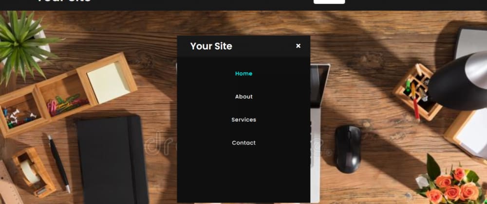
As you can see in the above image, there is a navbar at the top of the webpage, with a Text logo on the left side and some navigation links on the right side. These navigation links are horizontally positioned on desktop computers, but vertically aligned on mobile devices.
This is a pure CSS application, and I did not utilize JavaScript or any JS libraries to construct it. I utilized the CSS @media feature to make this navbar mobile, tab, and PC responsive.
Source Code For Responsive Navigation Menu Bar Design using only HTML & CSS :
Then, make two files: one HTML file and one CSS file. When you’ve created these files, just copy and paste the following codes into your file.
Step One: Create an HTML file called index.html and put the following codes into it. Remember to save the file with the.html extension.
<!DOCTYPE html>
<!-- Created By CodingNepal -->
<html lang="en" dir="ltr">

<head>
  <meta charset="utf-8">
  <title>Responsive Navigation Menu</title>
  <link rel="stylesheet" href="style.css">
  <link rel="stylesheet" href="https://cdnjs.cloudflare.com/ajax/libs/font-awesome/5.15.3/css/all.min.css" />
  <meta name="viewport" content="width=device-width, initial-scale=1.0">
</head>

<body>
  <nav>
    <div class="logo">
      Your Site
    </div>
    <input type="checkbox" id="click">
    <label for="click" class="menu-btn">
      <i class="fas fa-bars"></i>
    </label>
    <ul>
      <li><a class="active" href="#">Home</a></li>
      <li><a href="#">About</a></li>
      <li><a href="#">Services</a></li>
      <li><a href="#">Contact</a></li>
    </ul>
  </nav>
  <div class="content"></div>
</body>
</html>
Step two is to create a CSS file called style.css and put the codes provided into it. Remember to save the file with the.css extension.
@import url('https://fonts.googleapis.com/css?family=Poppins:400,500,600,700&display=swap');
*{
  margin: 0;
  padding: 0;
  box-sizing: border-box;
  font-family: 'Poppins', sans-serif;
}
nav{
  display: flex;
  height: 80px;
  width: 100%;
  background: #1b1b1b;
  align-items: center;
  justify-content: space-between;
  padding: 0 50px 0 100px;
  flex-wrap: wrap;
}
nav .logo{
  color: #fff;
  font-size: 35px;
  font-weight: 600;
}
nav ul{
  display: flex;
  flex-wrap: wrap;
  list-style: none;
}
nav ul li{
  margin: 0 5px;
}
nav ul li a{
  color: #f2f2f2;
  text-decoration: none;
  font-size: 18px;
  font-weight: 500;
  padding: 8px 15px;
  border-radius: 5px;
  letter-spacing: 1px;
  transition: all 0.3s ease;
}
nav ul li a.active,
nav ul li a:hover{
  color: #111;
  background: #fff;
}
nav .menu-btn i{
  color: #fff;
  font-size: 22px;
  cursor: pointer;
  display: none;
}
input[type="checkbox"]{
  display: none;
}
@media (max-width: 1000px){
  nav{
    padding: 0 40px 0 50px;
  }
}
@media (max-width: 920px) {
  nav .menu-btn i{
    display: block;
  }
  #click:checked ~ .menu-btn i:before{
    content: "\f00d";
  }
  nav ul{
    position: fixed;
    top: 80px;
    left: -100%;
    background: #111;
    height: 100vh;
    width: 100%;
    text-align: center;
    display: block;
    transition: all 0.3s ease;
  }
  #click:checked ~ ul{
    left: 0;
  }
  nav ul li{
    width: 100%;
    margin: 40px 0;
  }
  nav ul li a{
    width: 100%;
    margin-left: -100%;
    display: block;
    font-size: 20px;
    transition: 0.6s cubic-bezier(0.68, -0.55, 0.265, 1.55);
  }
  #click:checked ~ ul li a{
    margin-left: 0px;
  }
  nav ul li a.active,
  nav ul li a:hover{
    background: none;
    color: cyan;
  }
}
.content{
  position: absolute;
  top: 50%;
  left: 50%;
  transform: translate(-50%, -50%);
  text-align: center;
  z-index: -1;
  width: 100%;
  height: 100%;
  padding: 0 30px;
  color: #1b1b1b;
  background:url("https://thumbs.dreamstime.com/b/person-using-laptop-computer-close-up-office-wooden-desk-103349924.jpg");
  background-repeat:no-repeat;
  background-size:cover;
}
.content div{
  font-size: 40px;
  font-weight: 700;
}
That’s it; you’ve now designed a Responsive Navigation Menu Bar Design using simply HTML and CSS. If your code does not function or you encounter any errors or problems, please leave a comment or contact us via the contact page.
View This Post On Hassanrao.com for free source Files download Link.


Top comments (0)