
Introduction
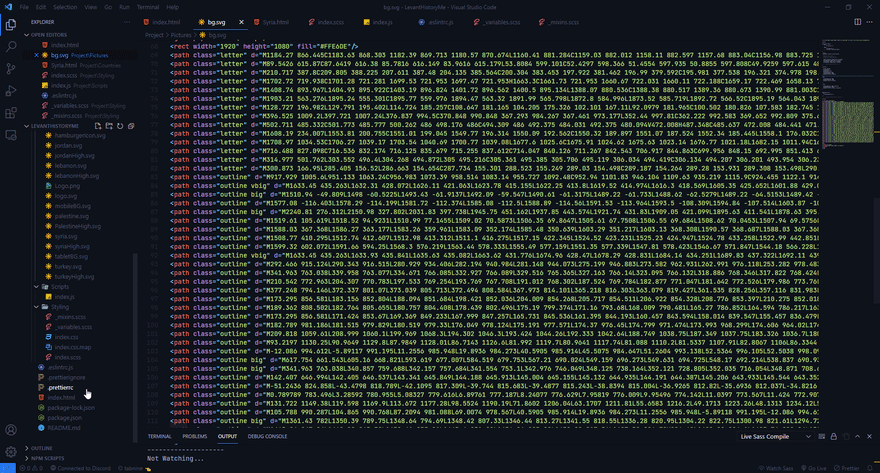
As I was setting up the background SVG for my website an issue arose. The background SVG is massive, I'm talking around 80 lines of code, and if I wanted to add that to my HTML file I would have two options. Either paste the entire SVG file's contents or just link the SVG file in an <img> tag.
You see, adding the entire 80 or so lines would really clog the HTML file, so I linked the SVG file in an <img> tag.
However, another issue arose. I wanted to use one of the <path> tags in the SVG file so I can animated them using CSS, but I could not since using something like
path {

};

// or

#pathID {

};
would not work.
This is when I realized that you can just write CSS in the SVG file itself. This allowed me to create animations and transitions without having to add 80 or so lines of code to my already big HTML markup.
<svg>

<style>

    // CSS HERE!

</style>

</svg>
How I animated the background
Basically, the background consisted of maps outlined with strokes and a bunch of letters scattered about. I wanted the map to draw itself as the website is loaded, and after that is done I wanted the letters to float into the screen.
This only works on an SVG's outline/stroke.
I first started following an article from 2014 on CSS Tricks. Basically, select every SVG path you want to animate and add the following properties in the SVG file itself.
<style>

.outline {

   stroke-dasharray: 800;
   stroke-dashoffset: 900;

};
</style>
then set stroke-dashoffset to 0 and store it in a @keyframes and add it in the .outline
<style>

.outline {

   stroke-dasharray: 800;
   stroke-dashoffset: 900;
   animation: dash 5s forwards;

}

@keyframes dash {
  to {
    stroke-dashoffset: 0;
  }
}

</style>
I also ran into another issue where some strokes took a lot more time to complete their animation. I ended up with the majority of the strokes reaching their destination while having some strokes move really slowly and stop half-way.

So, I identified which strokes were too long/short and added a class for each one, then gave each stroke properties that would make them go all the way to the end.
<svg>

<path class="outline big" ...>
<path class="outline vbig" ...>

<style>

.big{

  stroke-dasharray: 1700;
  stroke-dashoffset: 1000;
  animation: dash 5s forwards;

}

.vbig{

  stroke-dasharray: 2000 !important;
  stroke-dashoffset: 3000;
  animation: dash 5s forwards !important;
}

</style>
</svg>
Finally, give each letter in the SVG a class so they can be referenced with CSS. Animate. Donezo.
<svg>

<path class="letter" ...>

<style>

.letter{

  animation: fadeIn 7s ease forwards;

}

@keyframes fadeIn {
    0% {
        fill-opacity: 0;
    }
    100% {
         fill-opacity: 1;
         transform: translateY(-20px);
    }
}

</style>
</svg>
You can see it for yourself at Levant History.
The website is incomplete

Top comments (3)
Maybe you can also find the
<use>tag useful ?I'll look into it.
Like the "svg sprite" technique that write many svg images into one .svg file using
<g>, and refer to the<g>s from a html using<use>.