As per statcounter, in 2016, mobile internet usage surpassed computer internet usage which solidified and prioritized the mobile usage stance in the market. Another statistic by Statista conveys that in 2020, around 4.57 billion people were accounted for as active mobile internet users. This just goes on to show how indispensable mobiles have become for accessing the internet. If you are running an online business and don’t have a mobile-friendly website then you are missing out on a lot of potential leads.
But that is not the only reason why you should have a mobile-friendly website. Google has declared a mobile-first indexing algorithm that prioritizes mobile version of website content over desktop websites. So if you want to rank better on Google, which is something that everybody wants then you will need a mobile-friendly website.
Now I want to help you get better leads and rank higher on Google SERP. This is why I thought of coming up with a detailed guide on how to make websites mobile-friendly. I will be sharing with you some key design aspects that should be kept in mind while developing a mobile view of the website.
What Does A Mobile User Want?
“The customer’s perception is your reality.”
Kate Zabriskie
This holds entirely true for a mobile friendly website. Does your website offer a good mobile view of the website? It might look good to you but have you thought about this question from a customer’s perspective? If your customer isn’t happy with the mobile view of your website then it isn’t a mobile-friendly website. Period.
This is why it is important to note down metrics and areas which are important to customers in a mobile view of any website. “What does a mobile user seek on a mobile website?” Mobile users are very goal-oriented. Unlike desktop versions of a website, we cannot fill our pages with unnecessary components and place any component anywhere. Mobiles do not work that way. Mobile poses the challenge of limited screen size and as a developer, we need to fit everything relevant in that small area.
According to Google research, more than half of mobile users leave a website that takes more than 3 seconds to load.
Mobile users do not spend time finding what they need on the entire website. They want results immediately and within seconds (almost at first glance).
- If your website takes time to load completely, they won’t wait.
- If your website is not presentable, they won’t stay.
- If your website has an important element say two scrolls down, they would switch.
Let us jot down key areas where mobile users are most focussed. Adhering to these design points can help your website owner win a good word from millions of customers.
Appearance – Mobile View Of Your Website
As we said, the most important metric is the mobile view of a website. What content are you displaying in front of a customer in a mobile-friendly website could be the key to get more conversions. Here is a checklist to keep in mind for mobile view of your website.
Ditch The Navigation Bar
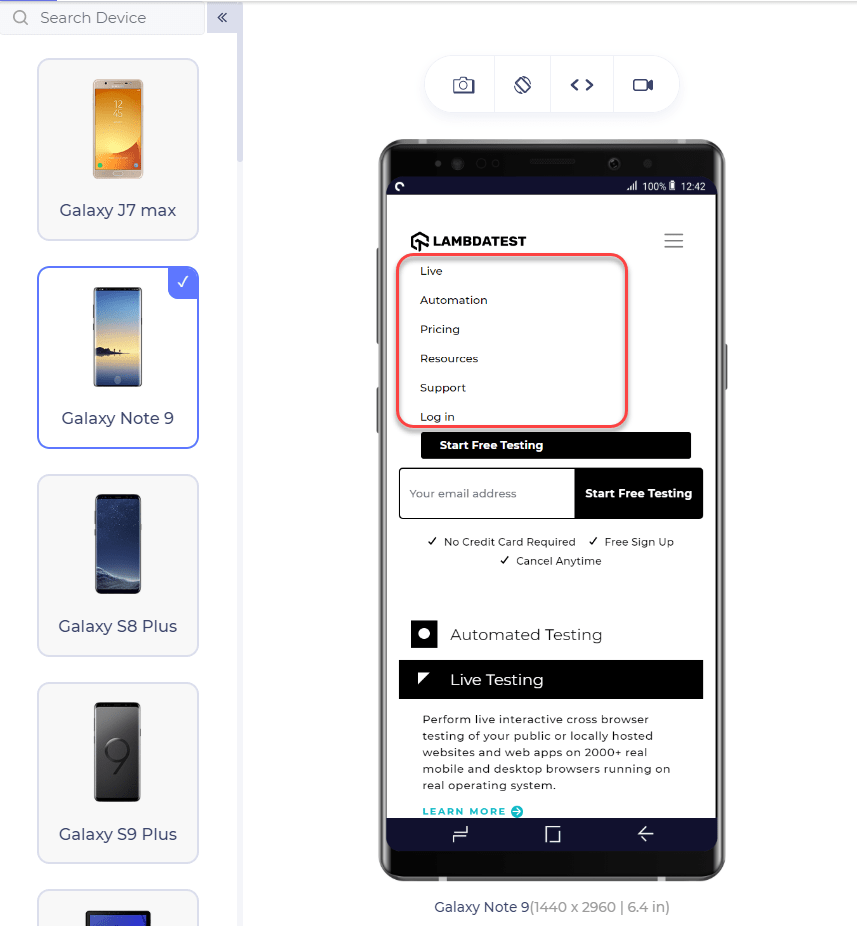
First and foremost design suggestion for a user-friendly mobile website is to ditch the navigation bar. The navigation bar is very helpful from the user’s point of view, but only on desktops. The navigation bar on mobiles is so small and the links are so close to each other that it makes no sense for any user to apply it on mobile devices. But, apparently, we need to provide the links somewhere. A better choice for a mobile-friendly website would be to create a hamburger menu and incorporate every link from the navigation bar to the menu.
The above image demonstrates the difference between a bigger screen (with nav bar) and a smaller mobile screen (hamburger menu). If the developer wants to provide even more links (which is not recommended) then scrollable menus work great where tapping on the main heading opens up more links as a subheading which is demonstrated below:
Disclaimer: All the images representing the mobile view of websites are captured using the LT Browser. A dedicated browser for developers that helps them perform responsive design checks effortlessly.
Keep The Menu Short For Mobile View Of Your Website
The user on a mobile device is not interested to scroll through a long list of menu options and select what he is looking for. In the worst case, he might leave the website after being irked from the user experience. You don’t need to provide an extensive menu for the mobile of your website. Just link the pivotal web pages in the menu and keep it short.
Keep Secondary Tasks In The Menu
Apart from the navigation links, it is better to keep all the secondary tasks inside the menu (only if they are required) and display just the primary ones onto the main page. For example, on an eCommerce website, we can put the “My Account” tab under the menu rather than on the main page because the users do not edit their profile every day (actually not for months).
Prefer Vertical Scrolling
Quite often I have seen that the developers implement horizontal scrolling on their website just to make the website look different, feel different or because it is a requirement for the component. As a user, I can assure you that mobile experience is well appreciated if the elements scroll vertically rather horizontally. It is only recommended if it is of extreme significance and vertical scrolling would make it lose its significance. But in a choice between the horizontal scroll and vertical scroll, always go with the vertical scrolling.
Prompt For the Rotation
Some of the components on your website are best seen on the landscape rotation, for example, images. While seeing these components, the user almost never rotates his phone to the other side on his own. This hurts the overall reputation of the mobile website since it has the potential to provide a better experience for the user but is relying on the user’s sense. As a better option, the developer can provide a prompt on such elements to suggest the user switch his mobile’s rotation for a better experience.
Go For Single Column Layout
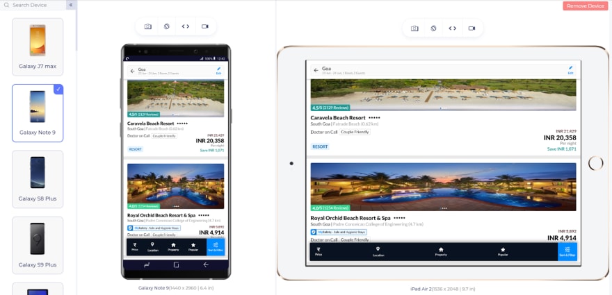
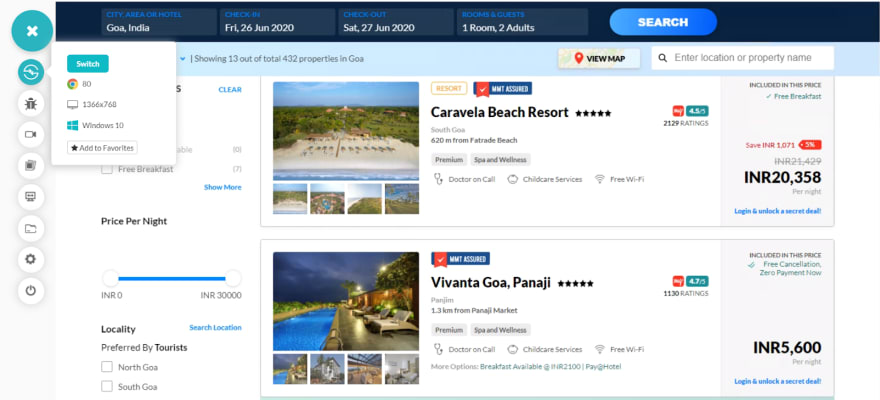
A single-column layout, as the name suggests, contains all the website’s content in a single column. A lot of the times on the desktop website you would see the content divided into different columns. Leveraging the size of the screen, it is a good practice on desktops but since we deal with much smaller screen size on mobiles, the elements shrink considerably well. Fitting everything to a single column ensures that the user will see the elements in a better size, better font, and all the elements will be visible clearly on the website. A good example that I came through is the MakeMyTrip website. Below I have shown how they show the hotel list using multiple column strategy on the desktop and how they switch to a single column strategy on the mobile website.
Avoid Pop-Ups
Pop-Ups have become very popular when it comes to presenting something very important such as a new summer sale on an eCommerce website or upcoming webinar on an educational platform. Pop-ups are highly successful in getting clicks and achieving the target for which they are designed. The problem with pop-ups is that people have started to use pop-ups for monetary purposes and enabling ads on the pop-up. It is very important for a developer to know that pop-ups hurt the user experience (ads or otherwise) and annoy the user. These should not be used on the mobile website, especially the full-page pop-ups. Another reason for not using the pop-ups is that Google has started to penalize the websites using full-page pop-ups and decrease their search rankings. As a substitute, you can provide a flashy sticky footer to display the same message that’s on your pop-up with a close button.
Use High-Resolution Zoomable Images
When a website displays a product, it should always open to provide the best resolution images and satisfy the user before purchasing. This also increases the overall chances of buying the product from your website. Let us suppose an interior designer is looking for a carpet and lands on your mobile website. It is quite definite that he has an eye for these things and would never be satisfied before zooming onto those threads. The same goes for us while buying the clothes. Therefore, use high-resolution images that are clickable and can be viewed in larger sizes.
Network For Mobile Friendly Website
Mobile networks have evolved drastically over the years. This evolution from 2G to 5G networks has been a major factor behind the rising number of mobile internet users. However, not every website visitor would be having the same network carrier or network bandwidth. Countries worldwide are still working to implement 5G on a country-wide scale. In remote areas, network reception for high-speed internet can be a challenge. You wouldn’t want to miss out on customers from these geographies. Plus, as we already discussed, it is imperative for your website to load faster. If it does then it will rank better on Google as well through the Speed update algorithm. This section will explore the necessary design practices that should be adopted to save the network usage of the user. Since a mobile user is extremely concerned about the network and speed of the website, these practices are of utmost importance.
Compress Necessary But Irrelevant Images
A mobile website will contain a lot of images apart from the main product images. For example, the logo of the website, the carousel images etc. These images are important for the website but are not of too much relevance for the user that he would zoom them and notice the fine details. These images are definitely not required to be in high-resolution and using high-quality images will just lead to the bandwidth wastage for which mobile users are extremely cautious. So many high-quality images will also create an imbalance between the data to be downloaded and the bandwidth provided by the network. This irks the customer and forces him to exit before exploring.
Provide Minimum Downloadable Element
As I mentioned, a mobile user is concerned with the network connectivity and favours the website which loads faster and which does not beat around the bush. A mobile user aims at specific content for which he is looking and is not interested in trivial elements on the website. Therefore, the best practice is to write minimum and provide minimum other downloadable elements such as videos, images, written content etc. For example, if your mobile website always witnesses thousands of comments on a single post, it is better to load the comments only when the user reaches the comment part. It shows that the user is really interested in reading the comments. For such huge contents, better use multiple pages (with pagination in CSS) and AJAX to load the element only when required.
User Experience
The entire essence of having a mobile friendly website comes down to delivering the right mobile user experience. This section explores the ways to provide a better user experience to the user and the design techniques to further guide you on how to make websites mobile friendly.
Reorganize The Content
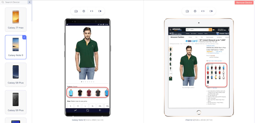
In the desktop versions of our website, we often try to take advantage of the screen size and place everything in one horizontal grid. This is done so that the user does not scroll up and down repeatedly. The best example of this is seeing our profile on various websites that contain our profile picture on the left and the content on the right. This should be reorganized when it comes to a mobile website. Since the screen size is smaller, it is important that the user sees the content in a bigger size. In our example, we can bring the content below the profile picture.
Notice in the above image how Amazon moves the content from the right to below with the button being of larger size.
Use Bigger Clickable Elements
The majority of mobile users use their fingers, rather thumbs to interact with the mobile view of a website through their screen(keeping aside the stylus people). Since fingers are much thicker than the mouse pointer on our desktops, we need relatively bigger clickable elements on the mobile screens. These can include the button and forms etc. In a study from MIT touch lab, it was found that the size of 10 mm is appropriate and comfortable for almost all the users operating on mobiles.
Keep Important Elements Within Reach
For the same reasons discussed above and based on my personal experiences, developers should give appropriate space between two elements that are clickable. A lot of times, I’ve tried pressing one button but due to less spacing, another button gets pressed. I’m sure you must have faced the same dilemma at some point in time. This is a very common mistake that the developers do while trying to adjust all the elements in a single row.
Keep Important Elements Within Reach
A lot of mobile users operate their devices with one hand. Also, mobile devices are rapidly changing and one of the key factors is their screen size. If you are on a mobile device right now and are holding your device with your right hand, try to reach the top-left corner of the screen with the same hand. It is not so convenient. Keeping this same observation in mind, we the developers need to understand that we provide a minimum clickable element in these areas. The main area of the target should be the middle area as seen in the below image:
This provides better user experience and even though the user does not appreciate this, he will certainly not get annoyed by it.
Provide A Home Button On All Pages
Through studies and surveys, we have noticed a basic fact that users return to the home page quite often during their session on a website. There can be several reasons associated with this pattern. For example, you cannot go back to a page that had a form in it since it does not allow resubmission and will repeatedly show the same message. Another example is the user often moves deep inside the website by visiting multiple pages. Pressing the back button repeatedly is not very good from a user experience point of view. Therefore, it is always recommended to use a home button to return to the home page with a single click. Mobile friendly website developers embed the home page link into the logo of the company these days. It is clean, convenient, and a good design method.
Usability
Don’t get confused between usability and user experience. They aren’t the same. Usability refers to how conveniently a user is able to finish a task over a website. User experience refers to the overall feel of the mobile website. How pleasant a user is with the mobile view of your website is something to count in the user experience. However, how quickly is the user able to login, fill forms, log-out and do other activities can be counted as usability. This section explores the aspects of usability from the user point of view and how it can be improved to create a mobile friendly website.
Provide Click-To-Call Buttons For Phone Numbers
A website almost always displays phone numbers for their users. If it is an eCommerce website then support phone numbers, if it is a hotel’s website then reception’s phone numbers etc. Providing a phone number as plain-text will force the user to copy and paste it on the dialler. A better method is designing it as a click-to-call button where the user can click the number and the dialler automatically opens up with numbers already typed. The same design method goes for email addresses (by opening the default mail client on click) and locations (opening the location directly into Google Maps or similar application).
Disable Multiple Tab System
Remember the target = “_blank” property of the anchor tag in CSS? It helps in opening a new tab when a link is clicked. It is very helpful for the user to move back and forth between tabs but it is exactly the opposite on a mobile. A mobile browser does not keep the tabs side by side but stacks these tabs on top of each other. This is extremely annoying to move back and forth and creates a lot of confusion for the user. Therefore, the developer should disable these multiple tabs and enable opening them on the same tab to create a mobile friendly website.
Do Not Use Location Always
A lot of the services on a website uses location. For example, the hotel booking website asks to enable the location to automatically detect where the user is and provide search results without too many efforts. But it does not work that smoothly always. In a study, it was found that users got confused when they wanted to search hotels in a different city but were shown the results in the same city. This counts as a bad experience that the user probably won’t forget in the near future. Instead, a better design is to provide an input button for the city name and along with it provide a call-to-action button for “Find Near Me” or anything like that. Pressing the button would find the hotels in the same city.
Avoid Adobe Flash Player
When internet speed started taking some pace and developers started putting heavy data such as videos on their websites, Adobe Flash Player was very common in those days. For every video, a prompt of “Flash Player Required” would pop up if you did not have it installed. This was followed by the troublesome process of downloading, installing and then watching the video. Later people discovered that Adobe Flash Player poses security issues and makes the website vulnerable to external threats. Also, it was not supported on the Apple devices. Today, Adobe Flash Player is hardly used and instead YouTube links are embedded to the website directly. As a web developer, ditch the flash player on your website.
Forms
Forms are the bread and butter for the majority of online businesses. Be it login form, registration form, demo scheduling etc. They are crucial for data collection so it only makes sense to keep them mobile friendly. Moving on with the next step on how to make a mobile friendly website, the following section explores the design tactics that web developers should follow while creating forms on the website.
Move Automatically In Forms
Forms are an integral part of the website. There is a form element on almost every website today. For example, account registration is a form, even the address is asked in a form. Now, these forms can be quite long especially if you are seeking a lot of information from the user like job seeking portals. Tapping on every element after filling the previous element is a bad practice to follow in development. A better practice is to move onto the next element automatically once the user fills the previous element and presses the ‘Go’ or enter button on the keyboard.
Validate Form Inputs In Real-Time
If your website contains forms then they must also contain the form validation into them. The time at which these forms are validated makes a lot of difference. For example, if I urge the user to fill a long form of 15 inputs and validates only after he has filled the complete form and pressed the submit button, then the user would have to repeat the same process again and again. This can happen many times for a single user and has personally happened with me a lot, leaving me frustrated all the time. Rather, it would be of great convenience to the user if the form is validated in real-time so that as soon as the user fills the input and it is not valid, the form immediately shows the error.
Use Appropriate HTML Input fields Types
The input element in HTML contains an attribute “type” which describes the type of input expected inside the form. Although the developer can go ahead by defining every input as “text” but providing correct input type helps in other ways. First of all, it is easy for validation if the input type is defined. Secondly, the browser takes advantage of this element for auto-filling the values rather than prompting the user to enter the values manually. For example, if I have mentioned the value as “phone”, the browser expects this value to be a phone number and phone numbers do not change every day so the browser fills this field automatically.Are Your HTML5 Input Fields Cross Browser Compatible?
Provide Visual Graphic Calendar
The website owner often demands data in the form of dates while the user fills the form on their website. This can be their date of birth during registrations or date of a journey for a ticket booking website etc. On many websites, I have noticed that the developers make a placeholder of the format they expect and leave all the hard work for the user. This is not a mobile-friendly web design for our mobile users. Instead, for any such input value, a graphic calendar should be used which is available inside CSS.
Check The Calendar Alignment
Once you have applied the code to open the calendar when a need to enter the date arises, it is even more important to check the alignment of the calendar. It is not a surprising factor that browsers will render the element in the same way it understands. Sometimes, when we open the calendar it gets opened at the bottom of the page (a problem I faced earlier on UPSRTC website but now it has been fixed). The user is unable to realise that the calendar has opened. Therefore, always implement the calendar so that it opens exactly where the input element is.
Break The Form Into Multiple Segments
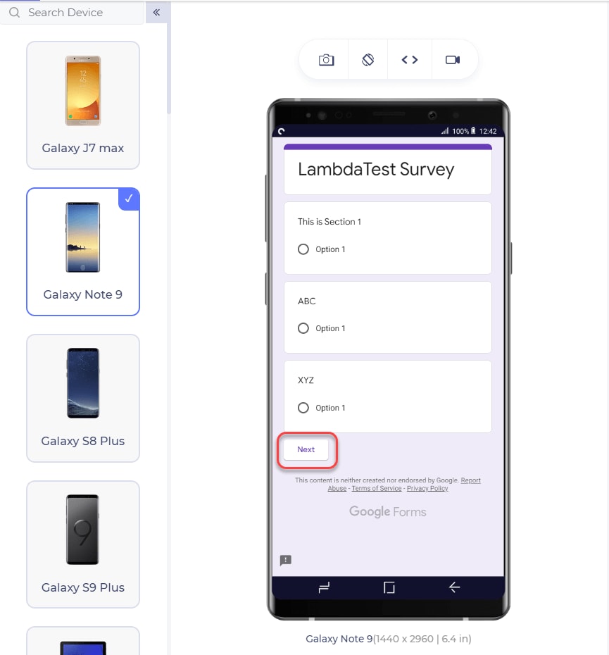
The user may get irritated by looking at the size of the form. Let’s say I need to fill 12 fields in a form. This will look overwhelming at first glance and believe it or not, the user finds excuses to leave the website altogether. But if I divide the forms into three segments with four questions each (hiding the segments currently not in consideration) and now ask the user to fill them, he would probably not recognize he filled twelve questions. A number of modern form embedding tools create this feature such as Google Forms.
Search
This section explores the key points we should keep in mind while putting up the search functionality on our mobile friendly website.
Provide Search Button
Search button relieves the user of the responsibility of finding what he is looking for. Although the search button is not required for every website, it should always be present on a mobile website which does require them like a website with a lot of products. Also, remember to put the search button on all the pages on your website and not just the home page.
Do Not Hide The Search Button
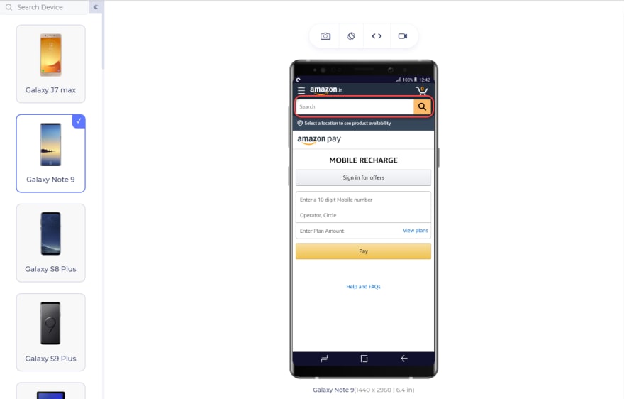
Once you have provided the search button on your website, remember to place it at a position where it is always visible. A more popular convention is having a search at the top-right corner and most of the users tend to look there first while searching for it. Some key places where you should never put the search button are on the menu and at the bottom of the website.
Show Search Results From All Pages
Once you have put the search button and placed it at a good place, remember to implement the search operation on all of your web pages. The user obviously does not know at which page he will find the element he is searching for. Therefore, your results should appear from all the pages.
Implement Autocorrect For Search
The user does not always necessarily know the spelling of his search query and often makes some mistakes while typing. To improve the user experience in this area, autocorrect the words, correct their spellings and also suggest queries that are relevant. There are tools available for that, the most popular one being Google Custom Search.
Use Filters
Mobile users often always abandon the website where there are too many products and no filter. A mobile friendly website always contains the filters on which the user can rely to narrow down their search results. Implement as many filters as necessary to provide the most accurate results the user is looking for.
Prefer Questions Before Results In Search
If your website is too vast and/or there are too many segments on your website with vast varieties, it is better to ask a couple of questions from the user before search. This would provide correct and narrowed down results with better accuracy resulting in increased user engagement.
Registrations
This section explores registration-related design methods which play an important role in answering ‘how to make website mobile friendly’. Primarily because we developers do not understand that not every user wants to register as they are fed up for doing so on hundreds of websites.
Do Not Prioritize Registration
I have noticed a lot of websites that prompt for registration before continuing forward and exploring their website. It is understandable that a website needs to show its user base to increase its value. But, a user does not prefer such an arrangement. Forcing a user to register leaves him with no option but to abandon your mobile website and find an alternate one.
Provide An Option To Guest Checkout
Guest checkout is an operation of checking out without registration. This option is very convenient for the user and usually, if given an option, a user prefers guest checkout by just filling one primary key value such as email id or contact number. This key helps the user see his orders without registering on the website. Registration should only be available on the websites where it is absolutely necessary from the security and monetary point of view.
Make The Website Responsive
Responsive websites are self-adjustable to different screen sizes to adhere to the needs of millions of users. A non-responsive website is not clearly visible without zoom, elements become extremely small (especially the buttons) and the users just hate it. A responsive website is received very well any day by the user and it is not so difficult to create or convert one into a mobile friendly website.
The above image reflects how a website adjusts itself on a smaller mobile screen (left) and shows a different view on the bigger screen (right).
Responsive Web Design vs Mobile-Friendly Website
Mobile-friendly website design is different from that of responsive website design. Before you make the decision of choosing one over the other, take a look at how they are different-
- The layout of a responsive website changes as the user device’s screen size changes, while a mobile-friendly design stays the same regardless of the screen size.
- The functionality of a responsive website is dependent on the user device but that is not the case with a mobile-friendly website.
- A responsive website has a lot of dynamic content that changes from device to device. On a mobile friendly website, nothing apart from the scale of the website changes.
- A responsive website improves the usability of a website by simply shrinking it while a mobile-friendly website may limit some features like a drop-down menu to make it easy to use on a mobile device.
Create Responsive Images
Images help in relaying your message and engaging the readers. If you are not using images at the right places, your website is definitely missing out on something special. Instead of writing pages-long content, include images and see a dramatic reduction in your bounce rate. For a mobile website, first, you will need to calculate the screen size of the device and adjust your images accordingly. We recommend using the View-port meta tag. But that’s not all. You might also need to tweak some attributes to make responsive images with CSS, HTML or WordPress.
Do Not Fix The Viewport
The viewport of a device is the visible area of the screen. Oftentimes new developers make a mistake of providing hardwired values for the elements such as “width:100px;”. Taking into consideration the varying sizes of the device, a 100px width element on a mobile screen is too huge to be fit properly. Therefore, in such cases, the developer should always place relative value according to the viewport such as “width: 25%” etc.
Make Use Of Website Analytics
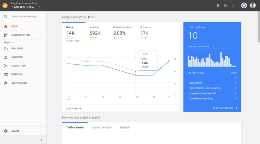
Website analytics helps you in identifying the weak and strong areas of your mobile friendly website along with great statistics. For example, what screen size is used most while opening your website, or which operating system or browser is used mostly for your website? These statistics, if worked upon, can help align the components according to the correct audience and provide them with a better experience.
Should You Provide A Mobile Site As A Separate Website?
Converting the desktop site to a mobile one by just improving the responsiveness sometimes does not work. If the developer provides a separate mobile website, he could present certain elements in a different way which are more mobile-like. For the same reasons, companies have started to adopt the strategy of providing a “lite” version of their website which gives the user a native app-like feel. You can go through my post on Latest web development trends to learn about this. The main focus here is to provide a user experience like the native application rather than the website.
The above image is of the mobile website of dominos pizza India. But it resembles the native application a lot.
Test Test Test!
Once you are done with implementing the components according to the best design practice, the most crucial thing is testing the website. Testing the website raises out some issues that would have been impossible to detect while developing the website. Testing the website would also give you confidence in your website when it goes live on the internet.
Perform Responsive Testing
So you have noted all the relevant pointers and guidelines for a mobile friendly website and keeping it responsive is one pointer that you need to put a double check on. The real question is how do you test it? What is the right way to perform responsive testing because you can’t go around buying an expensive device lab and developer tools don’t offer accurate results.
Use LT Browser To Ensure Mobile View Of Website
LT Browser is a developer-friendly browser which allows you to ensure mobile view of website over a variety of mobile view ports. You can select from 25+ devices, compare them in a side-by-side view with a bonus of mirrored interactions which automatically synchronizes every scroll, click and navigation while comparing.
With LT browser you can also perform responsive testing of your locally hosted web applications. All you need to do is type the localhost URL and you’re good to go.
You can debug issues on the go with native developer tools. If you’re a React fan then you will be delighted to know that it also offers hot reloading and do a lot more.
Perform Cross Browser Testing
When we have made our website responsive to satisfy customers using devices with largely varying screen sizes, we need to ensure that it does work correctly on these devices. For this, we need to perform the cross browser testing and find all the compatibility issues and work on them. The hard work you put in to create a mobile friendly website is of no use if it cannot be delivered to every type of user. Hence, cross-browser testing is necessary and you can perform cross browser testing in a number of ways.
You Need A Mobile Friendly Website, Period
According to StatCounter, mobile devices account for 50% of the global traffic while 47% of them use desktops. Focusing on the user behind the mobile screen has become so important that in 2015, Google announced that it will be handling mobile search results differently. These results would be analysed and displayed in accordance with the mobile user’s needs. In addition to it, Google has also rolled out an additional modification into its algorithm which will give ranking scores on the basis of mobile-friendliness. So, if you have a mobile friendly website, you will be ranked above those who do not. This shows the importance of a mobile friendly website in the market today. But it does not end here. To provide a better mobile website, you need to make the user stay on it satisfactorily.
Designing a mobile website plays a key role because of the competition in the market. A mobile-user is not a patient one. If the user gets annoyed by even a single factor, he will abandon the website and believe me there are tens of factors on which a user judges a website, although unintentionally. A better-designed website not only speaks volumes but also tells Google that people do tend to like your website which automatically bumps it up the search ranking, ultimately providing more traffic. Therefore, stick to these design points and develop a better and more convenient mobile friendly website for the user.
Cheers!









Top comments (0)