
Web developers often find themselves tangled with complex web designs. They usually spend days figuring out a CSS grid arrangement or managing a vertical navigation bar. Professional or novice, both developers are fascinated by the smooth transitional design and Javascript functions that create wonders on the web page.
But in this endeavour of observing the bigger picture, they often miss out on an element that is easy to ignore in development but plays a vital role in making an impact on the user. This element is the typography of the website. Typography may not be the core point of the web design during the initial development days (or final). Still, subconsciously, typography determines whether the reader would be comfortable in reading the content or not.
After all, what’s the use of a complex design when the user can’t even read what is written on the web page? But this post is not about typography and its techniques. This post will take you one step forward in the typography design and explore the fluid side of it or in popular terms, the responsive side of the typography design. Furthermore, we will explore how we can improve it for a wide range of devices in the market with CSS help.
Typography Basics
Before jumping straight to the responsive design, I believe a brief introduction to typography is important for readers who are not familiar with it. For expert professionals and designers who have already dealt with typography can skip to the fluid typography section.
Typography is the careful selection of colour, contrast, size, font, alignment, and other factors that directly affect the design of type on a web page. Typography is a thoughtful process and needs in depth analysis of each element described above and being used on the web page.
As a beginner, the thumb rule of typography based on my experience is, never think that if you can read it, everyone can or if you feel comfortable with the text properties, everybody does.
Typography has a different effect on everyone. Some people are fast readers, some people are sensitive to certain colours etc. This post is not about typography and therefore we shall not go too deep into this. But to make you understand, let’s just brush up on just two properties in short: contrast and font.
Contrast
In laymen terms, contrast on a web page (focusing on typography) can be understood as to how different the text colour and its background are.

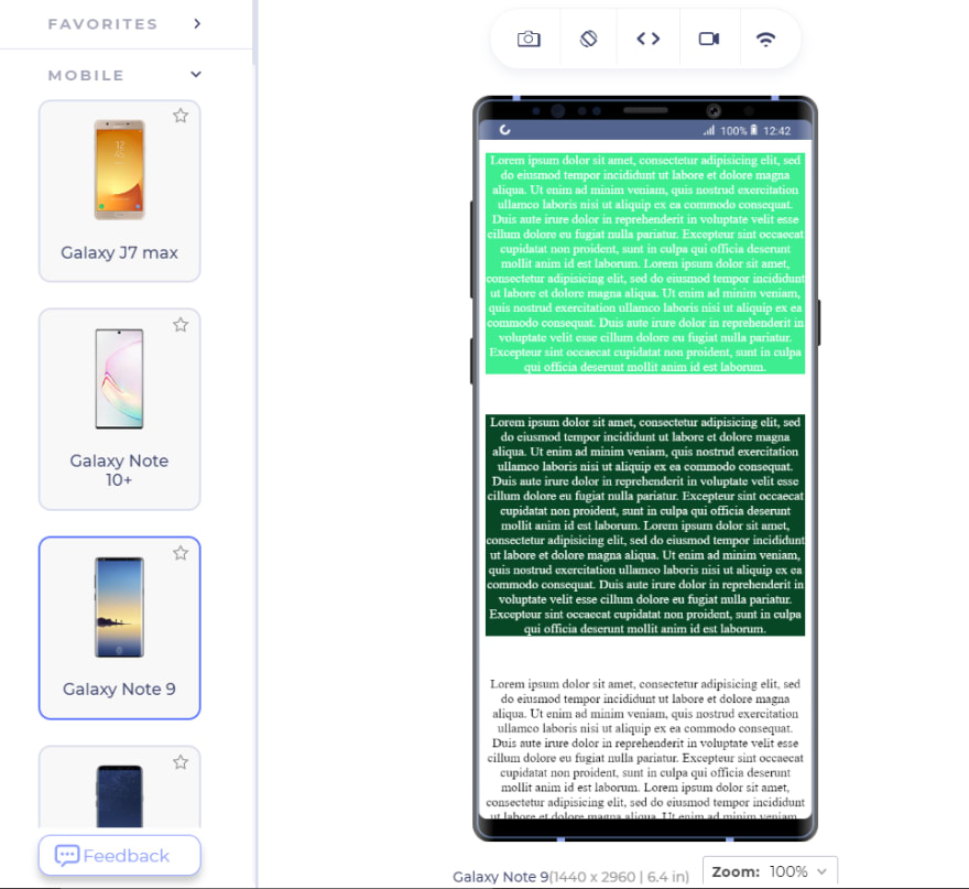
Here I have designed a small web page with three different contrasts. Which one is easier to read for you? The first block has a contrast ratio of 1.53 which is extremely poor in terms of WCAG guidelines.
The second block passes the AAA level of the guidelines (which is the best level) to read and the third block is the most common in web design and arguably the best one too. You can calculate the contrast ratio with online tools such as contrast-ratio. Contrast ratio is an essential part of accessibility and for a better user experience, it should pass the WCAG Level AA. Good typography consists of a perfect contrast that is comfortable for everyone.
Font
The next thing to take care of in typography is the font we use on the web page. The font has two main segments: the size and the type of font. Let’s first see the type of font.
There are two types of fonts available that can be implemented in web design.
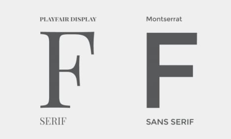
And the difference between them is this:
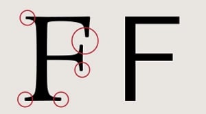
The Serif fonts have these pointed end strokes while the “Sans-Serif” does not (tip to remember: sans means without in English). These two types of fonts can dramatically change the impact your content will have on the reader.
Serif fonts are hard to read because of the pointy ends. But this claim is only satisfied when we are talking about normal small text (12-14px) and letter spacing is normal. As we increase the font size, serif fonts do not create any trouble and can be read quite comfortably.
In fact, in bigger headings and banner images, serif fonts do look good. On the downside, if you choose to use serif and increase the normal body font size, it will take much more space on the web page which is not a good sign.
Hence, it’s good to always experiment with the typography on your web page and take feedback from users.
Fluid Typography – The Responsiveness of Fonts
Fluid typography makes the typography responsive so that when we change the screen size, the font size, font height, space and other type attributes all change with respect to it.
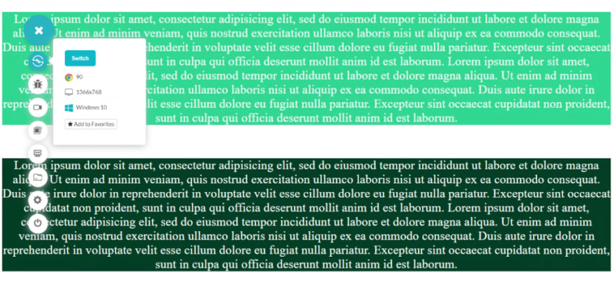
Let’s test the above example of contrast colour using LT Browser, a developer-friendly browser that helps you test websites for responsiveness instantly across 50+ screen resolutions. You can even create custom screen resolutions, debug with inbuilt dev tools, collaborate with team members by sharing screenshots or videos and even run a performance test report.
If I render the same website on a mobile device, I get this:
Honestly, if I were the user and saw this type of content, I would press the back button to navigate to any other link. No matter how much focus you have put up on the typography, all the hard work is down the drain if it is not fluid in nature.
Fluid typography is a short concept but of utmost importance just like CSS pseudo-classes and pseudo-elements. Going forward we will see two methods to apply fluid typography on a web page. One with CSS media queries and the other with an in-built CSS clamp function.
Fluid Typography with CSS Media Queries
Before continuing to this section about fluid typography with CSS media queries, it is highly recommended to have prior knowledge of media queries used in CSS. You can take help from your favourite CSS source or the post I wrote recently about CSS Media Queries and implementing them to achieve responsiveness.
In short, media queries detect the media device on which the website is rendered and applies the defined media rules to the selector used. For example:
@media screen and (max-width: 840px){
  p {
     color: red;
}
}
The above media query makes the content inside the “p” tag red on a “screen” whose maximum width is 840px.
Fluid typography also requires similar treatment. We are looking to change the type properties according to the viewport of the device and when we talk about viewport in typography, the first thing that comes to mind is “vw”? Can we give “vw’ a try here?


Fluid Typography – Fixed and Static
With fixed values in our media queries, we can define a rule to change the font size according to the current viewport of the device. Defining the font size in “vw” gives us the advantage to skip the calculation and just rely on CSS to adjust the font according to the viewport. “VW” works with reference to the viewport device. A font size of 2vw is 2% of the current viewport. For example, if the viewport is of 1000px, 2vw would correspond to 1000 * 2% = 20px.
p{
font-size: 2vw;
}
The only problem with fixed value as demonstrated is it works fine only for a given range of resolutions. If the resolution becomes too big, the font would become too big and often it is not required.
You can observe a similar pattern when the resolution is too low. Practically, font size can be utilized to a range of viewports rather than always moving it upside down. Apart from the “vw” unit, you can use other options too in place of vw (viewport width):
vh: viewport height.
vmin: takes the smaller value of viewport height and width.
vmax: takes the larger value of the viewport.
Therefore, we can use media queries here to implement the adjustments only when it is required. The breakpoints can be found out by simple math that we applied in the previous example where:
value * resolution = font size
Here, we want the breakpoint resolution with a fixed value of font size that we know. So, if I want to know the breakpoint of 20px that we used above, we change the position of variables as follows:
value / font size * 100 = resolution – Eq. 1
Substituting the values:
20/2 * 100 = 1000px – Eq. 2
Or 10px for 500 resolution etc. Finding the breakpoint is very important. If you put down any value as you wish the font size would jump after the “min-width” which is not a very “fluid” design. We can now apply media queries because I don’t want my font size to go below 10px ever and beyond 16px which brings out a resolution of 800px (using the equations).
@media (min-width:500px){
font-size : 2vw;
}

@media (min-width: 800px){
font-size: 16px;
}
Results:

This method to implement the fluid typography is a little hectic though. With all the calculations and hit and try methods, it becomes too much of a burden when we have more than three or four elements on our web applications.
Fluid Typography with Calc Function
We can make a small adjustment to our above code and leave out the calculation part to the CSS itself by using the calc function. This option is great when you don’t want to bug yourself with calculations and want fluid typography that does not jump from a small font to bigger ones instantaneously.
The calc function is used to calculate an expression when specified inside the CSS property values. Any property that takes length, percentage, number, time, integer, angle and time can be specified as an operator in calc.
Calc takes four types of operands: addition, subtraction, multiplication and division. An important and probably the only thing to remember while constructing a “calc” function is that the operators “+” and “-” should always be surrounded by white space. If the operand and the operator are as follows:
calc(15vw -35vw)
It will be considered as -35 and the expression will become invalid. By defining a mathematical expression inside the calc function, we can quickly achieve fluid typography (or at least easier than the previous method).
The following expression is a tested expression for the font size and will work by calculating the font size within a range of numbers.
font-size: calc([minimum_font_size] + ([maximum_font_size - minimum_font_size]) * ((100vw - [minimum_viewport]) / ([maximum_viewport - minimum_viewport])));
To substitute random values just for the demonstration, the calc function will become as follows:
p {
font-size: calc(16 + ([16 - 12]) * ((100vw - 1200) / (1200 - 500)));
}
100 has been used because of the percentage terms. Please refer to equation 1 and equation 2 to know more about it.
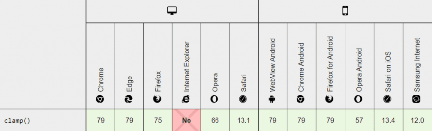
Let’s also evaluate browser compatibility for the calc function as it receives great support from the browsers.

With calc function in our hand, we don’t need to worry about those absurd jerks in fluidity and extra head of calculations. It is better than the first method but still a bit more “mathematical” than our next method.
Fluid Typography with CSS Clamp Method
Our final method to achieve fluid typography is the CSS clamp method. Seeing how web developers were involved in tedious process of calculating their font size for every element that displays font to achieve fluid typography, the clamp function was introduced in CSS Level 4 to ease out their pain.
The Clamp function works as one of the bounds in CSS, the other two being the “max” and “min” functions which are discussed in the CSS Media Query post.
The CSS Clamp function takes two bounds and a preferred value. These bounds are the minimum bound and the maximum bound. The function roams around these bounds and selects a value from in between them. If the preferred value goes below the minimum bound, the minimum bound is used. On the other side, when it goes beyond the maximum bound, the maximum bound is used.
Consider the following example of the CSS Clamp function:
<style>
      p{
        font-size: clamp(12px, 40px , 200px);
        margin-top: 40px;
        text-align: center;
}
    </style>
The font size of the paragraph is returned as 40 on the loaded page (the middle value aka the preferred value). This is the problem here. When the preferred value is in between the min and max, it will always be the preferred value that is returned even if the viewport width goes below 200px. With such an arrangement, fluid typography will not be achieved as the font size will remain static. It’s like defining a font size conventionally in simple px terms.
Therefore, it is better to use an expression in the place that returns this value based on the device’s viewport so that as the viewport changes, the font size of the element changes too! We can take advantage of the clamp function that monitors the preferred value to always be within the bounds.
In the following example, I am considering a 50% expression as a preferred value restricted between ridiculously small 12px and 200px for an image width:
<!DOCTYPE html>
<html lang="en" dir="ltr">
  <head>
    <meta charset="utf-8">
    <title>Constrast Demo</title>
    <style>
      img {
        width: clamp(12px, 210px, 200px);
        margin-top: 40px;
        text-align: center;
}
    </style>
  </head>
  <body>
      <div>
    <img src="cat.jpg" id="mycat">

    </body>
</html>
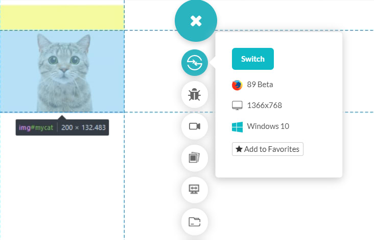
So, here we get restricted by the maximum bound because the viewport 50% was greater than 200.
Apart from an expression as simple as used above, you can also use a complete calc function equipped with expressions in the preferred value. Or you can go ahead with a single base value along with the percentage as demonstrated above in the following approach:
<!DOCTYPE html>
<html lang="en" dir="ltr">
  <head>
    <meta charset="utf-8">
    <title>Constrast Demo</title>
    <style>
      p {
        font-size: clamp(16px, 5vw, 50px);

        text-align: center;
}
    </style>


  </head>
  <body>
      <div>
  <p id = "paragraph">Your Text.</p>
  <br><br>
    </body>
</html>

The fluid typography is achieved by this small function that was much needed for the web developers. The CSS Clamp function can be used for a whole lot of use cases but using it for font sizes or fluid typography is a classical and most popular use case. You can experiment with the function and leave a comment below with codepen links!
The CSS Clamp function even though being fairly new has been recognized as a function of utmost importance by all the browsers in the market. Hence, you can blindly use the CSS Clamp function in your code without worrying about cross browser compatibility issues.
And yes, Internet explorer lovers have to be disappointed once again. But it’s time to get over it now! (:P)
Min Max and Clamp Function in CSS
Often, you would see people using just the “max” function or just the “min” function to achieve almost the same results of fluid typography that we tried above. They do work a bit like each other, and when we want to take control over a container width or fluid typography, often we can get confused between the three. Therefore, a small section demonstrating the min and max function is necessary when we talk about CSS Clamp.
Min Function in CSS
The “min” function in CSS takes different values as arguments (similar to clamp) and applies the value that is the minimum of all of them.
The following code is demonstrated later with the video:
<!DOCTYPE html>
<html lang="en" dir="ltr">
  <head>
    <meta charset="utf-8">
    <title>Min Property</title>
    <style>
      div {
        width: min(50vw, 500px);
        text-align: center;
}
    </style>
<script>
   function calcwidth(){
     setInterval(function(){var x = document.getElementById("divblock").clientWidth;
     document.getElementById('mywidth').innerHTML = x;}, 100);
  }
</script>
  </head>
   <body onload="calcwidth()" style= "background-color: rgb(181, 209, 255)">
      <div style="display: block" id="divblock">
   <h2> My Width is <span id="mywidth"></span></h2>
  <br><br>
</div>
    </body>
</html>

So, the width of my “div” box remains constant at 500px because it is the minimum value compared to 50vw. But, as soon as 50vw becomes less than 500px, the width of the “div” box starts to change too.
Let’s evaluate the browser compatibility for min() function across different browsers,

Max Function in CSS
Once you have dealt with the min function above, decoding what max function would do is not rocket science. The max function works as just the converse of the min function where the maximum of the values is chosen instead of the minimum.
Change just a single line (Line Number 8 as per count) by changing the word “min” to “max”.
width: max(50vw, 500px);

The width gets fixed at 500px as soon as the 50vw becomes lesser than it.
Let’s evaluate the browser compatibility for min() function across different browsers,

Similar to its siblings: min and clamp, the max function is a member of all the major browsers as well.
Min and max functions are great and are very essential in certain use cases. But, they both provide one loose end from their side. You cannot judge how small the font size or width would go when you use the min function or how large it would get with the max function. A precautionary function that works smoothly here is the clamp function and therefore as far as accessibility is concerned, the min and max functions should be avoided.
Also, if you ponder over the min and max functions a bit, you will realise that the clamp function is actually made up of these functions as this snippet:
width: clamp(150px, 50%, 1000px); = width: max(150px, min(50%, 1000px));
But using Clamp is clean and understandable.
Conclusion
Over the years, we have seen a massive surge in mobile device usage. This gave birth to the term fluid typography, which makes web page typography immune to changing viewports. Font size also plays a very crucial role in creating an impact for the user of your website. People hardly zoom in to read the content. They take the easiest shortcut; the back button. One such function that takes control over deciding what font size to put is the CSS Clamp function. As explained in the post, the clamp function is better and much more helpful than the min and max function, even though it is a mix of them behind the scenes.
Furthermore, you can also test whether implementing the CSS clamp function is working across different browsers and browser versions using a cloud testing platform like LambdaTest that enables you to perform browser compatibility testing at scale. I hope this post increased your knowledge on CSS Clamp and fluid typography and the next time you are developing a website, make sure you implement this fluid typography using the CSS Clamp function.

Oldest comments (0)