One of the most common input types that users interact with online, dropdowns allow users to select from various items. Many organizations use dropdown menus to allow users to complete an online form accurately. They are used for choosing options such as selecting your country, language, or responding to a question where there are only a few possible responses.
Besides being a default HTML element through the element, plenty of open-source and third-party dropdown controls are available online; which one should you choose?
Thankfully, Wijmo has you covered with ComboBox, the best Angular dropdown control available. It's simple to implement, easily customizable, and has an extensive list of features that allow you to easily integrate it into your other controls and components.
In this article, we'll be outlining the following features of the ComboBox:
- Dropdown Implementation
- Styling the ComboBox Control
- Customizing the Dropdown Elements
- Integrating the Dropdown Control with other Components
If you'd like to download this project for yourself, you can find it here. Now, let's get to work!
Dropdown Implementation
Before we implement Wijmo's Angular dropdown, ComboBox, we'll need to install Wijmo's components library. Inside of your Angular application, run the following command:
npm i @grapecity/wijmo.angular2.all
This will install all the Wijmo files required for its set of Angular controls.
Next, we'll need to include Wijmo's styling and the ComboBox module. Inside of the app.module.ts file, include the following:
    import { WjInputModule } from '@grapecity/wijmo.angular2.input';
    ...
    imports: [
        ...
        WjInputModule
    ],
And for the styles, include the following at the top of your application's styles.css file:
@import '@grapecity/wijmo.styles/wijmo.css';
Now the application is set up to allow us to create a ComboBox control. Inside our app.component.ts file, we'll create some dummy data to populate our dropdown:
    import { Component } from '@angular/core';

    @Component({
      selector: 'app-root',
      templateUrl: './app.component.html',
      styleUrls: ['./app.component.css']
    })
    export class AppComponent {
      countries = ['US', 'UK', 'China', 'Russia', 'Germany', 'India', 'Italy', 'Canada'];
    }
We're just creating an array of countries, which we'll give the user the ability to select from inside of the app.component.html file:
    <h2>ComboBox Blog</h2>
    <wj-combo-box [itemsSource]="countries"></wj-combo-box>
Now we're good to run our application to see the ComboBox in action:

As you can see, Wijmo's Angular dropdown neatly displays all our data. Next, it's time to customize the look of the ComboBox.
Styling the ComboBox Control
Wijmo's ComboBox, along with all its other controls, is highly customizable. For this sample, we will modify the dropdown to have a dark-mode look.
One thing to point out, when customizing some of Wijmo's core CSS classes, these changes need to be implemented inside of the styles.css file to take effect.
    .wj-control .wj-input-group .wj-form-control {
        background: hsl(0, 0%, 15%);
        color: hsl(0, 0%, 70%);
        font-weight: bold;
        padding: 10px 16px 8px;
        font-size: 16px;
    }

    .wj-control .wj-input-group .wj-input-group-btn {
        background: hsl(0, 0%, 15%);
    }

    .wj-control .wj-input-group-btn>.wj-btn.wj-btn-default:hover {
        background: hsl(0, 0%, 30%);
        transition: .4s;
    }

    .wj-control .wj-input-group-btn>.wj-btn.wj-btn-default:hover .wj-glyph-down {
        color: hsl(0, 0%, 85%);
        transition: .4s;
    }

    .wj-combobox {
        border-radius: 0px;
        border: 1px solid rgba(0, 0, 0, 0.5);
    }

    .wj-listbox-item {
        background: hsl(0, 0%, 15%);
        color: hsl(0, 0%, 70%);
    }

    .wj-listbox-item.wj-state-selected {
        background: hsl(0, 0%, 30%);
    }

    .wj-control .wj-input-group .wj-input-group-btn:last-child:not(:first-child)>.wj-btn {
        border-left: 1px solid hsl(0, 0%, 70%);
    }

    .combo-dropdown > .wj-listbox-item:hover {
        cursor: pointer;
        background: hsl(0, 0%, 30%) !important;
        transition: .3s;
      }

    .wj-glyph-down {
        color: hsl(0, 0%, 70%);
    }
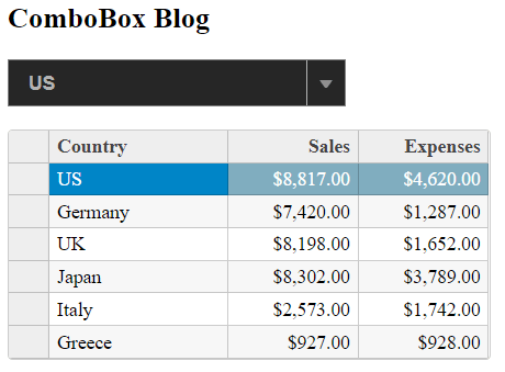
There's a fair amount of code here, but all we're doing is modifying the size and color of the ComboBox. We change all the white in the dropdown to black, darken the grey hover effect when users hover over list elements, and add some padding to the control to give it a little more space. When we run the application, we'll see the following:

Customizing the Dropdown Elements
Now, loading in an array is pretty basic. In most scenarios, you won't be creating your data in code but receiving it from a database, and most of the time, it won't be an array of strings but an array of objects that you'll be receiving. The nice thing about this, however, is that ComboBox makes it easy to add data from an API call, and even more, you can use this additional data to customize the dropdown elements of the ComboBox further.
The first thing we'll need to do is get the data from the data source. In this article, I'll be making an HTTP GET request to an API, which will return some data on each country. To do this, we'll be including the HttpClient module in the application and create a data service to retrieve the data. Inside of the app.module.ts file, add the following import:
    import { HttpClientModule } from 'angular/common/http';
    ...
    imports: [
        ...
        HttpClientModule
    ],
And run the following command to generate a data service:
ng g s data
This will create a data.service.ts file inside of our app folder and register it with our application. Next, open up the data.service.ts file and add the following:
    import { Injectable } from '@angular/core';
    import { HttpClient } from '@angular/common/http';

    @Injectable({
      providedIn: 'root'
    })
    export class DataService {

      dataSetURL = 'https://mocki.io/v1/eaf8d0a8-052c-4d2a-b105-da40855634fa';

      constructor(private http: HttpClient) { }

      getDataSet() {
        return this.http.get(this.dataSetURL);
      }
    }
All we're doing here is returning the Observable that gets created by our HTTP GET call, which will contain the data from our API. Now, inside the app.component.ts file, we're going to replace the code that we've written with the following:
    import { Component } from '@angular/core';
    import { DataService } from './data.service'

    import * as wjcCore from '@grapecity/wijmo';

    @Component({
      selector: 'app-root',
      templateUrl: './app.component.html',
      styleUrls: ['./app.component.css']
    })
    export class AppComponent {
      dataSet: any;

      constructor(private dataService: DataService) {
        dataService.getDataSet().subscribe((data) => {
          this.dataSet = new wjcCore.CollectionView(data, {});
        });
      }
    }
So, there are a few changes that we've made for this file. First, we're importing our data service and something called wjcCore. This is Wijmo's core library, which all other components reference. We're going to use that to create a CollectionView, an object that Wijmo uses to manage the data sources of its components. If you don't create a CollectionView and instead pass an array to a Wijmo control, it will create its own CollectionView. This CollectionView will become important down the line, but for now, we don't need to worry about it anymore.
We're also subscribing to the Observable that gets returned on our HTTP GET call and using the data that is returned by the Observable to populate the CollectionView with data. Now, when we run our application, we'll see the following:
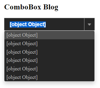
As you can see, this isn't what we want to display. We're seeing this because we've dropped an object in as the data source for the dropdown, so it just shows that each item in the list is an object. Thankfully, Wijmo's Angular dropdown makes it easy to tell the component what exactly we want to display. Inside the app.component.html file, we're going to add some properties to the ComboBox control:
<wj-combo-box [itemsSource]="dataSet" [displayMemberPath]="'country'" [headerPath]="'country'" [dropDownCssClass]="'combo-dropdown'"></wj-combo-box>
Here, we're setting 2 properties: displayMemberPath and headerPath. The displayMemberPath property tells the control which property of the object we want to display, and the headerPath will tell the ComboBox the property what property we want to display in the text box portion of the control. You usually only need to set displayMemberPath, but in this article, we're also modifying what we're displaying in the dropdown elements. That is where headerPath comes in. It allows you to decouple the display values of the dropdown elements and the display value of the input element.
Finally, we're going to add our template to the ComboBox. Wijmo allows you to create custom templates for many of its controls, which are used to override the default display text. Inside the app.component.html file, add the following code:
   <wj-combo-box [itemsSource]="dataSet" [displayMemberPath]="'country'" [headerPath]="'country'" [dropDownCssClass]="'combo-dropdown'">
      <ng-template wjItemTemplate let-item="item" let-itemIndex="itemIndex">
        <div class="item">
            <div class="itemHeader"><img src="{{item.flag}}" alt=""> <b>{{item.country}}</b></div>
            Sales: <b>${{item.sales}}</b><br>
            Expenses: <b>${{item.expenses}}</b>
        </div>
      </ng-template>
    </wj-combo-box>
We're using ng-template to create a wjItemTemplate, which will replace the default HTML used to generate each of the dropdown elements. The item variable is simply used to hold the properties of each of the dropdown elements, which means that we can just use the same property names that our object uses when referencing those properties.
We're also going to add some CSS inside of the app.component.css file to clean up the look a little:
    .item {
        margin: 2px;
    }

    .itemHeader {
        font-size: 16px;
        margin-bottom: 4px;
    }
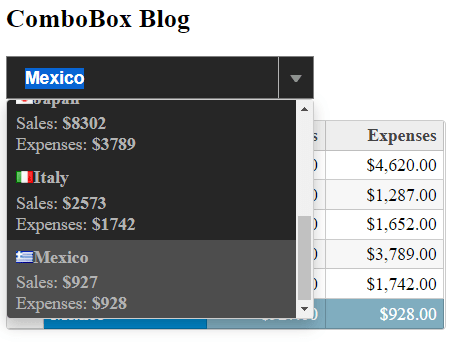
Now, when we run the application, we'll see the following:

Now we've got a dark-themed dropdown control, which displays each country's flag, name, and their current sales and expenses. Very nice! We're almost done. There's still one more thing that we need to do; we need to tie the ComboBox to another control. We'll cover how to do that in the next section.
Integrating the Dropdown Control with other Components
The final step in this application is to tie Wijmo's Angular dropdown to another control, allowing them to work together. In this sample, we'll use Wijmo's FlexGrid control. First, we'll need to import the required module inside of the app.module.ts file:
    import { WjGridModule } from 'angular/common/http';
    ...
    imports: [
        ...
        WjGridModule
    ],
Next, we'll add FlexGrid to the app.component.html file:
    <wj-flex-grid [itemsSource]="dataSet" [selectionMode]="'Row'">
      <wj-flex-grid-column header="Country" binding="country" [width]="'*'"></wj-flex-grid-column>
      <wj-flex-grid-column header="Sales" binding="sales" [format]="'c2'"></wj-flex-grid-column>
      <wj-flex-grid-column header="Expenses" binding="expenses" [format]="'c2'"></wj-flex-grid-column>
    </wj-flex-grid>
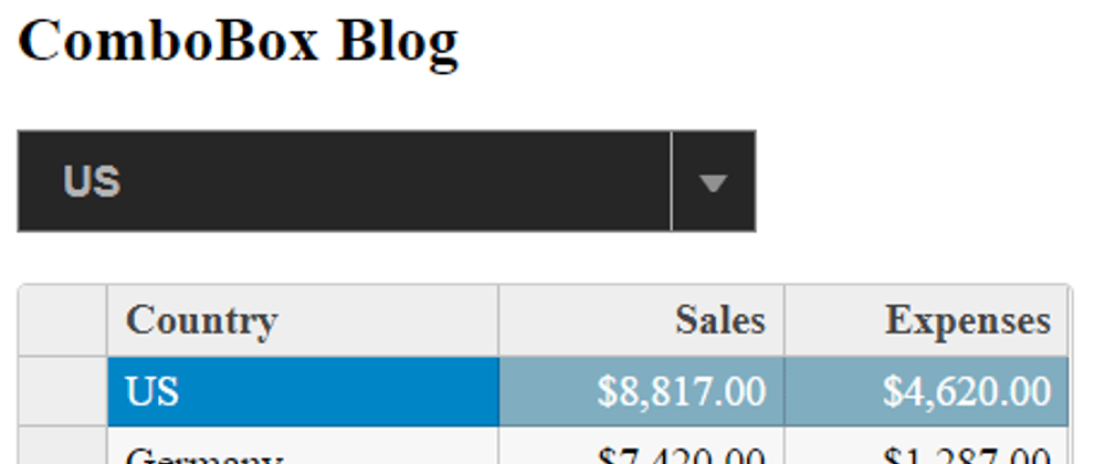
Most of this code isn't relevant to this article, but the one crucial thing that I will cover is that we're using the same data source for each of the controls: the dataSet, which is a CollectionView object. When we run the application, you'll see the following:
The CollectionView object is what allows us to tie the controls together. When two different controls use the same CollectionView, any changes made to one are reflected by another. In the case of the ComboBox and FlexGrid, when the user selects a different item from the dropdown, the grid's selection will change to match the same item. Also, if a user changes any of the cells in the FlexGrid, those changes will be reflected in the ComboBox.
To show this, we'll change "Greece" in the country column to "Mexico" and you'll see the following:
As you can see, the country name in the dropdown has changed from "Greece" to "Mexico" and the selected row in the grid has changed to match the selected item in the dropdown.
Conclusion
As you can see, you can build a very powerful and versatile Angular dropdown with Wijmo's ComboBox. This article scratches the surface of what you can do with the ComboBox; if you'd like more information, we've got demos, documentation, and API references for developers to use. If you'd like to download the finished application, you can find it here.
Happy coding!


Top comments (0)