
Dashboards have become a crucial part of many businesses; the ability to get the information you need at a glance is invaluable, improving both the speed at which your business and employees operate and allowing them to make better decisions based on the data that they are provided.
The data must be portrayed in an easy-to-understand format, allowing managers and executives to quickly understand the data and make decisions based on that data.
Creating a dashboard that is both responsive and efficient is no small feat, however. There are many libraries available online that offer multiple features, and many developers use several UX/UI libraries when building their dashboards.
Fortunately, one library makes it easy to build a dashboard without needing a host of different packages to get it up and running: Wijmo's component library.
Throughout this blog series, we'll take you through the steps of creating a responsive dashboard that outlines information on users that visit our site based on the region that they're in, using both Wijmo as well as CSS so that you can provide easy to consume data, along with the ability to view the data on any device. If you'd like to see the project in its final form, you can view it here.
Defining a Dashboard
Before we get into the weeds and start building our dashboard, let's define what we mean when we say dashboard. Typically, a dashboard would look something like this:

It's nice, compact, and easy to read. This is what managers have in mind when they throw around the idea of having developers build a dashboard.
Many developers have a problem: they aren't graphic designers; they're developers. As a developer, how close can we get to building something like this when we don't have the experience of a graphic designer?
It turns out that when we choose the correct library, we can get very close. Using Wijmo, we can easily create a dashboard that both looks good and provides all of the data that the users will need. The dashboard above is what we'll be building throughout this blog series.
Let's take a look at the tools that we'll be using.
The Toolbox
Angular
I assume that you're familiar with Angular if you're reading this blog. If you aren't, Angular is a TypeScript framework developed by Google, allowing developers to easily construct web applications that are easy to build and deploy.
If you're new to Angular, or it's been a while since you've used it, I recommend looking at Angular's documentation before continuing. We won't be going over the basics of Angular; instead, we're going to be focusing on building our dashboard, so there may be concepts that, if you're new, you won't be familiar with.
Wijmo
Developed by GrapeCity, Wijmo is a fantastic set of enterprise-ready JavaScript/TypeScript UI controls, available in JavaScript, Angular, React, Vue, and Web Components.
Wijmo is an all-in-one UX/UI library that is easy to incorporate into your web applications, allowing you to create excellent dashboards and reporting tools quickly. All of the tools that we'll be incorporating into our dashboard are available out of the box with Wijmo; they require no third-party libraries and are simple to implement, only requiring us to define the features of each control we'll be using, as well as supplying them with our data source.
Many other libraries require us to use DOM refs and fine-tune them to work correctly, but with Wijmo, once we've imported the components that we want to take advantage of, we can begin using them immediately. Below, you can see what Wijmo components we'll be taking advantage of when putting together our dashboard.
FlexGrid

Wijmo's Angular DataGrid, FlexGrid, is the answer to your boring HTML tables. It's a highly customizable grid, allowing users to implement features such as custom cells, aggregates, virtualization, paging, and more! The best part is that incorporating many of these features is as simple as setting a property on the grid, allowing developers to implement highly complex datagrids quickly and easily.
FlexChart
Wijmo's Angular Chart, FlexChart, offers developers over 80 different chart types to choose from, meaning that you'll have a chart for whatever your needs are. These include charts such as column, bar, scatter, line, area, and spline. It also allows you to combine several of these chart types at once!
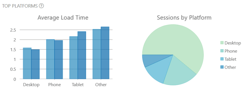
We'll be using FlexChart to implement great-looking pie and bar charts to display our data for our dashboard.
FlexMap
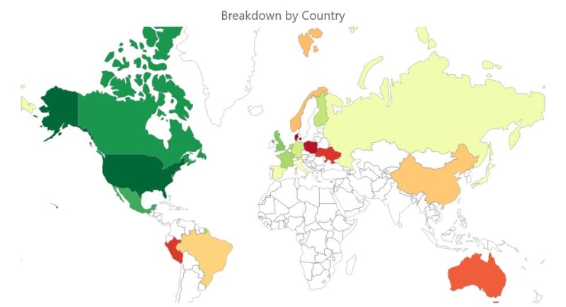
A newcomer to the Wijmo component library, FlexMap is built on top of our FlexChart controls, allowing us to incorporate many of the same features of FlexChart while allowing us to use GeoJSON to build out an interactable choropleth map control. We can assign data to different regions of the map, set a palette scheme to color the regions based on the region's data and assign tooltips to each region to allow users to view data related to the region.
For our dashboard, we're going to be using FlexMap to allow users to display data by region at the click of a button.
Linear Gauge

Wijmo's Linear Gauge will enable users to assess the data being displayed at a glance quickly. In our dashboard, the linear gauge will show the percentage of users that visit the site for each country in relation to all of the other countries where the site is available.
Setting Up the Project
Now that we've outlined the Wijmo components that we'll be using to build our dashboard, it's time to set up the project. For this, we'll be using the Angular CLI and running the following commands:
    ng new wijmo-dashboard

    cd wijmo-dashboard
After the project has been set up and you've navigated into the folder, we'll need to install Wijmo itself. We'll also be installing Bootstrap Icons for a little bit of styling. To install these packages, run the following commands:
    npm i @grapecity/wijmo.all

    npm i bootstrap-icons
Your application will then use NPM to install all of Wijmo's packages.
Once Wijmo has been installed, we'll need to include all of the modules that we'll want to take advantage of inside of the app.module.ts file:
import { NgModule } from '@angular/core';

    import { BrowserModule } from '@angular/platform-browser';

    import { AppRoutingModule } from './app-routing.module';

    import { AppComponent } from './app.component';

    import { WjCoreModule } from '@grapecity/wijmo.angular2.core';

    import { WjGridModule } from '@grapecity/wijmo.angular2.grid';

    import { WjChartModule } from '@grapecity/wijmo.angular2.chart';

    import { WjChartMapModule } from '@grapecity/wijmo.angular2.chart.map';

    import { WjGaugeModule } from '@grapecity/wijmo.angular2.gauge';

    import { WjInputModule } from '@grapecity/wijmo.angular2.input';

    @NgModule({

      declarations: [

        AppComponent

      ],

      imports: [

        BrowserModule,

        AppRoutingModule,

        WjCoreModule,

        WjGridModule,

        WjChartModule,

        WjChartMapModule,

        WjGaugeModule,

        WjInputModule

      ],

      providers: [],

      bootstrap: [AppComponent]

    })

    export class AppModule { }
Below I've also outlined what we'll be using each of the Wijmo modules for:
- WjCoreModule: Wijmo's core module, which is required to be included to utilize Wijmo's other modules, as well as the Tooltip control
- WjGridModule: Required to use Wijmo's FlexGrid control
- WjChartModule: Required to use FlexChart's bar chart, as well as the pie chart
- WjChartMapModule: Required to use the FlexMap control
- WjGaugeModule: Required to use the Linear Gauge control
- WjInputModule: Required to the Popup control
Setting Up the Dashboard CSS
Now that we've installed the packages that we'll be using and imported the modules that we want to use in our dashboard into our app.module.ts file, it's time to set up some of our core styles. Inside of our project's styles.css file, include the following:
@import '@grapecity/wijmo.styles/themes/wijmo.theme.material.css';
    @import '~bootstrap-icons/font/bootstrap-icons.css';

    body {
        margin: 0;
        background-color: hsl(0, 0%, 95%);
    }

    .wj-flexgrid {
        border: none;
    }

    .wj-flexgrid .wj-cell {
        border-left: none;
        border-right: none;
        display: flex;
        align-items: center;
        padding: 6px 16px;
        background: hsl(0, 0%, 100%);
        font-weight: 400;
        height: 48px;
    }

    .wj-flexgrid .wj-colheaders .wj-header.wj-cell {
        height: 56px;
        font-weight: bold;
        font-size: 16px;
        background: hsl(0, 0%, 80%);
        border-right: 1px solid gray;
    }

    .wj-flexgrid .wj-colheaders .wj-header.wj-cell:last-child {
        border-right: none;
    }

    .wj-cell.wj-has-notes:after {
        position: absolute;
        content: '';
        width: 0;
        right: 0;
        top: -10px;
        border: 10px solid transparent;
        border-right: 10px solid red;
        opacity: .5;
    }

    .wj-cell.wj-has-notes:hover:after {
        opacity: 1;
    }
Here, we're doing a couple of different things. The first is that we're importing both our Wijmo style sheet and our Bootstrap icons. These need to be included inside the styles.css file so that the rest of our application can use them.
Second, we're setting up some base styling for our dashboard's . We're simply setting the margin to 0, which will allow us a little more control over the spacing of our components and changing the background color to a slight gray. Our components will stand out on the page a little more with the slight gray.
Finally, we're adding some styling changes to the FlexGrid itself. FlexGrid style changes must be included in the styles.css file. If you try to make any style changes directly in the component that utilizes FlexGrid's CSS file, the changes will not be applied.
Here, we're adding a little more space to the cells of the datagrid and making our column headers more defined. We're also adding some styling to cells that will have tooltips appended to them and make them display when a user hovers over the cell.
Don't worry too much about that now. I'll touch on that once we get to implementing our tooltips.
To round out our styling section, we will set up the layout for our dashboard. To do this, we'll be making use of a CSS grid. This will allow our dashboard to be responsive, formatting itself properly no matter the device it is opened on. Open up your app.component.css file and include the following:
.livemap-grid {
        display: grid;
        gap: 1.5rem;
        grid-auto-columns: minmax(0, 1fr);
        grid-template-areas:
            'one'
            'two'
            'three'
            'five'
            'four'
            'six'
            'seven'
            'eight';
        padding-block: 2rem;
        width: 95%;
        margin-inline: auto;
    }

    .map {
        height: 550px;
        box-shadow: 2px 2px 2px 2px hsl(0, 0%, 70%);
        width: 100%;
    }

    .sessions {
        height: 550px;
        box-shadow: 2px 2px 2px 2px hsl(0, 0%, 70%);
        width: 100%;
    }

    .user-info {
        height: 550px;
        box-shadow: 2px 2px 2px 2px hsl(0, 0%, 70%);
        width: 100%;
    }

    .issue-info {
        height: 550px;
        box-shadow: 2px 2px 2px 2px hsl(0, 0%, 70%);
        width: 100%;
    }

    .top-platforms {
        box-shadow: 2px 2px 2px 2px hsl(0, 0%, 70%);
        width: 100%;
    }

    .browsers {
        box-shadow: 2px 2px 2px 2px hsl(0, 0%, 70%);
        width: 100%;
    }

    .livemap:nth-child(1) {
        grid-area: one;
    }

    .livemap:nth-child(2) {
        grid-area: two;
    }

    .livemap:nth-child(3) {
        grid-area: three;
    }

    .livemap:nth-child(4) {
        grid-area: four;
    }

    .livemap:nth-child(5) {
        grid-area: five;
    }

    .livemap:nth-child(6) {
        grid-area: six;
    }

    .livemap:nth-child(7) {
        grid-area: seven;
    }

    .livemap:nth-child(8) {
        grid-area: eight;
    }

    @media (min-width: 800px) {
        .livemap-grid {
            grid-template-areas:
                'one one one one'
                'two two two two'
                'two two two two'
                'three three three three'
                'three three three three'
                'five five five five'
                'five five five five'
                'four four six six'
                'four four six six'
                'seven seven seven seven'
                'eight eight eight eight';
        }
    }

    @media (min-width: 1200px) {
        .livemap-grid {
            grid-template-areas:
                'one one one one'
                'two two two two'
                'two two two two'
                'three three three four'
                'three three three four'
                'five five five six'
                'five five five six'
                'seven seven eight eight';
        }

        .map {
            height: 550px;
        }
    }
It's a fair amount of CSS, but what it manages to do is very simple. We create our livemap-grid class, which will handle the layout of our dashboard. We set its display property to grid, add some padding and margins to the grid, and designate how we want it to handle the column layout.
By default, it will display each element (of which there will be 8) in a single column. We also set the grid-auto-columns property to minmax(0, 1fr). We do this so that the Wijmo controls that will live inside each of these sections of our grid will expand and shrink properly on-screen resizing, maintaining the full width of their containers.
We then set some styles for each of the different sections of our grid. This is, so they pop out and are distinguishable from the page background. We also go through and assign each of the child elements of the grid to an area; that way, they will be properly situated within our grid.
The final section of code will handle resizing and formatting the grid based on the screen's width. This will handle both the layout of the dashboard on different devices and if a user decides that they want to resize the window.
The final thing we'll be doing in this article is creating the HTML that will render our CSS grid. Open up your app.component.html file and include the following:
    <main class="livemap-grid">

      <div class="livemap load-info"></div>

      <div class="livemap map"></div>

      <div class="livemap user-info"></div>

      <div class="livemap sessions"></div>

      <div class="livemap issue-info"></div>

      <div class="livemap top-countries"></div>

      <div class="livemap top-platforms"></div>

      <div class="livemap browsers"></div>

    </main>
This makes use of all of the CSS classes that we had outlined within our app.component.css file. If you run your application, you should see something like this:

Now, it is not the prettiest, but it does follow the grid outline that we had set up in our CSS file (the current size of our screen is greater than 1200px in width, so we're getting the last layout in our CSS file).
In the next article, we'll incorporate the code that will display some information at the top of the dashboard (within the div using the load-info class) and our charts and gauges. See you there!

Top comments (0)