
Creating illustrations in CSS is like a hobby with perks 🎨 . I learned to create illustrations using CSS a few weeks earlier. So I put my skills in creating a moving bot illustration.

Requirements:
- HTML
- CSS
Let's Start 🏁
HTML structure:
   <div class="container">
       <div class="bot">
           <div class="bot_head">
               <div class="left_eye"></div>
               <div class="right_eye"></div>
           </div>
           <div class="stomach"></div>
       </div>
   </div>
.container is to wrap the whole screen
.bot is to wrap the bot, it will be used to set the maximum width and height of the bot
.bot_head is for the head of the bot
.left_eye & .right_eye is for the eyes of the bot
.stomach is for the lower part of the bot
Apply CSS:
Set width,height 100% of both html & body
   html,
   body{
      width:100%;
      height:100%;
      padding:0px;
      margin:0px;
      }
Set
position: absolute
to all tags so that left, right, bottom, top attributes can be used.
    *{
      position:absolute;
    }

    *:after,*:before{
      position:absolute;
      content:'';
    }
Apply flexbox in .container in order to justify the bot at the centre of the screen.
   .container{
      width:100%;
      height:100%;
      display:flex;
      justify-content:center;
      align-items:center;
      }
set custom width & height for the bot container which is .bot, use flexbox to make its content justify & align centre.
   .bot{
       width:250px;
       height:400px;
       display:flex;
       align-items:center;
       flex-direction:column;
       }
now we can finally start with styling bot's body parts. ✨
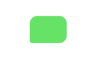
BotHead:
border-radius will be useful to create the head of bot
   .bot_head{
       background:#66e366;
       width:150px;
       height:110px;
       top:10%;
       border-radius:30px 30px 30px 10px;
}
border-radius: top-left top-right bottom-right bottom-left
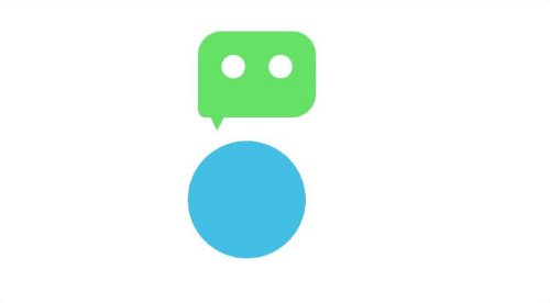
The bot_head will look like this
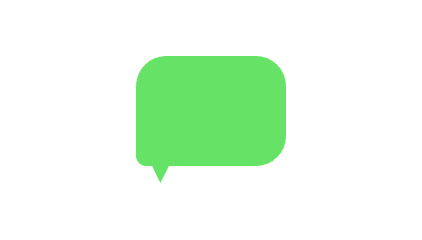
In order to create a pointed triangle in the bot head, which will make it look like a chatbot head, we will use the :after pseudo-elements of CSS .
  .bot_head:after{
       width:40px;
       height:40px;
       bottom:-17px;
       left:5px;
       background:inherit;
       clip-path: polygon(48% 100%, 0 0, 100% 0);
     }
The clip-path CSS property creates a clipping region that sets what part of an element should be shown .
You can use BennettFeely to generate clip-path.
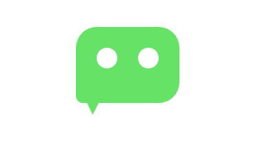
Eyes:
For the Eyes, we will create two circles both for left and right eyes
   .left_eye{
         width:30px;
         height:30px;
         background:white;
         border-radius:50%;
         top:30px;
         left:30px;
         }
    .right_eye{
         width:30px;
         height:30px;
         background:white;
         border-radius:50%;
         top:30px;
         right:30px;
     }
left:30px will move the .left_eye 30px from the left.
right:30px will move the .right_eye 30px from right.
we have written similar code for both left_eye and right_eye in order to use separate left & right CSS properties. However, using sass can reduce the repetition but we are not using it in this article.
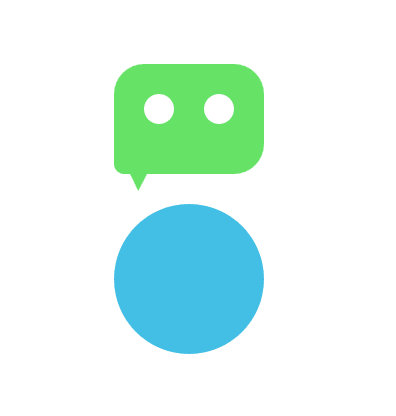
Stomach Part:
create a big circle and move it 45% from top
   .stomach{
      width:150px;
      height:150px;
      border-radius:50%;
      top:45%;
      background:#43bfe6;
     }
Awesome we have our bot ready.
Animation:
Definition by Mozilla docs:
''CSS animations make it possible to animate transitions from one CSS style configuration to another. Animations consist of two components, a style describing the CSS animation and a set of keyframes that indicate the start and end states of the animation’s style, as well as possible intermediate waypoints.''
The CSS style properties & keyframes are used in order to create animations.
How to create Keyframes:
@keyframes AnimationName{
     0%{
        /* some css property */
        left: 20px;
      },
     50%{
        left:40px;
      }
     100%{
        /* some css property */
        left: 0px;
        }
}
here AnimationName can be any name you prefer to use like jump, bounce, slide etc.
we are telling keyframe that at 0% of animation make the element shift to left 20px, at 50% 40px to the left and at 100% of animation return back to 0px from left.
How to use Keyframes:
CSS animation property is used to apply the keyframes.
Syntax:
animation: animation-name animation-duration animation-timing-function animation-iteration-count;
animation-name: identifier for the keyframe.
animation-duration: how long the animation should take to finish.
animation-timing-function: It specifies the speed curve of an animation.
animation-iteration-count: how many times the animation should iterate.
You can read in detail about animation at css-tricks
let's apply the animation in our cute bot.
create keyframes for the stomach:
   @keyframes stomach_move{
    0%,50%,100%{
       left:15%; /* we can set same style for multiple percentage */
     }
    25%{
      left:-35%;
     }
    75%{
      left:100%;
     }
   }
At 0%, 50% & 100% of the animation the bot will be at 15%(towards right side) from the left,it is the starting and ending position of animation.
At 25% the bot will move -35%(towards left side) from the left.
At 75% the bot will move 100%(towards right side) from the left.
In left:100% the 100% is the complete width of the .bot class which is 250px.
Apply stomach_move keyframe in .stomach class under animation property
   .stomach{
       width:150px;
       height:150px;
       border-radius:50%;
       top:45%;
       background:#43bfe6;
       animation: stomach_move 3s ease infinite;
    }
The stomach is moving left & right.
The animation-iteration-count is set to infinite which will make the animation iterate infinitely.
create keyframes for the bot_head:
   @keyframes bot_head_motion{
     0%,50%,100%{
       left:25%;
     }
     25%{
      left:-45%;
      transform:rotate(-20deg)
     }
     75%{
      left:90%;
      transform:rotate(20deg)
      }
  }
''The transform property applies a 2D or 3D transformation to an element. This property allows you to rotate, scale, move, skew, etc., elements. ''
At 25% the bot head will rotate -20deg and at 75% it will rotate by 20deg.
Apply bot_head_motion keyframe in .bot_head class
      .bot_head{
        background:#66e366;
        width:150px;
        height:110px;
        top:10%;
        border-radius:30px 30px 30px 10px;
        animation: bot_head_motion 3s ease infinite;
}
and tada 🎉 the bot is moving 😄
Here is my codepen:
ThankYou for reading this 😄
Feel free to customize the animations on your own.

Top comments (0)