Charts are used to represent data and make it more understandable. Most people comprehend and recall the information in a chart more quickly than in a block of text. As a React developer, you will almost certainly need to deal with React graph visualization to display data from an API.
Depending on the size of your project, you may either want to build a chart component from scratch or rely on third-party data visualization libraries. The cons of building your own component include excessive time consumption and continuous maintenance of the code. However, with the help of third-party React visualization libraries, you can easily create insightful data visualizations.
This article contains a list of the best ReactJS chart libraries, arranged in order of highest weekly downloads according to NPM Trends. To determine the best React data visualization library, we’ll also consider the number of forks and stars on Github for each library are also highlighted.
The Top 6 Libraries for React Graph Visualization
1) Recharts
Recharts is a React graph visualization library built on SVG elements with a light reliance on D3 submodules. Charts are easily created from decoupled, reusable ReactJS components. These charts can be customized by changing props and passing in custom components.
This React data visualization library is composable, reliable, powerful, and trusted by many professional developers.
Installation:
$ npm i recharts
Sample data:
const data = [
 {
  name: "Page A",
  uv: 4000,
  pv: 2400,
  amt: 2400,
 },
 {
  name: "Page B",
  uv: 3000,
  pv: 1398,
  amt: 2210,
 },
 {
  name: "Page C",
  uv: 2000,
  pv: 9800,
  amt: 2290,
 },
];
Example:
function App() {
 return (
  <LineChart width={500} height={300} data={data}>
   <XAxis dataKey="name" />
   <YAxis />
   <Line type="monotone" dataKey="pv" stroke="#8884d8" activeDot={{ r: 8 }} />
   <Line type="monotone" dataKey="uv" stroke="#82ca9d" />
  </LineChart>
 );
}
Result:
Rechart averages 1,100,000+ weekly downloads, and has 18.8k stars and 1.4k forks on Github.
2) React ChartJS 2
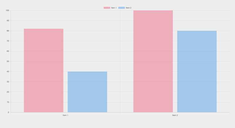
React ChartJS 2 is a wrapper for the Chart.js library, which is a Javascript chart library for React used to build chart components with the HTML5 canvas element. In addition, Chart.js features can be used in React ChartJS 2. To get the most out of React ChartJS 2, you need to be familiar with the Chart.js docs.
This library offers nine components: <Chart />, <Bar />, <Line />, <Pie />, <Doughnut />, <PolarArea />, <Radar />, <Scatter /> and <Bubble />. Each component can be utilized to build powerful, responsive charts, depending on your chart preference.
Installation:
npm i chart.js react-chartjs-2
Example:
import { Bar } from "react-chartjs-2";
import { Chart as ChartJS, CategoryScale, LinearScale, BarElement, Title, Tooltip, Legend } from "chart.js";

ChartJS.register(CategoryScale, LinearScale, BarElement, Title, Tooltip, Legend);

const App = () => {
 const data = {
  labels: ["Item 1", "Item 2"],
  datasets: [
   {
    label: "Item 1",
    data: [82, 100],
    borderColor: "black",
    backgroundColor: "rgba(255, 99, 132, 0.5)",
   },
   {
    label: "Item 2",
    data: [40, 80],
    borderColor: "black",
    backgroundColor: "rgba(53, 162, 235, 0.5)",
   },
    ],
   };
    return (
     <Bar
      data={data}
      options={{
       responsive: true,
     }}
    />
   );
  };
Result:
The React ChartJS 2 library averages 600,000+ weekly downloads and has 5.3k stars and 1.1k forks on Github.
3) Victory
Victory is a ReactJS and React Native chart library created by Formidable. It’s one of the best React libraries for data visualization. It's based on ReactJS and D3, and comes with a slew of fully configurable charts pre-installed.
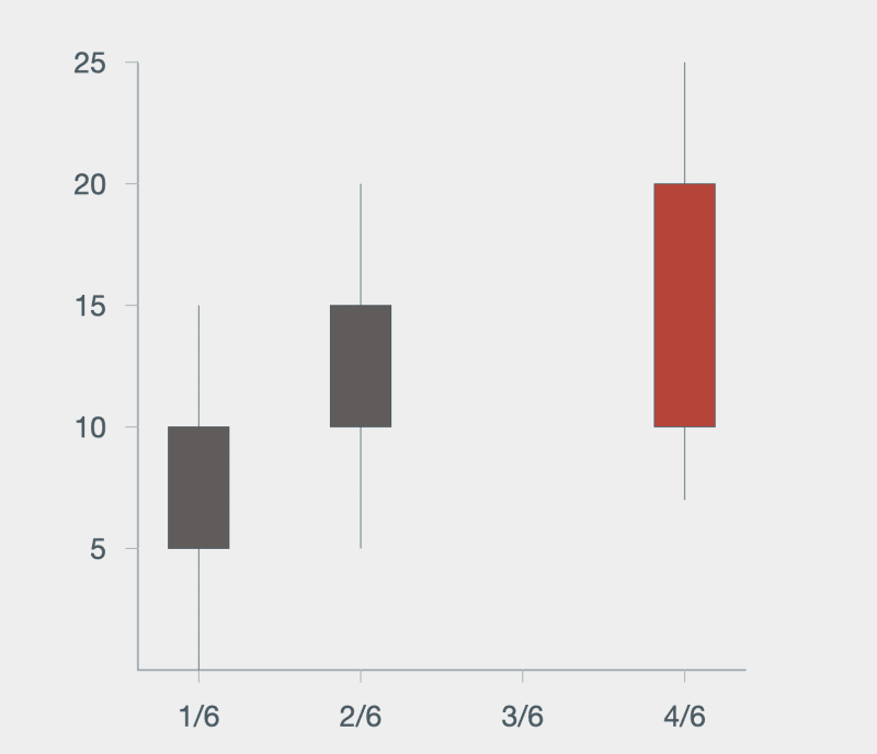
Victory has a number of charting widgets and a standard API across all projects. This powerful charting tool for React graph visualization also allows users to effortlessly add line, bar, pie, and candlestick charts into their projects.
Installation:
npm install victory
Example:
const data=[
 {x: new Date(2016, 6, 1), open: 5, close: 10, high: 15, low: 0},
 {x: new Date(2016, 6, 2), open: 10, close: 15, high: 20, low: 5},
 {x: new Date(2016, 6, 4), open: 20, close: 10, high: 25, low: 7},
]

const App = () => {
 return (
  <VictoryChart theme={VictoryTheme.material} domainPadding={{ x: 25 }} scale={{ x: "time" }}>
  <VictoryAxis tickFormat={(t) => `${t.getDate()}/${t.getMonth()}`} />
  <VictoryAxis dependentAxis />
  <VictoryCandlestick candleColors={{ positive: "#5f5c5b", negative: "#c43a31" }} data={data} />
 </VictoryChart>
 );
};
Result:
Victory averages 180,000+ weekly downloads and has 9.9k stars and 517 forks on Github.
4) React Vis
React Vis is a React graph visualization library built by Uber. It is an easy-to-use library that offers components that render data visualization charts including line, area, bar, pie, or donut charts, as well as heat maps, hexagon heatmaps, sunbursts, radar charts, scatterplots, contour plots, parallel coordinates, and tree maps.
Installation:
npm i react-vis
Sample data:
const data = [
 {x: 0, y: 8},
 {x: 1, y: 5},
 {x: 2, y: 4},
 {x: 3, y: 9},
 {x: 4, y: 1},
];
Example:
<XYPlot height={600} width={600}>
 <LineSeries data={data} />
 <VerticalGridLines />
 <HorizontalGridLines />
 <XAxis />
 <YAxis />
</XYPlot>
Result:
React Vis averages 100,000+ weekly downloads and has 8.3k stars and 850 forks on Github.
5) visx
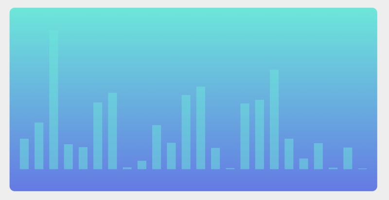
visx is a data visualization library developed by Airbnb. This is not a charting library, but rather a tool that combines the capabilities of D3 and ReactJS, allowing you to use visualization primitives to build your own charting library.
visx is divided into several packages, keeping the bundle size down and allows you to download only the packages needed. It has great documentation and a gallery of React graph visualization examples to get you started.
Installation:
npm i @visx/visx
Example:
import React, { useMemo } from 'react';
import { Bar } from '@visx/shape';
import { Group } from '@visx/group';
import { GradientTealBlue } from '@visx/gradient';
import letterFrequency from '@visx/mock-data/lib/mocks/letterFrequency';
import { scaleBand, scaleLinear } from '@visx/scale';

const data = letterFrequency.slice(2);
const verticalMargin = 120;

// accessors
const getLetter = (d) => d.letter;
const getLetterFrequency = (d) => Number(d.frequency) * 100;

function App({ width = 1000, height = 500, events = false }) {
 // bounds
 const xMax = width;
 const yMax = height - verticalMargin;

// scales, memoize for performance
const xScale = useMemo(
 () =>
  scaleBand({
   range: [0, xMax],
   round: true,
   domain: data.map(getLetter),
   padding: 0.4,
  }),
 [xMax],
);
const yScale = useMemo(
 () =>
  scaleLinear({
   range: [yMax, 0],
   round: true,
   domain: [0, Math.max(...data.map(getLetterFrequency))],
  }),
 [yMax],
);

return width < 10 ? null : (
 <svg width={width} height={height}>
  <GradientTealBlue id="teal" />
  <rect width={width} height={height} fill="url(#teal)" rx={14} />
  <Group top={verticalMargin / 2}>
   {data.map((d) => {
    const letter = getLetter(d);
    const barWidth = xScale.bandwidth();
    const barHeight = yMax - (yScale(getLetterFrequency(d)) ?? 0);
    const barX = xScale(letter);
    const barY = yMax - barHeight;
    return (
     <Bar
      key={`bar-${letter}`}
      x={barX}
      y={barY}
      width={barWidth}
      height={barHeight}
      fill="rgba(23, 233, 217, .5)"
      onClick={() => {
       if (events) alert(`clicked: ${JSON.stringify(Object.values(d))}`);
      }}
     />
    );
   })}
   </Group>
  </svg>
 );
}
Result:
visx averages 12,000+ weekly downloads and has 15.7k stars and 611 forks on Github.
6) Nivo
Nivo is built on D3 and provides a variety of templates for data presentation and data visualization with React. It’s one of the few libraries that provide server-side rendering and fully declarative charts.
Features of Nivo include support for motion/transitions (React motion), HTML, Canvas, and SVG charts, isomorphic rendering, and a component playground.
Installation:
npm i @nivo/core @nivo/pie
Example:
import { Pie } from "@nivo/pie";
import { ThemeProvider, SvgWrapper } from "@nivo/core";

const data = [
 {
  id: "Item1",
  value: 410,
  color: "hsl(19, 70%, 50%)"
 },
 {
  id: "Item2",
  value: 175,
  color: "hsl(213, 70%, 50%)"
 },
 {
  id: "Item3",
  value: 128,
  color: "hsl(58, 70%, 50%)"
 }
];

const App = () => (
 <div>
  <Pie
   width={400}
   height={400}
   data={data}
   margin={{
    top: 40,
    right: 80,
    bottom: 80,
    left: 80
   }}
   innerRadius={0.5}
   padAngle={0.7}
   cornerRadius={3}
   borderColor="inherit:darker(0.6)"
  />
  <ThemeProvider>
   <SvgWrapper
    height={100}
    width={400}
    margin={{ left: 0, right: 0, top: 0, bottom: 0 }}
   >
   </SvgWrapper>
  </ThemeProvider>
 </div>
);
Result:
Nivo averages 5,000+ weekly downloads, 10.4k stars and 845 forks on Github.
Conclusion
A ReactJS charting library will make work easier for you. It’s best to check out each of these React graph visualization libraries and their features before deciding which one to use. The type of features you want and the requirements of your project will determine which React visualization library is best for your needs.


Top comments (0)