

The CSS float and clear properties go hand in hand and help create web layouts. Therefore, learning how floating elements behave using these properties is crucial. In this article, you will learn what the CSS float and clear properties are, what they do, and how they work. You will also learn the techniques to clear floats and how clearfix works.
What are CSS float and clear?
CSS float and clear are positioning properties for aligning HTML elements. The CSS float property determines where an element should float. It moves an element to the right or left of its container, making it possible for other elements to wrap around it.
On the other hand, the CSS clear property determines if an element is next to the floated element or if it appears below the floated element.
Why use CSS float and clear?
There are many reasons why we use the CSS float and clear properties, including:
- To prevent overlapping by clearing the floating property
- To build clean layouts
- To float images and wrap text around them
- To position and format the content of web pages
How to use float
When you float an element on a web page, it remains part of the flow, allowing the adjacent elements to flow around it. The floated element will move to the right or left until it touches the edge of its containing box or another floated element. You can't float an element to a container's center, top, or bottom.
To use float, you need a CSS selector and to define the float property within the brackets.
The structure is:
element {
float: value;
}
To explain how float works, we will look at the different float property values with examples.
Types of float values
Float has the following values:
Left: This property value allows an element to float to the container's left. It moves an element to the left of the parent element and then allows other elements to wrap around it.
Let’s take a closer look:
<!DOCTYPE html>
  <html>
  <head>
    <style>
 .container {
 border: solid thin blue;
 padding: 5px;
 background-color: orange;
      }
 .image {
 float: left;
 height: 170px;
 width: 170px;
 background-color: red;
 margin-right: 11px;
      }
    </style>
  </head>
<body>
  <h1>float left</h1>
  <div class="container">
    <div class="image"></div>
    <p class="text">
 Lorem ipsum dolor sit amet, consectetur adipiscing elit. Phasellus imperdiet, nulla et dictum interdum, nisi lorem egestas odio, vitae scelerisque enim ligula venenatis dolor. Maecenas nisl est, ultrices nec congue eget, auctor vitae massa.
 Fusce luctus vestibulum augue ut aliquet. Mauris ante ligula, facilisis sed ornare eu, lobortis in odio. Praesent convallis urna a lacus interdum ut hendrerit risus congue. Nunc sagittis dictum nisi, sed ullamcorper ipsum dignissim ac. In at
 libero sed nunc venenatis imperdiet sengue eros non fermentum. Sed dapibus pulvinar nibh is quis diam velitipsum dolor sit amet, consectetur adipiscing elit. Phasellus imperdiet, nulla et dictum interdum, nisi lorem egestas odio, vitae
 scelerisque enim ligula venenatis dolor. Maecenas nisl est, ultrices nec congue eget, auctor vitae massa. Fusce luctus vestibulum augue ut aliquet. Mauris ante ligula, facilisis sed ornare eu, lobortis in odio. Praesent convallis urna a lacus
 interdum ut hendrerit risus congue. Nunc sagittis dictum nisi, sed ullamcorper ipsum dignissim ac. In at libero sed nunc venenatis imperdiet sengue eros non fermentum. Sed dapibus pulvinar nibh is quis diam velit.</p>
  </div>
</body>
</html>
Here's the result:

The box floats to the left of its parent container, allowing the text to wrap around it and fill the space to the right.
Right: This value allows an element to float to the container's right. It moves an element to the right of the parent element and lets other elements wrap around it.
<!DOCTYPE html>
  <html>
  <head>

<style>
 .container {
 border: solid thin blue;
 padding: 5px;
 background-color: orange;
      }
 .image {
 float: right;
 height: 170px;
 width: 170px;
 background-color: red;
 margin-right: 11px;
      }
    </style>
  </head>
<body>
  <h1>The float Right Property</h1>
  <div class="container">
    <div class="image"></div>
    <p class="text">
 Lorem ipsum dolor sit amet, consectetur adipiscing elit. Phasellus imperdiet, nulla et dictum interdum, nisi lorem egestas odio, vitae scelerisque enim ligula venenatis dolor. Maecenas nisl est, ultrices nec congue eget, auctor vitae massa. Fusce luctus vestibulum augue ut aliquet. Mauris ante ligula, facilisis sed ornare eu, lobortis in odio. Praesent convallis urna a lacus interdum ut hendrerit risus congue. Nunc sagittis dictum nisi, sed ullamcorper ipsum dignissim ac. sed nunc venenatis imperdiet sengue eros non fermentum. Sed dapibus pulvinar nibh is quis diam velitipsum dolor sit amet, consect
eturaipiscing elit. Phasellus imperdiet, nulla et dictum interdum, nisi lorem egestas odio, vitaescelerisque enim ligula venenatis dolor. Maecenas nisl est, ultrices nec congue eget, auctor vitae massa. Fusce luctus vestibulum augue ut aliquet. Mauris ante ligula, facilisis sed ornare eu, lobortis in odio. Praesent convallis urna a lacus interdum ut hendrerit risus congue. Nunc sagittis dictum nisi, sed ullamcorper ipsum dignissim ac. In at libero sed nunc venenatis imperdiet sengue eros non fermentum. Sed dapibus pulvinar nibh is quis diam velit.</p>
  </div>
</body>
</html>
Here's the result:
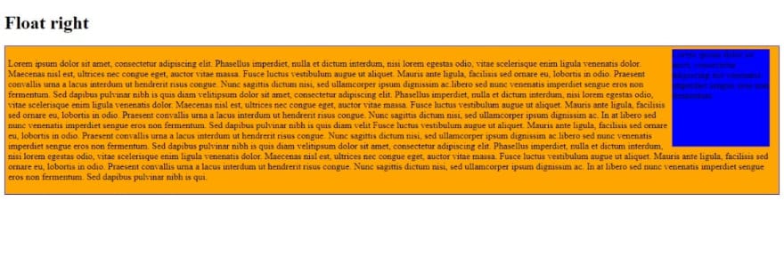
The box floats to the right of its parent container, allowing the text to wrap around it and fill the space to the left.
None: This property is the default value and does not float any element.
Inherit: This property allows an element to inherit the float value of the parent element.
How the clear property works
The problem with floats is their effect on the parent element that contains them. If only floated elements exist within the parent element, there could be a collapse. This collapse can make the layout appear abnormal or cause cross-browser problems. To be able to handle this issue, we clear the float. We use the CSS clear property when we want the element after the floated element to be below instead of right or left. To clear floats, we need to match the clear to the float. Any side an element floats to is the side you will clear. Therefore, the floated element will always float on the web page, but the element you clear will emerge below it.
We will look at the different clear property values with examples to better explain how the CSS clear property works.
Types of clear values
None: This is the default value of clear — it enables elements to float on both sides of a cleared element.
Right: This value prevents elements from floating on the right side of a cleared element. So, it does not allow wrapping around the right floating element. For example:
.image {
 float: right;
 height: 170px;
 width: 170px;
 background-color: blue;
 margin-right: 11px;
      }
 .text{
 clear: right;
      }
Here is the result:

The float is cleared to the right, so the text moves below the element instead of wrapping around it.
Left: This value prevents elements from floating on the left side of a cleared element; it doesn’t allow wrapping around the left of a floating element. Here is an example of the left clear value.
.image {
 float: left;
 height: 170px;
 width: 170px;
 background-color: blue;
 margin-right: 11px;
      }
 .text{
 clear: left;
      }
Here’s the result:

Here, the element is floated to the left and cleared to the left, thereby moving the text below instead of wrapping around it.
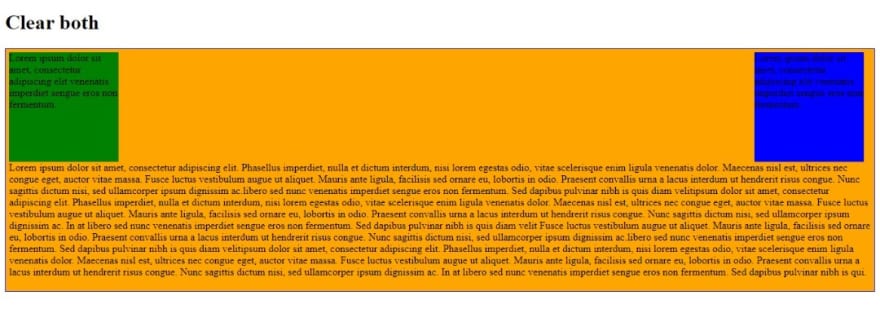
Both: This clear property value prevents elements from floating on either side of a cleared element. It clears all floats in an element and stops any element from wrapping around an adjacent floating element. For example:
<!DOCTYPE html>
  <html>
  <head>
    <style>
 .container {
 border: solid thin blue;
 padding: 5px;
 background-color: orange;
      }
 .image1 {
 float: right;
 height: 170px;
 width: 170px;
 background-color: blue;
 margin-right: 11px;
      }
 .image2 {
 float: left;
 height: 170px;
 width: 170px;
 background-color: green;
 margin-right: 11px;
      }
 .text {
 clear:both;
      }
    </style>
  </head>
<body>
  <h1>Clear both </h1>
  <div class="container">
    <div class="image1"> Lorem ipsum dolor sit amet, consectetur adipiscing elit venenatis imperdiet sengue eros non fermentum.</div>
    <div class="image2"> Lorem ipsum dolor sit amet, consectetur adipiscing elit venenatis imperdiet sengue eros non fermentum.</div>
    <p class="text">
 Lorem ipsum dolor sit amet, consectetur adipiscing elit. Phasellus imperdiet, nulla et dictum interdum, nisi lorem egestas odio, vitae scelerisque enim ligula venenatis dolor. Maecenas nisl est, ultrices nec congue eget, auctor vitae massa.
 Fusce luctus vestibulum augue ut aliquet. Mauris ante ligula, facilisis sed ornare eu, lobortis in odio. Praesent convallis urna a lacus interdum ut hendrerit risus congue. Nunc sagittis dictum nisi, sed ullamcorper ipsum dignissim ac.
 sed nunc venenatis imperdiet sengue eros non fermentum. Sed dapibus pulvinar nibh is quis diam velitipsum dolor sit amet, consectetur adipiscing elit. Phasellus imperdiet, nulla et dictum interdum, nisi lorem egestas odio, vitae
 scelerisque enim ligula venenatis dolor. Maecenas nisl est, ultrices nec congue eget, auctor vitae massa. Fusce luctus vestibulum augue ut aliquet. Mauris ante ligula, facilisis sed ornare eu, lobortis in odio. Praesent convallis urna a lacus
 interdum ut hendrerit risus congue. Nunc sagittis dictum nisi, sed ullamcorper ipsum dignissim ac. In at libero sed nunc venenatis imperdiet sengue eros non fermentum. Sed dapibus pulvinar nibh is quis diam velit Fusce luctus vestibulum augue ut aliquet. Mauris ante ligula, facilisis sed ornare eu, lobortis in odio. Praesent convallis urna a lacus interdum ut hendrerit risus congue. Nunc sagittis dictum nisi, sed ullamcorper ipsum dignissim ac.
 sed nunc venenatis imperdiet sengue eros non fermentum. Sed dapibus pulvinar nibh is quis diam velitipsum dolor sit amet, consectetur adipiscing elit. Phasellus imperdiet, nulla et dictum interdum, nisi lorem egestas odio, vitae
 scelerisque enim ligula venenatis dolor. Maecenas nisl est, ultrices nec congue eget, auctor vitae massa. Fusce luctus vestibulum augue ut aliquet. Mauris ante ligula, facilisis sed ornare eu, lobortis in odio. Praesent convallis urna a lacus
 interdum ut hendrerit risus congue. Nunc sagittis dictum nisi, sed ullamcorper ipsum dignissim ac. In at libero sed nunc venenatis imperdiet sengue eros non fermentum. Sed dapibus pulvinar nibh is qui.</p>
  </div>
</body>
</html>
Here is the result:
Inherit: This value lets an element inherit the clear value of the parent element.
Techniques for clearing floats
There are several methods to clear a float; the best one to use depends on your situation. Let's look at ways of clearing floats in CSS.
The simple method
Use clear: both after floating elements. This comes in handy in a situation where you know where the next element will be, plus this approach is as straightforward as it gets.
Empty Div Method
This involves using an empty div with a default browser styling to clear floats.
<div style="clear:both"></div>
Overflow Method
This method depends on the overflow CSS property of the parent element. Unfortunately, the overflow property is not specifically for clearing floats. Still, if the parent element property is on auto or hidden, there will be an expansion of the parent to house the floats, which will clear the float of the following elements.
Example:
<!DOCTYPE html>
  <html>
  <head>
    <style>
 div {
 background: #4CAF50;
 color: white;
 padding: 15px;
 width: 400px;
 height: 400px;
 overflow: scroll;
 border: 1px solid #ccc;
      }
 p{
 color: white;
    }
    </style>
    </style>
  </head>

<body>
  <h1>Overflow Method </h1>
  <div class="overflow">
    <p class="text">
 Lorem ipsum dolor sit amet, consectetur adipiscing elit. Phasellus imperdiet, nulla et dictum interdum, nisi lorem egestas odio, vitae scelerisque enim ligula venenatis dolor. Maecenas nisl est, ultrices nec congue eget, auctor vitae massa.
 Fusce luctus vestibulum augue ut aliquet. Mauris ante ligula, facilisis sed ornare eu, lobortis in odio. Praesent convallis urna a lacus interdum ut hendrerit risus congue. Nunc sagittis dictum nisi, sed ullamcorper ipsum dignissim ac.
 sed nunc venenatis imperdiet sengue eros non fermentum. Sed dapibus pulvinar nibh is quis diam velitipsum dolor sit amet, consectetur adipiscing elit. Phasellus imperdiet, nulla et dictum interdum, nisi lorem egestas odio, vitae
 scelerisque enim ligula venenatis dolor. Maecenas nisl est, ultrices nec congue eget, auctor vitae massa. Fusce luctus vestibulum augue ut aliquet. Mauris ante ligula, facilisis sed ornare eu, lobortis in odio. Praesent convallis urna a lacus
 interdum ut hendrerit risus congue. Nunc sagittis dictum nisi, sed ullamcorper ipsum dignissim ac. In at libero sed nunc venenatis imperdiet sengue eros non fermentum. Sed dapibus pulvinar nibh is quis diam velit Fusce luctus vestibulum augue
 ut aliquet. Mauris ante ligula, facilisis sed ornare eu, lobortis in odio. Praesent convallis urna a lacus interdum ut hendrerit risus congue. Nunc sagittis dictum nisi, sed ullamcorper ipsum dignissim ac.
 sed nunc venenatis imperdiet sengue eros non fermentum. Sed dapibus pulvinar nibh is quis diam velitipsum dolor sit amet, consectetur adipiscing elit. Phasellus imperdiet, nulla et dictum interdum, nisi lorem egestas odio, vitae
 scelerisque enim ligula venenatis dolor. Maecenas nisl est, ultrices nec congue eget, auctor vitae massa. Fusce luctus vestibulum augue ut aliquet. Mauris ante ligula, facilisis sed ornare eu, lobortis in odio. Praesent convallis urna a lacus
 interdum ut hendrerit risus congue. Nunc sagittis dictum nisi, sed ullamcorper ipsum dignissim ac. In at libero sed nunc venenatis imperdiet sengue eros non fermentum. Sed dapibus pulvinar nibh is qui. Lorem ipsum dolor sit amet, consectetur
 adipiscing elit. Phasellus imperdiet, nulla et dictum interdum, nisi lorem egestas odio, vitae scelerisque enim ligula venenatis dolor. Maecenas nisl est, ultrices nec congue eget, auctor vitae massa.
 Fusce luctus vestibulum augue ut aliquet. Mauris ante ligula, facilisis sed ornare eu, lobortis in odio. Praesent convallis urna a lacus interdum ut hendrerit risus congue. Nunc sagittis dictum nisi, sed ullamcorper ipsum dignissim ac.
 sed nunc venenatis imperdiet sengue eros non fermentum. Sed dapibus pulvinar nibh is quis diam velitipsum dolor sit amet, consectetur adipiscing elit. Phasellus imperdiet, nulla et dictum interdum, nisi lorem egestas odio, vitae
 scelerisque enim ligula venenatis dolor. Maecenas nisl est, ultrices nec congue eget, auctor vitae massa. Fusce luctus vestibulum augue ut aliquet. Mauris ante ligula, facilisis sed ornare eu, lobortis in odio. Praesent convallis urna a lacus
 interdum ut hendrerit risus congue. Nunc sagittis dictum nisi, sed ullamcorper ipsum dignissim ac. In at libero sed nunc venenatis imperdiet sengue eros non fermentum. Sed dapibus pulvinar nibh is quis diam velit Fusce luctus vestibulum augue
 ut aliquet. Mauris ante ligula, facilisis sed ornare eu, lobortis in odio. Praesent convallis urna a lacus interdum ut hendrerit risus congue. Nunc sagittis dictum nisi, sed ullamcorper ipsum dignissim ac.
 sed nunc venenatis imperdiet sengue eros non fermentum. Sed dapibus pulvinar nibh is quis diam velitipsum dolor sit amet, consectetur adipiscing elit. Phasellus imperdiet, nulla et dictum interdum, nisi lorem egestas odio, vitae
 scelerisque enim ligula venenatis dolor. Maecenas nisl est, ultrices nec congue eget, auctor vitae massa. Fusce luctus vestibulum augue ut aliquet. Mauris ante ligula, facilisis sed ornare eu, lobortis in odio. Praesent convallis urna a lacus
 interdum ut hendrerit risus congue. Nunc sagittis dictum nisi, sed ullamcorper ipsum dignissim ac. In at libero sed nunc venenatis imperdiet sengue eros non fermentum. Sed dapibus pulvinar nibh is qui
    </P>
  </div>
</body>
</html>
Check out the result:

Notice the content of the element is too big and the overflow method helps to house it by using a scrollbar.
Clearfix Hack
A Clearfix hack fixes the problem of overflow outside a floating element container. This overflow happens when a floated element is taller than the containing element. The overflow: auto clearfix helps to solve the problem as long as you can keep the margins and padding to avoid creating scrollbars.
Example of a floated element without clearfix:
<!DOCTYPE html>
<html>
<head>
<style>
div {
 border: 3px solid red;
 padding: 5px;
}
.image{
 float:right;
 height: 170px;
 width: 170px;
 background-color: blue;
}
</style>
</head>
<body>
<h2>Without Clearfix</h2>
<p>The image is floated to the right but taller than the element containing it. So it overflows outside of its container.</p>
<div class="container">
<div class="image"></div>
</div>
</body>
</html>
Check out the result:

Example of a floated element with Clearfix:
<!DOCTYPE html>
  <html>

  <head>
    <style>
 div {
 border: 3px solid red;
 padding: 5px;
      }

 .image {
 float: right;
 height: 170px;
 width: 170px;
 background-color: blue;
      }

 .clearfix {
 overflow: auto;
      }
    </style>
  </head>

<body>
  <h2>With Clearfix</h2>
  <div class="clearfix">
    <div class="image"></div>
  </div>
</body>

</html>
Check out the result:

The modern clearfix hack is safer to use. This method uses a pseudo selector (: after). Instead of using the parent element's overflow property, you use an extra class such as clearfix.
Apply this code to follow the clearfix method:
<!DOCTYPE html>
  <html>
  <head>
    <style>
 div {
 border: 3px solid red;
 padding: 5px;
      }
 .img1 {
 float: right;
      }
 .img2 {
 float: right;
      }
 .img1 {
 background-color: blue;
      }
 .img2 {
 background-color: blue;
      }
 .clearfix::after {
 content: "";
 clear: both;
 display: table;
      }
    </style>
  </head>
<body>
  <h1>Without a Clearfix</h1>
  <p>The image is floated to the right, and it is taller than the element containing it, so it overflows outside of its container.</p>
  <div>
    <img class="img1" width="170" height="170">
  </div>
  <h1 style="clear:right">With New Modern Clearfix</h1>
  <p> You should add the clearfix hack to the containing element to fix this problem:</p>
  <div class="clearfix">
    <img class="img2" width="170" height="170">
  </div>
</body>
</html>
Check out the result:

Conclusion
Use float and clear collectively to create unique web layouts. Now that you know how to use them to align HTML elements, try it out!

Top comments (0)