
Data visualization is a useful way for data scientists to present a clear idea of all important information contained in a data set. It shows a graphical illustration of data values, allowing readers to comprehend vast amounts of information at a glance. Data is presented in charts (such as bar charts, pie charts, line graphs, etc.), making it easier to identify patterns and trends from large data sets.
There are several visualization tools available to data scientists. However, for the purpose of this article, we’ll focus on the Python Matplotlib library. We’ll cover a basic overview of the Matplotlib, its importance, and how to use it to plot simple charts.
Introduction to Matplotlib
Created by John Hunter, Matplotlib is a cross-platform, graphical visualization plotting library for Python built on a NumPy array. In the words of its creators, Matplotlib is a “comprehensive library for creating static, animated, and interactive visualizations in Python.” Thus, Matplotlib provides ways for developers to represent their data using bar charts, pie charts, line charts, and a number of other charts.
The Importance of Matplotlib
Matplotlib is one of the tools most widely used by data scientists for visualization. Here are features that makes this library stand out:
- It can be used for several user interfaces such as IPython, Python shells, Jupyter Notebook, and more.
- It includes support for LaTex formatted labels and texts, which is important for handling cross-references.
- It is a low-level Python library, and is very easy to use.
- It has a community of Python developers and users who regularly make contributions to the library.
Installation
To install Matplotlib, run the command below in your terminal:
pip install matplotlib
To get started, run the following code on your terminal:
import numpy as np
import matplotlib.pyplot as plt
%matplotlib inline
The inline function %matplotlib inline allows plots and graphs to be displayed just below the cell where your plotting commands are written.
Bar Charts in Matplotlib
Bar charts or bar graphs are a pictorial representation of data in the form of vertical or horizontal rectangular bars proportional to the values they represent. A bar chart describes the comparisons between various discrete categories; the (x) axis represents the categories of what is being compared, while the (y) axis represents the values of those categories.
Creating a Simple Bar Chart in Matplotlib
The first step in plotting any graph is to import the Matplotlib. The next step is to determine the x and y axis, which basically depends on the data type and what we intend to compare. After that, we’ll need to give a title to our graph, as well as create titles for both the x- and y-axis.
Here is an example of a simple template:
import matplotlib.pyplot as plt

plt.bar(xAxis,yAxis)
plt.title('title name')
plt.xlabel('xAxis name')
plt.ylabel('yAxis name')
plt.show()
Example:
For a simple illustration, we’ll be working with a small data set that compares various car brands and their prices.
import matplotlib.pyplot as plt

Car = ['BMW','Lexus','Audi','Jaguar','Mustang']
Reg_price = [2000,1500,1500,2000,1500]

#Plotting the data with car as x and Reg_price as y
plt.bar(Car, Reg_price)
# Adding title to the Graph
plt.title('All cars produced in 1995')
#Adding label on the x-axis
plt.xlabel('Cars')
# Adding label on the y-axis
plt.ylabel('Prices')
plt.show()
This is a simple bar plot, comparing just a single unit of a data set. With Matplotlib, we can customize the colors of the bars by simply typing colors=“any_colour”. We can also define the labels by typing label=’any_title’, and display the legend using plt,legend(). See the documentation for more features.
Output:

The example given above shows a vertical bar chart. To convert our chart to a horizontal chart, we simply replace “plt.bar()” to (plt.barh), like this:
import matplotlib.pyplot as plt

Car = ['BMW','Lexus','Audi','Jaguar','Mustang']
Reg_price = [2000,1500,1500,2000,1500]

plt.barh(Car, Price)
plt.title('All cars produced in 1995')
plt.xlabel('Cars')
plt.ylabel('Prices')
plt.show()
Output:

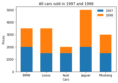
Creating a Stacked Bar Chart
Our previous example for a simple chart showed a data set comparing different cars with their individual prices for a single year. However, what if we have prices for two different years? How do we represent that on a bar plot? We can show this information using a stacked bar chart or a clustered bar chart.
An illustration:
import matplotlib.pyplot as plt

Car = ['BMW','Lexus','Audi','Jaguar','Mustang']
Price_1997 = [2000,1500,1500,2000,1500]
Price_1998 = [1500,2000,500,3000,1500]

#Defining the width of stacked chart
W= 0.6

#Plotting the data with car as x and Price as y
plt.bar(Car, price_1997, W, label='1997')
plt.bar(Car, price_1998, W, bottom=Price_1997, color='orange', label= '1998')
# Adding title to the Graph
plt.title('All cars sold in 1997 and 1998')
#Adding label on the x-axis
plt.xlabel('Cars')
# Adding label on the y-axis
plt.ylabel('Prices')
plt.legend()
plt.show()
The code above shows very little difference from our previous code. Here we only plotted two graphs representing each year’s prices. We set the width of the stacked charts and defined which prices stay at the bottom of the graph (in this case, price_1997). We also used this opportunity to show how to format the colors and labels, as well as show the legend in a graph.
Here is what the output looks like:
Pie Charts in Matplotlib
A pie chart is a type of graph that displays data in a circular graph. The pieces of the graph are proportional to the fraction of the whole in each category. Here, values are usually (but not always) represented in percentages.
Creating a Simple Pie Chart
Plotting pie charts is as simple as plotting bar charts, with very minor changes.
Example:
For the purpose of illustration, we’ll plot a pie chart to reflect the car prices from our data set. Note that pie charts are more suited to representing data as parts of a whole, but we’ll use the same data set as before to make it a little easier for this tutorial.
import matplotlib.pyplot as plt

Car = ['BMW','Lexus','Audi','Jaguar','Mustang']
Price= [2000,1500,1500,2000,1500]

#Plotting the chart
plt.pie(Reg_price, labels=Car)
# Adding title to the Graph
plt.title('Car prices')
plt.show()
The pie charts have no x- or y-axis like a typical bar chart, hence there is no need to define those. The chart is plotted taking into consideration only the values presented. Here is what the output looks like:
Output:

The pie chart includes other formatters that help to create more aesthetically pleasing charts. Next, we can explore other formatters like the autopct, shadow and explode functions.
Here is a simple illustration:
Car = ['BMW','Lexus','Audi','Jaguar','Mustang']
Price = [2000,1500,1500,2000,1500]

#defining the colour for each car brand
colors = ( "orange", "cyan", "yellow", "grey", "green",)
#Plotting the chart
plt.pie(Price, labels=Car, autopct='%1.2f%%', colors=colors, explode=[0.2, 0, 0, 0, 0], shadow=True)
# Adding title to the Graph
plt.title('Car prices')
plt.show()
The explode formatter allows us to separate a single unit from the entire pie, while the color formatter allows us to define the color of each car company. Further, the autopct formatters allow us to display each car price as a percentage in our chart. For more features in the Matplotlib pie chart, check the documentation.
Here is what our output looks like:

Line Charts in Matplotlib
A line graph is used to show information that changed over time. Line graphs are plotted using several points connected by straight lines. Plotting a line chart is very similar to plotting a bar chart because line charts are also made up of x- and y-axes.
Example:
Taking our previous example into consideration, we can plot a line graph to show the change in the quantity of BMWs sold from 1995 to 1999. This is what it would look like:
import matplotlib.pyplot as plt

year= [1995,1996,1997,1998,1999]
Quantity=[5, 12, 19, 21, 31]]

plt.plot(year,Quantity, label='BMW qty')
plt.title('BMW car prices since 1995')
plt.xticks(year)
plt.xlabel('Years')
plt.ylabel('Quantity')
plt.show()
Observe that the code above is very similar to that of the bar plot. However, instead of plt.bar(), it uses plt.plot(). This is a very basic plot and one of the easiest to create.
Here is what our output looks like:

Like the bar plot, the color of the line graph can be formatted and the line pattern can be changed. There is also an option to set the marker. Look at the documentation to get more insights about line charts in Matplotlib.
Plotting Multiple Line Charts
If we decide to compare the quantity sold for two cars – say BMW and Audi – the chart would look like this:
import matplotlib.pyplot as plt

year= [1995,1996,1997,1998,1999,2000]
BMW_qty=[5, 12, 19, 21, 31]
Audi_qty=[3, 5, 11, 20, 15]

plt.plot(year, BMW_qty, label='BMW')
plt.plot(year, Audi_qty, marker='o', '--', colour='orange',label='Audi')
plt.title('BMW and Audi car prices since 1995')
plt.xticks(year)
plt.xlabel('Years')
plt.ylabel('Quantity')
plt.legend()
plt.show()
With the code above, we introduced a new plot to show the changes in price for Audi cars over a period of time. We also used this opportunity to illustrate how to format the color, set the marker, change the line (‘--’) pattern, and display the legend for each graph. Here is what our diagram looks like:

Conclusion
In this tutorial, we’ve covered overviews of how to plot and format simple graphs to create more aesthetically pleasing charts. With this, you now have a basic understanding and you should be able to easily plot your own graphs. As always, to get more detailed information, you can look up the Matplotlib documentation.

Top comments (0)