position: sticky is a CSS property that lets you "stick" an element to the top of the screen when it would normally be scrolled away. However, there is no native way to change the element's styling when it becomes stuck. In this article, I will show you how to detect and style a "stuck" element using an underused feature of the Svelte API: actions.
If you want to see the end result and don't want to read the explanation, here's my finished demo in the Svelte REPL. You can also find the code on my GitHub.
What is position: sticky?
In essence, sticky positioning lets you stick an element on screen once a certain point in the page is crossed. Per MDN:
Sticky positioning can be thought of as a hybrid of relative and fixed positioning. A stickily positioned element is treated as relatively positioned until it crosses a specified threshold, at which point it is treated as fixed until it reaches the boundary of its parent.
A common use case is to keep some information in view that would normally be scrolled off screen. For instance, if someone is changing their flight online, you may want to stick their current flight information to the top of the screen as they scroll through other flight options. Here are some other examples of position: sticky in practice.
Sticky positioning is supported in the vast majority of browsers (Can I Use). Even if a browser doesn't support it, it can be treated as a progressive enhancement and gracefully fall back to static positioning.
How do I change the appearance of an element when it becomes stuck?
You can't, at least not natively, and this is intentional. If you had a :stuck selector, you could easily write a rule that would result in an infinite loop. For instance, look at the following:
:stuck {
  position: static;
}
With this rule, the element becoming stuck would trigger static positioning, which would make it unstuck, so the rule would no longer apply, and so on until the end of time.
You can find a more detailed discussion of the issue on the CSS Working Group wiki. If you want to change styling when an element becomes stuck, you're going to have to implement it yourself with JavaScript. You should still be careful, as you can run into similar infinite loop issues on your own. Getting this wrong could result in a jittering screen that is very unpleasant for the user.
I will show you how to detect a "stuck" element using Svelte actions, though it could easily be written without a framework as well. If you are using Svelte, writing it as an action will allow this functionality to be re-used in any component you want with minimal boilerplate.
What is a Svelte action?
A Svelte action is a function that runs when a node is rendered into the DOM. They're commonly used for adding custom event handling logic or interfacing with external libraries, but the sky's the limit! You can do anything you want to the node inside that function. I recommend looking at the official Svelte tutorial on them to learn more. I've linked some other resources at the end of the article.
Writing our sticky functionality as an action lets us put all the imperative DOM code in one place that can be reused by multiple components. Here's what an action looks like in practice. All you need is a function that takes two arguments: a node and an (optional object of parameters).
// sticky.js
export default function sticky(node, {stickToTop}) {
  // do stuff
}
We pass the parameter stickToTop into the action to indicate whether the node will be stuck to the top or bottom. We'll go into how this will be used later.
One you have your action, you can attach it to a node with use.
<script>
  import sticky from "./sticky";
</script>

<h2
  class="sticky"
  use:sticky={{ stickToTop: true }}>
  I use position: sticky!
</h2>
When the h2 appears in the DOM, the sticky function will run and we'll be off to the races!
Detecting stickiness
The way we'll detecting our node becoming stuck is with two "sentinel" divs: one at the top of the node's parent and one at the bottom. If the top sentinel exits the viewport, then a top position: sticky element is currently stuck. If the bottom sentinel exits the viewport, then a bottom position: sticky element is currently stuck.
Here's a gif of the sentinel in action. For the purposes of this demo, I've given the sentinel a height and colored it blue. See how the heading style changes once the sentinel travels off-screen.

To accomplish this, let's first create and insert our sentinel divs inside our sticky function.
const sentinelStyle = 'position: absolute; height: 1px;';
const stickySentinelTop = document.createElement('div');
stickySentinelTop.classList.add('stickySentinelTop');
stickySentinelTop.style = sentinelStyle;
node.parentNode.prepend(stickySentinelTop);

const stickySentinelBottom = document.createElement('div');
stickySentinelBottom.classList.add('stickySentinelBottom');
stickySentinelBottom.style = sentinelStyle;
node.parentNode.append(stickySentinelBottom);
The classes aren't strictly necessary, but they make it clear why the divs are there if you saw them in the dev tools inspector. We also give the sentinels a height — for whatever reason, the demo was not working properly in Safari if I did not set a height. We set position: absolute so that the sentinels do not take up space in the document.
We then initialize an intersection observer to observe either the top or bottom sentinel, depending on the stickToTop parameter passed to the action. The Intersection Observer API allows us to execute a function when a certain node exits or enters the viewport. If the observer fires and the sentinel is outside of the viewport (i.e., not intersecting), then the element must be stuck (except for an edge case we'll cover later). If the sentinel is within the viewport, then the sticky element cannot be stuck.
Either way, we dispatch a custom stuck event with a property that indicates whether the element is sticking. The component using the action can listen to this event and update its state accordingly.
const intersectionCallback = function(entries) {
  // only observing one item at a time
  const entry = entries[0];
  let isStuck = !entry.isIntersecting;
  node.dispatchEvent(
    new CustomEvent('stuck', {
      detail: {isStuck}
    })
  );
};

const intersectionObserver = new IntersectionObserver(intersectionCallback, {});

if (stickToTop) {
  intersectionObserver.observe(stickySentinelTop);
} else {
  intersectionObserver.observe(stickySentinelBottom);
}
This is our basic implementation. It has some bugs, but it works well enough to start using it. We'll circle back to some edge cases and enhancements later in the post, but let's see how we can use this action in a Svelte component.
Using the action in a Svelte component
First, let's see how far we can get with just CSS and HTML.
<style>
  .sticky {
    position: sticky;
    top: 1rem;
    background: mistyrose;
  }
</style>

<section>
  <h2 class="sticky">
    I use position: sticky!
  </h2>

  <!-- Lorem ipsum text truncated for readability -->
  <p>Lorem ipsum dolor sit amet...</p>
  <p>Phasellus lobortis molestie turpis...</p>
</section>
Presto! Render that HTML and you'll see a sticky header that stays visible when we scroll. My REPL has some extra styling, but this has the really essential stuff. No JavaScript is required for basic sticky positioning. It's only when you want to style it differently that you need a little something extra.
Note: h2 is not the correct heading level to use if this is the only thing on your page. In my demo, this is being placed in a larger page that contains an h1. You should always ensure that headings are in a logical order to aid screen reader navigation.
If you want to change something about the element or component when it's sticking to the top of the screen, you need to write some JavaScript. Let's add a script tag and update our markup to use the action we created.
<script>
  import sticky from './sticky.js';

  let isStuck = false;

  function handleStuck(e) {
    isStuck = e.detail.isStuck;
  }
</script>

<style>
  /* No change */
</style>

<section>
  <h2
    class="sticky"
    use:sticky={{ stickToTop: true }}
    on:stuck={handleStuck}>
    I use position: sticky! (currently
    {isStuck ? 'sticking' : 'not sticking'})
  </h2>

  <!-- Lorem ipsum text truncated for readability -->
</section>
There's a bit more going on here, so let's break it down.
Our script tag is pretty slim — we import our sticky action and define a state variable isStuck and a function handleStuck to update that variable when the event is fired.
In our markup, we use the action we created earlier with use:sticky and pass in the action parameters. We also set up an event listener to listen for our custom stuck event. When the h2 is added to the DOM, the action will initialize the observers with the callback we provided. Executing the callback will dispatch the stuck event and we can dynamically show whether the element is sticking or not. Pretty neat!
We can also update the styling of the element using our isStuck state variable.
<script>
  // No change
</script>

<style>
  .sticky { /* No change */ }

  .sticky.isStuck {
    background: mintcream;
  }
</style>

<section>
  <h2
    class="sticky"
    class:isStuck
    use:sticky={{ stickToTop: true }}
    on:stuck={handleStuck}>
    I use position: sticky! (currently
    {isStuck ? 'sticking' : 'not sticking'})
  </h2>

  <!-- Lorem ipsum text truncated for readability -->
</section>
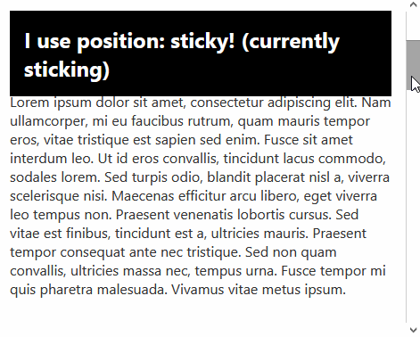
Since we can't reference JavaScript variables in our styles directly, we need to add a class to the element so we have something to target in our CSS. We add the isStuck class using the Svelte class: directive. Now when the element is stuck, the color changes to mintcream 🍦.
Looks great! Unfortunately, we have a bug when we have multiple sticky elements on the page. Depending on your CSS, when scrolling down you may see a brief flash of the "stuck" styles on the heading coming into view. I changed the sticky colors to black and white and increased the transition duration to make the problem clear. See the gif below.
What's happening here? In our sticky action, we set isStuck based on the visibility of the top sentinel. When the page loads, the sentinel for the second heading is out of view, so the second heading applies the stuck styles. When we scroll down, the sentinel comes into view and the stuck styles are removed, resulting in a flash of the stuck styles as the styles transition.
To fix this, we need to check the Y position before dispatching the event. If the sentinel is coming into view from the bottom of the screen but we are observing an element sticking to the top, isStuck should be false. Similarly, if the sentinel is coming into view from the top of the screen but we are observing an element sticking to the bottom, isStuck should also be false. Here's what that looks like in code.
const intersectionCallback = function(entries) {
  const entry = entries[0];
  let isStuck = !entry.isIntersecting && isValidYPosition(entry);
  node.dispatchEvent(
    new CustomEvent('stuck', {
      detail: {isStuck}
    })
  );
};

const isValidYPosition = function({target, boundingClientRect}) {
  if (target === stickySentinelTop) {
    return boundingClientRect.y < 0;
  } else {
    return boundingClientRect.y > 0;
  }
};
With that change, sticky styling is applied correctly.
Another edge case: mutations
I encountered another edge case while preparing the demo for this post — what happens if the content inside the component moves around? It's important that our sentinel nodes are at the top and bottom of the node's parent, but that is not guaranteed if Svelte dynamically inserts elements after the action has run.
For instance, let's say you had some content controlled by a checkbox that toggles flag.
<section>
  <h2
    class="sticky"
      use:sticky={{ stickToTop: true }}
      on:stuck={handleStuck}>
    I use position: sticky!
  </h2>

  <slot />
  {#if flag}
    <p>Me too</p>
  {/if}
</section>
I found that toggling the value of flag would re-insert the node after the bottom sentinel, which could introduce bugs since we expect the bottom sentinel to be the last element in its container. The rendered HTML would look like the following.
<div class="stickySentinelTop"></div>
<h2 class="sticky svelte-1n1qj7a"></h2>
<div class="stickySentinelBottom"></div>
<p>Me too</p>
You might not encounter this edge case. In case you do, let's show how we can re-insert the sentinels on changes to the container using a mutation observer.
Replacing sentinels on mutations
The Mutation Observer API is similar to the Intersection Observer API — you observe a node and execute a callback when something changes. Our mutation callback will check if the sentinels are still the first and last child and re-insert them if they're not.
const mutationCallback = function(mutations) {
  mutations.forEach(function(mutation) {
    const {parentNode: topParent} = stickySentinelTop;
    const {parentNode: bottomParent} = stickySentinelBottom;

    if (stickySentinelTop !== topParent.firstChild) {
      topParent.prepend(stickySentinelTop);
    }
    if (stickySentinelBottom !== bottomParent.lastChild) {
      bottomParent.append(stickySentinelBottom);
    }
  });
};
We don't have to worry about removing the sentinels before re-inserting them, since prepend and append will move them to the new location instead of duplicating the node.
Now that we have our callback, we can initialize the mutation observer and observe our node's parent. We pass an options object to the observe call to indicate that we only care about updates to the list of children.
const mutationObserver = new MutationObserver(mutationCallback);
mutationObserver.observe(node.parentNode, {childList: true});
Peachy 🍑. If we try our demo again, we'll see that the sentinels stay in position even when content is added and removed.
Update and destroy
One last aspect of actions we haven't touched on is the update and destroy methods. An action can optionally return an object containing these methods. update will be called when any of the parameters passed to the action change, and destroy will be called when the node is removed from the DOM.
Since my demo allows for toggling between sticking to the top and sticking to the bottom, I had to implement update so that we could start observing the other sentinel when stickToTop changes. I also disconnected our observers in the destroy method, but this might not be necessary if garbage collection handles it.
return {
  update({stickToTop}) {
    // change which sentinel we are observing
    if (stickToTop) {
      intersectionObserver.unobserve(stickySentinelBottom);
      intersectionObserver.observe(stickySentinelTop);
    } else {
      intersectionObserver.unobserve(stickySentinelTop);
      intersectionObserver.observe(stickySentinelBottom);
    }
  },

  destroy() {
    intersectionObserver.disconnect();
    mutationObserver.disconnect();
  }
};
Some caveats
There's a few caveats to this implementation. Adding raw DOM nodes like this could break certain CSS selectors like :first-child. There's an alternative approach using the rootMargin property of the observer, but this does not let you set any sort of offset position for the sticky element (e.g. top: 1rem). If you don't need to offset the sticky element, using rootMargin may be a better option. You can read more about it at CSS Tricks.
We also didn't implement anything for horizontal stickiness. I'll leave that as an exercise for the reader. Our method also requires sticky elements to be the first or last child of their parent. I haven't experimented with how this method handles sticky elements in the middle of a container, and there could be more edge cases.
Wrapping up
I hope you learned something about the power of Svelte actions and modern CSS! If you enjoyed the article, let me know on Twitter.
Further reading
- MDN docs on sticky positioning
- Documentation on Svelte actions
- Introduction to Actions (Svelte School)
- Unlocking the power of Svelte actions (Kirill Vasiltsov)
- An event for CSS position:sticky (Google Developers Blog) — this inspired a lot of my approach for this post.
- CSS Tricks on an alternative approach


Top comments (0)