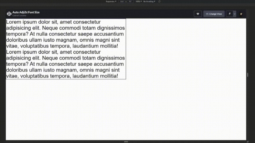
Original article with code snippets (recommended): https://gabriellazcano.com/blog/how-to-auto-adjust-font-size-to-fit-div/
I’ve been trying to get a solution like this for a long time already. As I didn’t find anything apart from libraries from JQuery I decided to make my own implementation with vanilla JavaScript. I know there must be ways of optimizing my code completely with some algorithms and such. Feel free to let me know if you found something or you want to share something :)
Detect Overflow
So I decided to take this path. Calculating if the div has overflow and then work the font-size afterwards. This is how we detect if a div has overflow:
And it’s time for the main function! My thought process here was, if I start the font-size with 0.1em I can increase the font size by a fixed rate until I get an overflow point in the div. For not overflowing I save the last size in a variable and substract the incrementation to get the last point when it wasn’t overflowing.
And we have it. We are adjusting the font-size already. To make it to work when resizing we just have to call to the function when the window resize event happens.
If you’ve read my other post you might have already noticed that doing handling the event this way is not very performant. So we are going to use the same technique. We are going to throttle the function calls to have a delay of 500ms.
So now it’s working completely. You can check at the CodePen in this link for the full implementation.


Top comments (1)
You can try with this Yogurt CSS. It has the simplest API to manipulating the font-size adaptively to the width of the screen size. (Documentation)
Other companions for the
fluidAPI are: fluid margin and fluid padding.You can try it with the Yogurt Playground.
Hope it helps.