Introduction
Cascading Style Sheets (CSS) is a styling language that web designers use to describe the display of a webpage. The Flexbox layout is one of the newer CSS layout modes that provide a powerful way to align and distribute items inside a container. In this paper, we will discuss how to create a feature using a Flex tag. This feature is useful for web designers who want to create responsive and dynamic layouts without relying on JavaScript libraries or frameworks.
Flexbox is a flexible layout mode that enables designers to create responsive layouts that can adapt to different screen sizes and devices. The Flex tag is an HTML5 element that enables designers to style the container element as a Flexbox container. To use the Flex tag, you must specify the display property as flex.
Syntax:
.container {
  display: flex;
}
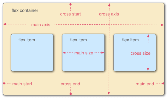
The Flex container has two main axes: the main axis and the cross axis. The main axis is the axis along which the Flex items are laid out, while the cross-axis is the perpendicular axis. By default, the main axis is horizontal, and the cross-axis is vertical.
.container {
  display: flex;
  flex-direction: row;
  align-items: center;
  justify-content: space-between;
}
The flex-direction property specifies the direction of the main axis of the Flex container. In the example above, row means that the main axis is horizontal. The align-items property specifies how Flex items are aligned vertically along the cross-axis. The justify-content property specifies the alignment of Flex items along the main axis.
Creating Responsive Designs with Flex Container
One of the main advantages of using the Flexbox layout is its ability to create responsive designs without the need for media queries. Media queries are used to specify different CSS styles for different device sizes. With Flexbox, designers can create flexible layouts that automatically adjust to different screen sizes.
.container {
  display: flex;
  flex-direction: column;
  align-items: center;
}
In the example above, we're using the column value for the flex-direction property, which means that the Flex items are laid out in a vertical column. The align-items property centers the Flex items vertically along the cross-axis.
Controlling the Flex Item Size and Position
Flex items have several properties that enable designers to control their size and position within the Flex container. The flex property is one of the most powerful properties that designers can use to control the size and position of Flex items.
.item {
  flex: 1;
}
The flex property specifies the contractibility and expandability of a Flex item. A value of 1 means that the item can grow or shrink to fill the available space. A value of 0 means that the item cannot grow or shrink.
Conclusion
In conclusion, the Flex tag is a powerful tool for creating flexible and responsive layouts. It provides web designers with a simplified way of aligning and distributing items inside a container. By using the Flexbox layout, designers can create complex layouts with less CSS code and without relying on JavaScript libraries or frameworks. With the Flexbox layout, web designers can create elegant designs that work well on different screens and devices.


Top comments (0)