A component library is a cloud-based folder that consists of styled pieces of software or parts of a website. In this case, we are going to develop React components. Component libraries are great to help designers and developers maintain design guidelines and, when done correctly, increases time efficiency tremendously from reutilising code rather than rewriting it.
For this component library, the following technologies/packages will be used:
Webpack: Bundles the component library's modules.
Babel: Converts ECMAScript 2015+ code into a backward-compatible version of JavaScript that can be run by older JavaScript engines.
Storybook: User interface development environment and playground for UI components.
PropTypes: Checks the types passed in the props object against a specification we set beforehand. Raises a warning if the props passed to the component do not match the expected data type.
Classnames: Joins CSS class names based on a set of conditions set beforehand. It helps the logic needed to pass CSS classes to the component.
PostCSS: Converts modern CSS into something modern browsers understand and determines the polyfills needed based on the targeted browsers or runtime environments.
Feel free to check the code in the library repository here!
PostCSS
Run this command on terminal:
   npm install --save-dev lost postcss-css-variables postcss-
   import postcss-inherit postcss-loader postcss-mixins
   postcss-nested postcss-preset-env postcss-reporter postcss-
   custom-properties postcss-custom-media
Create a postcss.config.js file in the root folder of the project and add the code below. This is used to specify all the necessary plugins Webpack will need during bundling.
module.exports = {
 plugins: {
   "postcss-import": {},
   "postcss-preset-env": {
     stage: 0,
   },
   "postcss-mixins": {},
   "postcss-css-variables": {},
   "postcss-nested": {},
   "postcss-inherit": {},
   "postcss-reporter": {},
   "postcss-custom-properties": {},
   "postcss-custom-media": {},
   lost: {},
 },
};
Babel
Run this command on terminal:
npm install --save-dev @babel/core @babel/preset-env @babel/preset-react autoprefixer babel-loader
Create a .babelrc file in the root directory with the following config:
{
   "presets": ["@babel/preset-env", "@babel/preset-react"]
}
Custom Webpack Bundling
Run this command on terminal:
npm install --save-dev clean-webpack-plugin webpack webpack-cli webpack-node-externals path mini-css-extract-plugin css-loader
Add the following script to package.json:
"build": "webpack --mode production && npm version patch"
In the root directory of the component library, create a webpack.config.js file to specify how to bundle the components. The following should look like this:
const path = require('path')
const { CleanWebpackPlugin } = require('clean-webpack-plugin')
const nodeExternals = require('webpack-node-externals')
const MiniCssExtractPlugin = require('mini-css-extract-plugin')

module.exports = {
 entry: './src/index.js',
 externals: [nodeExternals(), 'react'],
 output: {
   filename: 'index.js',
   path: path.resolve(__dirname, 'lib'),
   library: '',
   libraryTarget: 'commonjs'
 },
 plugins: [
   new MiniCssExtractPlugin({
     filename: '[name].css',
     chunkFilename: '[id].css',
     ignoreOrder: false
   }),
   new CleanWebpackPlugin()
 ],
 module: {
   rules: [
     {
       test: /\.(js|jsx)$/,
       exclude: /node_modules/,
       use: ['babel-loader']
     },
     {
       test: /\.(css|pcss)$/i,
       use: [
         {
           loader: MiniCssExtractPlugin.loader,
           options: {}
         },
         {
           loader: 'css-loader',
           options: {
             importLoaders: 1,
             sourceMap: true,
             modules: {
               localIdentName: '[path]__[name]__[local]--[hash:base64:5]'
             }
           }
         },
         {
           loader: 'postcss-loader',
           options: {
             sourceMap: 'inline',
             config: {
               path: path.resolve(__dirname, './config/postcss.config.js')
             }
           }
         }
       ],
       include: path.resolve(__dirname, './src')
     },
     {
       test: /\.(png|jpe?g|gif)$/i,
       use: [
         {
           loader: 'file-loader'
         }
       ]
     },
     {
       test: /\.(woff|woff2|eot|ttf|otf)$/,
       use: 'file-loader'
     }
   ]
 }
}
Above, custom configurations are specified for the component library export bundle. These are similar to the Storybook configs.
Here, we are defining the loaders each file type will require, the plugins necessary for bundling, and the entry/outputs points of the bundle.
Every time a new component is created, and you want it to be included in the next library version, you must run:
npm run build
Setting up Storybook
Storybook works as a UI interface to develop components without adding them to any specific project. It is great to isolate them from custom project bundling and focus on the sole component.
Run this command on terminal:
npm install --save-dev @storybook/addon-knobs @storybook/react
Add the following script to package.json:
"start": "start-storybook -s ./src"
Create a folder with the name .storybook in the root directory of the project and within it, a file with the name:
main.js
main.js holds the configuration to bundle our components as well as specify the files from which our components will be rendered for Storybook. Use the code below:
const path = require('path');
const MiniCssExtractPlugin = require('mini-css-extract-plugin');

module.exports = {
 stories: ['../src/components/**/*.stories.[tj]s'],
 addons: ['@storybook/addon-knobs/register'],
 webpackFinal: async (config, { configType }) => {
   config.plugins.push(
     new MiniCssExtractPlugin({
       filename: '[name].css',
       chunkFilename: '[id].css',
       ignoreOrder: false,
     })
   );

   config.module.rules.push({
     test: /\.(css|pcss)$/i,
     use: [
       {
         loader: MiniCssExtractPlugin.loader,
         options: {},
       },
       {
         loader: 'css-loader',
         options: {
           importLoaders: 1,
           sourceMap: true,
           modules: {
             localIdentName: '[path]__[name]__[local]--[hash:base64:5]',
           },
         },
       },
       {
         loader: 'postcss-loader',
         options: {
           sourceMap: 'inline',
           config: {
             path: path.resolve(__dirname, './config/postcss.config.js'),
           },
         },
       },
     ],
     include: path.resolve(__dirname, '../src'),
   });
   return config;
 },
};
src/index.js
Import Button from './components/Button';

Export { Button };
This is where webpack will read all of the components to be included in the library. src/index.js is the entry point for the custom bundle. Components not included in this file, will not be bundled.
Deploy to NPM
Add the following script to package.json:
"deploy": "npm publish"
If this is your first time running this command, it will ask you to login. Enter your credentials when prompted and deployment to npm should begin!
Sample Component
Use the following code blocks as an example of a sample component for this library.
src/components/Button/index.js
import Button from './Button.js'

export default Button;
src/components/Button/Button.js
import React from 'react'
import PropTypes from 'prop-types'
import cs from 'classnames'

import s from './Button.pcss'

const styleLookup = {
 download: 'btn-download',
 simple: 'btn-simple'
}

const Button = ({ type, text }) => (
 <button className={cs(s.btn, { [s[styleLookup[type]]]: type })}>
   {text}
 </button>
)

Button.propTypes = {
 type: PropTypes.string,
 text: PropTypes.string
}

export default Button
src/components/Button/Button.pcss
.btn {
 border: 1px solid black;
 border-radius: 0.25em;
}

.btn-download {
 background-color: orange;
 text-transform: uppercase;
}

.btn-simple {
 background-color: white;
}
src/components/Button/Button.stories.js
import React from 'react'
import { storiesOf } from '@storybook/react'

import Button from './'

storiesOf('Buttons', module)
 .add('Simple Button', () => {
   const component = <Button type="simple" text="Download" />
   return component
 })
 .add('Download Button', () => {
   const component = <Button type="download" text="Download" />
   return component
 })
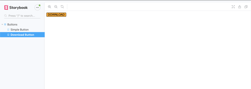
Once the component is set up using this structure, run
npm run start
in the terminal to visualize it.
It should look something like this:
To publish your package to NPM, login via Command Line to successfully run:
npm run deploy
Component Library Target Project
Please access the target project directory in the terminal and run:
npm install gs-component-library
Now, we have to import the shared component library main design file (main.css) into the main app.js file:
import 'gs-component-library/lib/main.css';
You can now import the desired component into your work area:
   import { Button } from 'react-component-library';

   <Button type="download">Download</Button>
Following these steps, you should be able to create your react component library in no time!
Please check out my sample react component library repository here!

Top comments (1)
Great article, well done mate! 🔝 🔝