Welcome to our tutorial! Today, we'll guide you through the process of creating disabled buttons in Next.js 13 with the help of Shadcn UI. We'll cover a range of scenarios, including buttons with icons, loading states, post-loading interactions, and more. But before we get started, let's begin by setting up a Next.js 13 project with Shadcn UI.
how to use shadcn ui in next js 13
To use an loading buttons in Next.js 13 with Shadcn UI, first, make sure you've installed the Shadcn UI Button component.
npx shadcn-ui@latest add button
# or
npx shadcn-ui@latest add
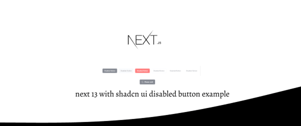
Next 13 with Shadcn UI Disabled Buttons Example
1.Create basic disabled Button in Next.js 13 using the Shadcn UI Button component.
import { Button } from "@/components/ui/button"

export default function DisabledButton() {
  return (
    <div>
      <Button disabled>Disabled Button</Button>
    </div>
  )
}

2.Creating disabled Buttons with Different variant in Next.js 13 with Shadcn UI - primary, secondary, destructive, outline, ghost and link.
import { Button } from "@/components/ui/button"

export default function DisabledButton() {
  return (
    <div>
      <Button disabled>Disabled Button</Button>
      <Button variant="secondary" disabled>
        Disabled Button
      </Button>
      <Button variant="destructive" disabled>
        Disabled Button
      </Button>
      <Button variant="outline" disabled>
        Disabled Button
      </Button>
      <Button variant="ghost" disabled>
        Disabled Button
      </Button>
      <Button variant="link" disabled>
        Disabled Button
      </Button>
    </div>
  )
}

3.Creating a Loading Disabled Button with Loader Icon in Next.js 13 and Shadcn UI.
import { Loader2 } from "lucide-react"

import { Button } from "@/components/ui/button"

export default function ButtonLoading() {
  return (
    <Button disabled>
      <Loader2 className="mr-2 h-4 w-4 animate-spin" />
      Please wait
    </Button>
  )
}

4.Building a Loading Disabled Button with an Icon: Click to Trigger a 2-Second Loading Period, Followed by a 2-Second Disabled State. We'll Achieve This Using React's useState and setTimeout Methods in Next.js 13 with Shadcn UI.
"use client"

import * as React from "react"
import { Loader2 } from "lucide-react"

import { Button } from "@/components/ui/button"

export default function ButtonLoading() {
  const [isLoading, setIsLoading] = React.useState(false)

  const handleClick = () => {
    setIsLoading(true)
    setTimeout(() => {
      setIsLoading(false)
    }, 2000)
  }

  return (
    <Button disabled={isLoading} onClick={handleClick}>
      {isLoading ? (
        <>
          <Loader2 className="mr-2 h-4 w-4 animate-spin" />
          Loading...
        </>
      ) : (
        "Click to Loading"
      )}
    </Button>
  )
}

See Also
👉Building a Next.js Hover-Activated Dropdown Menu with Shadcn UI
👉Next.js with Shadcn UI Product Cards Example
👉how to use icon in shadcn ui with next js 13
👉create responsive navbar in next 13 with shadcn ui
👉create footer section in next 13 with shadcn ui
👉Next.js Image File Upload and Preview with Shadcn UI
👉create sidebar in next 13 with shadcn ui
👉how to use skeleton loading next 13 with shadcn ui
👉next 13 with shadcn ui date picker example
👉next 13 with shadcn ui pagination example


Top comments (0)