
Dark mode is one of the features that would look excellent implemented in your app, as it would improve the user experience inside your app.
So this time, I will show you how to implement dark mode with React and without any other external library!
🚨 Note: This post requires you to know the basics of React with TypeScript (basic hooks).
Any kind of feedback is welcome, thanks and I hope you enjoy the article.🤗
Table of Contents.
📌 Technologies to be used.
📌 Creating the project.
📌 First steps.
📌 Creating Switch component.
📌 Adding a few cards.
📌 Styles for the themes.📍 Configuring variables for light theme.
📍 Configuring variables for dark theme.
📍 Using the variables in our style.📌 Adding the logic to switch between themes.
📌 Refactoring the logic in a custom hook.
📌 Conclusion.
💡 Technologies to be used.
- ▶️ React JS (version 18)
- ▶️ Vite JS
- ▶️ TypeScript
- ▶️ CSS vanilla (You can find the styles in the repository at the end of this post)
💡 Creating the project.
We will name the project: dark-light-app (optional, you can name it whatever you like).
npm init vite@latest
We create the project with Vite JS and select React with TypeScript.
Then we run the following command to navigate to the directory just created.
cd dark-light-app
Then we install the dependencies.
npm install
Then we open the project in a code editor (in my case VS code).
code .
💡 First steps.
Now we first create a folder src/components and add the Title.tsx file it contains:
export const Title = () => {
    return (
        <h1>Dark - Light Mode </h1>
    )
}
And now, inside the folder src/App.tsx we delete all the content of the file and we place the title that we have just created.
const App = () => {
  return (
    <div className="container">
      <Title />
    </div>
  )
}
export default App
It should look like this 👀:

💡 Creating Switch component.
Now inside the src/components folder we add the Switch.tsx file and place the following:
export const Switch = () => {
    return (
        <div className="container-switch">
            <span>Change Theme </span>
            <label className="switch">
                <input type="checkbox" />
                <span className="slider"></span>
            </label>
        </div>
    )
}
It should look like this 👀:

💡 Adding a few cards.
Again, inside the src/components folder, we add Card.tsx file.
we add the Card.tsx file.
First we will create the Layout component that will contain the cards.
export const LayoutCards = () => {
    return (
        <div className="grid-cards">
            <Card />
            <Card />
            <Card />
        </div>
    )
}
Then, the Card component will look like this:
 export const Card = () => {
    return (
        <div className="card">
            <div className="card-image"></div>
            <h4 className="card-title">Lorem ipsum dolor sit.</h4>
            <p className="card-description">Lorem ipsum dolor sit amet consectetur adipisicing eli...</p>
            <div className="card-container-buttons">
                <button>Buy</button>
                <button>Show</button>
            </div>
        </div>
    )
}
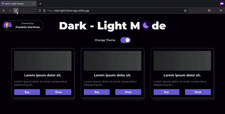
It should look something like this 👀:

💡 Styles for the themes.
The idea is to use the variables with CSS for the dark and light theme.
🟡 Configuring variables for light theme.
We create a folder called src/styles and create the file var.css.
This file will be in charge of setting the CSS variables.
1- To set the variables inside CSS we use pseudo-class root as follows
:root {

}
Inside we place the variables we are going to use. To define variables we use this syntax
--background: #f2f2f2;
We have to place a double hyphen before the custom name of our property, then, we place a colon and add the value of that property.
Here are the other variables:
:root {
    --background: #f2f2f2;
    --text-primary: #0f0f0f;
    --text-secondary: #4e4e4e;
    --accent: #dfb017;
    --accent-hover: #cea315;
    --border: #1f1e1e;
    --shadow: 7px 15px 13px -4px #00000056;
}
These variables that we have just declared without for the light theme.
🟡 Configuring variables for dark theme.
Now let's define the variables for the dark theme.
To do this, the variable names have to be named exactly the same as the previous variables and we only change their value after the colon.
[data-theme='dark'] {
    --background: #05010a;
    --text-primary: #f2f2f2;
    --text-secondary: #a7a4a4;
    --accent: #6a5acd;
    --accent-hover: #5b4cbe;
    --border: #696969;
    --shadow: 7px 15px 13px -4px #ffffff1b;
}
Note that for the dark theme variables, we no longer use the pseudo-class root, but we reference a custom attribute that we are defining as theme.
This custom attribute, has to be placed in an HTML tag for the dark mode to work (Do not place the attribute manually, this will be done dynamically, using react).
But not in just any tag, it must be placed in the highest hierarchy tag, such as the body.
This is an example of how it should look
<body data-theme='dark' >
<!-- content -->
<body>
If we place the data-theme attribute in the other tag with less hierarchy, only the content of that tag will use the dark mode.
For this reason, it should be placed in the tag with the highest hierarchy.
<body>
    <div data-theme='dark' >
        <!-- Dark theme -->
    </div>
    <div>
        <!-- Light theme -->
    </div>
<body>
🟡 Using the variables in our style.
Now, notice that we have created a var.css file inside src/styles. But where do we import them?
Well, in my case I found it best to import them into the src/index.css file.
To import .css files into another .css file we use @import url() and add the path where the file to import is located.
This is a good practice to separate the CSS files as it helps to understand better the code of the styles.
By the way, you must place the import at the top of your file.
@import url('./styles/var.css');

body{
  font-family: 'Montserrat', sans-serif;
  font-weight: 600;
  transition: all .5s ease-in-out;
}
Well, now, let's use the variables.
To use the variables, we make use of the function var() and inside we place the name of the variable exactly as we name it in our file var.css.
body{
  background-color: var(--background);
  color: var(--text-primary);
}
Once the variables have been placed in the other styles (in the cards, switch and title), we will proceed with adding the logic for switching between themes.
💡 Adding the logic to switch between themes.
First, we have to control the state of the switch to be able to get when it is 'on' / 'off' and depending on those values use one theme or another.
🟡 Controlling the state of the switch.
1- First we add a state. This state will be of type Theme, and will only accept the string 'dark' or 'light'.
type Theme = 'dark' | 'light'

export const Switch = () => {

    const [theme, setTheme] = useState<Theme>('light')

    return (
        <div className="container-switch">
            <span>Change Theme </span>
            <label className="switch">
                <input type="checkbox" />
                <span className="slider"></span>
            </label>
        </div>
    )
}
2- We create the function to control the switch event.
Which, receives as parameter the event that emits by default the input.
The function calls the setter setTheme and inside it makes an evaluation:
If the checked property of the input is set to true, it sets the 'dark' theme.
If the checked property of the input is false, it sets the 'light' theme.
Now, the function handleChange is going to be executed when the input of type checkbox has a change and for that reason we pass it to method onChange.
And the checked property of the same input, we will pass an evaluation, since the checked property only accepts boolean values. The evaluation will be:
If the value of the state theme is 'dark', the value of checked will be true.
If the value of the state theme is 'light', the value of checked will be false.
type ChangeEvent = React.ChangeEvent<HTMLInputElement>

type Theme = 'dark' | 'light'

export const Switch = () => {

    const [theme, setTheme] = useState<Theme>('light')

    const handleChange = (e: ChangeEvent) => setTheme(e.target.checked ? 'dark' : 'light')

    return (
        <div className="container-switch">
            <span>Change Theme </span>
            <label className="switch">
                <input type="checkbox" onChange={handleChange} checked={theme === 'dark'} />
                <span className="slider"></span>
            </label>
        </div>
    )
}
3- And now, remember that we were going to place the custom attribute data-theme, well now it's time to do it.
For this we use an effect, which must be executed every time the value of the theme state changes. That's why we place it in its dependency array of the useEffect.
Then, inside the useEffect we execute the following:
document.body.setAttribute('data-theme', theme);
Basically, we are accessing the body tag (because it is the highest point that encloses all our application), and we set a new attribute with the function setAttribute.
-
setAttribute, receives in this case two parameters:
- the name of the new attribute.
- the value for that new attribute.
So, we set the data-theme attribute with the value of the theme state.
The code should look like this:
type ChangeEvent = React.ChangeEvent<HTMLInputElement>

type Theme = 'dark' | 'light'

export const Switch = () => {

    const [theme, setTheme] = useState<Theme>('light');

    const handleChange = (e: ChangeEvent) => setTheme(e.target.checked ? 'dark' : 'light');

    useEffect(() => {

        document.body.setAttribute('data-theme', theme);

    }, [theme]);

    return (
        <div className="container-switch">
            <span>Change Theme </span>
            <label className="switch">
                <input type="checkbox" onChange={handleChange} checked={theme === 'dark'} />
                <span className="slider"></span>
            </label>
        </div>
    )
}
And that's it, you would now have the functionality to switch between themes. 🥳

But now, we have a lot of logic in our file, so it's time to create a custom hook! 👀
💡 Refactoring the logic in a custom hook.
We create a new folder inside src/hook create the useTheme.ts file and cut the logic from the Switch.tsx file and paste it into useTheme.ts.
We make the necessary imports.
import { useEffect, useState } from 'react';

type ChangeEvent = React.ChangeEvent<HTMLInputElement>

type Theme = 'dark' | 'light'

export const useTheme = (): => {

    const [theme, setTheme] = useState<Theme>('light')

    const handleChange = (e: ChangeEvent) => setTheme(e.target.checked ? 'dark' : 'light')

    useEffect(() => {
        document.body.setAttribute('data-theme', theme);
    }, [theme])
}
Then, this hook will return an array with two elements:
- theme: the value of the theme state.
- handleChange: the function, which receives an event, to change the state between themes and returns nothing.
import { useEffect, useState } from 'react';

type ChangeEvent = React.ChangeEvent<HTMLInputElement>

type Theme = 'dark' | 'light'

type useThemeReturn = [ string, (e: ChangeEvent) => void ];

export const useTheme = (): useThemeReturn => {

    const [theme, setTheme] = useState<Theme>('light')

    const handleChange = (e: ChangeEvent) => setTheme(e.target.checked ? 'dark' : 'light')

    useEffect(() => {
        document.body.setAttribute('data-theme', theme);
    }, [theme])

    return [theme, handleChange]
}
And also, we are going to receive as parameter the initial theme and add it to the initial value of the useState.
import { useEffect, useState } from 'react';

type ChangeEvent = React.ChangeEvent<HTMLInputElement>

type Theme = 'dark' | 'light'

type useThemeReturn = [ string, (e: ChangeEvent) => void ];

export const useTheme = (initialTheme:Theme): useThemeReturn => {

    const [theme, setTheme] = useState<Theme>(initialTheme)

    const handleChange = (e: ChangeEvent) => setTheme(e.target.checked ? 'dark' : 'light')

    useEffect(() => {
        document.body.setAttribute('data-theme', theme);
    }, [theme])

    return [theme, handleChange]
}
Now, it's time to call our custom hook.
Returned in the file src/components/Switch.tsx.
import { useTheme } from "../hook/useTheme";

export const Switch = () => {

    const [theme, handleChange] = useTheme('dark');

    return (
        <div className="container-switch">
            <span>Change Theme </span>
            <label className="switch">
                <input type="checkbox" onChange={handleChange} checked={theme === 'dark'} />
                <span className="slider"></span>
            </label>
        </div>
    )
}
And now it is definitely cleaner and easier to read our component! 🥳
💡 Conclusion.
The whole process I just showed, is one of the ways you can do the functionality to create dark mode and switch between themes, without using some external library. 🌙
I hope I helped you understand how to make this functionality and that you manage to apply it in your future projects, thank you very much for getting this far! 🤗❤️
I invite you to comment if you know any other different or better way of how to do this functionality. 🙌
🟡 Live Demo.
https://dark-light-theme-app.netlify.app
🟡 Source code.
 Franklin361
/
dark-light-app
Franklin361
/
dark-light-app
Switch between dark - light themes without using external libraries. 🌙
Dark Theme React JS 🌘
This time, we are going to implement the dark mode with React and without any other external library!.
Features ⚙️
- Tema Light
- Dark Theme
- Switch between themes
Tecnologies 🧪
- React JS
- TypeScript
- Vite JS
- Vanilla CSS 3
Installation 🧰
- Clone the repository (you need to have Git installed).
git clone https://github.com/Franklin361/dark-light-app.git
- Install dependencies of the project.
npm install
- Run the project.
npm run dev
Note: For running the tests, use the following command
npm run test
Links ⛓️
Demo of the application 🔥
Here's the link to the tutorial in case you'd like to take a look at it! eyes 👀
-
🇲🇽 🔗
-
🇺🇲 🔗


Top comments (8)
When I added the first two component files and updated the App.tsx file, I ran
npm dev runand didn't see any of the changes. Did I miss a step? Do I need to do something to recompile the TypeScript?Have you already imported the first component files into the App.tsx file? 🤔
The correct command to get the server up is "npm run dev".
If you like, you can check the grab in my GitHub repository 🙌.
github.com/Franklin361/dark-light-app
Grate Article..!
Great! Thanks for the article. I learned what how can i'll make dark-light theme and how can i'll use custom hook. Really helpful for me 🙌
I'm glad you find it useful, thanks for your comment! 🙌
Excellent article, I will use it in my next project!!
I think it's a great idea! 😌
Good reading, helped a lot!