Time for big release, the largest Framework7 update in terms of new features is coming soon.
Let’s look at new features and breaking changes coming in version 4 and what to expect with migrating your existing app from v2/v3 to v4.
Core Framework7 Files Structure
Core framework has new file structure. In previous version (v3) we had the following:
| components/
 | /accordion/
 | /actions/
 | /calendar/
 | ...
| lazy-components/
 | accordion.css
 | accordion.js
 | actions.css
 | actions.js
 | calendar.css
 | calendar.js
 | ...
| js/
 | framework7-lazy.js
 | framework7-lazy.min.js
 | framework7.js
 | framework7.min.js
| css/
 | framework7-lazy.css
 | framework7-lazy.min.css
 | framework7-lazy.rtl.css
 | framework7-lazy.rtl.min.css
 | framework7.css
 | framework7.min.css
 | framework7.rtl.css
 | framework7.rtl.min.css
 | framework7.ios.css
 | framework7.md.css
 | ...
| framework7.esm.bundle.js
| framework7.esm.js
| framework7.less
| framework7.less
In new version file structure is more consistent and a bit different:
| components/
 | /accordion/
 | accordion.css
 | accordion.js
 | /actions/
 | actions.css
 | actions.js
 | /calendar/
 | calendar.css
 | calendar.js
 | ...
| js/
 | framework7.bundle.js
 | framework7.bundle.min.js
 | framework7.js
 | framework7.min.js
| css/
 | framework7.bundle.css
 | framework7.bundle.min.css
 | framework7.bundle.rtl.css
 | framework7.bundle.rtl.min.css
 | framework7.css
 | framework7.min.css
 | framework7.rtl.css
 | framework7.rtl.min.css
| framework7.esm.bundle.js
| framework7.esm.js
| framework7.bundle.less
| framework7.less
Before: Files with -lazy suffix in name contain minimal (core) Framework7 version with minimal required set of components. Files without -lazy suffix contain full bundle Framework7 version with all components.
In v4: Minimal core version now comes without any suffix and it is just framework7.js and framework7.css (what was with -lazy before). Full bundle version now has bundle in file name.
Browser lazy components that were in lazy-components/ folder moved to the root of components folder.
Theme-specific styles like framework7.ios.css removed and not available anymore because it is not really necessary now (explanation in next section).
CSS Variables (Custom Properties)
This is the most significant and most complex part of new update. All CSS styles were reworked to use CSS Variables (Custom Properties). So why it was needed? Here is some awesome advantages of moving to CSS variables:
- It allowed us to reduce size of whole Framework7 bundle by 60%! Unminified CSS bundle reduced from ~1MB (in v3) to 400Kb (in v4)!
- We were able to reduce amount of JS code as well. Some new features like Large Navbars became available due to CSS variables without significant extra amount of JavaScript.
- A lot of theme-specific differences we had before now unified, that will make app branding a way more simpler.
- It is extremely easy to add new and modify existing colors, theme colors and color modifiers.
- For some components it is now possible to mix theme styling. For example, if you use iOS theme and want button to appear in style of MD theme, we can just add md class to this button and it will look like in MD theme.
Custom styling became much more easier with CSS variables. The stunning part here is that we don’t need to know the exact HTML markup of the component we want to style if CSS variables available for this component. For example, if we need to change font-size of List Item’s title, we can just add to CSS:
:root {
 --f7-list-item-title-font-size: 20px;
}
If we need to change Navbar’s height:
:root {
 --f7-navbar-height: 80px;
}
And in this case all Navbar-size dependent styles (rules that depend on this CSS variable) will be updated automatically (e.g. page-content paddings, transformations, etc.).
CSS variables just make developer life easier.
But there are some drawbacks of moving to CSS variables. And the most noticeable, is their support in browsers. Like we may see from this table it is supported on:
- Edge 16+
- iOS Safari 10+
- Chrome — means Android 5+
- FireFox
What it means? It means that Framework7 v4 will not work on browsers older than mentioned above. And here we come to Framework7 v4+ ideology.
Supported Browsers & Devices
Due to CSS variables and some other legacy features removed in v4, it will be the framework for modern devices. No IE and Android <5 support at all! Supporting such old browsers just holds us back in terms of new features development and framework evolution, so no more old browsers.
Framework7 v3 will be maintained for a while (bug fixes) for the apps needed old devices support.
Color Themes
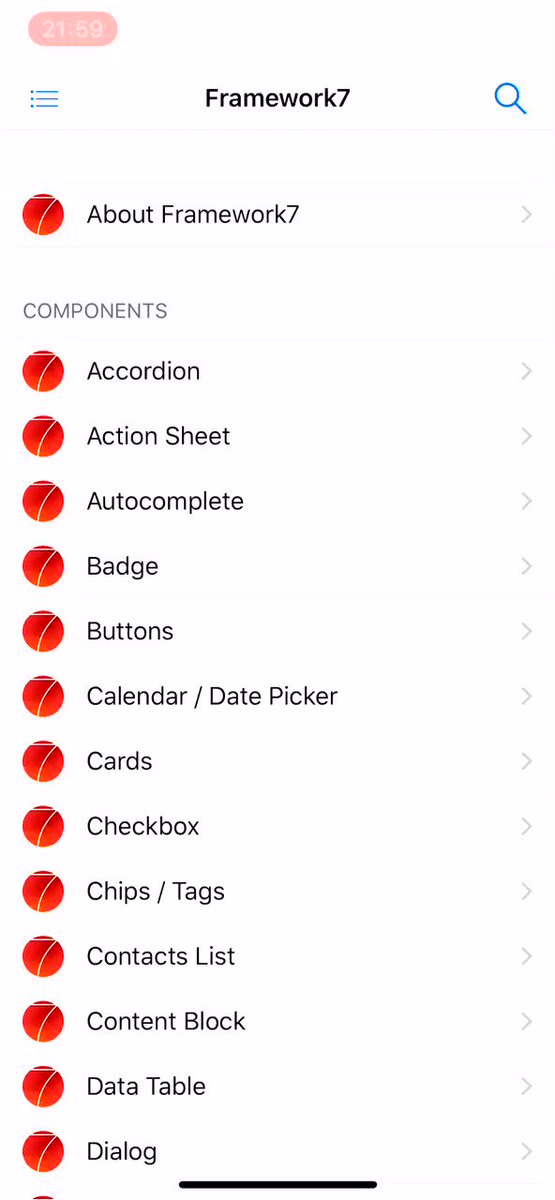

 Framework7@framework7io
 How about ... generating custom color themes right in Kitchen Sink. Coming in @framework7io v4 🔥19:04 PM - 03 Nov 2018
Working with color themes in v4 is like a breath of fresh air. Now if you need to change default color theme, you just need to specify few CSS variables instead of modifying/overwriting all default color references in whole CSS file. We need 4 CSS variables:
-
--f7-theme-color— HEX value of theme color. -
--f7-theme-color-shade— 8% darken theme color. Required, for example, for pressed buttons state. -
--f7-theme-color-tint— 8% lighten theme color. Required, for example, for pressed buttons state. -
--f7-theme-color-rgb— RGB value of theme color. Required for semitransparent elements.
For example, if our brand color is #f00 (red) we just need to add following variables to our CSS:
:root {
 --f7-theme-color: #f00;
 --f7-theme-color-shade: #d60000;
 --f7-theme-color-tint: #ff2929;
 --f7-theme-color-rgb: 255, 0, 0;
}
That is all we need to create custom color theme!💥
There is also new colorThemeCSSProperties util that can generate required CSS variables:
/* Generate CSS variables for red theme color */

app.utils.colorThemeCSSProperties('#f00');
It will return the following object:
{
 "--f7-theme-color": "#f00",
 "--f7-theme-color-rgb": "255, 0, 0",
 "--f7-theme-color-shade": "#d60000",
 "--f7-theme-color-tint": "#ff2929"
}
Unified Navigation Bars
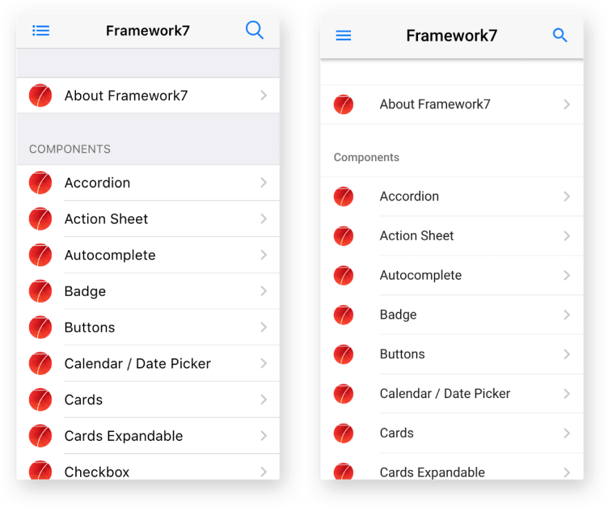
There is also unification in navigation bars (Navbars, Toolbars, Subnavbar, etc.) appearance. In v3 their color scheme is different for iOS and MD themes. This brings complications and a bunch of extra styles when we need to bring custom branding.
In v3 they look like on the following picture:
In v4 we unified color scheme for navigation bars in iOS and MD themes to the following:
With such scheme it is much easier to bring your custom branding for navigation bars.
Also Navbar with centered title (and with its dynamically calculated position) is also available in MD theme now.
Unified Toolbars Position
Before v4 we had the following restrictions for Toolbar position:
- in iOS theme, Toolbar is always on the bottom
- in MD theme, Toolbar by default is on the top, and can be positioned on bottom with extra
toolbar-bottom-mdclass.
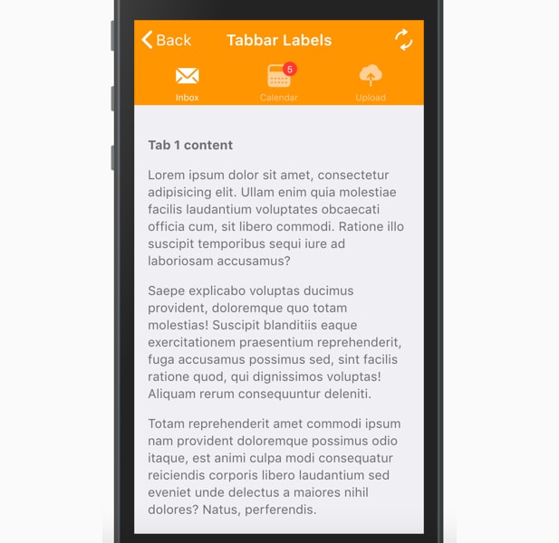
Now such restriction is gone and in both themes Toolbar / Tabbar can be positioned on top or on bottom. But now it is always required to add position-specific class to each Toolbar/Tabbar:
-
toolbar-topto place Toolbar on top of view/page -
toolbar-bottomto place Toolbar on bottom of view/page
Again, it also should help to keep your custom styles/branding in consistence across iOS and MD themes.
So even on iOS, Toolbar can be easily positioned on top:
Unified & Reworked Buttons
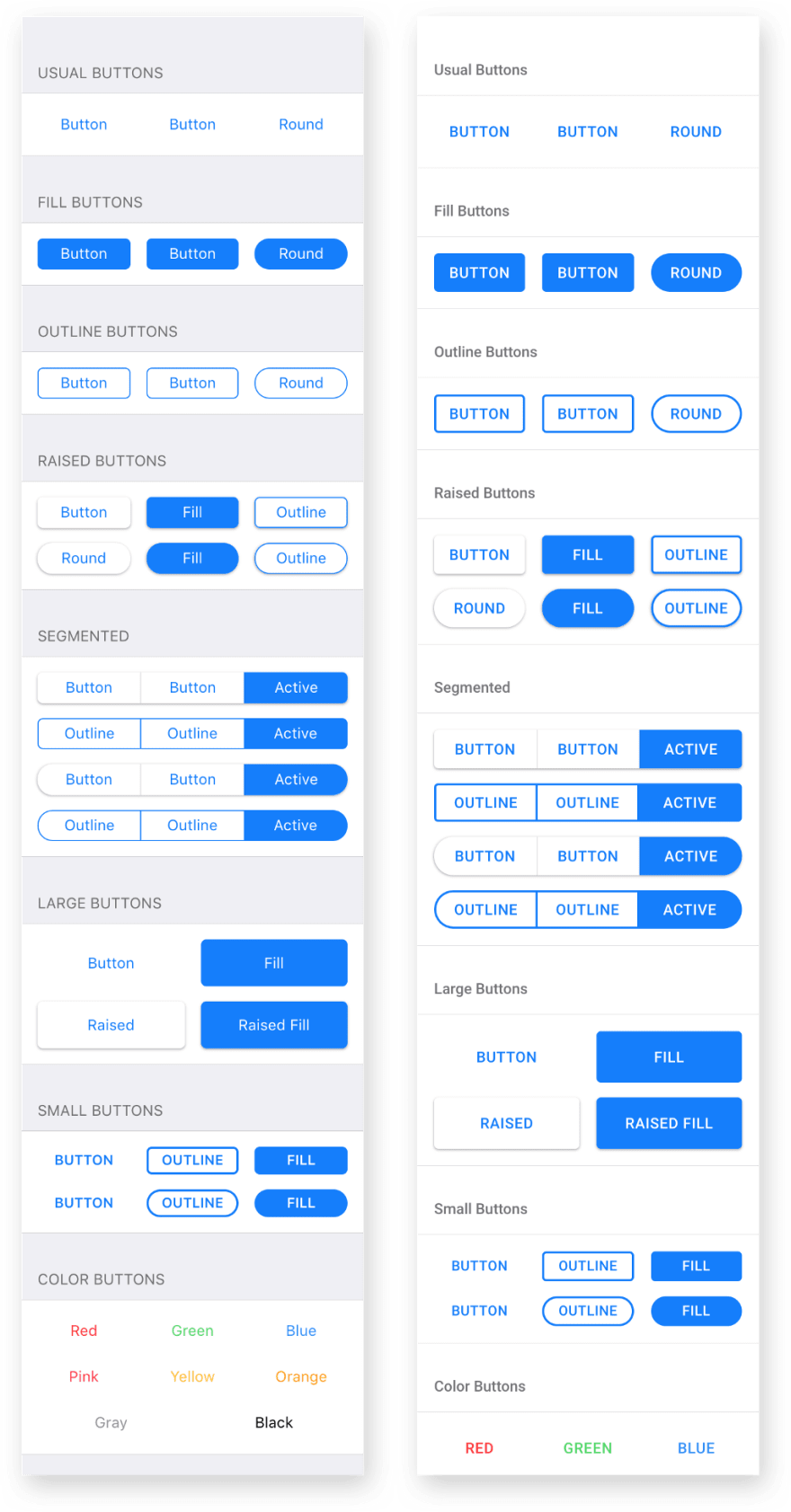
With the arrival of CSS variables, Buttons now also support all modifiers for both iOS and MD themes. For example, “raised” button now supported by iOS theme and “outline” button supported by MD theme.
Also “button-big” has been renamed to “button-large”.
Unified Messages Colors
Messages component now has similar color scheme for both iOS & MD themes:
Navbar Goes Large
This is one of the most requested features in Framework7. And now it is available in v4 for both iOS and MD themes.
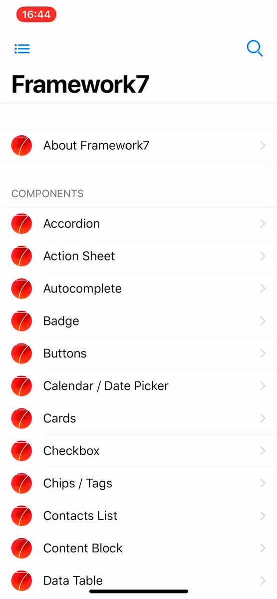

 Framework7@framework7io
 You have asked for it, you will get it! Meet all new large navbars with proper transitions coming in @framework7io v4 🎊13:56 PM - 21 Nov 2018
HTML markup for large navbar is pretty simple:
<div class="navbar">
  <div class="navbar-inner">
    <div class="left">...</div>

    <!-- Usual title -->
    <div class="title">My App</div>

    <div class="right">...</div>

    <!-- New large title (text can be different) -->
    <div class="title-large">
      <div class="title-large-text">My App</div>
    </div>
  </div>
</div>
For Framework7 Vue/React components it is even more simpler:
<f7-navbar title="My App" large />

<Navbar title="My App" large />
Expandable Cards
This was a real challenge to implement but here we goes. Meet all new expandable cards (aka AppStore cards) coming in v4:
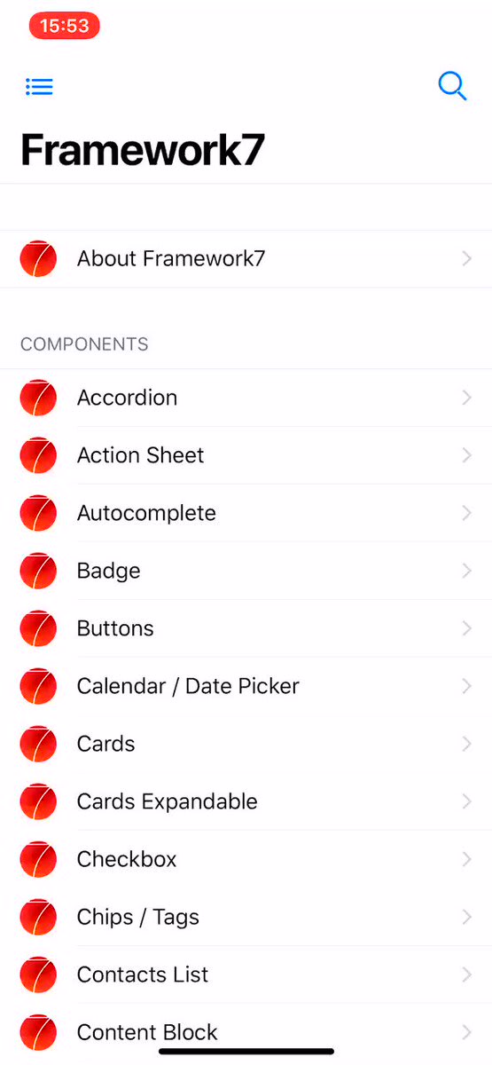

 Framework7@framework7io
 How about this? Meet all new expandable cards (aka AppStore cards) coming in @framework7io v4 🔥🔥🔥14:16 PM - 26 Nov 2018
And their API is pretty simple. Just extra card-expandable class on card element. But sometimes, to look correctly and feel native, expandable card content may require additional tweaks. But in general it is just:
<!-- expandable card -->
<div class="card card-expandable">
  <div class="card-content">
    ... any HTML content here ...
  </div>
</div>
Large Block Titles
Block titles extended to be in medium and large sizes to improve out-of-the-box typography:
It is just extra block-title-large or block-title-medium class on any block title to make it large or medium size.
Pull To Refresh From Bottom
In addition to usual pull to refresh, v4 also supports pull to refresh from bottom:
Menu — New UI Component
The idea and request for this component came from our Patrons 🙌
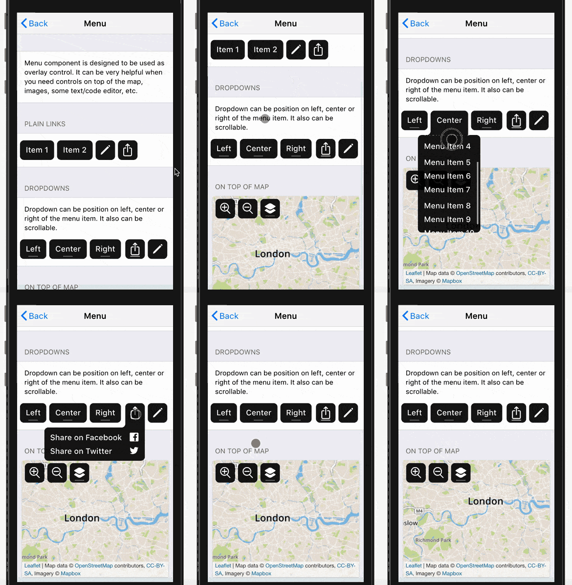
Menu component not so often seen in mobile apps. But it is proven to be extremely helpful when you need controls on top of the map, images, some text/code editor, etc.
Skeleton — New UI Component
Perhaps you have already heard of such concept: UI Skeletons, Skeleton Screens, Skeleton Elements, or even Ghost Elements?
Skeleton elements are basically “gray box” representations of UI that will be available soon. They are designed to improve perceived performance.
Framework7 comes with two Skeleton patterns:
-
skeleton-block. It is just a usual block element with gray background color, that can be in any required size -
skeleton-text. It is more interesting thing. Framework7 comes with special built-in Skeleton font, that renders every character as small gray rectangle. When we applyskeleton-textclass to any element, it converts text to gray blocks/lines. Advantage overskeleton-blockis that such “skeleton text” can be fully responsive and it is size will reflect actual text size.
Skeleton elements also support three animation effects: Fade, Blink and Pulse.
Range Slider Goes Vertical
Range Slider in v4 is also a bit reworked and improved. Now it supports scale, and vertical directions:
Core Icons Font
Here is one more improvement related to Framework7 core icons, e.g. “back” icon, Searchbar “search” icon, and others. Before v4 they were implemented as inline (data-url) SVG images in main CSS bundle. It is pretty convenient, but brings difficulties when we need to change color of such icons — we need to redefine it with another inline SVG image with required color.
In v4 all core icons are reworked to built-in core icons font with ligatures. It allowed to save extra KB’s of size and no more difficulties to change their color. Now to change such icon color we can use CSS’s color rule.
Service Workers — New Module
This new module is a large step towards Progressive Web Apps development with Framework7. Right now it only allows to simplify the process of service workers registration but will have a lot more functionality soon.
For example to register service worker, we can just specify it in app parameters:
var app = new Framework7({
  // ...
  serviceWorker: {
    path: 'path/to/service-worker.js',
    scope: '/',
  },
});
Or with API after app initialization:
app.serviceWorker.register('path/to/service-worker.js', '/')
  .then((registration) => {
    console.log('Service worker registered');
  })
With this module it will be super easy to work with service workers.
Request Promisified
Built-in Request library to work with XHR requests can work as Promises now.
-
app.request.promise(...)— same asapp.request()but returns Promise that will be resolved with response data -
app.request.promise.get(...)— same asapp.request.get(...)but returns Promise that will be resolved with response data -
app.request.promise.post(...)— same asapp.request.post(...)but returns Promise that will be resolved with response data -
app.request.promise.json(...)— same asapp.request.json(...)but returns Promise that will be resolved with response data -
app.request.promise.postJSON(...)— same asapp.request.postJSON(...)but returns Promise that will be resolved with response data
And the usage is:
app.request.promise.get('./something.html')
  .then((data) => {
    // Handle response
    console.log(data);
  })
  .catch((err) => {
    // Error happened
    console.log(err);
  });
Or with async/await:
const content = await app.request.promise.get('./something.html');

// Handle content
console.log(content)
Fastclicks Disabled
Fast clicks is a built-in library that removes 300ms delay from links and form elements in mobile browser while you click them. It was implemented and enabled since very first Framework7 release and this is one of the features that makes app developed with Framework7 feel native.
But much time has passed since then. And modern browsers are smart enough to eliminate that click delay when certain conditions met like correct <meta name="viewport"\> meta tag. So in v4 it is now disabled by default to avoid unnecessary issues, especially with 3rd party libraries. And it must be enabled if you target older devices, like iOS < 10.
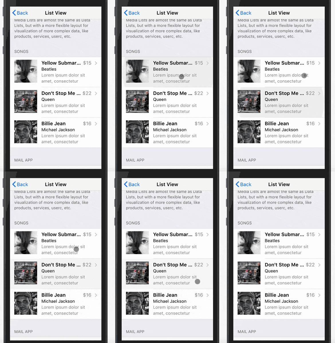
Touch Ripple in iOS Theme
Why not? Touch ripple effect that was MD-theme exclusive now can be enabled for iOS theme too with app.touch.iosTouchRipple = true parameter.
Events Bus
As you may aware Framework7 has pretty flexible events system/model. Each instance of Framework7's class (like main Framework7() class or any class-based component like app.calendar.create()) has methods to emit and handle events (emit, on, once, off).
Such model is also very useful to create custom events for communication between app components.
So in v4 there is a new helper class that is designed to be used like event bus only and not to flood main app instance.
const myEvents = new Framework7.Events();

// handle event
myEvents.on('some-event', () => {
  // do something when 'some-event' fired
})

// emit event
myEvents.emit('some-event');

// another event bus
const notificationEvents = new Framework7.Events();

notificationEvents.on('notificationReceived', (notification) => {
  // do something
})

// somewhere in the app
notificationEvents.emit('notificationReceived', {
  title: 'New message',
  from: 'John Doe',
});
Framework7 Icons V2
You may aware that we recently released Framework7 Icons v2 — free, amazing and huge set of hand-crafted iOS icons specially designed for Framework7.
And in this blog post we wrote that they have different design sizes, so their usage in Framework7 v1–v3 may required additional tweaks.
Framework7 v4 is designed to be used with new F7 icons so they will perfectly fit here.
Framework7 React & Vue Changes
Of course all new features written above like large navbars, toolbar positions, unified buttons, expandable cards will be available here with new props on related components. And there are new Vue/React components for new UI components like Menu and Skeleton.
But there is also breaking changes here. f7-label / Label component has been removed. It was used together with f7-input / Input component to create inputs in List View. Now instead of that components, we need use new f7-list-input / ListInput that was recently introduced in latest versions of Framework7 v3.
So if you have something like this (for example in Vue):
<f7-list-item>
  <f7-label>Name</f7-label>
  <f7-input
    type="text"
    :value="userName"
    placeholder="Your name"
    @input="updateUserName"
  />
</f7-list-item>
It needs to be changed to new single component:
<f7-list-input
  label="Name"
  type="text"
  :value="userName"
  placeholder="Your name"
  @input="updateUserName"
/>
Framework7 CLI v2
First version of Framework7 CLI was released a while ago and due to lack of its features and usefulness it wasn’t maintained and mentioned anywhere.
But now everything changes. With Framework7 v4 release we introduce totally new Framework7 CLI which is an extremely powerful tool to start Framework7 app development. And with Framework7 v4 it will be the most recommended way for setting up new Framework7 project.
Instead of maintaining different variations of official templates (Core/Vue/React * Single View/Tabs/Split View * Web/Cordova/PWA) it is easier to have one tool that combines all variations.
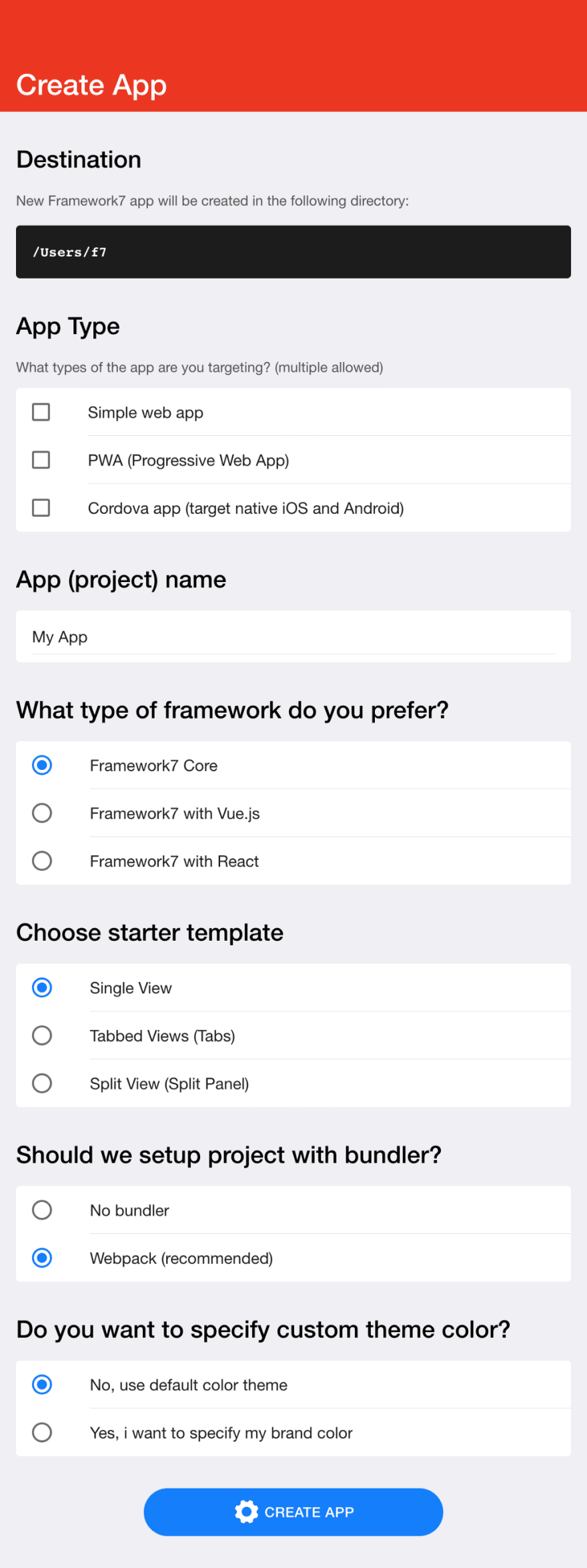
So new Framework7 CLI allows:
- to select template: Single View, Tabs, Split View
- to choose framework: F7 Core, F7 Vue, F7 React
- to choose target: Web app, PWA, or Cordova, or mix of them
- to specify custom color theme from the start
- to choose bundler: No bundler, Webpack or Rollup (coming later)
- to generate required icons and splash screen
And the usage is very simple. First, we need to install F7 CLI (in beta now) and Cordova:
$ npm i framework7-cli@beta cordova -g
And to run the following command in the directory where you want to create app:
$ framework7 create
Program will prompt for a few questions about framework and template you want to start with:
And it also comes with UI. We can run the following command instead to launch UI to create the project:
$ framework7 create --ui
And the following web app will be opened:
When?
Final and stable 4.0.0 release is going to happen in the end of January — beginning of February, 2019 🎉
But you can already try the beta version which can be considered as production ready.
For already created v2/v3 app, you can upgrade by downloading beta release at GitHub releases page or via NPM:
-
npm i framework7@beta— for core framework v4 -
npm i framework7-react@beta— for Framework7-React v4 -
npm i framework7-vue@beta— for Framework7-Vue v4
For the new app it is highly recommended to start with all new Framework7 CLI:
$ npm i framework7-cli@beta cordova -g
$ framework7 create --ui
P.S.
If you love Framework7, you can support project by donating or pledging on Patreon: https://www.patreon.com/vladimirkharlampidi or by purchasing a nice branded t-shirt at Framework7 Shop







Top comments (0)