In this post we are going to build a simple button as a svelte library within 15 minutes.
Prerequisites:
Run this command to command to create the project:
npm create svelte@latest svelte-button-example
While the command running, choose the following answers:
-
Which Svelte app template? >
Library skeleton project -
Add type checking with TypeScript? >
Yes, using TypeScript syntaxFor people who don't want to use TypeScript or don't want to build a TypeScript library, feel free to use the option above. Because we can write code in javascript without type and SvelteKit will generate types automatically for the build. Then the lib can be used in both javascript and typescript projects.
Add ESLint for code linting? >
YesAdd Prettier for code formatting? >
YesAdd Playwright for browser testing? >
Yes
Then follow the instructions on the terminal to install packages and start the project:

Don't forget to do step 3 because we want to manage package version via git

If you see the hint (yellow) section as image above, no worries, in the next step we will change the branch name and push the local repo to GitHub.
Setting up GitHub repo
Open GitHub website and create a repository svelte-button-example (same name with your project).
Then follow the instruction for an existing repository

Setting up extensions and auto formatting for VSCode
Create .vscode/settings.json
{
    "editor.formatOnSave": true,
    "editor.tabSize": 2,
}
Then install ESLint, Svelte for VS Code
extensions.
If you want nice vscode icons, install vscode-icons.
Creating the component
Create the Button.svelte in src/lib folder
<button class="btn" on:click>
    <slot />
</button>
<style>
.btn {
    border: 1px solid rgb(209, 213, 219);
    border-radius: 0.375rem;
    cursor: pointer;
    padding: 0.375rem 1rem;
    font-size: 100%;
    background-color: inherit;
    color: #212121;
}
.btn:hover {
    border-width: 1px;
    border-radius: 0.375rem;
    border-color: rgb(164, 164, 164);
    background-color: rgb(238 238 238);
}
</style>
To test during development, use the button on the home page /routes/+page.svelte
<script>
    import Button from '$lib/Button.svelte';
    function handleClick() {
        console.log('clicked');
    }
</script>

<Button on:click={handleClick}>My Button</Button>
Then you can see the button on http://localhost:5173/
Publishing to npm
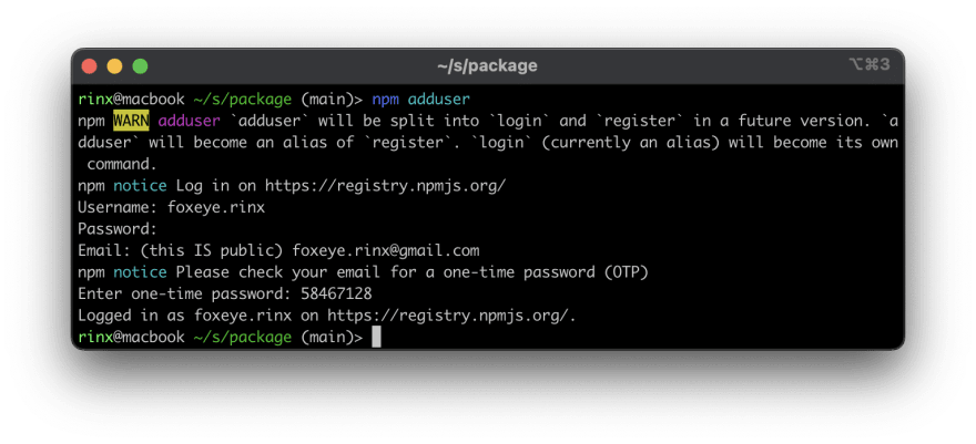
- Write
README.mdfirst - Log in to npm running:
npm add user
enter your credentials and your email to get the OTP
Then run these command to create /package folder
npm run build
cd package
npm publish

The package folder is exactly what will be published to npm, then it will be downloaded to /node_modules of users's projects.
If users want to use your package they can do:
<script>
import Button from 'svelte-button-example/Button.svelte'
...
</script>
...
or with TypeScript:
<script lang="ts">
import Button from 'svelte-button-example/Button.svelte'
...
</script>
...
Thanks to the type generator of SvelteKit, not much differences for JS users or TS users.
Let's take a look on the package folder, we did not re-export the Button
component topackage/index.jsso users have specify which component
they want insvelte-button-examplefolder,
I love this because it's good for tree shaking and simple enough.But if you want users are able to do:
import { Button } from 'svelte-button-example';Or
import Button from 'svelte-button-example';Re-export the component in
lib/index.js, read more at the SvelteKit official packaging document
Updating your package to a new version
First, make some update to your component then:
- Write some test/demo code on the dev-mode homepage:
routes/+page.svelte(optional) - Update version on the
package.jsonand updateREADME.mdabout the new changes - Push new commit to the GitHub
- Run:
npm run build
npm publish ./package

Top comments (0)