This week I finished writing a free Vue.js ebook which I'll launch next week.
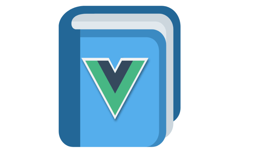
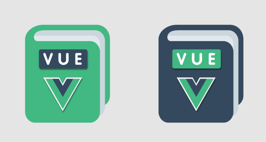
I set out to create a little landing page for it, and I decided to create a logo. I'm no designer, so this was my first attempt, combining a Twemoji with the Vue logo.
I thought it looked good.
Until recently this was enough to go on. But recently I discovered Twitter Polls and enjoyed using them.
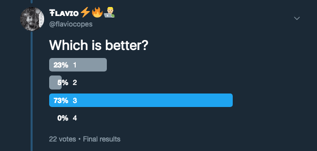
So I asked my 1800ish Twitter followers if they liked it. They said NO.
😔
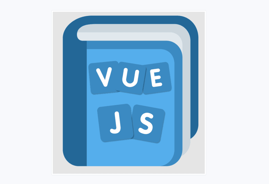
So I tried another iteration.
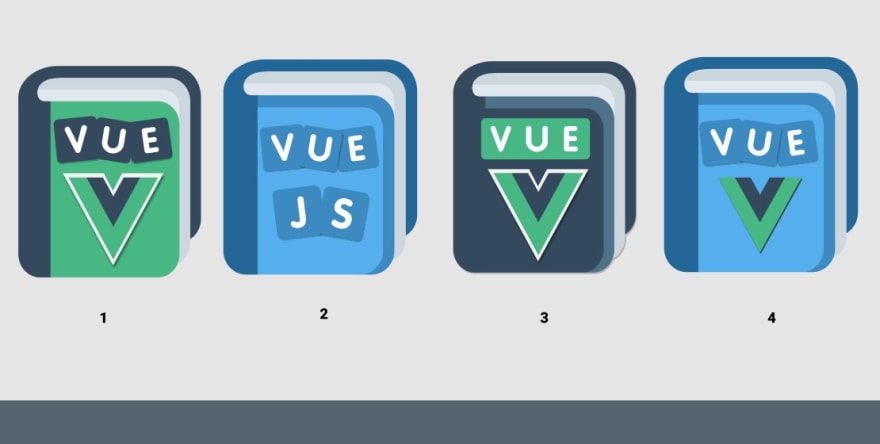
They liked it better, but I decided to throw some more ideas to the wall.
3 hit a cord:
I iterated, made the logo smaller and the words take less space, and I think this hit the right balance:
Now I realize the initial logo I came up with looks pretty ugly in comparison.
It looks pretty nice in the landing page I built, which lives on Netlify at vuehandbook.com
In the end, I really liked the process, it was fun seeing what people voted and also very motivational towards getting to a good result that was appreciated.
Again, I'm no designer but I think this is good enough for me at this point.
The inverted colors also make for a nice GIF 😁
Off to work on the final touches to the ebook.
I hope this was a nice story to read 🙂



Top comments (0)