
After setting up the basic configuration for linting and testing is time to start working on the proper project. To make the development faster, the best is to use some frontend component library so we can have a good styling.
Bootstrap is one of the most extended options out there, there is plenty of documentation so I’m going to cover how to set it up including a custom colour template. As usual, my aim is to have it working in less than 10 minutes.
1. Install dependencies
npm i bootstrap node-sass --exact
As a clarification, we are installing bootstrap for the library and node-sass to be able to work with .scss files.
2. Display some elements
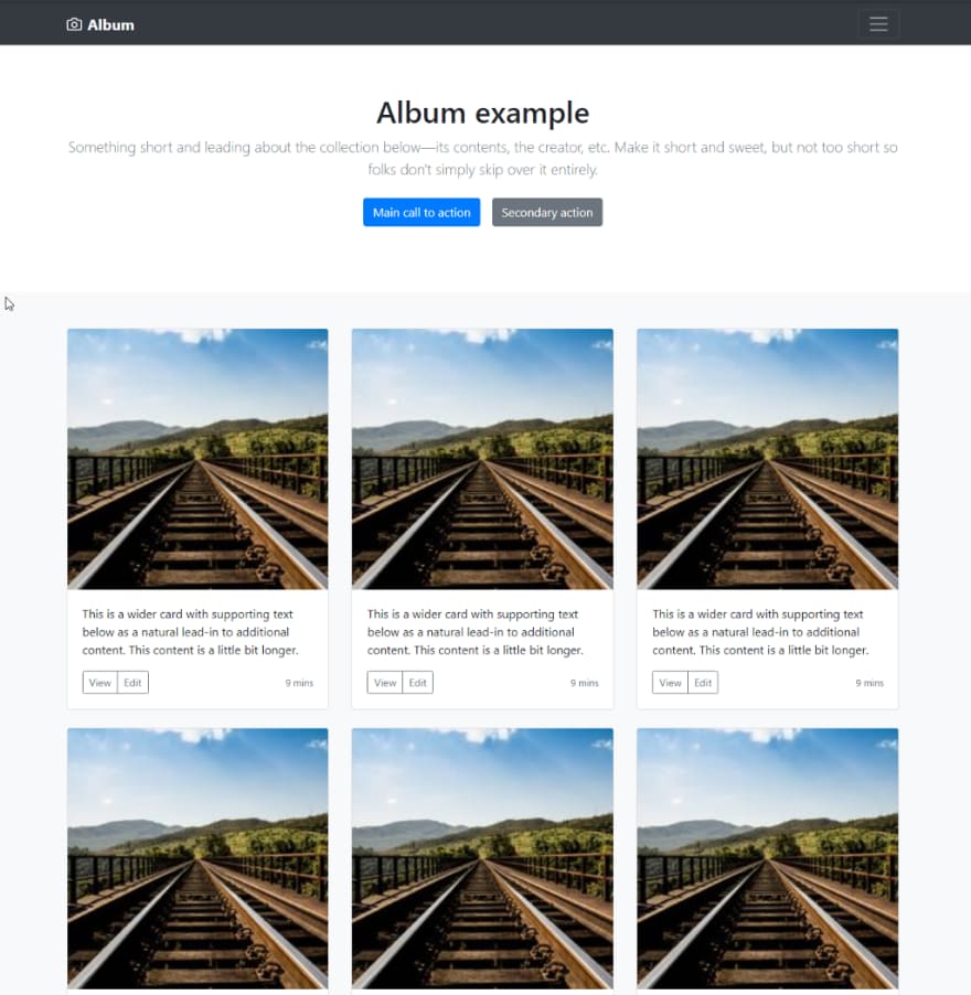
To verify if we are doing things properly, let’s add a screen. To showcase the configuration I’m using the Album example from bootstrap mostly updatingclass for className and splitting the bits into components for easier readability.
Using App as the initial component that will have different components inside.
// src/App.tsx

import React from 'react';

import { Header } from './components/header';
import { Main } from './components/main';
import { Footer } from './components/footer';

import './styles.css';

export const App = () => {
 return (
  <>
   <Header />
   <Main />
   <Footer />
  </>
 );
};

export default App;
Header
// src/components/header.tsx

/* eslint-disable jsx-a11y/anchor-is-valid */
import React from 'react';

export const Header = () => {
 return (
  <header>
   <div className="collapse bg-dark" id="navbarHeader">
    <div className="container">
     <div className="row">
      <div className="col-sm-8 col-md-7 py-4">
       <h4 className="text-white">About</h4>
       <p className="text-muted">
        Add some information about the album below, the author, or any
        other background context. Make it a few sentences long so folks
        can pick up some informative tidbits. Then, link them off to
        some social networking sites or contact information.
       </p>
      </div>
      <div className="col-sm-4 offset-md-1 py-4">
       <h4 className="text-white">Contact</h4>
       <ul className="list-unstyled">
        <li>
         <a href="#" className="text-white">
          Follow on Twitter
         </a>
        </li>
        <li>
         <a href="#" className="text-white">
          Like on Facebook
         </a>
        </li>
        <li>
         <a href="#" className="text-white">
          Email me
         </a>
        </li>
       </ul>
      </div>
     </div>
    </div>
   </div>
   <div className="navbar navbar-dark bg-dark box-shadow">
    <div className="container d-flex justify-content-between">
     <a href="#" className="navbar-brand d-flex align-items-center">
      <svg
       xmlns="[http://www.w3.org/2000/svg](http://www.w3.org/2000/svg)"
       width="20"
       height="20"
       viewBox="0 0 24 24"
       fill="none"
       stroke="currentColor"
       strokeWidth="2"
       strokeLinecap="round"
       strokeLinejoin="round"
       className="mr-2"
      >
       <path d="M23 19a2 2 0 0 1-2 2H3a2 2 0 0 1-2-2V8a2 2 0 0 1 2-2h4l2-3h6l2 3h4a2 2 0 0 1 2 2z" />
       <circle cx="12" cy="13" r="4" />
      </svg>
      <strong>Album</strong>
     </a>
     <button
      className="navbar-toggler"
      type="button"
      data-toggle="collapse"
      data-target="#navbarHeader"
      aria-controls="navbarHeader"
      aria-expanded="false"
      aria-label="Toggle navigation"
     >
      <span className="navbar-toggler-icon" />
     </button>
    </div>
   </div>
  </header>
 );
};
Main
// src/components/main.tsx

import React from 'react';

import { Jumbotron } from './jumbotron';
import { Card } from './card';

export const Main = () => {
 return (
  <main role="main">
   <Jumbotron />
   <div className="album py-5 bg-light">
    <div className="container">
     <div className="row">
      <Card />
      <Card />
      <Card />
      <Card />
      <Card />
      <Card />
      <Card />
      <Card />
      <Card />
     </div>
    </div>
   </div>
  </main>
 );
};
Jumbotron
// src/components/jumbotron.tsx

/\* eslint-disable jsx-a11y/anchor-is-valid \*/
import React from 'react';

export const Jumbotron = () => {
 return (
  <section className="jumbotron text-center mb-0 bg-white">
   <div className="container">
    <h1 className="jumbotron-heading">Album example</h1>
    <p className="lead text-muted">
     Something short and leading about the collection below—its contents,
     the creator, etc. Make it short and sweet, but not too short so folks
     don't simply skip over it entirely.
    </p>
    <p>
     <a href="#" className="btn btn-primary m-2">
      Main call to action
     </a>
     <a href="#" className="btn btn-secondary m-2">
      Secondary action
     </a>
    </p>
   </div>
  </section>
 );
};
Card
// src/components/card.tsx

/\* eslint-disable jsx-a11y/anchor-is-valid \*/
import React from 'react';

export const Card = () => {
 return (
  <div className="col-md-4">
   <div className="card mb-4 box-shadow">
    <img
     className="card-img-top"
     src="[http://picsum.photos/200/200](http://picsum.photos/200/200)"
     alt="Card"
    />
    <div className="card-body">
     <p className="card-text">
      This is a wider card with supporting text below as a natural lead-in
      to additional content. This content is a little bit longer.
     </p>
     <div className="d-flex justify-content-between align-items-center">
      <div className="btn-group">
       <button
        type="button"
        className="btn btn-sm btn-outline-secondary"
       >
        View
       </button>
       <button
        type="button"
        className="btn btn-sm btn-outline-secondary"
       >
        Edit
       </button>
      </div>
      <small className="text-muted">9 mins</small>
     </div>
    </div>
   </div>
  </div>
 );
};
Footer
// src/components/footer.tsx
/\* eslint-disable jsx-a11y/anchor-is-valid \*/
import React from 'react';
export const Footer = () => {
return (
<footer className="text-muted py-5">
<div className="container">
<p className="float-right">
<a href="#">Back to top</a>
</p>
<p>
Album example is © Bootstrap, but please download and customize
it for yourself!
</p>
</div>
</footer>
);
};
If you have copied and pasted the code your app should look something like this.

As you can see the html is there but there is no styling at all. That makes sense as we haven’t included bootstrap yet. Let’s do it!
2. Bootstrap configuration
2.A. Full version
This is the easy way of importing bootstrap in case you are happy with the default variables such as colours and measures. It’s very straightforward and easy to configure.
First of all, you need to import bootstrap at the beginning of the project so it can be overridden with your customization. The first file from your project is usually src/index.tsx so we just need to add a line.
import 'bootstrap/dist/css/bootstrap.css';
So the file should look like this:
import 'bootstrap/dist/css/bootstrap.css';
import \* as React from 'react';
import { render } from 'react-dom';

import App from './App';

const rootElement = document.getElementById('root');
render(<App />, rootElement);
And that small line has a big impact.
2.B Bootstrap Themes
If you are interested in a proper customization overwriting bootstrap defaults, the good news is that it can be done!
In order to do that, you just need to create a custom scss file changing the bootstrap variables values and after import the bootstrap file. I usually place it in src/css/bootstrap.scss. Let’s start by only importing the bootstrap styling.
// src/css/bootstrap.scss

// Import Bootstrap and its default variables
[@import](http://twitter.com/import) "node\_modules/bootstrap/scss/bootstrap";
Now we import the custom styling in index.tsx and everything is still working.
// src/index.tsx

import './css/bootstrap.scss';

import \* as React from 'react';
import { render } from 'react-dom';

import App from './App';

const rootElement = document.getElementById('root');
render(<App />, rootElement);
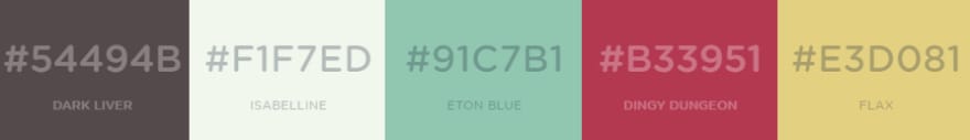
Let’s update the main colours of the app for the ones in the palette that I have generated randomly using the brilliant tool coolors.
Usually the variables should go in their own file but to make it easier to read in this example, I’m going to include them directly on the bootstrap file. So the file should look like this:
// src/css/bootstrap.scss

$darkLiver: rgba(84, 73, 75, 1);
$isabelline: rgba(241, 247, 237, 1);
$etonBlue: rgba(145, 199, 177, 1);
$dingyDungeon: rgba(179, 57, 81, 1);
$flax: rgba(227, 208, 129, 1);

$theme-colors: (
  "primary": $isabelline,
  "secondary": $darkLiver,
  "light": $etonBlue,
  "dark": $dingyDungeon
);

$white: $flax;

$grid-breakpoints: (
  xs: 0,
  sm: 700px,
  md: 900px,
  lg: 1200px,
  xl: 1500px,
  xxl: 2300px
);

$container-max-widths: (
  sm: 600px,
  md: 800px,
  lg: 1100px,
  xl: 1300px,
  xxl: 2000px
);

[@import](http://twitter.com/import) "node\_modules/bootstrap/scss/bootstrap";
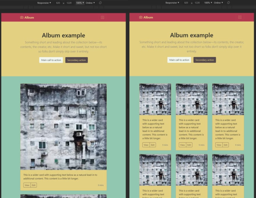
And the page reloads looking different

Let’s see how the breakpoints have changed the visual also. As the card is set to change on breakpoints and we have increased the value to 900px we can clearly see the difference.
Improvements
As usual, there is always room for improvement. If you have any comments or suggestions please leave a comment below.

Latest comments (1)
You saved my day. In my case I'm using:
$ yarn create react-app bootstrap-create-react-app-typescript --template typescript$ cd bootstrap-create-react-app-typescript$ yarn add bootstrap sassAnd after applying your tut is working like a charm, thanks.