In this post, we are going to build together a special design pattern called Media Object with only Tailwind and HTML.
The Media Object term was coined by Nicole Sullivan, the creator of Object-Oriented CSS (OOCSS), and it is a main CSS design pattern.
It can be very useful in reducing the amount of CSS you need.
Tailwind CSS, by definition, is a utility-first CSS framework for rapidly building custom user interfaces.
I myself find it so easy to create UI Interfaces with.
Tailwind allows me to have designs ready much faster than other libraries and concepts, and it's super easy to start with.
It is also customizable and themeable, And it's my go-to CSS library.
So, Let's create this Media Object example together:
We are going to use Tailwind from a CDN, but it's more recommended installing it locally and integrate it with your bundler.
(Learn more about it here.)
Let's start to code.
Create a new index.html file, and insert the Tailwind link to it at the top:
<link
  href="https://unpkg.com/tailwindcss@^1.0/dist/tailwind.min.css"
  rel="stylesheet"
/>
Markup
We'll start by creating the markup of the Media Object.
Copy and paste this snippet below:
<div>
  <img src="https://upload.wikimedia.org/wikipedia/commons/thumb/3/36/McDonald%27s_Golden_Arches.svg/546px-McDonald%27s_Golden_Arches.svg.png"
  />
  <div>
    <h3>McDonald's</h3>
    <h4>Fast food company</h4>
    <p>
      McDonald's Corporation is an American fast food company, founded in 1940
      as a restaurant operated by Richard and Maurice McDonald, in San
      Bernardino, California, United States.
    </p>
  </div>
</div>
First, we are wrapping everything with a container div.
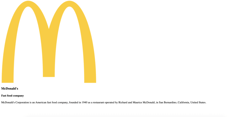
After it, ther'es the media side we talked about before - represented by the img tag.
I used Wikimedia McDonald's logo.
Then we have a container for the other side of the object: The Content.
It includes a title and a description.
It should look something like this, without the styling.
Now here's come the magic: Let's use tailwind classes to make it behave the way we want to.
CSS
First, adding the container classes.
We are flexing it, centering the items, and giving him a bit of padding and margin.
To the first div, add:
<div class="flex items-center m-2 p-2">
Next, We are gonna make the image responsive with a width class -
tailwind width classes are responsive by default.
We'll use 6rem, from the w-24 class.
In a Media Object, You should change the image size to whatever suit your design.
We also adding margin-right so it'll have space from the content.
  <div class="flex items-center m-2 p-2">
    <img
      class="w-24 mr-8"
      src="https://upload.wikimedia.org/wikipedia/commons/thumb/3/36/McDonald%27s_Golden_Arches.svg/546px-McDonald%27s_Golden_Arches.svg.png"
    />
We've made a Media Object!
img on one side, accompanying content on the second side.
Last thing is styling the text:
 <div class="flex items-center m-2 p-2">
    <img
      class="w-24 mr-8"
      src="https://upload.wikimedia.org/wikipedia/commons/thumb/3/36/McDonald%27s_Golden_Arches.svg/546px-McDonald%27s_Golden_Arches.svg.png"
    />
    <div>
      <h3 class="text-3xl text-gray-900">McDonald's</h3>
      <p class="text-lg text-gray-700">
        McDonald's Corporation is an American fast food company, founded in 1940
        as a restaurant operated by Richard and Maurice McDonald, in San
        Bernardino, California, United States.
      </p>
    </div>
  </div>
YOU DID IT!
Now it looks exactly like in the sample.
You can always DM me if you have any question or something is not working for you - let me know,
I'm at @coheneyal4 at Twitter.
Good Luck!


Top comments (0)