
Most of us have been aware of CSS-in-JS libraries since around 2015 and they have come a long way since! The top libraries that most people are familiar with are styled-components and emotion. They have mostly the same API and syntax and for this article, I won’t go into the differences between the two.
One of the main benefits that CSS-in-JS (for this article I’ll mainly reference styled-components) provides is the ability to write, quite obviously, CSS in javascript files. This is usually either through using a template string like:
import { styled } from 'styled-components'

const Container = styled.div`
  background-color: white;
`
…as well as using a Javascript object:
import { styled } from 'styled-components'

const Container = styled.div({
  backgroundColor: 'white',
})
This especially changed the game for the React world because now we can pass props to these styled components for contextual use cases
import { styled } from 'styled-components'

const Container = styled.div((props) => ({
  backgroundColor: props.mode === 'light' ? 'white' : 'black',
}))

const MyComponent = () => {
  const { mode } = useThemeContext()

  return <Container mode={mode}>...</Container>
}
No more messing with classes and CSS (Sass/Less) files!
Pitfalls
The flexibility of styled-components is great for developers to get started using it, but it can also create problems for large teams that may not have the best communication standards and best practices in place. Some developers may use the template literals, while others use CSS objects. This can cause some inconsistency in how design tokens are utilized and can cause one-off values that can make it difficult to update according to a set theme. This is where styled-system can help with giving CSS-in-JS more structure to help build a robust design system component library.
What is styled-system
Styled System lets you quickly build custom UI components with constraint-based style props based on scales defined in your theme.
It allows for style props to be added directly to styled-components so that it doesn't need to be done manually. It also hooks into the theme in a type-safe way to take the guesswork out of what type of variable should be used according to the design system.
<Box
  fontSize={4} // 4th index in theme fontSizes = ['0.5rem', 0.75rem', '1rem', 1.5rem']
  fontWeight='bold'
  p={3} // 3rd index in theme spacing = ['0px', '2px', '4px', '8px', '16px']
  mb={[ 4, 5 ]}
  color='white'
  bg='primary' // contextual color value at the theme level
>
  Hello World
</Box>
How does this help?
Why would we want to add something like this to the way we already do things with styled-components?
First-class theming
When working with styled-components, we often use the styled function that is offered. With this function, we can define what type of HTML element we want to use. To take that even further, we can even add styles to any React component (granted it accepts and passes the className to the component's underlying elements).
import { styled } from 'styled-components'
import { colors } from 'design'

const Container = styled.div`
  background-color: white;
  color: ${colors.green4};
  border-color: ${(props) => props.theme.primaryColor}
`
As you can see, we have three different ways to define a color. And the right way may not be so apparent, especially to someone who is not familiar with the code base. This ambiguity allows for theming to be a second-class citizen and for it to seem acceptable to have many one-off values (in a few cases it can be acceptable). So what if there is only one real way to define this color (two if you'd like to consider the "escape hatch" css prop as an option)?
<Box
  {/* with Typescript we can restrict these values to what is a part of the theme */}
  bg="white"
  color="green3"
  borderColor="primaryColor"
>
  ...
</Box>
These three values come directly from the theme object if it were to look like this:
export const theme = {
  colors: {
    white: '#fff',
    green3: '#1ea676',
    primaryColor: '#1ea676',
  }
}
Responsiveness
We live in a world that has so many devices and devices sizes to access the web. And because all those different devices have their own screen sizes, our site needs to be responsive to be able to provide an elegant user interface for each of those devices. To do so we utilize media queries and show styling based on the different device screen sizes. The way we currently do that with styled-components looks like this:
import { styled } from 'styled-components'
import { size, mediaQueries } from 'design'

const Container = styled.div`
  margin-top: ${size.sm}px; /* sometimes we forget about handling the mobile size */

  ${mediaQueries.forTabletVerticalUp} {
    margin-top: ${size.md}px;
  }

  /* sometimes we forget about handling the large desktop size */
`
With styled-system, almost every prop comes with a scaled value option - meaning we can easily give a value for each defined breakpoint. Let's say our theme breakpoints are set up like
export const theme = {
  breakpoints: ['400px', '600px', '900px', '1200px'], // mobile, tablet, desktop, large desktop
  size: {
    0: '0px',
    sm: '4px',
    md: '8px',
    lg: '16px',
  }
}
We can write our components like below without having to wrap styled around it and manually set the media queries
<Box
  marginTop={['sm', 'md']} // 'sm' for mobile, 'md' for everything larger
>
  ...
</Box>
Atomic Design
Atomic Design is a design concept that web elements should build upon each other like atoms, molecules, organisms, and so on.
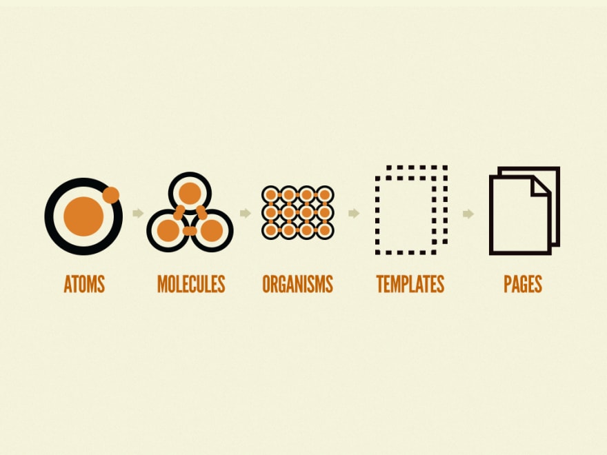
This concept is a bit tough to achieve with styled-components alone because, with the styled method, we tend to "extend" components constantly just to add some styling. When we extend these base components like that, we are essentially trying to recreate the atom with different protons and neutrons and to any newcomer, it looks like a new atom.
With styled-system, we maintain the base components as much as possible by relying on specialization - which means adding different prop values to add a specialization to a more generic component. This way as the team grows and new developers look at the codebase, it is more apparent what the underlying HTML markup is and what the intentions are.
To explain an example:
- a
buttonelement is an atom - a
styled-system+styled-componentButton is a molecule - components that ingest a Button would be an organism
- a collection of organisms that make up an experience would be a template
- templates make up a page
Downsides to styled-system
Not actively maintained
Unfortunately, the styled-system repo on Github is not actively maintained but that doesn’t mean it’s useless. This just means that no further improvements or fixes will be made and if the tool does not need any fixes then that’s okay. styled-system is super lightweight and does not have any real (shipped) dependencies. Essentially it’s a collection of methods that can be added to either styled-components or emotion to enable various style props. This is why the package size is ~150kb, which is pretty small!
Other alternatives are more robust
The creators of styled-system also have created theme-ui, which is a more full-fledged (and more fledge-ness coming soon) than styled-system. The main difference between the two is that theme-ui is opinionated to use emotion under the hood and is not compatible with styled-components (read more). Both of them do use the System UI specification as well as a few more that you can find here.
Conclusion
I believe the concept of styled-system is huge, especially when paired with Typescript, in developing a robust design system and component library. It allows for defining the styles inline with the component instead of somewhere else, which can make writing CSS less painful - especially if Typescript can tell you variables you have to pick from and it doesn’t give you an option to veer away from it unless you really try hard. And because it allows you to make your components more strict when it comes to what design token options it accepts, the more resilient to change they are as those tokens can be changed in one place and that change updates all the components respectively since they have to use the tokens and not one-off values.
So, if you work with a large group and would like to avoid rewriting the same styles and CSS values, I would highly recommend styled-system or any of the other libraries using the System UI specification. #happycoding


Top comments (1)
Useful Content ! Thanks for sharing you Knowledge Dude!
github.com/realkevinbrian Let's connect!