

Introduction.
Let's start with understanding what exploratory data analysis (EDA) is. It is an approach to analyzing data sets to summarize their main characteristics, often using statistical graphics and other data visualization methods. Simply put, it is the process of investigating data. This blog is a guide to understanding EDA with an example dataset.
Intuition
Before we know how, we should first understand why. Why perform EDA at all? Imagine you and your friends decide to go on a vacation to a beach destination neither of you has been to. At first, all of you are bummed. You don't know where to begin. Being a good planner the first question you would ask is, what are the best beach destinations? The next natural question would be, what is our budget? Consequently, you would then ask, what accommodations are available in that area and finally you'd find out the ratings and review the hotel you plan to stay at.
Whatever investigating measures you would take before finally booking your stay at your destination, is nothing but what data scientists in their lingo call Exploratory Data Analysis.
EDA is all about making sense of the data in hand, before getting them dirty with it.
EDA explained using a sample data set:
To share my understanding of the EDA concept and techniques I know, I'll take an example of the Pima Indians diabetes data set. A few years ago research was done on a tribe in America which is called the Pima tribe (also known as the Pima Indians). It is this research data we will be using.
First a little knowledge of diabetes. Diabetes is one of the most frequent diseases worldwide and the number of diabetic patients are growing over the years. The main cause of diabetes remains unknown, yet scientists believe that both genetic factors and environmental lifestyle play a major role in diabetes.
Our Data dictionary:
Below is the attribute information:
- Pregnancies: Number of times pregnant
- Glucose: Plasma glucose concentration a 2 hours in an oral glucose tolerance test
- Blood pressure: Diastolic blood pressure (mm Hg)
- SkinThickness: Triceps skinfold thickness (mm)
- Insulin: 2-Hour serum insulin (mu U/ml) test
- BMI: Body mass index (weight in kg/(height in m)^2)
- DiabetesPedigreeFunction: A function that scores the likelihood of diabetes based on family history
- Age: Age in years
- Outcome: Class variable (0: the person is not diabetic or 1: the person is diabetic)
Now that we understand a little about our data set and the goal of the analysis ( to understand the patterns and trends of diabetes among the Pima Indians population), let's get right into the analysis.
** The analysis**
To start with, I imported the necessary libraries ( pandas, NumPy, matplotlib, and seaborn).
Note: Whatever inferences and insights I could extract, I've mentioned with bullet points and comments on the code starts with #.
import numpy as np  # library used for working with arrays
import pandas as pd # library used for data manipulation and analysis

import seaborn as sns # library for visualization
import matplotlib.pyplot as plt # library for visualization
%matplotlib inline


# to suppress warnings
import warnings
warnings.filterwarnings('ignore')
*Reading the given dataset *
#read csv dataset

pima = pd.read_csv("diabetes.csv") # load and reads the csv file
pima
| Pregnancies | Glucose | BloodPressure | SkinThickness | Insulin | BMI | DiabetesPedigreeFunction | Age | Outcome | |
|---|---|---|---|---|---|---|---|---|---|
| 0 | 6 | 148 | 72 | 35 | 79 | 33.6 | 0.627 | 50 | 1 |
| 1 | 1 | 85 | 66 | 29 | 79 | 26.6 | 0.351 | 31 | 0 |
| 2 | 8 | 183 | 64 | 20 | 79 | 23.3 | 0.672 | 32 | 1 |
| 3 | 1 | 89 | 66 | 23 | 94 | 28.1 | 0.167 | 21 | 0 |
| 4 | 0 | 137 | 40 | 35 | 168 | 43.1 | 2.288 | 33 | 1 |
| ... | ... | ... | ... | ... | ... | ... | ... | ... | ... |
| 763 | 10 | 101 | 76 | 48 | 180 | 32.9 | 0.171 | 63 | 0 |
| 764 | 2 | 122 | 70 | 27 | 79 | 36.8 | 0.340 | 27 | 0 |
| 765 | 5 | 121 | 72 | 23 | 112 | 26.2 | 0.245 | 30 | 0 |
| 766 | 1 | 126 | 60 | 20 | 79 | 30.1 | 0.349 | 47 | 1 |
| 767 | 1 | 93 | 70 | 31 | 79 | 30.4 | 0.315 | 23 | 0 |
Let's find the number of columns
# finds the number of columns in the dataset
total_cols=len(pima.axes[1])
print("Number of Columns: "+str(total_cols))
Number of Columns: 9
Let's show the first 10 records of the dataset.
pima.head(10)
| Pregnancies | Glucose | BloodPressure | SkinThickness | Insulin | BMI | DiabetesPedigreeFunction | Age | Outcome | |
|---|---|---|---|---|---|---|---|---|---|
| 0 | 6 | 148 | 72 | 35 | 79 | 33.600000 | 0.627 | 50 | 1 |
| 1 | 1 | 85 | 66 | 29 | 79 | 26.600000 | 0.351 | 31 | 0 |
| 2 | 8 | 183 | 64 | 20 | 79 | 23.300000 | 0.672 | 32 | 1 |
| 3 | 1 | 89 | 66 | 23 | 94 | 28.100000 | 0.167 | 21 | 0 |
| 4 | 0 | 137 | 40 | 35 | 168 | 43.100000 | 2.288 | 33 | 1 |
| 5 | 5 | 116 | 74 | 20 | 79 | 25.600000 | 0.201 | 30 | 0 |
| 6 | 3 | 78 | 50 | 32 | 88 | 31.000000 | 0.248 | 26 | 1 |
| 7 | 10 | 115 | 69 | 20 | 79 | 35.300000 | 0.134 | 29 | 0 |
| 8 | 2 | 197 | 70 | 45 | 543 | 30.500000 | 0.158 | 53 | 1 |
| 9 | 8 | 125 | 96 | 20 | 79 | 31.992578 | 0.232 | 54 | 1 |
Finding the number of rows in the dataset.
# finds the number of rows in the dataset
total_rows=len(pima.axes[0])
print("Number of Rows: "+str(total_rows))
Number of Rows: 768
Now let us understand the dimensions of the dataset.
print('The dimension of the DataFrame is: ', pima.ndim)
The dimension of the DataFrame is: 2
- Note: The Pandas dataframe.ndim property returns the dimension of a series or a DataFrame.
For all kinds of dataframes and series, it will return dimension 1 for series that only consists of rows and will return 2 in case of DataFrame or two-dimensional data.
The size of the dataset.
pima.size
6912
- Note: In Python Pandas, the dataframe.size property is used to display the size of Pandas DataFrame.
It returns the size of the DataFrame or a series which is equivalent to the total number of elements.
If I want to calculate the size of the series, it will return the number of rows. In the case of a DataFrame, it will return the rows multiplied by the columns.
Let us now find out the **data types **of all variables in the dataset.
#The info() function is used to print a concise summary of a DataFrame.
#This method prints information about a DataFrame including the index dtype and column dtypes, non-null values and memory usage.

pima.info()
<class 'pandas.core.frame.DataFrame'>
RangeIndex: 768 entries, 0 to 767
Data columns (total 9 columns):
 #   Column                    Non-Null Count  Dtype
---  ------                    --------------  -----
 0   Pregnancies               768 non-null    int64
 1   Glucose                   768 non-null    int64
 2   BloodPressure             768 non-null    int64
 3   SkinThickness             768 non-null    int64
 4   Insulin                   768 non-null    int64
 5   BMI                       768 non-null    float64
 6   DiabetesPedigreeFunction  768 non-null    float64
 7   Age                       768 non-null    int64
 8   Outcome                   768 non-null    int64
dtypes: float64(2), int64(7)
memory usage: 54.1 KB
There are 768 entries
There are 2 float data types and 67 integer data types
Now let us check for missing values.
#functions that return a boolean value indicating whether the passed in argument value is in fact missing data.
# this is an example of chaining methods

pima.isnull().values.any()
False
- Pandas defines what most developers would know as null values as missing or missing data in pandas. Within pandas, a missing value is denoted by NaN.
#it can also output if there is any missing values each of the columns

pima.isnull().any()
Pregnancies                 False
Glucose                     False
BloodPressure               False
SkinThickness               False
Insulin                     False
BMI                         False
DiabetesPedigreeFunction    False
Age                         False
Outcome                     False
dtype: bool
- We can then conclude there is no missing values in the dataset. ## Statistical summary Now let us do a statistical summary of the data. We should find the summary statistics for all variables except 'outcome' in the dataset. It is our output variable in our case. Summary statistics of data represent descriptive statistics. Descriptive statistics include those that summarize the central tendency, dispersion and shape of a dataset’s distribution, excluding NaN values. ``` #excludes the outcome column pima.iloc[:,0:8].describe() ```
| Pregnancies | Glucose | BloodPressure | SkinThickness | Insulin | BMI | DiabetesPedigreeFunction | Age | |
|---|---|---|---|---|---|---|---|---|
| count | 768.000000 | 768.000000 | 768.000000 | 768.000000 | 768.000000 | 768.000000 | 768.000000 | 768.000000 |
| mean | 3.845052 | 121.675781 | 72.250000 | 26.447917 | 118.270833 | 32.450805 | 0.471876 | 33.240885 |
| std | 3.369578 | 30.436252 | 12.117203 | 9.733872 | 93.243829 | 6.875374 | 0.331329 | 11.760232 |
| min | 0.000000 | 44.000000 | 24.000000 | 7.000000 | 14.000000 | 18.200000 | 0.078000 | 21.000000 |
| 25% | 1.000000 | 99.750000 | 64.000000 | 20.000000 | 79.000000 | 27.500000 | 0.243750 | 24.000000 |
| 50% | 3.000000 | 117.000000 | 72.000000 | 23.000000 | 79.000000 | 32.000000 | 0.372500 | 29.000000 |
| 75% | 6.000000 | 140.250000 | 80.000000 | 32.000000 | 127.250000 | 36.600000 | 0.626250 | 41.000000 |
| max | 17.000000 | 199.000000 | 122.000000 | 99.000000 | 846.000000 | 67.100000 | 2.420000 | 81.000000 |
661    42.9
Name: BMI, dtype: float64
- The person with the highest glucose value (661) has a bmi of 42.9 **Finding Measures of Central Tendency (the mean,median, and mode) ** ``` m1 = pima['BMI'].mean() # mean print(m1) m2 = pima['BMI'].median() # median print(m2) m3 = pima['BMI'].mode()[0] # mode print(m3) ```
32.45080515543619
32.0
32.0
- Mean, median and mode ( central measures of tendency) are equal
*How many women's Glucose levels are above the mean level of Glucose
*
mean() method finds the mean of all nimerical values in a series or column.
pima[pima['Glucose']>pima['Glucose'].mean()].shape[0]
343
- There are 343 number of women's glucose levels that are above the 32.45 mean
Let us count the number of women that have their 'BloodPressure' equal to the median of 'BloodPressure' and their 'BMI' less than the median of 'BMI'
it then saves this into a new dataframe pima1
pima1 = pima[(pima['BloodPressure']==pima['BloodPressure'].median()) & (pima['BMI']<pima['BMI'].median())]
number_of_women=len(pima1.axes[0])
print("Number of women:" +str(number_of_women))
Number of women:22
Getting a pairwise distribution between Glucose, Skin thickness and Diabetes pedigree function.
The pair plot gives a pairwise distribution of variables in the dataset. pairplot() function creates a matrix such that each grid shows the relationship between a pair of variables. On the diagonal axes, a plot shows the univariate distribution of each variable.
sns.pairplot(data=pima,vars=['Glucose', 'SkinThickness', 'DiabetesPedigreeFunction'], hue = 'Outcome')
plt.show()

Studying the correlation between glucose and insulin using a Scatter Plot.
A scatter plot is a set of points plotted on horizontal and vertical axes. The scatter plot can be used to study the correlation between the two variables. One can also detect the extreme data points using a scatter plot.
sns.scatterplot(x='Glucose',y='Insulin',data=pima)
plt.show()

- The scatter plot above implies that mostly the increase in glucose does relatively little change in insulin levels It also shows that in some the increase in glucose increases in insulin. This could probably be outliers.
Let us explore the possibility of outliers using the Box Plot.
Boxplot is a way to visualize the five-number summary of the variable. Boxplot gives information about the outliers in the data.
plt.boxplot(pima['Age'])

plt.title('Boxplot of Age')
plt.ylabel('Age')
plt.show()

- The box plot shows the presence of outliers above the horizontal line.
Let us now try to understand the number of women in different age groups given whether they have diabetes or not. We will utilize the Histogram for this.
A histogram is used to display the distribution and spread of the continuous variable. One axis represents the range of the variable and the other axis shows the frequency of the data points.
Understanding the number of women in different age groups with diabetes.
plt.hist(pima[pima['Outcome']==1]['Age'], bins = 5)
plt.title('Distribution of Age for Women who has Diabetes')
plt.xlabel('Age')
plt.ylabel('Frequency')
plt.show()

Of all the women with diabetes most are from the age between 22 to 30.
The frequency of women with diabetes decreases as age increases.
understanding the number of women in different age groups without diabetes.
plt.hist(pima[pima['Outcome']==0]['Age'], bins = 5)
plt.title('Distribution of Age for Women who do not have Diabetes')
plt.xlabel('Age')
plt.ylabel('Frequency')
plt.show()

The highest number of Women without diabetes range between ages 22 to 33.
Women between the age of 22 to 35 are at the highest risk of diabetes and also the is the highest number of those without diabetes.
What is the Interquartile Range of all the variables?
The IQR or Inter Quartile Range is a statistical measure used to measure the variability in a given data.
It tells us inside what range the bulk of our data lies.
It can be calculated by taking the difference between the third quartile and the first quartile within a dataset.
Why? It is a methodology that is generally used to filter outliers in a dataset. Outliers are extreme values that lie far from the regular observations that can possibly be got generated because of variability in measurement or experimental error.
Q1 = pima.quantile(0.25)
Q3 = pima.quantile(0.75)
IQR = Q3 - Q1
print(IQR)
Pregnancies                  5.0000
Glucose                     40.5000
BloodPressure               16.0000
SkinThickness               12.0000
Insulin                     48.2500
BMI                          9.1000
DiabetesPedigreeFunction     0.3825
Age                         17.0000
Outcome                      1.0000
dtype: float64
*And finally let us find and visualize the correlation between all variables.
*
Correlation is a statistic that measures the degree to which two variables move with each other.
corr_matrix = pima.iloc[:,0:8].corr()

corr_matrix
| Pregnancies | Glucose | BloodPressure | SkinThickness | Insulin | BMI | DiabetesPedigreeFunction | Age | |
|---|---|---|---|---|---|---|---|---|
| Pregnancies | 1.000000 | 0.128022 | 0.208987 | 0.009393 | -0.018780 | 0.021546 | -0.033523 | 0.544341 |
| Glucose | 0.128022 | 1.000000 | 0.219765 | 0.158060 | 0.396137 | 0.231464 | 0.137158 | 0.266673 |
| BloodPressure | 0.208987 | 0.219765 | 1.000000 | 0.130403 | 0.010492 | 0.281222 | 0.000471 | 0.326791 |
| SkinThickness | 0.009393 | 0.158060 | 0.130403 | 1.000000 | 0.245410 | 0.532552 | 0.157196 | 0.020582 |
| Insulin | -0.018780 | 0.396137 | 0.010492 | 0.245410 | 1.000000 | 0.189919 | 0.158243 | 0.037676 |
| BMI | 0.021546 | 0.231464 | 0.281222 | 0.532552 | 0.189919 | 1.000000 | 0.153508 | 0.025748 |
| DiabetesPedigreeFunction | -0.033523 | 0.137158 | 0.000471 | 0.157196 | 0.158243 | 0.153508 | 1.000000 | 0.033561 |
| Age | 0.544341 | 0.266673 | 0.326791 | 0.020582 | 0.037676 | 0.025748 | 0.033561 | 1.000000 |
Now let us visualize using a Heatmap.
Heatmap is a two-dimensional graphical representation of data where the individual values that are contained in a matrix are represented as colors. Each square in the heatmap shows the correlation between variables on each axis.
```# 'annot=True' returns the correlation values
plt.figure(figsize=(8,8))
sns.heatmap(corr_matrix, annot = True)
display the plot
plt.show()
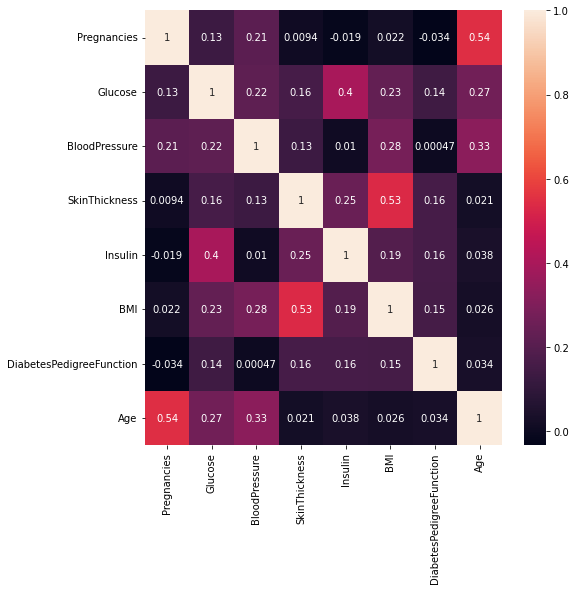
- Note: The close to 1 the correlation is the more positively correlated they are; that is as one increases so does the other and the closer to 1 the stronger this relationship is.
A correlation closer to -1 is similar, but instead of both increasing one variable will decrease as the other increases.
- Age and pregnancies are positively correlated.
Glucose and insulin are positively correlated.
SkinThickness and BMI are positively correlated.
This marks the end of our exhaustive EDA. Tell me what you think, and drop your comments in the comment section. Bye.

Top comments (0)