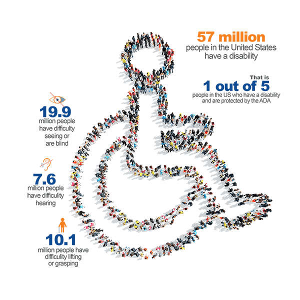
About a billion people experience disability in some form. Does your website offer the web accessibility needed for them to use it?
The Web is essentially designed to work for all people. The web works in whatever hardware, software, language, location, or ability. The web should be useful and usable to people with diverse challenges such as hearing and sight.
What is Web Accessibility?
Web accessibility is ensuring that people with disabilities can access and use the web and achieve their intended goals. Web accessibility encompasses all disabilities that include:
- auditory
- cognitive
- neurological
- physical
- speech
- visual Below are key areas that designers and developers can ensure that their websites meet web accessibility.
Images.
All images should have alternative text that is meaningful. if the description is rather long, the longdesc tag should be used instead.
<!-- The description is on the same page as the image -->
<img src="mtkenya.jpg" alt="An image of Mt.Kenya"
 width="100" height="132" longdesc="#MtKenyaExplained">
<div id="#MtKenyaExplained">
  <h2>Image mykenya.jpg</h2>
  <p>At 5,199 m, Mount Kenya is the second
highest peak in Africa. It is an ancient extinct volcano ...
</p>
</div>
Alt-text is used by people with sight impairment to understand what the image represents. In case of a broken image due to poor connectivity, the alt text will be used to give more details about the image.
Audio and Video
Audio and video require subtitles and captions. The subtitle should be synchronized with the video to avoid confusion to the user.
People with hearing impairment use subtitles and captions to understand what is being played.
Don't auto-play videos and audio. Audio or video play should be initiated by the user. If an audio plays for more than 3 seconds provide a play and pause functionality.
Colors
Developers should ensure that there is a high contrast between the color of the text presented and that of the background. Text and interactive elements should have a color contrast ratio of at least 4.5:1.
Developers should ensure that color is not the only indicator of interactive elements. (eg do not say “select the blue circle to continue”).
Text
Texts on a website should be made larger without disorienting the content, or function of a page. Image with text should be avoided at all costs since images can be unclear when resized on a page.
Your web visitors with low visibility need to increase the text size to interact with your content.
Navigation
a user should be able to navigate a website without the user of a mouse. The navigation order should be logical and intuitive. Include a search functionality for finding information quickly.
Use an unordered list so that the screen reader can read them out so that the visually impaired user can get the most information.
use the aria-label attribute to give more information as possible to the visually impaired user.
Accessibility is important for web developers and organizations who want to target a diverse range of customers. Lack of web accessibility excludes some people from using your products and services.


Top comments (0)