The great reopening debate attacked using infectious disease modeling
With the coronavirus raging through major cities all over the world, the question remains the same: when is it safe to reopen? The answer is not simple, so as usual, data science comes to the rescue. Using an SIR-based model in multiple experiments will give clues to how the reopening of the world might look, and whether it will last.
The SIR Model
The SIR model is one of the most sacred disease modeling tools. Its versatility, simplicity, and effectiveness make it one of the most powerful tools in epidemiological modeling. Here is a simple breakdown of the key ideas behind the model:
The S, I, and R
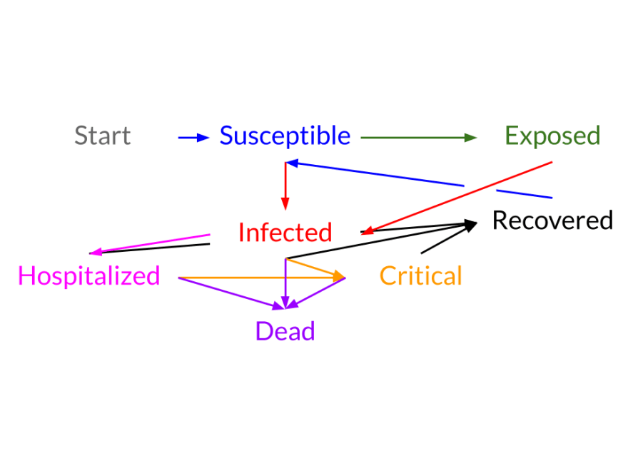
The first step in the SIR model is to break down the population into three possible states: Susceptible (S), Infected (I), or Recovered (R). The states themselves are quite self-explanatory. However, the last state, removed, is also commonly referred to as the “Removed” state because it can contain individuals who are recovered or dead.
The Dynamics
As with many problems involving populations, it is much easier to describe the change of a state rather than it is to describe the state itself. Essentially, this means that differential equations are necessary.

The equations above might look intimidating at first glance, but when understood in the right context, they make perfect sense. In order to understand these equations, we need to define a few variables, notably:
Beta = infection rate * number of individuals a person makes contact with (essentially how many people 1 infected infects)
Gamma = 1 / days to recover (the recovery rate)
The first equation means that the number of people exiting the susceptible compartment per timestep is beta * I * S/N. This makes sense because each infected infects beta people (see the definition of beta). The last part, S/N, represents the portion of the population that is susceptible because an infected or recovered person cannot be reinfected*.
Now, since everyone who “leaves” the Susceptible compartment must go to the Infected compartment (you can’t jump to the Removed compartment without first being infected), the Infected compartment simply gets whatever population leaves the Susceptible compartment (notice the derivative of the Infected compartment is just the negated derivative of the Susceptible compartment with one other term). The extra term at the end represents the people leaving the Infected compartment after recovering (the recovery rate * the infected population). And lastly, the same number of people leaving the Infected compartment join the Recovered compartment.
*The idea that someone who has recovered from an illness cannot be susceptible to it again is one of the assumptions behind the SIR model which is mostly true for COVID-19
Setting it Up
Coding the SIR Model might seem quite intimidating at first, but luckily, there is a software library that can help — check out epispot on GitHub. Epispot can handle the SIR model and even more complex models (where there are exposed and hospitalized states). Coding this model in epispot will be covered in the following sections. The code itself is not that important (you can always consult the documentation), but its predictions and the reasons behind them are.
If you are interested in the code, there is one other parameter that epidemiologists frequently use (and one that epispot uses). That parameter is of course R Naught. R Naught is essentially beta / gamma or the net gain in the infected category per infected if 100% of the population is fully susceptible. Essentially, this tells epidemiologists how infectious a certain disease is (e.g. for COVID-19, this number is around 2.5).
The Case Study
San Francisco
The entire code would be too much to explain for this article, but if you are interested, see the sf-case-study-covid-19.py in the epispot repo. However, the rest of the article will be mostly code snippets.
After we import the epispot library and get everything configured, we load the San Francisco case data from 3/19 to 7/11 from DataSF. If you want to download the data yourself, this is in the epispot repo under tests/data . Here is a sample of the data:
Now we set up the model. Again, the full code for this can be found on GitHub, but for the sake of simplicity, only an important snippet is shown. After the coronavirus data loads, the model is set up in just a few lines of code:
Before we get the predictions, there is a little bit of setup required. The parameters used in this model ( R_0, gamma, N, delta, alpha ) have all been gathered using open data sets and a regression algorithm. This means that we have essentially fitted our model to the data to get more accurate estimates. In case you are interested, the regression was performed using data from the infamous Diamond Princess cruise ship.
Lastly, the model outputs the predictions (using the epi.plots.compare method), plotted on a logarithmic scale. The predictions are from 7/11 to 8/10 (1 month ahead)*. The predictions are calculated as if there is no social distancing at all (that is, San Francisco completely reopened). Finally, the question is answered:
*Yes, this is not exactly happening right now, but it still is useful because it gives a general idea of what could happen in the future. The modeling is also still necessary because we are simulating what would happen after a complete reopening, so we need to predict.

This graph can be a lot to take in at one time, especially since all the important details are stashed away in the right corner. Zooming in on days 120–140 yield the following graph:

The gigantic yellow box on top is the period where San Francisco’s maximum hospital capacity is passed (i.e. not everyone can be treated). At this point, there is a clear public health disaster — so how long did San Francisco’s pretend lockdown really last?
7 days.
What Happened?
Seven days is quite a surprising number. Only one week. That is the maximum duration of a complete reopening. Reopening clearly does not mean that there will be no safety precautions, but in many cases it does make some sacrifices. Aside from that, there are still many reasons why this model is an exaggeration: it is from a few months ago, the parameters are all estimated, etc. However, this model does show something important:
small changes in awareness, precautionary measures, or anything that is carried out on an even citywide scale can have major impacts.
Of course, several questions remain. For example, what would happen if there was just a partial reopening, or what if this was in a suburb, or New York, or what happened it Italy? See you in the next blog post …
This is article one of the series “Reopening Safely”
While you wait …
- See the epispot repo on GitHub
- See these Medium posts on infectious disease modeling
- Look at the San Francisco case data
Credits
Epispot is built using numpy for managing multidimensional arrays. The plots shown in this article are using epispot’s plot feature, which relies on matplotlib for the stunning graphics and annotations.

Top comments (0)