Despite the move to “design in the browser” and design tools like Figma and Adobe XD, there are still quite a few of us out there being provided Photoshop PSDs to be converted into functional webpages on a regular basis. A great portion of my front end developer career revolved around “slicing” Photoshop files and writing HTML and CSS to match. While each designer tends to organize their files in their own way, I have some tips for making your Photoshop files easier for developers to use.
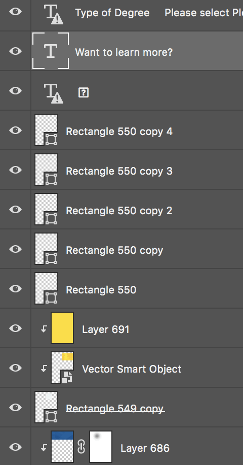
- Name Layers: appropriately named layers and folders make it easy to see what’s on them. How often have you gotten a PSD with labelled very specifically?

Not very helpful is it? Which rectangle? What’s this layer? Who knows.
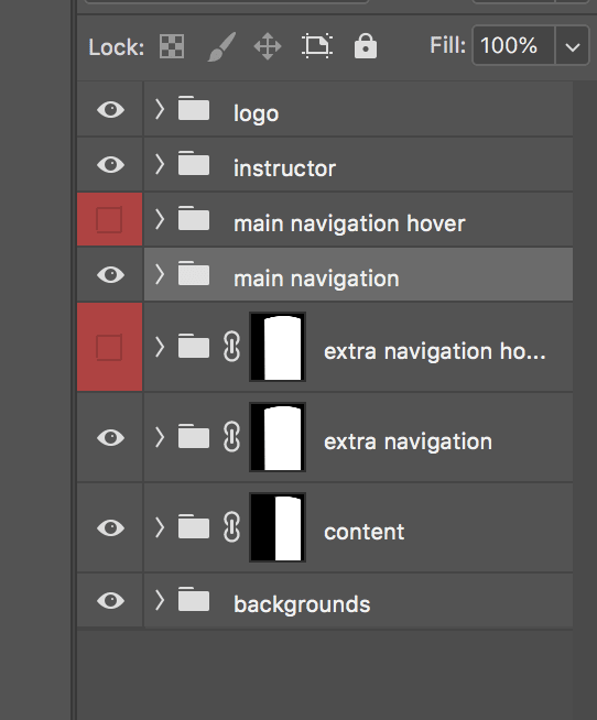
- Use Folders: group things like Header, Hero, Body, Footer etc. This will keep things organized and make it easier to find the element you are looking for in the future.
- Ensure layers/folders can be turned on and off to hide web text and reveal backgrounds or images below: Web safe text will often need to be hidden on a PSD in order to reveal the background below it. If your layers are labelled and grouped appropriately a developer should be able to turn off those layers easily as well as know which layers need to be hidden.
- Indicate hover states if any and link states: if part of the design includes graphics or buttons that change as the user hovers over them, include a layer for those graphic hover states. It is also helpful to indicate text link styles in the sample content of the design and even a list of headings, bulleted lists and other content related items that need styling.
- Do not flatten layers : definitely don’t flatten layers especially if you aren’t sure which layers your developer might need to hide/show to get to the graphics/information they might need.
I know this is only a few tips but these small things can really make a difference in time and effort on the development side of things.
Do you have any development tips for Photoshop files, I’d love to hear them!


Top comments (0)