The problem: No sticky save for lazy developers
When you are browsing this website, you get the titles like this, sometimes there are description, images and tags.
So you have two options here, either open to read it, or save it for later. Sometimes the titles are tricky as this post you are reading right now. Maybe you thought it was something very interesting, but it was actually a trap to get views/likes etc. Let's open the post to see what's inside.
Great! It's a great article to read with lots of valuable information. But wait, you got to hurry up with your train so you have decided to save the post.
The save button is either on the previous page or at the bottom of current post, no save button on the side of the post where you could easily just save it for later. Maybe you can use bookmarks with ctrl + d, but that'd be so boring.
We can either wait for the team to build one for us or we can build one ourselves. Won't it be great to fiddle with some little stuff sometimes?
The Solution: Fiddling with CSS
Okay, let's extract the selector first. I'll right click, select "Inspect Element" and it will be highlighted like this.

Now we know what to break. Let's make some css code for the selector,
#article-reaction-actions {
    position: fixed; /* This will make it floating around */
    z-index: 1000000; /* Just to make sure it's on top of everything */
    bottom: 0; /* So it stays sticky to bottom of my screen */
    background: white; /* Well it's transparent otherwise */
    width: 880px; /* The size of the parent container */
}
I am not going to discuss what each letter of the above snippet does. I'm too lazy to do that right now.
To apply the style, I'll use Stylish, which is a chrome extension. There are firefox and safari version too.
Let's create a new style. when I am reading this post, I will install the chrome extension, come back to this post, and then click the icon.

Then I'll use the above snippets code, enter a nice name and save it.

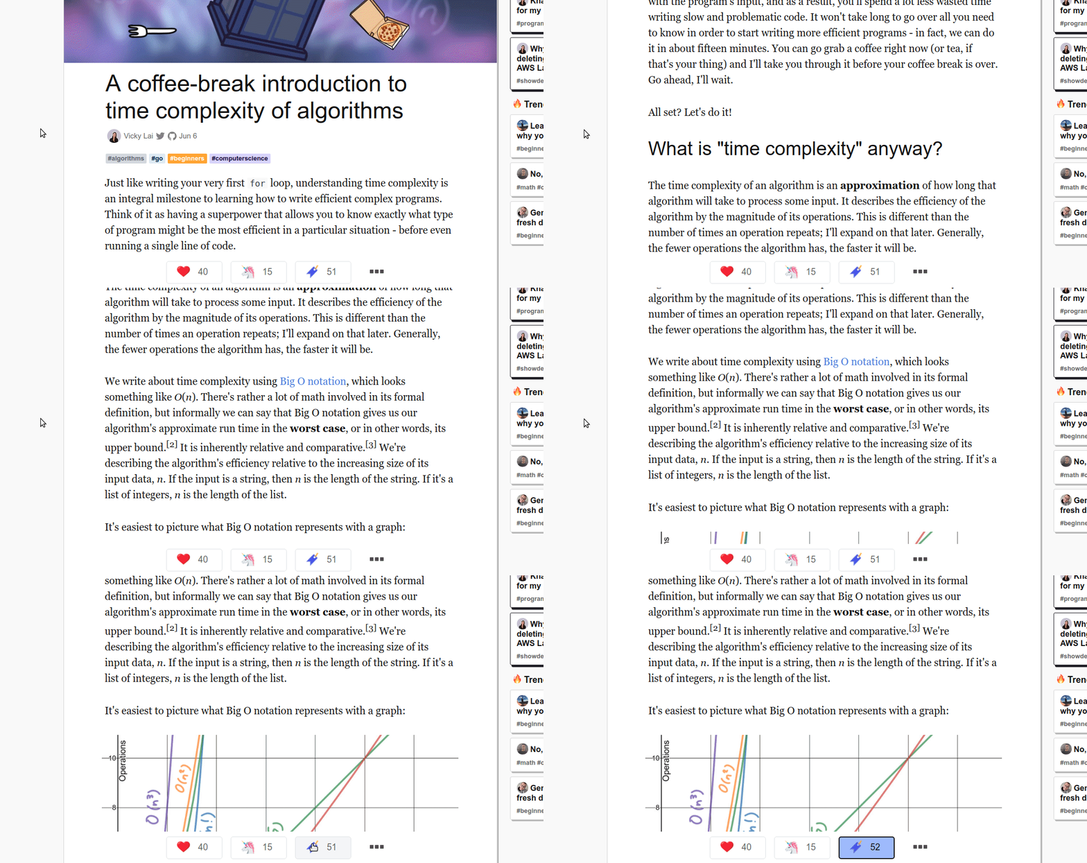
Great, now when I refresh the page, I'll see this,

Nice, isn't it? I can use this to read first few lines and decide to save or heart it without scrolling to end.
PS:
- This was just to relieve my boredom, but I use Stylish for many different websites. I also use Tampermonkey to fiddle with the JS if needed.
- Please don't make a change on website or create a chrome extension just for this post. This is no big deal.
- Sorry for using posts on images without permission :D, it's dev.to, so I guess it won't hurt.


Top comments (23)
I made a stylish which hides the number of article reactions. This way I don't get opinionated just due to the popularity of an article.
Woah, a great and different perspective. But also it will remove the opportunity of reacting to a post, right?
Nope, it looks like this: i.imgur.com/D2Mu6O9.png
Everything works, it's just the number that is not shown. It does not work for the classic posts though.
Current version: gist.github.com/elmuerte/c3a541c16...
Classic posts? Can you show what it shows?
@ben , I thought you might like to see this.
Thanks for the heads up!
@entrptaher This is awesome. I played around with some Medium-style buttons to solve this problem. That may still end up being the solution but this intrigues me at the very least. Thanks a lot for the great food for thought!!
There is still one upcoming post which is for auto update of the reactions, where it will auto update every 1 second. :P Bit hard on your server.
Woah this is super cool. Nice work! Proof of concept makes it look great, too!
I actually submitted a feature request a while ago to their Github to get the bookmark icon in an easier spot on the actual articles, since it isn't really a "reaction" more of a pre-action to reading the article. Nice to see someone else had the same idea!
Great!
Well, it's actually normal to have multiple people having same idea. There are billions of people in world after all.
This is a great idea ! Honestly, you could build on this and create a plugin in the same kind as github.com/sindresorhus/refined-gi....
Many thanks for suggestion.
Footnote: Please don't make a change on website or create a chrome extension just for this post. This is no big deal.
:D This post just shows what you can do with simple small knowledge and have fun.
I'll probably add an extension with many different changes for dev.to in next post. But that'll also probably be an overkill for something so simple.
Of course, I saw your footnote. But making an extension could be worthwhile to make an extension with many small changes and hope that dev.to will like and implement them.
Okay. I'm 😶 and welcoming all the money 🤗....
I'm actually not a fan of fixed elements. I find it takes up too much screen space. Maybe have a smaller version of the buttons at the top?
A sidebar and compact version with auto update coming up soon. :D
Is that background Tardis?
Tardis? No! That's white...
I often use an adblocker to cut bits of a website out that I don't use, too.
Great! Great! For the sake of productivity!
Cool, im currently cloning dev.to with angular 6 just for learning purposes
Great! For the sake of learning!