Well, CRAP!
One of the widely accepted design guidelines is CRAP, catchy yet misleading, referring to contrast, repetition, alignment and proximity. Graphic designers tend to think in these terms when looking at graphic images and print designs, but they can also apply to the design of user experience. Yes, I said the design of user experience…
Let’s dive into the C…
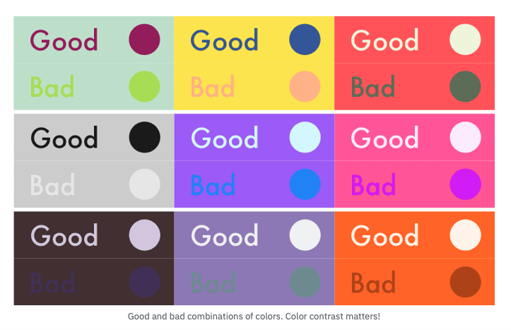
Contrast can relate to several different concepts, contrast in color typically, but can also mean the contrast in size, shape and texture. Antonio Villegas has a great article on Nelio about color and has a great graphic that demonstrates the importance of contrast when it comes to color. The difference is the experience the user has when trying to consume content from the site in the most efficient way possible. It also leads itself into web accessibility, but that is a topic for a later discussion.
I regret not saving a resource, but I read somewhere that a great way to check your contrast is to put the document in grayscale, which can be done with overlays in most mock-up programs, to see how the colors react to one another when hue is not a contributing factor. Do the grey tones all blend together? If they do, then you should re-evaluate.
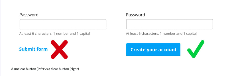
Another place where contrast can come into play when creating a quality user experience is in interactive elements. Imagine how hard it would be to quickly find a button to submit an online order if it were the same color as the elements around it? Contrast is a great way to make the things we want people to take action on to be more present and apparent, which makes the experience for the user easier. An example from an article on Digital Litmus has a great example.
Typography is another area where contrast can be applied to the design of user experience. Pages that are text heavy, can improve the user experience by helping to guide the visitors eye to where you want it to land with contrasting size or style of type. It can also help establish a hierarchy of information at a quick glance. I asked Google how long the average person spends scanning a webpage and the first search result was 2.6 seconds. That means you have less than 3 seconds to get your visitor interested before they are moving on. Using a type that draws the eye is one way to gain the users attention so they do not navigate away from the page.
Increasing the contrast of the words you want the visitors to read first, by making them larger and/or bolder will draw the eye to that text. This contrast can also be created by difference in typefaces. Using contrasting typefaces can give the appearance of importance within large bodies of text.
Contrast can be hugely helpful in designing a user experience that makes a page easier to digest and lead the reader to the most important information.
Moving on to the R, repetition. Repetition is the use of repeating elements in the design. Repetition is important in the design of user experience because it helps train the user how to interact with your site. What does that mean? Train the user? By now, each person visiting a webpage has a general idea where they can expect to find particular elements. The navigation will probably be near the top, the main content in the middle-ish, all the less important stuff that has to be there will be near the bottom. If you have a site that doesn’t follow those typical conventions, repetition can help you train your user how to see your site. Side bar- there is something to be said about keeping your site as viewers expect, makes the user experience more fluid because there isn’t a learning curve.
In an article from The Design Work, several examples of atypical designs are presented. All of them intriguing, all of them requiring additional thought from the visitor before moving on within the site. And by additional thought, I don’t mean people are staring at the page in confusing, but the decision to click an interaction such as a menu takes a fraction longer when it isn’t where it is expected to be.
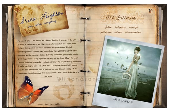
In this example, the navigation is at the bottom of the left side page. With each page turn, the navigation should stay in that same spot, using repetition to train the user how to interact with the site. If the navigation moved around the “pages” based on how it looks best, readers may become frustrated at having to find their way around each time.
Another place where repetition helps in the design of user experience, page layouts. Each page in the site should have a repetitive look about them. Why is that important? To maintain consistency, which improves the user experience because the user knows what to expect and generally where they can find a particular element, like navigation, next buttons or site map (if that’s a thing anymore). Again, we’re back to having 2.6 seconds to make an impression, if it takes your user much longer than that to find what they need, they will probably look somewhere else.

A fun graphic from Orbit Media showing why people leave pages, they can’t find stuff! Use repetition of site layout or element designs to help users find the information they need and create an easy user experience.
Following contrast and repetition is alignment. Alignment refers to how things are lined up with one another. The first element we typically think of when bringing up alignment is text. Text can be aligned to the page in several ways, but the easiest to read is left justified. Center justified is okay, with small pieces of text, such as captions or quotes. A great article from Meetchopz on Medium explains it well.
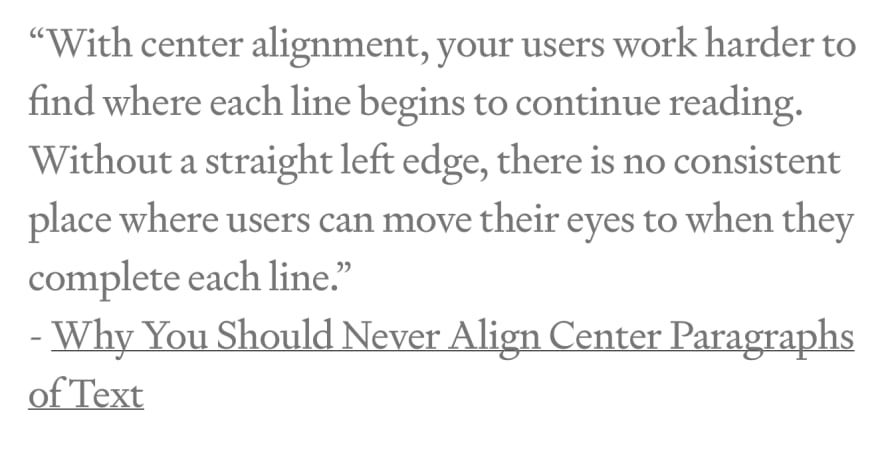
Alignment can also refer to elements other than text. It will create a better user experience if all elements have a similar alignment. An example being a blog where all post previews are left justified versus alternating between left, right and center aligned. Consistent alignment allows the viewers eye to use the most efficient movement to take in the consecutive information.
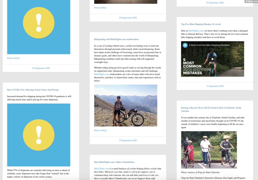
This blog page has posts arranged from left to right in chronologic order, kind of, but they are aligned up and down. It is very unexpected and causes the visitor to have to think about articles are arranged because the alignment is not typical of a blog page.
Lastly we have proximity. When talking about proximity, we are referring to the relationship each element has with each other, including the use of white space. Proximity of elements helps to group like items and create a hierarchy of information. Having elements that belong together in close proximity encourages them to visually be experienced together. With elements being grouped together, having white space between groupings creates a pause so the viewer understands there is a break in thought or idea.
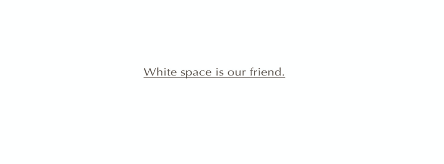
A big point I want to make in regards to proximity is the use of white space. I know I mentioned it just a few sentences ago, but it is something that I find needs its own thought. White space is not necessarily white, but it is space that doesn't have anything in it. Its a break between elements or groups of elements that act as a paragraph break. These are important because it helps present information in digestible pieces. I found a great article from interaction-design.org that has a lot more detail, if your interested.
So there you go, next time you're creating a design remember the design principles of C.R.A.P.


Top comments (0)