
Are you trying to keep up with a complex system at your work? Do you keep your finger on the pulse of sales or user signups? Or maybe you make sure the servers keep running when a surprise event happens? No matter what numbers you’re looking at, being able to collaborate with teammates can make a huge difference in your organization’s response to big changes. In this article we’ll walk through a scenario that should be familiar to you:
😎 everything is normal
🚀 something changes
😱 things go wrong
🤔 try to find out why
💪 fix the issue and adapt to the new normal.
What may not be familiar is how we can use collaborative visualization to have a better response at every step of the way. What follows is an account of an outage our team experienced that could have been a whole lot worse!
1. Everything is normal
Things are good, our dashboard looks like this:
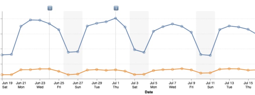
We have two versions of our website being visited, the blue line is showing how many people are visiting the current version every day and the orange line is how many people are visiting the upcoming version. You can see the regular dips in weekend usage (our website is used mostly by people doing work with data).
😎
2. Something happens
One fateful Friday our engineering team pushed a big change: we’re switching over the majority of our visitors to the new version of our website!
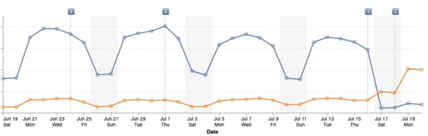
At Tuesday’s team meeting we reviewed the dashboard showing that the new version has indeed overtaken the old version in visits, success!
🚀
3. Things go wrong
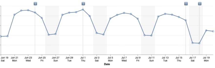
One of our non-engineering teammates points out that the two lines don’t seem to add up to what we might expect our total usage to look like based on the patterns in past weeks. The engineers agree there could be something but it’s pretty hard to tell given the usual weekend slump and we move on to other company-wide agenda items.
This is where collaboration makes all of the difference. If we had just left it at that, which would be a totally reasonable decision to make in most circumstances, we would have lost a whole lot of data.
😱
Interlude: The analytics environment
Before we continue the story let’s take a moment to talk about the analytics environment. While it will look different at different organizations, there are a few important aspects to consider.
The first is access to data, oftentimes this involves one or several databases with some kind of managed accounts to control permissions. Are you (or your analysts) able to easily get the data needed into the tools your team uses? In some organizations this may be considered a given, without access, analysis can’t happen, but it’s still common for data to be locked up from those who could make the most out of it.
The second thing to consider is the tools being used to analyze data, especially their expressive potential. There are many products that offer out-of-the-box value with pre-built visualization components, but we argue that the biggest value comes from seeing the unexpected. The question isn’t about the features of the tool, but rather how fluent is your team with their tools?
In our case, we use Observable to bring data and code into the same canvas, allowing our teammates to work directly with the data they need to answer the questions they have. We can also work together in the same canvas, greatly reducing turnaround time for iteration. Now let’s get back to the story to see how enabling collaboration can make a huge difference for the team!
4. Try to find out why
One of the newer members on our visualization team wanted to look a little deeper into the concern our other teammate had raised, but didn’t have much experience with our analytics system. Because our dashboards are built in Observable, anyone at the company is able to fork them and try out their own queries and visualizations with the data. So during a huddle with a few others on the visualization team she gave it a try, forked the dashboard and put together a new line chart that added the two series together:
This way we could see a little better that the weekend and the last two days seemed a bit lower than the past few weeks. It was still a lot of eyeballing though, and we wondered if there was a way to have a more direct comparison of past weeks. Our teammate suggested a couple of techniques she was familiar with but would need to write some code to implement because they aren’t available in the out-of-the-box visualization packages. Another visualization teammate in the huddle offered to help her pair program with Observable Plot, an open source visualization library that could be used in the same canvas she had just forked.
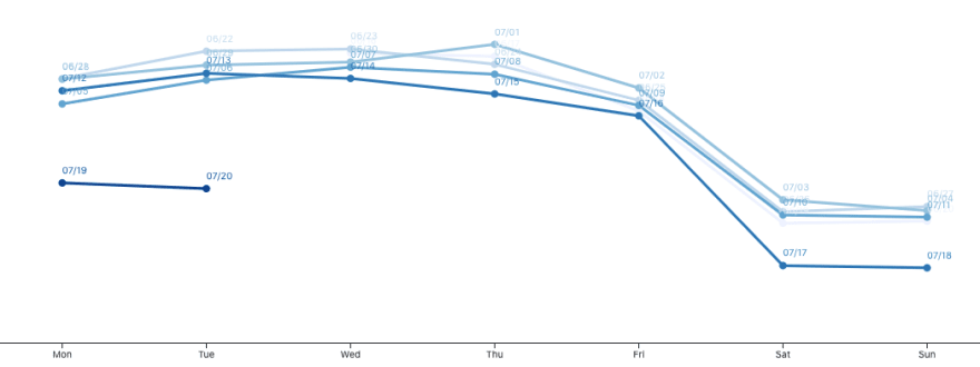
The two of them came up with the Plot above showing the last 5 weeks overlaid on each other, the more recent the week the darker blue the line. From this it was definitely apparent that the last two days were lower than the previous weeks. This was a helpful perspective, but she was convinced that we could see it even more clearly with a technique called a “Cycle Plot”.
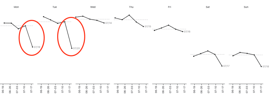
Using Observable Plot’s faceting functionality they were able to create a trend line for each day of the week. This made it even clearer that Monday and Tuesday were much lower than usual, and it even highlights that the drop started over the weekend with Saturday and Sunday showing lower than usual traffic.
🤔
5. Fix the issue and adapt to the new normal
With the problem in clear view, one of the engineers in the huddle checked on one of our error logging dashboards and found a steady rise in errors that began the Friday of the deploy. This was a real production bug!

The engineering team tracked down the issue to a problem with the way our user analytics events were being created in the new version and quickly deployed a fix.
💪
In retrospect, had we been watching this error dashboard we may also have caught the bug early. In fact, after the bug was addressed the engineering team setup an alert on the error logs so that we would automatically be watching. As the saying goes, if a tree falls in the forest and no one is there to hear it, does it make a sound? The reality is that engineering teams are busy with lots of demands on their attention, they can’t be in every forest all the time! Bringing clarity to a situation via visualization can be a valuable way to direct limited attention to where it’s most needed.
👀
Collaborative visualization for the win! 👩💻+👨💻=📈
Every hour that the bug was live was an hour of missing data from our analytics! If we hadn’t been set up for easy collaboration on visualization, that bug would have stayed invisible to the team until it had accumulated so much under-counting that it started to trigger questions in our higher-level aggregate tracking metrics. By that time we would have lost lots of important data that we could not get back.
As we experienced, sometimes it’s too much work for a single person to follow a hunch by themselves, but if the team is empowered to work with data and collaborate on visualizations it’s possible to expose valuable insights, before it’s too late! How empowered is your team to see what’s happening with your data?
😎🚀😱🤔💪

Top comments (0)