
Build components faster for your React project.
Take a look at the final result
What is Storybook?
Storybook is a tool for developing UI components in isolation, this means we can have these outside our main app, make the necessary changes, and import them in our app knowing how they look.
Design systems have become an important part of any product development process, and chances are that you already work with one. This system delivers a style guide for designers and developers to follow. You have many UI components with different patterns and variations. This is a perfect scenario to use Storybook.
The advantages of Tailwind
Tailwind CSS is a highly customizable, low-level CSS framework. It's not a UI kit like many other frameworks, it gives you full control over how your website looks, all through CSS classes.
Setup a react app and install tailwind.
I will start a project from scratch with create-react-appp.
npx create-react-app storybook-ts --template typescript
Let's install the dependencies.
npm install tailwindcss postcss-cli autoprefixer
Create a new file called postcss.config.js on the root of the app with the code below.
module.exports = {
  plugins: [require('tailwindcss'), require('autoprefixer')],
};
We will process tailwind with postcss, and autoprefixer will parse the CSS and add vendor prefixes for browser support.
Now add this script in the package.json file.
{
    "scripts": {
        ...
    "build:tailwind": "postcss src/scss/base.scss -o src/scss/tailwind.scss"
  },
  ...
}
Create a new scss folder inside src. I will use sass files because I will use base.scss to write more classes, but you can use css.
If you decide to use sass don't forget to install node-sass.
Create a base.scss file inside the scss folder with this content.
@tailwind base;
@tailwind components;
@tailwind utilities;
Run this command on the console and the tailwind file will be generated.
npm run build:tailwind
Place the generated tailwind file in your App component.
// App.tsx

import './scss/tailwind.scss';
For this tutorial, we are going to work with the default configuration of tailwind, feel free to adjust it to your needs. Run this command npx tailwind init and a tailwind configuration file will be generated, you can add the values that work better for you. This is tailwind's default configuration, take it as a reference.
Create a new components folder insider src and add a button.tsx file.
import React, { FC } from 'react';

type ButtonTypes = {
  /**
   * Label of the button
  */
  label: string;
  /**
   * Boolean value to define the button style
  */
  outlined?: boolean;
  /**
   * Button click action
  */
  onClick(): void;
}

const BASE_BUTTON = 'rounded outline-none shadow py-3 px-12 font-normal uppercase tracking-wider text-lg'
const CONTAINED_BUTTON = `${BASE_BUTTON} bg-teal-400 border border-teal-400 text-white`
const OUTLINED_BUTTON = `${BASE_BUTTON} border border-teal-400 text-teal-400`

export const Button:FC<ButtonTypes> = ({ onClick, label = "Some label", outlined }) => {
  return (
    <button
      onClick={onClick}
      className={outlined ? OUTLINED_BUTTON : CONTAINED_BUTTON}
    >
      <span>{label}</span>
    </button>
  )
};
Let's dive into Storybook
In order to process typescript files with Storybook we need to extend the webpack configuration. Let's create a new folder at the root of our project called .storybook and create a main.js file inside.
But first, let's install the dependencies that we need.
npm install --save-dev @storybook/react @storybook/preset-create-react-app babel-loader react-docgen-typescript-loader @storybook/addon-actions @storybook/addon-info @storybook/addon-knobs @storybook/addon-notes @storybook/addons
We are going to use the addons to enable advanced functionality to our stories.
On the main.js file add the following code.
module.exports = {
  stories: ['../src/stories/**/*.stories.tsx'],
  addons: [
    '@storybook/addon-actions/register',
    '@storybook/addon-knobs/register',
    '@storybook/addon-notes/register',
  ],
  webpackFinal: async config => {
    config.module.rules = [
      ...config.module.rules,
      {
        test: /\.(ts|tsx)$/,
        use: [
          {
            loader: require.resolve("babel-loader"),
            options: {
              presets: [require.resolve("babel-preset-react-app")]
            }
          },
          require.resolve("react-docgen-typescript-loader")
        ]
      }
    ],
    config.resolve.extensions.push('.ts', '.tsx');
    return config;
  },
};
Let's create our first story.
Create a stories folder inside src, and a file called button.stories.tsx. We are going to add some addons, to change the props of the button directly from storybook.
import React from "react";
import { Button } from '../components/button';
import { action } from '@storybook/addon-actions';
import { withKnobs, text, boolean } from "@storybook/addon-knobs";

export default {
  title: "Button",
  decorators: [withKnobs]
};

export const primary = () => {
  const label = text("Label", "See now");
  const outlined = boolean("Oultined", false);
  return (
    <Button onClick={action('clicked')} outlined={outlined} label={label} />
  )
};
Let's add a script on the package.json file to run storybook.
{
    "scripts": {
        ...
    "build:tailwind": "postcss src/scss/base.scss -o src/scss/tailwind.scss",
    "storybook": "start-storybook -p 5000"
  },
  ...
}
Now if we run npm run storybook we will see something like this.

It's our button! but without the styles. Let's fix that by creating a new Layout component. All the files that we are creating from now are going to be inside .storybook folder.
import React from 'react';
import '../src/scss/tailwind.scss';

const Layout = ({ children }) => {
  return (
    <div className="px-20 py-10">
      {children}
    </div>
  )
}

export default Layout;
Create a preview.js file.
import React from 'react';
import { addDecorator } from '@storybook/react';
import { withInfo } from '@storybook/addon-info';
import Layout from './Layout';

addDecorator(storyFn => <Layout>{storyFn()}</Layout>);
addDecorator(withInfo({
  inline: true,
  propTablesExclude: [Layout]
}));
If you run storybook again, our story now looks like this. The info addon generates the source code and a proptypes table.

Notes:
If you face problems importing the tailwind file, you need to add a
sass-loaderto your webpack configuration onmain.js.If you can't see any proptypes, check your component file. Be sure to destructure the react imports or import React like this. Or try to not use
export defaultfor your component.
  import * as React from 'react';

  import React, { FC } from 'react';

  export const Button = () => {} //don't use export default.
Dark mode.
Our app looks great, but do you know how can we make it look better? Yes, with dark mode.
First, create a manager.js file and add the following code.
import { addons } from '@storybook/addons';
import { themes } from '@storybook/theming';

addons.setConfig({
  theme: themes.dark,
});
This will add the dark theme to your storybook app.
On the previous preview.js file, add this to change the styles for the info.
import React from 'react';
import { addDecorator } from '@storybook/react';
import { withInfo } from '@storybook/addon-info';
import Layout from './Layout';

addDecorator(storyFn => <Layout>{storyFn()}</Layout>);
addDecorator(withInfo({
  inline: true,
  styles: (base) => ({
    ...base,
    infoBody: {
      ...base.infoBody,
      backgroundColor: '#303030',
      color: 'white',
    },
    source: {
      h1: {
        margin: '20px 0',
        padding: '0 0 5px 0',
        fontSize: '25px',
        borderBottom: '1px solid #EEE',
      },
    },
  }),
  propTablesExclude: [Layout]
}));
We almost have it. But now the text on the proptypes table doesn't look good.
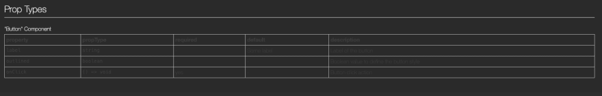
Create a preview-body.html and add this code.
<style>
  .info-table, .info-table td, .info-table th{
    color: #fff;
  }
</style>
Run storybook again.
Now you have it, storybook is up and running on dark mode with your tailwind components and typescript support.
Check the code in this repo.


Top comments (1)
Great explanation Elizabeth!
I was having a hard time trying to setup quickly a Gatsby + Storybook + Tailwind project and this was really helpful 🎉
This is a cool entry point 🤓