
Let's explore 2 things today in parallel:
- Observable's new Plot library for quick data visualizations and exploratory data analysis.
- The minor plague that is parking sprawl.
A few reasons why Observable Plot is great:
- It’s super quick and relatively mindless to crank out “good enough” charts and graphs. If you need something fancy, d3 is still a reasonable bet, but for basic bar graphs, line charts, distributions, etc., it’s does the trick with minimal fuss.
- The API is intuitive, minimal and uses the conventions that most d3 data visualization developers have come to rely on for custom dataviz.
- The faceting concept, which we’ll explore here, makes it easy to visualize many different dimensions of the same dataset in parallel, as small multiple charts.
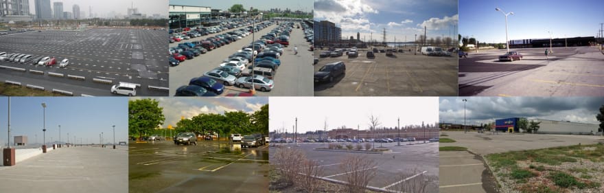
A few reasons why parking lots are the worst:
- Car accidents. 20% of car accidents happen in parking lots (leading to 60k injuries each year, src).
- Housing prices. More parking → less housing. In NYC, a 10% increase in minimum parking requirements leads to a 6% reduction in housing density (src).
- Pollution. More parking → more auto emissions (src).
- They’re so, so ugly.
Land Use for Parking Dataset
Let’s start with a dataset. Note that Plot is built with “Tidy Data” in mind, which is another way of saying it’s clean and tabular. Observable’s definition:
- Each variable must have its own column.
- Each observation must have its own row.
- Each value must have its own cell.
So I’ve put together a County Parking Area Dataset here. It’s a combination of the results of this study, which models parking lot land use for the United States and the US Census National Counties Gazetteer File, which has basic facts about counties like population size and land area. It’s ~16k rows, each with 6 fields:
-
geoid: The FIPS state + county code for the county -
countyName: A human readable name for a county -
landAreaMSq: Land area in meters squared -
parkingLandAreaMSq: Parking lot land area in meters squared -
year: The year associated with the parking lot measurement estimation.
We can pull down the data with:
countyDataTidy = d3.json("https://gist.githubusercontent.com/elibryan/0bc177106babf67c1bf446d81fc6e5c9/raw/fea5ebd25f4d0f37f8a70a597540c5c97d030f4f/parking-area-dataset.json")
Then let’s make some charts!
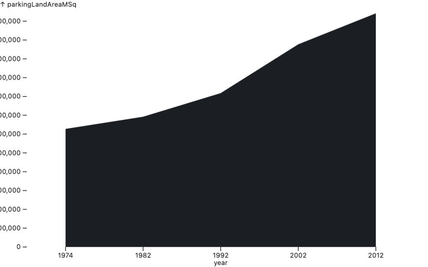
How much have parking lots spread in single city?
A simple area chart in Observable Plot
Let’s start simple and just look at growth for one city. Let’s say Raleigh NC.
First let’s pull out just the Raleigh related rows:
  // The Geoid for Wake County, NC
  const raleighGeoid = "37183";
  // Filter the dataset for just Raleigh data
  const raleighTidyData = countyDataTidy.filter(
    record => record.geoid === raleighGeoid
  );
Then we'll create a simple area chart showing just the Raleigh time series.
We get the plot above from the following snippet:
Plot.plot({
  marks: [
    Plot.areaY(raleighTidyData, {
      x: "year",
      y: "parkingLandAreaMSq"
    })
  ]
})
This loosely translates to “given this tidy data, show me a sane area chart where X is the “year” field and Y is the “parkingLandAreaMSq.” Granted, the result is ugly, but this is a single, straightforward function call.
This introduces Plot’s concept of “marks.” In this context, a “mark” is an abstract term describing any visual encoding of data. Plot offers built in marks for all your favorite data visualizations (e.g. bars, lines, dots, areas, etc).
Let’s clean it up a bit:
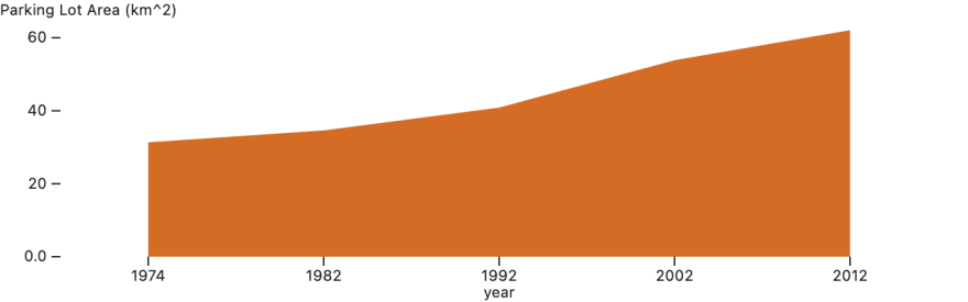
We get the chart above from the following snippet:
Plot.plot({
    // Set formatting for the y axis
    y: {
      label: "Parking Lot Area (km^2)",
      tickFormat: (d) => d3.format(",.2r")(d / 1000000)
    },
    // Set the overall chart height
    height: 200,
    // Add "marks" to the plot
    marks: [
      // Define an area...
      Plot.areaY(raleighTidyData, {
        // Where X is year
        x: "year",
        // Y is parking lot area
        y: "parkingLandAreaMSq",
        // Color it a gross orange, to remind us that parking lots are gross
        fill: "#D46C25"
      })
    ]
  });
Conclusions:
- Plot gives (nearly) 1-liner graphs for visualizing (silly) data in Javascript
- Since 1974, Raleigh’s has more than doubled its surface area devoted to ugly parking lots
How much have parking lots spread across multiple cities?
Small multiples charts in Observable Plot
Let’s plot the 20 counties with the largest land-use area devoted to parking lots.
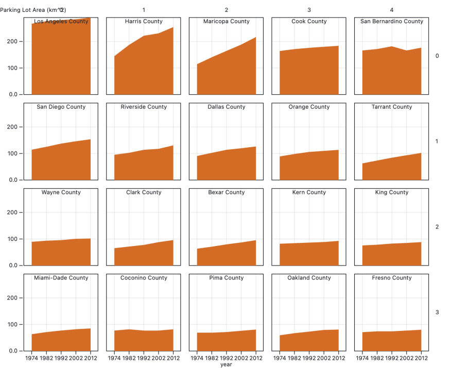
We get the graphs above from the following code snippet:
// The dataset includes observations for 5 different years
  const pointsPerCounty = 5;

  // Let's get the 20 counties with the largest (ever) parking lot areas
  let largestCountyIds = d3
    .groupSort(
      countyDataTidy,
      (records) => -d3.max(records, (record) => record.parkingLandAreaMSq),
      (record) => record.geoid
    )
    .slice(0, 20);

  // Filter a subset of the data for the selected counties
  const countyIdsToPlotSet = new Set(largestCountyIds);
  let countyDataTidySubset = countyDataTidy.filter((record) =>
    countyIdsToPlotSet.has(record.geoid)
  );

  // Let's add indicies to each row based on the county (a hack for later)
  // It doesn't matter what the indices are, so long as they're sequential
  countyDataTidySubset = countyDataTidySubset.map((record) => ({
    ...record,
    index: largestCountyIds.indexOf(record.geoid)
  }));
  // return countyDataTidySubset;

  // Extract the largest Y value (another hack for later)
  const yMax = _.max(
    countyDataTidySubset.map((record) => record.parkingLandAreaMSq)
  );

  return Plot.plot({
    // Draw a grid on the plot
    grid: true,
    // Set width to 800
    width: 800,
    // Slightly abusing facets to just show a grid of arbitrary charts
    y: {
      label: "Parking Lot Area (km^2)",
      tickFormat: (d) => d3.format(",.2r")(d / 1000000)
    },
    facet: {
      data: countyDataTidySubset,
      x: (record) => Math.round(record.index % 5),
      y: (record) => Math.floor(record.index / 5)
    },

    marks: [
      // Show borders around each chart
      Plot.frame(),
      // Show the area chart for the county with the matching index
      Plot.areaY(countyDataTidySubset, {
        x: "year",
        y: "parkingLandAreaMSq",
        fill: "#D46C25"
      }),
      // Show a label with the name of each county
      Plot.text(countyDataTidySubset, {
        filter: (d, i) => i % pointsPerCounty === 0,
        x: () => "1992",
        // Add the title to the top of the chart
        y: yMax,
        text: "countyName",
        dy: "1em"
      })
    ]
  });
We’re doing a couple things here:
- First we’re extracting the 20 counties with the largest parking lot areas
- Then we’re plotting them by slightly hacking Plot’s faceting system
Conclusions:
- LA County has a crazy amount of parking lot. As of 2012 it’s 290km2 (111 sq mi). That is, LA county has about 5x more area for parking than Manhattan has for everything.
- Plot’s Facets are great for showing small multiples charts of datasets split by dimension.
- Parking lots are the worst.
-
Like this post?
You can find more by:
Following me on twitter: @elibryan
Joining the newsletter: 3iap.com
Thanks for reading!

Top comments (0)