The Bootstrap grid-system offers a simple and powerful way to create responsive layouts and therefore suitable for all shapes and sizes.
A grid-system is a set of CSS rules useful for managing the arrangement of content on a page.
It divides the container into multiple columns with dimensions and spaces consistent with each other.
It is based on flexbox.
The layout adapts flexibly to the display used (Responsive Design).
The space is filled or the elements are juxtaposed together so that everything is ordered.
It works with two axes: the main one horizontally, the transverse one vertically.
It uses a twelve column per row system and six predefined reactive levels (breakpoints).
Characteristics of the grid-system
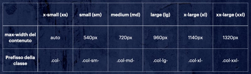
Applying a .col-sm-* class to an element will affect small devices, but also medium, large and extra large devices if the specific .col-md-* .col-lg-* classes are not present, .Col-xl-, or .col-xxl-
How use it
You create a container that acts as a wrapper using a container class such as .container
You create lines inside the container using the .row class
Columns are created within any row using the classes .col-, .col-sm-, .col-md-, .col-lg-, .col-xl-* and .col-xxl-*
If you want to see some example, see the document

Top comments (0)