
A modern, high quality website deserves great photography-but websites are responsive; photographs are not. How these two come together is always an unavoidable compromise. Until now.

Good photography often ends up looking like this on a live website—it's a shame half her face is gone (cropped; photo by jordanbauer on Unsplash)
I searched for an option that would give us the best of both worlds-the mythical unicorn of responsive photography on the web. In this article I'll quickly go through the different technical methods I've tried. I also discovered something very unexpected on the way… Want to know more? Come along with me and find out.
Just interested in the solution?
Skip right ahead. I won't hold it against you. 😁
The impossible choice
We've all seen websites with chopped off heads, half hidden products or images so large they push the content out of view. We can avoid that with proper art direction. First get some good crops, then add a responsive point of interest on top of that. Sounds simple enough, but there are downsides. The biggest of which is the reason you're actually seeing this issue more often, rather than less-accessibility.
Whenever we use an image, we have to choose between two options; a regular image, or a background image. To support art direction, we need to use a background image; this enables different crops and points of interest, but requires inaccessible markup. To make it accessible, we need to use a plain image; but these can only be cropped, not art directed. We're caught between a rock and a hard place.
And before you mention it; yes, we can apply art direction on an image via object-fit-but only for a single breakpoint. That usually makes things worse on all the others!
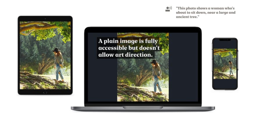
A regular image—fully accessible, but there's no art direction apart from simple cropping. (Photo by Kevin Young)

A background image—fully responsive, but screen readers and search engines don't know what to make of it. (Photo by Kevin Young)
The same impossible choice, every time. Well, not this time! I want to have both. I want different crops and points of interest, so the art director will be happy. I want it to be lazy loaded, small in size and accessible for screen readers, so the end user will be happy. And I want it to be an elegant, uncompromising and minimally complex solution, so as a developer I’ll also be happy.
My mother used to say: “You can’t have it all, you little mister-future-frontend-developer-at-a-high-end-design-agency—if you don’t eat your veggies you won’t get ice cream” but I’ll prove her wrong! That ice cream is mine! 🍦
What do we want to accomplish?
Let’s setup the requirements, first. In the ideal situation, we’d have the following:
A native image element, with alt description, for accessibility.
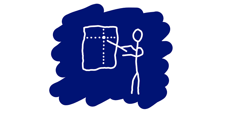
A custom image crop for each breakpoint, for art direction.
A custom point of interest for each image crop, also for art direction.
Without polling or trashing layout, for performance.
Working in all current, relevant, browser versions, for usability.
And progressively enhanced, for backwards compatibility.
Trying some different methods
So our goal is to come up with a solution that is fully accessible, makes the photography as good as it can be, and doesn't cause a large performance impact. Let's try out some different methods, shall we?
Method 1: A picture with an object position
If we use a picture with a few source elements for each crop, we can use object-fit and object-position to fill the available space and set the point of interest squarely in the middle of the photo. To then apply art direction, we need to set a different point of interest per crop.
Unfortunately, source elements are a bit of a weird bunch—they represent the different source images, with a limited set of properties, while having no content or layout of their own. The object-position needs to be set on the image, but controlled by the source. Not possible. You can have multiple sources, but only one point of interest.
Method 2: Adding a resize event handler
If we add a resize event handler, we can read the window.innerWidth property, pick the corresponding source, read some style data from it, and then apply this as inline style to the image. This'll do in a pinch-but it trashes the layout multiple times whenever the visible viewport is resized. And you'd have to manually trigger it on page load or visibility change for every image as well.
And that will, in effect, change your nice, handcrafted, smooth as silk, 60 frames per second animations into choppy, dirty, horrible garbage. So this is not a reasonable option, either.
Method 3: Using a Mutation Observer
If we use the Mutation Observer API, then whenever the src attribute changes, the browser will dutifully tell us so. And this will happen in a lazy manner on the next available frame, so it won't impact paint or layout. We can then use that moment to apply the right object position.
The difficulty in this scenario, is that the attribute (and corresponding property) doesn't actually change, even if the browser shows a different image. The moment the image changes, the src property no longer reflects its true value-just the initial one. I don't know who came up with that, but it's utterly useless.
Pull up your sleeves; let's go a little bit deeper.
Method 4: Querying the currentSrc property
The src property might be useless, but there's also a currentSrc property! That one has the correct and current image address. It doesn't work in Safari, but we can work around that. There's just one thing: we can't use a Mutation Observer to track changes, since it's not an attribute. And querying the property manually has the unfortunate side-effect of…? You guessed it - trashing the layout. Aargh!
Okay, what else do we have? Let's think… Ah!

Method 5: Using a Proxy
To be honest, now we're grasping at straws, really.
We'll try adding a Proxy-basically, trapping the currentSrc property and wrapping it with our own function. Instead of observing the change like with Mutation Observer, a Proxy allows us to effectively intercept it and transparently pass it along, all the while doing something else on the sly. Just like a secret agent on a mission. 😎
Because we intercept the original change, we know a repaint is already happening, so this is the perfect moment to set the object position-it hasn't been painted yet anyway. Nice!
Unfortunately, it appears the browser never sets this specific property (at least in Chrome). It is only determined upon request, sort of like Schrödinger's Cat. You know, the one that's both dead and alive at the same time and has a cameo on Rick & Morty? And forcing it won't help-we'd just trash the layout again.
Back to square one
Anyway, so this gets us nowhere-we're back to square one. This is usually the point where we decide to give up, get a bit of fresh air, come back, undo all the commits of this day, wonder how we're gonna stretch the rest of the project's hours, and then decide that we really didn't need to attend that good friends' house warming party tonight, after all.
But you know what? I'm a front end developer-I love what I do, and if I know one thing, it's that developers never give up! Never surrender! We'll find a solution-we can do this-we must do this!
Let's change tactics. Surely we can't be the first person on this entire dirt ball who struggled with media queries and layout trashing, right? Perhaps there's an old feature buried somewhere that we can (ab)use?
Digging through old documentation
Browser software has been around for a while. About ten years ago, most websites were only developed for a certain specific browser. It had lots of proprietary functionalities and weird quirks. For compatibility reasons, other browsers emulated these. But a lot of these features were not well tested, or even well thought out in some cases. And not every feature is used that often, or even reasonably well known.
I took a dive through the de facto webdeveloper documentation. And I looked at everything that didn't immediately rang a bell-in the slight hope that there would be some feature that I could use or subvert. Preferably something that is still supported by current browsers. And then I stumbled upon a feature that was barely documented, but harbored big potential.
Something first implemented in…
Internet Explorer
Yes, seriously. The one browser we all hate with a fiery passion. The one that has all those weird quirks. In this case, it might just be the one browser to save our collective behinds.
Internet Explorer 10 implemented a feature called the matchMedia API. It wasn't a standard, but other browsers eventually followed (Chrome 9 was officially the first to release, but the addListener in the specification-definitely Microsoft). And it's been basically supported for years now.
We can use it to check media queries-it does this lazily, without trashing the layout. Given that we have a list of sources, and the media queries they are linked to, we can easily match these and then apply our style changes.
That sounds exactly like what we need! This is one of those rare times where you can find a treasure, even in the dankest of places.

The ultimate solution
So, how do we do this?
First, we're going to listen to media query changes. And then, whenever a different media query is triggered and we've got a match, we'll apply a custom object-position to the img element, depending on the image source that is then visible. We have to save the position style information somewhere, so let's save it on the
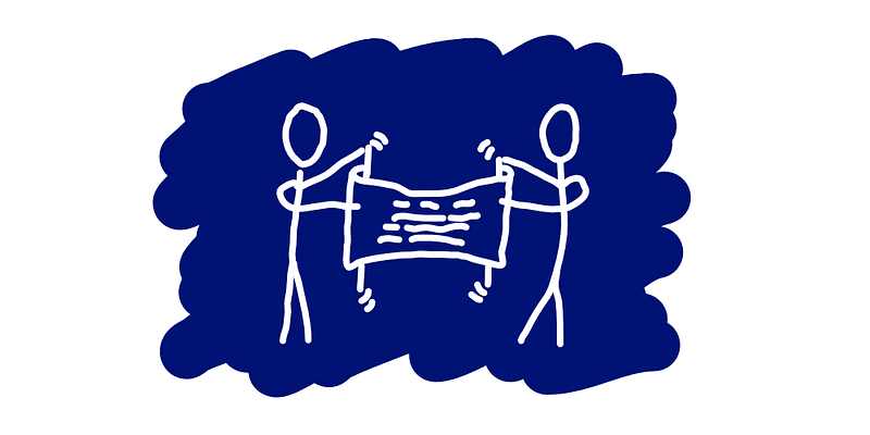
So, this is basically a picture with multiple sources. Each one has their own inactive point of interest, which we then activate-when needed-with a little bit of scripting. Screen readers won't notice, but they will notice the image itself.
And here is the result:
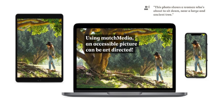
Holy mackerel, we did it!
A fully responsive, art directed, native image element with different crops and a different focal point per breakpoint.
It does not interrupt the critical path or trash the layout, so performance doesn't suffer.
We can add multiple levels of retina sized images and multiple file formats for capable browsers.
It's completely accessible to screen readers, since it uses an ordinary
imgtag.For that same reason it's also trivial to use native lazy loading-slick!
It's progressively enhanced since the basic image works without JavaScript.
With this, we are finally able to implement proper photography, without compromises! And, to top it all off, it uses a very old and almost forgotten technique as the basis for a modern solution.
Voila!
We've just saved the world! Well, maybe not the world, but at least the photography on the website of our clients. Which is also pretty nice, if I may say so. At least, I feel pretty good about myself right now. What about you?
Of course, 10 minutes later, a designer comes by with a seemingly innocuous question: "We can also do this with video's, right?"… and you can only respond with: "w-what? … Oh no, please tell me you don't - How would I even… What?!"


Top comments (1)
I’ve been searching for a professional photography studio to elevate my corporate headshot to reflect confidence and professionalism. The goal is to create a portrait that not only aligns with my personal brand but also conveys credibility and approachability in today’s competitive business environment. I believe that only experts who understand lighting, angles, and storytelling can deliver a result that perfectly captures this vision.