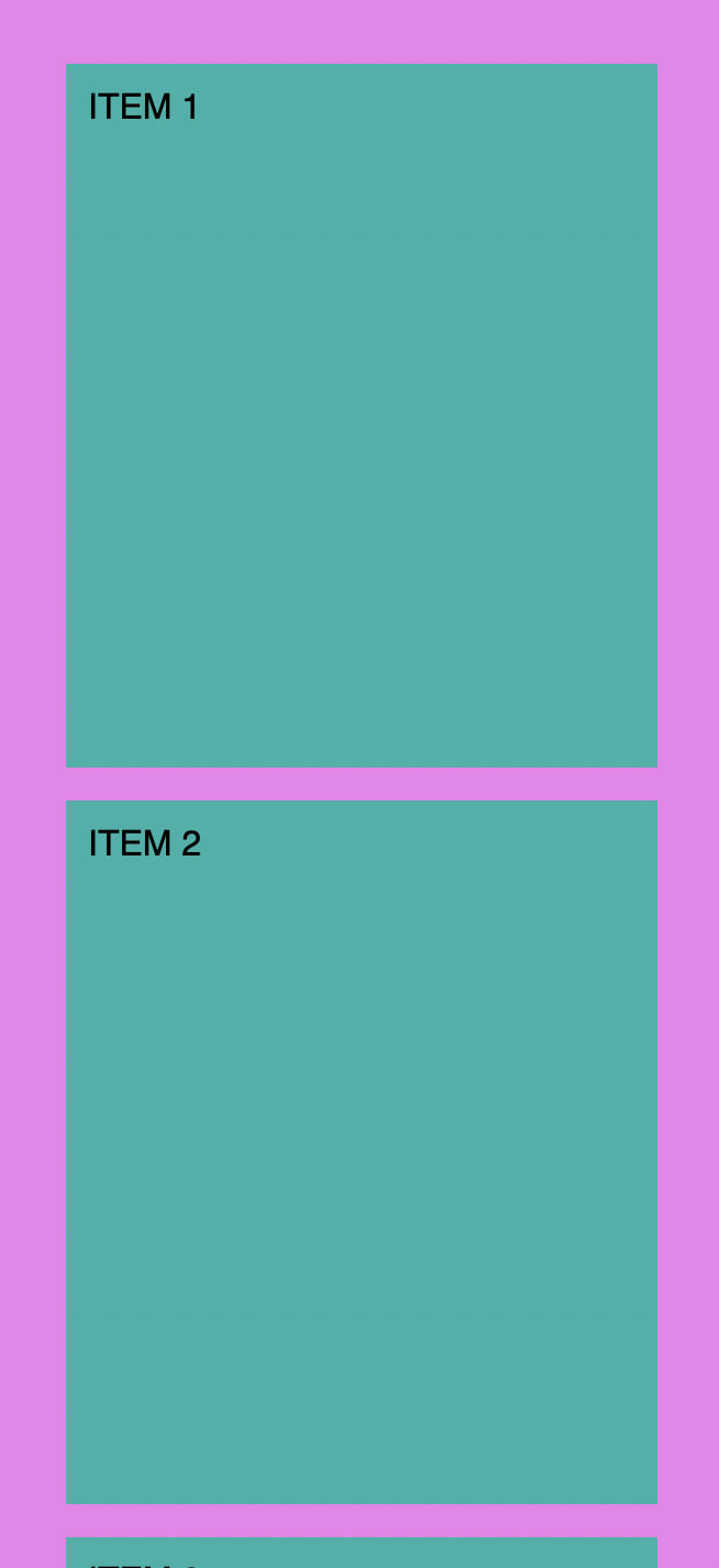
We can use auto-fit to create a simple responsive layout of items without writing any @media query code by setting grid columns like:
grid-template-columns: repeat(auto-fit, minmax(150px, 1fr));
The above means:
Each grid column has minimum width of 150px, and maximum width of 1 faction unit;
Auto-fit FITS the CURRENTLY AVAILABLE columns into the space by expanding them so that they take up any available space.
Example:
<div class="container">
  <div class="item">ITEM 1</div>
  <div class="item">ITEM 2</div>
  <div class="item">ITEM 3</div>
  <div class="item">ITEM 4</div>
  <div class="item">ITEM 5</div>
  <div class="item">ITEM 6</div>
  <div class="item">ITEM 7</div>
  <div class="item">ITEM 8</div>
</div>
.container {
  background-color: violet;
  padding: 30px;
  display: grid;
  grid-template-columns: repeat(auto-fit, minmax(150px, 1fr));
  grid-gap: 15px;
}

.item {
  background-color: lightseagreen;
  padding: 10px;
  height: 300px;
}
Result:


Top comments (0)