
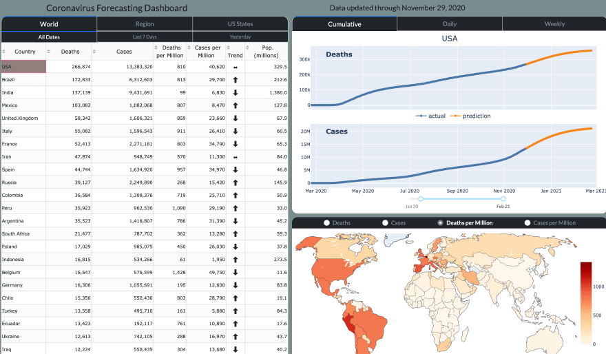
I have been modeling covid-19 cases and deaths in all areas of the world for the past six months. I built the ![coronavirus forecasting dashboard][https://coronavirus.dunderdata.com] which makes predictions for covid cases/deaths for all countries and US states. In this post, I will explore the remarkable similarity of covid infection waves across many areas of the world.
Similarity of Covid Waves by Area
Understanding the shape and trajectory of covid waves can provide useful approximations for the time frame where many infections will occur. When I speak of “covid waves”, I refer to the rise and fall of cases (confirmed infections) in a particular area of the world.
One remarkable observation thus far, is that nearly all areas have covid waves that follow similar trajectories and last a similar amount of time. The most widely available data to track covid waves is the number of daily cases reported. While the severity of individual cases varies, the daily number provides a good indication of the overall covid activity in an area. To help improve the discussion, I have defined the following covid wave stages and approximate length each area spends within them.
- Trough — same low number of daily cases
- Start — slow increase in daily cases (1–3 weeks)
- Outbreak — rapid (quadratic/exponential) increase in daily cases (1–3 weeks)
- Growth — steady (linear) increase in daily cases (1–3 weeks)
- Flattening — daily cases slowly stop increasing (1–3 weeks)
- Peak — same number of daily cases (1–3 weeks)
- Drop — steady (linear) decrease in daily cases (1–3 weeks)
- Stop — slow decrease in daily cases (1–3 weeks)
- Trough — same low number of daily cases (until the next wave)
Example Covid Waves
In this section, I’ll look at covid waves in specific areas. During the early parts of the pandemic (March-April 2020), covid struck areas that rank high in population density, industrialization, and connectedness to the world — Western Europe and the North Eastern United States. Although testing at this time was far lower than it is today, these countries and US states will be used as first examples of covid waves.
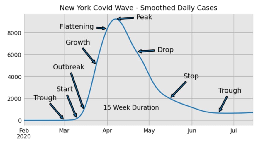
Let’s take a look at New York state which experienced its first major covid outbreak in mid-March. The data below is of smoothed daily cases. Using the raw data cases is much messier and more difficult to spot the wave stages. Although New York state is fairly large, most of the population (and initial covid activity) was from New York City, so it works well as a single “area”. As we will discover, its covid wave is typical, lasting about 15 weeks or 3–4 months.
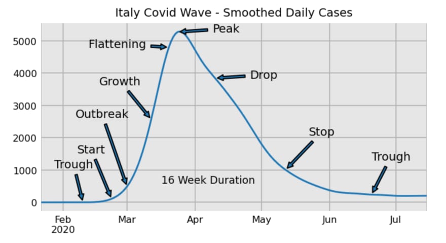
Italy was the first western nation to have an outbreak, just a couple weeks before New York. It’s covid wave followed a very similar pattern.
Normalizing Covid Waves
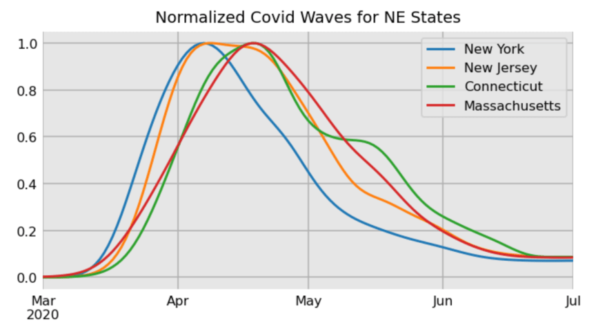
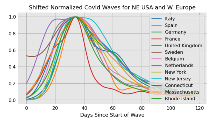
Instead of plotting each covid wave individually, several of them can be plotted at the same time for easier comparison. Because, each has a different maximum value, they are normalized (scaled) such that the maximum value is 1 for each. Five North Eastern states are plotted below. You can see the similarity between each.
Shifting Covid Waves
Different states reach their peaks at different times. To make the comparison even easier, each wave is shifted so that their peaks align. Several Western European nations are plotted together with these states. Despite being in different areas of the world, the waves share a remarkably similar shape.
Examining Smaller Areas
Looking at aggregated state or country data hides covid outbreaks that happen at different dates within that particular state or country. Take a look at daily covid cases in the large state of Texas.

While there is clearly a wave from June to September and another one beginning in October, this aggregated total misses waves from different areas of the state.
Texas is the second largest US state, sitting around 270,000 square miles. It takes around 14 hours of driving to go from El Paso (Western border) to Orange (Eastern border). El Paso is very isolated from all the other major cities in Texas, separated by hundreds of miles of desert, and so far west it’s in a different time zone.
El Paso vs Houston
The wonderful John Hopkins Github repository has covid data for each county in the US. From this data, smoothed daily cases are made for both El Paso and Houston, the largest city in Texas, very far from El Paso. While both cities had summer waves, El Paso had a much larger wave beginning in mid-September and is just now close to completing. Houston appears to be in the growth stage of a second wave.
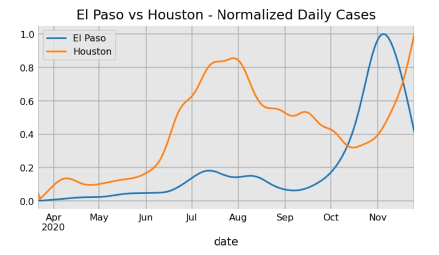
Even though El Paso is a fairly large city with nearly 700,000 residents, it accounts for less than 3% of the total population of Texas. Their latest major wave barely registers on the aggregated Texas total of daily cases from above.
El Paso’s latest wave appears to follow the typical pattern seen in the initial waves of the North Eastern US and Western Europe, and is likely to last the same amount of time (3–4 months).
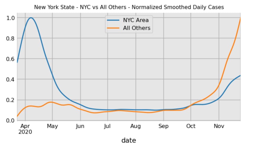
New York City vs All Others
Getting back to New York state — splitting the counties by proximity to New York City shows a clear difference in their covid waves. The less dense areas outside of New York City are seeing their largest wave (and hopefully nearing the flattening stage). It remains to be seen whether this wave lasts the typical 3–4 months.
India
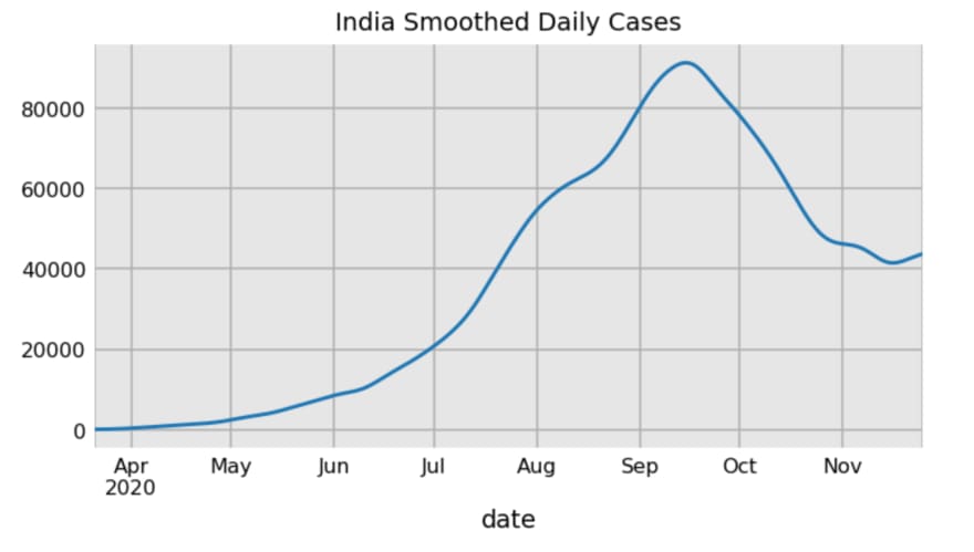
Turning to India, the country likely with the most overall total infections (currently second in confirmed infections), has daily case data that appears to be one long six or more month wave.
Like the US, India is a huge country with diverse geographic regions. Inspecting the nine largest Indian states reveals covid waves that are fairly similar to those in the US and Europe, lasting perhaps a bit longer (4–5 months).
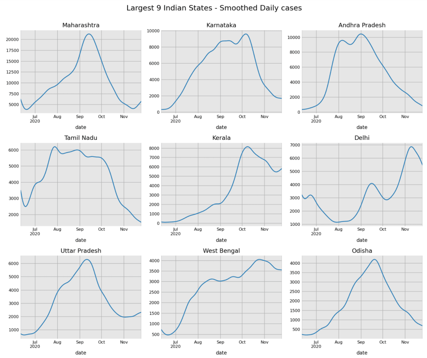
All of these states are very large, with the smallest having 43 million residents. I imagine that dividing these states into even smaller regions could reveal more typical covid waves.
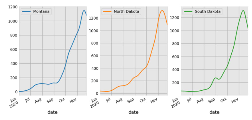
Isolated Areas
This pattern of covid waves seems to hold regardless of the geography or population density. The rural states of Montana, North Dakota, and South Dakota saw little covid activity until July/August with outbreaks happening in September. All three are following a typical covid wave trajectory and are into the drop phase and should complete their wave around the new year.
Eastern Europe
Eastern Europe (which I define as countries east of the border formed by Germany, Austria, and Italy) also had little covid activity until the late summer. These countries are far more dense than the central US states, but are less connected to the world than Western Europe, have less tourism, and less GDP per capita. The closest countries to Western Europe, Czechia and Slovakia, began their prototypical covid wave patterns first, followed by those countries further east.

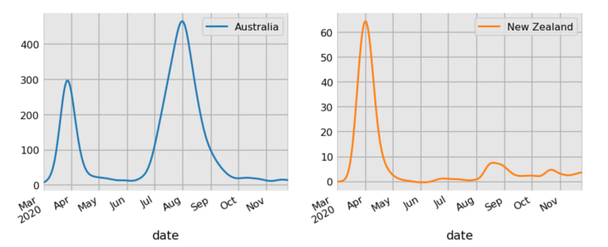
Australia and New Zealand
The isolated islands of Australia and New Zealand with little overall covid activity due to harsh lockdown measures still exhibited similar covid waves.
Counterexamples
I have yet to locate an area of the world with a covid wave that differs significantly from the ones above. Nearly all appear to follow the same pattern from trough to peak back to trough in a span of 3–4 months. If an area appears to violate this pattern, it is likely because the are encompasses a geographic area that is too large with a large population.
Fractal Nature of Covid Waves
In this section, I explore the idea that covid waves have some properties of fractals all the way down to within the human body. From above, we saw how aggregated totals of large states or countries such as New York, Texas, and India can hide the underlying covid waves of smaller geographic areas. The best examples to reveal covid waves are small, rural, isolated cities, states, or countries, such as El Paso, North Dakota, or Czechia.
It could well be the case that examining smaller and smaller areas, for instance, neighborhoods in a city, similar covid waves would appear. Geometric shapes that have the same patterns for each increasingly smaller area that you magnify are called fractals.
The animated image on the left is a classic example of a fractal showing the same repeating pattern while magnification goes on indefinitely.
As a whole, the covid-19 pandemic is not quite fractal since the aggregated totals do have different trajectories than the small geographic areas. But, I suspect that as we examine smaller and smaller groups, the covid waves will converge to some limit.
City to Neighborhood to House to Self
The city level was the smallest area we looked at in this post with the example of the isolated city of El Paso having its own covid wave at a different time than the rest of Texas.
But what if we looked further down and performed an analysis by city neighborhood? Intuitively, people in the same neighborhood would have their own covid wave. Going further, isolated communities such as nursing homes have had some of the worst covid outbreaks and likely have their own wave.
How about our own bodies? Once someone has covid, the virus multiplies quickly before the immune system fights it and clears the infection. This process seems to last between 2–4 weeks. Could this be the limiting covid wave after peeling back all of the layers?
Black Friday Special 2020 — Get 50% Off — Limited Time Offer!
If you’ve enjoyed this article and are interested in mastering the python data science libraries so that you can produce trusted results in a professional environment, take a course with me. You can get 50% off all my courses today for a limited time!

Top comments (0)