Introduction
Developers were more convenient with using pixels for setting every size in building a website until larger and smaller screens messed up with that rule. Then arose the need for CSS units that align with the screen sizes of any device with minimal changes. CSS later versions changed that with the introduction of relative units.
Quick One: CSS sizes can be defined using two types of units with each having many subtypes — Absolute and Relative units. While absolute units such as the pixel (most common), picas, points, millimetres, and inches, depend on no other CSS ruleset when defined, relative units, as the name implies, are relative to other defined sizes. Examples of relative units are em, rem, vh, vw, ex, and percentages.
Em and rem are some of the most dreaded units to use despite the 'easiness' feature they introduce to a developer's website. And that is because they are usually misunderstood by the CSS ruleset they are relative to.
Let's get things clearer here
Ems are relative to the font-size of the element they are declared in. That is, if em is used as the unit for a paragraph element's padding, its measurement will be calculated based on the font-size of that paragraph. Say, the font-size of the paragraph element is declared as 12px, and the padding as 2em, the 2em padding will be equivalent to 24px (2 * 12px). In the case where the font-size of the paragraph element is also declared in em, the browser will calculate the font-size of the parent element of the paragraph if it is declared in px, then use it for the paragraph element's font-size, and further calculate it for its padding. Let's assume the p element is in the body element with a font-size of 16px, and the p has a font-size of 1.2em and padding of 1.2em as well, when the browser converts the ems to px, it starts with the 16px font-size of the body element in calculating the p element's font-size (1.2 * 16 = 19.2px). So, the font-size for the p element will be 19.2px. Using the 19.2px for the font-size of the paragraph element, the browser will calculate its padding as 23.04px (1.2 * 19.2px). That's how crazy the em unit works. The px equivalent gets bigger because the em is defined to be greater or equal to 1.
What if it's less than one? That's when the developer experiences the shrinking font problem! The font-size of the child element declared in an em unit less than 1 decreases in value when converted to pixel.
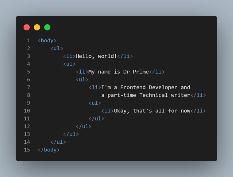
Let's get an illustration of the above statement with the list element.
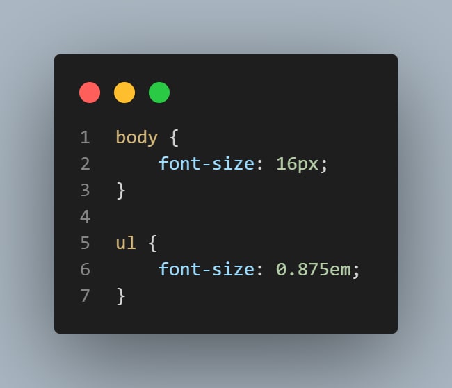
/* The CSS */
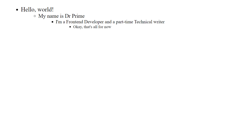
For the first ul, the li content will have a font-size of 14px. As the parent element of the next ul, with a font-size of 14px, the next ul will have a font-size of 12.25px (0.875 * 14px). The last ul will have a font-size of 10.71875px (0.875 * 12.25px). From these calculations, we can see that the font-size keeps decreasing, yeah, that's what an em unit can do, and it's obviously crazy as stated.
Check it out
What about Rems?
We've discussed em units a bit, so what about rem units?
Just as the em unit is, the rem unit is dependent on font-size, but instead of the parent element's font-size, rem is related to the root element's font-size—16px, if it's not defined. And it definitely got its 'R' from 'root'. 16px is the default browser's font-size, therefore, the rem unit is relative to it.
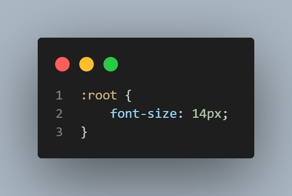
But, what if the developer defines another font-size for the CSS other than 16px? That's what the rem will be relative to.
The primary font-size, in this case, is 14px, and whatever your rem is, it'll be multiplied by 14 to get a px equivalent. Say an element's margin is 2.2rem, in px, it'll be 30.8px.
Another question
So, what if the developer decides to declare the root element's font-size in em or rem? For em and rem, the font-size will be calculated in terms of 16px, the browser's default font-size.
I know you've got questions. What should we do then? What should we use px for? What about rem and em? When should we use them?
As Keith J. Grant suggests in his book, CSS In Depth, we use px for borders, rems for font-sizes, and ems for paddings, margins, border-radius, and other elements.
Conclusion
In this article, we have done an in-depth explanation about ems and rems, their relations to pixels, and also suggested their best use cases. We have learnt our mistakes and know how to avoid them in the future.
All we need to do now is to write better CSS, use the most appropriate units, and pass on the torch to other developers by sharing this article, 😁.
Reach out to me on Twitter @theDocWhoCodes
Gracias.


Top comments (0)